Cadde wrote: Mon Nov 18, 2019 8:50 am
Ok seriously, all the people saying "color corrected monitors" need to just stop and instead consider...
How many users use the same color profiles and have monitors set up for that? How many users use the exact "correct" color settings on their screens when playing games?
The first part of that sentence is what matters the most here... there are practically as many different settings (regardless of how professional you are) and as many different eyes (colorblind people spring to mind) out there as there are users on these forums.
Cadde wrote: Mon Nov 18, 2019 8:50 am
Which brings me to what you colorphiles are really saying. "buy a real monitor that can cost hundreds if not over a thousand dollars for a game that costs $25"
And then what? Complain about all the other games that doesn't run toyland color settings being too dark?
It's about averages really and if i compare factorios current color scheme (before change that is) with other nice to look at games it's almost perfect to me (not including minimap in that statement BTW)
I think you misunderstand what the importance behind a color calibrated monitor is. It's not important in the sense that it should be the only thing to consider, or even the 'only way to play'. Heck, the sRGB standard has a sub-par gamut to begin with anyway, so it's
clearly not up on some pedestal as something to achieve.
What it does, however, is provide a
baseline for how things will typically look in an average, every-day and non-calibrated usage scenario. So in that way, while it's not the only thing that matters or anything, it
can be considered to be the only thing the developers themselves need to test their color choices against.
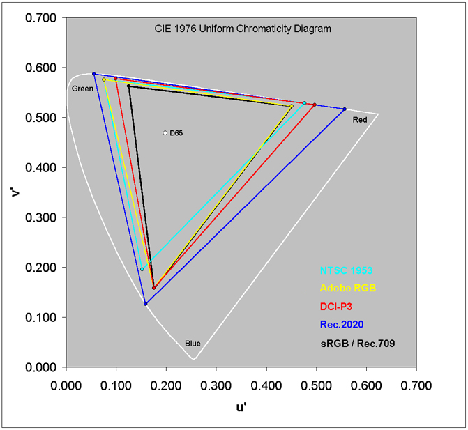
That said, monitors with higher gamuts are becoming more and more popular these days. Monitors that use AdobeRGB are very popular in the print industry, as it supports a wider gamut in the blue/green area of human vision, and thus can more accurately represent cyan printer ink. TVs and 'gaming' monitors are increasingly supporting DCI-P3, and a few even try to support Rec. 2020 (though it's extremely hard to do Rec. 2020 as a raw output, since each primary color is a single wavelength of light).
Cheaper high-gamut monitors will usually have very poor calibration and quality control, not really supporting any particular standard at all. These are the ones you'll see comparing themselves to NTSC (which teechnically had a higher gamut than sRGB, but sRGB has a much more chromatic blue primary, so the two really shouldn't be compared the way they often are). If you see something like '
129% sRGB & 108% NTSC', that's how you know you'll have no way to predict what you'll get (fun fact, that monitor I linked to has fine print stating they measured those two percentages with different chromaticity spaces; NTSC coverage was measured in the more perceptually uniform CIE u'v' chromaticity space (released in 1976), while the sRGB percentage was measured in the less perceptually uniform CIE xy chromaticity space (released in 1931). See
this chart for a comparison of the various mentioned gamuts in the u'v' chromaticity space).
People like me who keep emphasizing judging these things in environments where the monitors are properly calibrated, are
not saying that uncalibrated hardware isn't important... But we
are saying that the devs don't need to go out of their way to track down whatever cheap monitor you have and make sure it will look correctly on your specific display. It's not their fault if the colors look way too saturated and 'blinding' on your display, it's the manufacturer of your display's fault. Or, if you purposefully bought a cheap monitor that had higher-saturation colors and was wowed by how much the colors 'popped', it's your fault for not thinking about if there would ever be a scenario in which you
wouldn't want that anymore.
That said, many high-gamut monitors have a setting in them to change them to a low-gamut mode for you. Even many phones have this. It might be called 'sRGB mode', or maybe something like 'Natural' vs. 'Boosted'. You can probably turn it to 'sRGB' or 'Natural' while you play Factorio, and it'll look more similar to what the developers intend.
Cadde wrote: Mon Nov 18, 2019 8:50 am
Let's just play with the thought... just for a brief moment... that regardless of what hardware is used, players will have varying opinions based on TASTE.
To me, the examples show BAD TASTE. It's an opinion of mine and it has NOTHING to do with what setup i am running.
No, that's what mods are for. If you want different colors - a darker/grungier look; a brighter, colorful, cheery look; or something like a 'permanent night' look; those are things that you can decide to install or create as
mods. Different users have different tastes, and that's why mods exist.
What you are doing here is unnecessarily insulting the tastes and preferences
of the developers. And it is
their game,
not yours. Developing and creating assets for a video game is a form of art, and the primary purpose of art is to represent an aspect of the person creating it - whether that aspect is an opinion, a thought process, an abstract idea, a memory, or anything else that's personal to them.
You have no right to tell them how they should represent themselves through their art, and while there might be merit to complaints like, "I can't see the difference between these two colors because I am color blind," or, "Most modern monitors end up using a 2.2 power as their gamma curve instead of something like sRGB/BT.1886, so the darker colors are probably darker than you intend for most people," both of those are a matter of practicality - with the intention of helping the developers better express their art to various sorts of users. Neither have anything to do with taste, opinions, or personal preference.
Cadde wrote: Mon Nov 18, 2019 8:50 am
The only thing i don't like about it currently is there's some things that are too smudged/smooth/indistinct. Pipes come to mind and i made a test for that while i was looking to make different shaped storage tanks and i realized i am not really a "sprite artist".
I think I remember them saying they actually create the sprites with 3D models, rendering them at a decent size and then scaling them down in photoshop, tweaking the final look afterward. I've dabbled in 3D modeling before, but I must admit the same weakness: visual arts are a very weak part of my skill set.
Cadde wrote: Mon Nov 18, 2019 8:50 am
One can make a game colorful and bright without making it look like a toybox BTW. Simply increasing saturation and brightness is NOT a decent approach to this end. IF you want to make the game look nicer you will have to re-think your whole atmosphere. You can't just add more saturation and assume it will look good.
The artwork right now isn't perfect but at least it doesn't make me feel like i am playing a kids game.
Despite what I say above, having spent the last couple years studying colorspace conversions and color manipulation algorithms for various effects, I can tell you now that what they're doing with this update isn't
remotely as simple as 'increasing saturation and brightness'.
They have hand-tweaked numerous individual sprites' colors using LUTs, and to do
that means they likely did something more akin to increasing chroma (similar to saturation, but doesn't affect luminosity/lightness) on some things, shifting the hue here and there, and occasionally tweaked the luminosity. For the day/night part, it's clear they also changed and adapted the white point.


