Page 1 of 2
Factorio Paper Cuts
Posted: Tue Jun 02, 2020 12:51 am
by m44v
Given that Wube is on the race for the 1.0 release I thought about sharing my list of petty annoyances with the game, with luck some of them are trivial to fix, sort of like a
paper cut bug.
I want to encourage everyone to find more, it has to be an annoying usability issue that
hopefully is also trivial to fix, I say
hopefully because us as users can't tell what is and isn't trivial so is a given that we'll get it wrong sometimes, but Wube can figure that out.
I'll start,
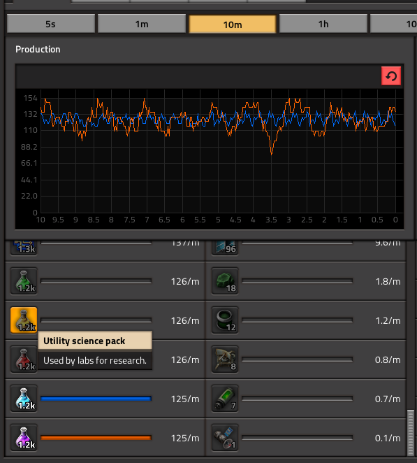
Selecting items in the production statistics window

I bet everyone went through this, you wanna see your science production, so you open the window and try to select all the science flaks, you click red science, you go for green science but before you click it switches places with red so now is deselected, you click red science again but now it switched places with iron gears ...
I know, is easier to do if you choose a longer timescale, but...
The production statistic window doesn't remember the last timescale used
Seriously, every time you open it it's 5 seconds, almost always I want it to be something else.
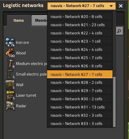
Logistic network #27, where are you?

I don't know why but there's some iron in that network, where the heck is this?
If you see the logistic networks (L) you can see all networks with a #number that identifies it, except for the one you're currently at you don't know which are the others. At least I haven't found any convenient way to identify them, roboports don't display their network number.
You can't drag around the world map when the game is paused
But you can zoom in and out for some reason!
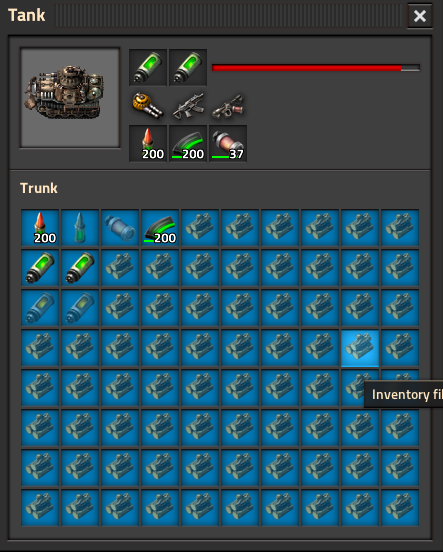
Can't limit the trunk's size

This is how the inventory of your tank looks if you want to automate loading but not put much stuff in it... yes it was a lot of clicking.
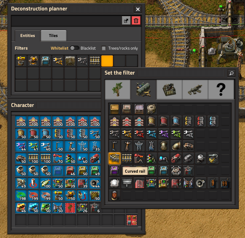
Having curved AND straight rails in the deconstruction planer

If I want to whitelist/blacklist rails in the deconstruction planer I have to add both curved and straight rail, in my over 1000h of playtime I never found myself needing the level of granularity where I would want to pick up curved rails but not straight ones. Besides, there's no longer curved rails in our inventories, so it can be confusing.
(I'm not posting this in the bug reports forum because Rseding91'll say "working as intended" and shove it to the not-a-bug subforum)
Re: Factorio Paper Cuts
Posted: Tue Jun 02, 2020 4:04 am
by Durentis
Medium electric pole coverage radius is one tile short from actually being useful in most places (instead of being stuck with a pole-spam choice of two medium or two small poles to accomplish the same thing).
Custom (snipped and restrung) copper wires aren't saved in blueprints - I acknowledge that this one is probably far less than trivial, however super annoying.
Re: Factorio Paper Cuts
Posted: Tue Jun 02, 2020 4:20 am
by steinio
Pipe connection position is not copied on recipe copy between assemblers...
Re: Factorio Paper Cuts
Posted: Tue Jun 02, 2020 10:28 am
by 5thHorseman
Durentis wrote: ↑Tue Jun 02, 2020 4:04 am
Medium electric pole coverage radius is one tile short from actually being useful in most places (instead of being stuck with a pole-spam choice of two medium or two small poles to accomplish the same thing).
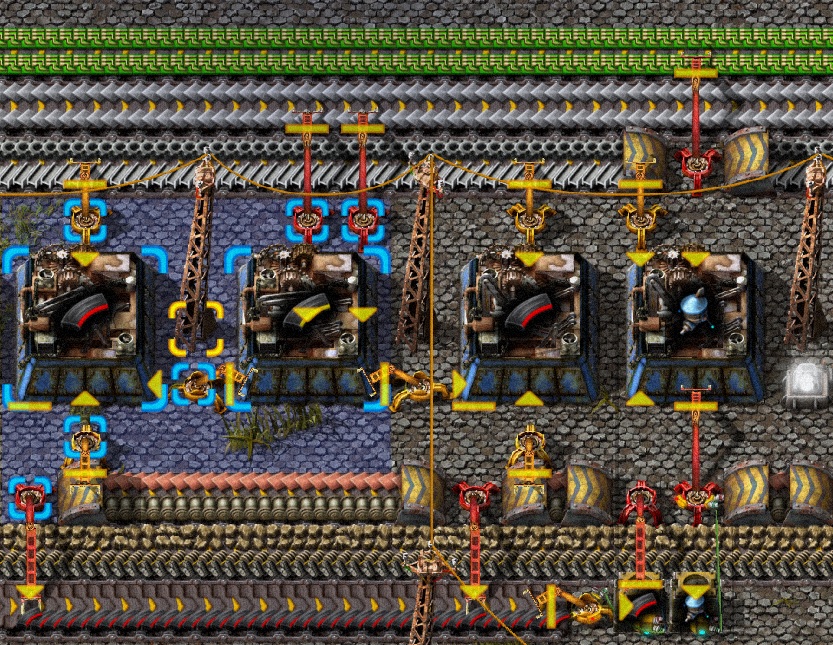
Not if you set up your assemblers to account for them, then they're the exact right size.
The below setup powers all assemblers and any needed inserters to pull from or put on any of the 3 belts on either side, with just one power pole for every 2 assemblers. Except when I'm forced to make a gap early due to direct inserting, of course.
- factorio_properpoles.jpg (379.3 KiB) Viewed 7545 times
Re: Factorio Paper Cuts
Posted: Tue Jun 02, 2020 11:59 am
by Xorimuth
Put the map icons on top of all other map visualisations:
viewtopic.php?t=81307
Re: Factorio Paper Cuts
Posted: Tue Jun 02, 2020 3:23 pm
by Serenity
m44v wrote: ↑Tue Jun 02, 2020 12:51 am
This is how the inventory of your tank looks if you want to automate loading but not put much stuff in it... yes it was a lot of clicking.
Even just filtering cargo wagons is a lot of clicking. Filters should be draggable like limiting a box
Re: Factorio Paper Cuts
Posted: Wed Jun 03, 2020 4:04 am
by Durentis
5thHorseman wrote: ↑Tue Jun 02, 2020 10:28 am
Durentis wrote: ↑Tue Jun 02, 2020 4:04 am
Medium electric pole coverage radius is one tile short from actually being useful in most places (instead of being stuck with a pole-spam choice of two medium or two small poles to accomplish the same thing).
Not if you set up your assemblers to account for them, then they're the exact right size.
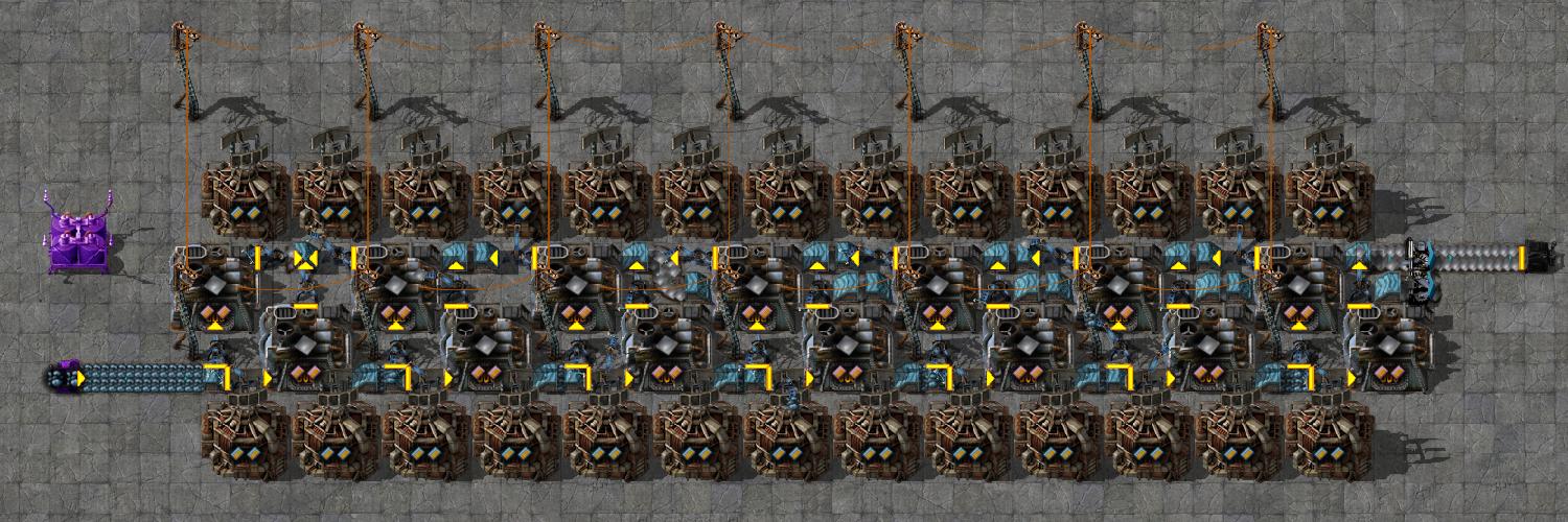
You'll always find a place where they're fine. I'm referring to the many situations, generally involving beacons or other tight designs, that just fail outright because the medium pole cannot stretch across a 3x3 entity. This is an example of a place where I need two poles for that one extra tile and it mars an otherwise beautiful design.
- SDB4wHM.jpg (183.47 KiB) Viewed 7409 times
The poles go from reaches of 1 to 2 to 3 to 8 tiles, but the big power pole is for long distance wiring and the substation doesn't fit in these setups. The medium pole simply doesn't differentiate itself enough from the small pole and is annoyingly close to doing so. (Also, reaches of 1, 2, 4, and 8 would scale them up in nice tidy powers of 2.)
Re: Factorio Paper Cuts
Posted: Thu Jun 04, 2020 1:13 am
by pichutarius
craft speed of assemble is .5, .75, 1.25
no assemble crafting speed is 1, which is annoying when doing mental calculation.
i would rather changing 1.25 to 1
Re: Factorio Paper Cuts
Posted: Thu Jun 04, 2020 3:47 am
by ssilk
See items without changing colors
I lent the first pic:

When you filter inside the graph, its line changes the color without reason.
See all circuit signals
Especially the output signals of combinators on smaller screens and when playing with the output of roboport. Need to add a filter to the signals you want to see and connect that to a pole. I want to scroll somehow, or switch between input and output, depending where I hover the mouse.
You can can’t change it, but you can print it
In map you can zoom to requesters/assemblies/combinator/..., but you cannot open it and do changes. But you can create a blueprint and paste it over.
Already mentioned: items change place
That is not only so in the statistics, but also in inventory.
General rule: the icon you are currently pointing to and the left and right icon from that shouldn’t change place.
Re: Factorio Paper Cuts
Posted: Sat Jun 06, 2020 2:23 am
by Xystem4
Far worse than the deconstruction planners having curved and straight rails, it also has twenty tree variants, and four rock variants. I usually keep a deconstruction planner that does the "destroy all trees and rocks" thing, but also cliffs. But I can't just add cliffs, I need to add all twenty trees and four rocks and then add cliffs.
It's made so tedious because the filter window closes every single time you choose an item to whitelist. It would be slightly inconsistent, but due to the nature of the deconstruction planner I really don't think it needs to be set up like filters. Rather, it could just show the inventory like usual and you can toggle every item on/off, and it will be highlighted in yellow if it's on. Or at least just don't make the filter window close every single time.
Also, several things in the game have no explanation/instructions. On the enemies tab when generating a map, every single item has a tooltip except for "peaceful mode", which easily needs explaining more than any other setting on there. The campaign with the most differences from normal gameplay, Tight Spot, has no instruction whatsoever (whereas the belt madness campaign gets instructions before every level, that aren't even necessary), and as far as I can tell the only way to find out how to play is by looking outside the game.
Oh, also no nested blueprint books. Although I have a suspicion there's some technical difficulty preventing them from adding it, since it seems so obvious and I've seen it requested in the past many times. Still though, to my dumb mind it seems pretty straightforward
Re: Factorio Paper Cuts
Posted: Thu Jun 11, 2020 12:29 am
by Illiou
Display save date and time. Being able to sort by time or other things would of course be next level, but just adding one line to the GUI that displays the date and time of the save would already be huge.
m44v wrote: ↑Tue Jun 02, 2020 12:51 am
(I'm not posting this in the bug reports forum because Rseding91'll say "working as intended" and shove it to the not-a-bug subforum)
I'm almost afraid to go there at this point

Re: Factorio Paper Cuts
Posted: Thu Jun 11, 2020 1:13 am
by Oktokolo
I am sad about this thread not being about paper cuts showing portraits of Factorio entities.
Re: Factorio Paper Cuts
Posted: Sun Jun 28, 2020 1:23 pm
by Zavian
Copy and paste (Control-C and Control-V) will overwrite train station names. (If the paste overlaps with an existing station, it can get renamed, potentially causing massive amounts of belt contamination.
(In my opinion it should work like the default behaviour in blueprints and not copy station names. It certainly should not rename stations that a player has explicitly named, because that result in trains heading to the wrong station, which can cause belt contamination).
Re: Factorio Paper Cuts
Posted: Sun Jun 28, 2020 2:49 pm
by Qon
Zavian wrote: ↑Sun Jun 28, 2020 1:23 pm
Copy and paste (Control-C and Control-V) will overwrite train station names. (If the paste overlaps with an existing station, it can get renamed, potentially causing massive amounts of belt contamination.
(In my opinion it should work like the default behaviour in blueprints and not copy station names. It certainly should not rename stations that a player has explicitly named, because that result in trains heading to the wrong station, which can cause belt contamination).
Do you save names in the blueprint? (It is optional)
Because if you do then it sounds like it is working.
Re: Factorio Paper Cuts
Posted: Sun Jun 28, 2020 3:11 pm
by TerraSleet
Durentis wrote: ↑Wed Jun 03, 2020 4:04 am
5thHorseman wrote: ↑Tue Jun 02, 2020 10:28 am
Durentis wrote: ↑Tue Jun 02, 2020 4:04 am
Medium electric pole coverage radius is one tile short from actually being useful in most places (instead of being stuck with a pole-spam choice of two medium or two small poles to accomplish the same thing).
Not if you set up your assemblers to account for them, then they're the exact right size.
You'll always find a place where they're fine. I'm referring to the many situations, generally involving beacons or other tight designs, that just fail outright because the medium pole cannot stretch across a 3x3 entity. This is an example of a place where I need two poles for that one extra tile and it mars an otherwise beautiful design.
SDB4wHM.jpg
The poles go from reaches of 1 to 2 to 3 to 8 tiles, but the big power pole is for long distance wiring and the substation doesn't fit in these setups. The medium pole simply doesn't differentiate itself enough from the small pole and is annoyingly close to doing so. (Also, reaches of 1, 2, 4, and 8 would scale them up in nice tidy powers of 2.)
+1, many of my builds end up tiling in a length with a multiple of 3, mostly due to beacons, furnaces and assembly machines being 3x3, yet medium power poles are just short of covering 9 tiles and end up being spammed. The Krastorio 2 mod adjusts medium poles to 9x9 coverage (vanilla is 7x7) and it makes such a huge difference for both usability and visibility, without breaking balance or trivializing power coverage.
Re: Factorio Paper Cuts
Posted: Sun Jun 28, 2020 3:44 pm
by 5thHorseman
Qon wrote: ↑Sun Jun 28, 2020 2:49 pm
Zavian wrote: ↑Sun Jun 28, 2020 1:23 pm
Copy and paste (Control-C and Control-V) will overwrite train station names. (If the paste overlaps with an existing station, it can get renamed, potentially causing massive amounts of belt contamination.
(In my opinion it should work like the default behaviour in blueprints and not copy station names. It certainly should not rename stations that a player has explicitly named, because that result in trains heading to the wrong station, which can cause belt contamination).
Do you save names in the blueprint? (It is optional)
Because if you do then it sounds like it is working.
Ctrl-c doesn't give you the option by default. You have to hold down shift to actually create a blueprint to see any options.
Re: Factorio Paper Cuts
Posted: Sun Jun 28, 2020 5:46 pm
by Qon
5thHorseman wrote: ↑Sun Jun 28, 2020 3:44 pm
Ctrl-c doesn't give you the option by default. You have to hold down shift to actually create a blueprint to see any options.
Correct. You can also create blueprints with the dedicated Alt+B (create blueprint hotkey) instead using the cut/copy functionality to create blueprints.
Re: Factorio Paper Cuts
Posted: Mon Jun 29, 2020 7:22 am
by Zavian
Qon wrote: ↑Sun Jun 28, 2020 5:46 pm
Correct. You can also create blueprints with the dedicated Alt+B (create blueprint hotkey) instead using the cut/copy functionality to create blueprints.
The point is I'm not creating a blueprint, I'm just using the keyboard copy + paste functionality.
Re: Factorio Paper Cuts
Posted: Mon Jun 29, 2020 1:55 pm
by Qon
Zavian wrote: ↑Mon Jun 29, 2020 7:22 am
Qon wrote: ↑Sun Jun 28, 2020 5:46 pm
Correct. You can also create blueprints with the dedicated Alt+B (create blueprint hotkey) instead using the cut/copy functionality to create blueprints.
The point is I'm not creating a blueprint, I'm just using the keyboard copy + paste functionality.
You did write that, yes... either I wasn't paying attention or I thought you didn't know that you could make blueprints and then not save the names in the blueprint.
I think it ALSO makes sense that Ctrl-C saves names. If I'm copying a row in a stacker to increase its capacity then I want it to have the same name as the other rows. It probably differs from person to person on how they want it to work. I wouldn't mind it being a setting.
Re: Factorio Paper Cuts
Posted: Mon Jun 29, 2020 11:36 pm
by T-A-R
The inability so to entire content of logistic networks. Especially with zoomed GUI. Suggestion: tiny button to show/hide minimap, or a scroll bar along the network content.
