Page 1 of 2
show different appearance to blacklist/whitelist icons in alt mode
Posted: Sat Mar 02, 2019 1:47 am
by psychogears
TL;DR
When using ALT mode, there's no visual distinction in the icon between a filter that's blacklisting or whitelisting the item.
What ?
There's no visual difference between a filter that's blacklisting vs a filter that's whitelisting. (attachment 1) I suggest either changing the blacklisting background to a color like red, since blacklisting is a new function of the filter inserter and the black background could be already strongly associated with a whitelisting filter inserter and does not defy the visual expectation of the veteran player, or changing the whitelisting background to something like light gray, so a black background would mean the filter is blacklisting and a (dark) white glow will mean the filter is whitelisting.
Why ?
One can more quickly distinguish at a glance using ALT mode what the filter is doing, leading to quicker decisionmaking.
Visualize negated filter inserters
Posted: Thu Feb 11, 2021 8:57 pm
by Eiermann
Hey Ho!
TL;DR
Visualize the configuration of filtered inserters so players can see the difference.
What ?
i would like to see an indicator when a filter inserter has negated filters configured. At the moment you cannot recognize inserts with a positiv and a negative list. As you can see in the attachments.
The following changes could help:
a) show the configured filters in the info-bar
b) cross out the configured items
c) add additional icon that indicated a negated filter
Why ?
The following problems would be solved:
a) players can see the configuration across the map
b) players dont need to click on the inserter to see the configuration
Re: Visualize negated filter inserters
Posted: Thu Feb 11, 2021 10:42 pm
by starlinvf
you mean whitelist vs blacklist?
Re: Visualize negated filter inserters
Posted: Fri Feb 12, 2021 5:18 pm
by Eiermann
starlinvf wrote: ↑Thu Feb 11, 2021 10:42 pm
you mean whitelist vs blacklist?
Yes!
Re: Visualize negated filter inserters
Posted: Fri Feb 12, 2021 8:00 pm
by QGamer
What if the background was white for whitelisted items and black for blacklisted items?
Re: Visualize negated filter inserters
Posted: Sat Feb 13, 2021 10:00 am
by ssilk
White/blacklisting is a very old
filtering pattern in information science.
In both cases there is a list of items. The filter takes one incoming item and checks it against the entries in the list. Either the item goes through the filter, or not.
For blacklisting this means: if there is any entry in the list that matches, it is filtered out. For whitelist it means: if there is no entry in the list, it is filtered out. The difference is: blacklisting is good, if you have many items, that needs to be filtered, because there is a chance, that the list don’t need to be scanned completely, while whitelisting is good, if you have many items, that match with the list.
The disadvantage of blacklisting is, that you don’t know, after filtering, what items could be in the result-set. Because of that, it is a security anti-pattern.
The reason why that is called white/black is not so obvious: white and black are patterns of security information science. White means in security, that you are operating in a so called “white room” (also a pattern of information science), and means that you can see everything, all is clear, it is secure to use an item. Black, because there is also a “black room”, where you cannot trust an item, it is dark, not clear.
So the origins are AFAIK from security information science.

You can replace white/blacklisting in case of Factorio with positive/negative listing, because here this pattern is not used in security context.
Re: Visualize negated filter inserters
Posted: Sat Feb 13, 2021 12:31 pm
by Eiermann
Its not about the naming convention. Its about the in-game visualisation. Currently you can not tell the difference between filter inserters by just looking at them (inserters with a blacklist configured look the same as inserters with a whitelist configured).
Just look at the example with the science packs. You simple cannot tell what the inserters are transfering from left to the right and vice versa (one has a blacklist, one has a whitelist).
Re: Visualize negated filter inserters
Posted: Sun Feb 14, 2021 8:24 am
by ssilk
@Eiermann: The idea is very good. I just answered the question above, because I was curious.
Re: Visualize negated filter inserters
Posted: Tue Feb 16, 2021 3:56 am
by foamy
Eiermann wrote: ↑Sat Feb 13, 2021 12:31 pm
Its not about the naming convention. Its about the in-game visualisation. Currently you can not tell the difference between filter inserters by just looking at them (inserters with a blacklist configured look the same as inserters with a whitelist configured).
Just look at the example with the science packs. You simple cannot tell what the inserters are transfering from left to the right and vice versa (one has a blacklist, one has a whitelist).
Yeah, it'd be nice of there was some kind of UI indicator in altmode about this. It can get real confusing in some builds that make use of both.
Re: Visualize negated filter inserters
Posted: Wed Feb 17, 2021 11:47 pm
by starlinvf
Well... the most direct approach is to have an strike-through over the item icon. But I don't know off hand if this can be a layer, or if they'll have to double the number of icons to incorporate the visual.
As for the origins of the terms...... Black list goes way back. Light research (not just wiki) says its at least as old as the 1600s, indicating a list of people who are suspicious/evil ... and I'm inclined to believe it given the verbiage.
"Ye secret oppressors,..ye kind drunkards, and who euer come within this blacke list of wickednesse."
https://www.reddit.com/r/AskHistorians/ ... klist_and/
Re: Visualize negated filter inserters
Posted: Thu Feb 18, 2021 7:56 am
by ssilk
Interesting.

Re: Visualize negated filter inserters
Posted: Thu Feb 18, 2021 8:38 am
by Zool
Absolutely amazing idea! The other day, I was looking for the error in a huge multiplayer factory, and only after starting to click through a good 100 inserters manually, I found that one that, for whatever reason, had whitelist instead of blacklist enabled.
Re: Visualize negated filter inserters
Posted: Mon Apr 05, 2021 12:47 pm
by ickputzdirwech
This is the same suggestion as this one:
66255 and should therefore be merged.
I noticed today that this kind of icon already exists. Exclusively for a deconstruction planner with "Trees/rocks only" however. And it's barely noticeable. They should change it to black maybe.

- trees rocks only.png (3.15 KiB) Viewed 5754 times
+1 to the suggestion.
Re: show different appearance to blacklist/whitelist icons in alt mode
Posted: Mon Apr 05, 2021 11:29 pm
by ssilk
merged
Nice find, ickputzdirwech!
Re: show different appearance to blacklist/whitelist icons in alt mode
Posted: Mon Sep 27, 2021 11:03 pm
by spiral_power
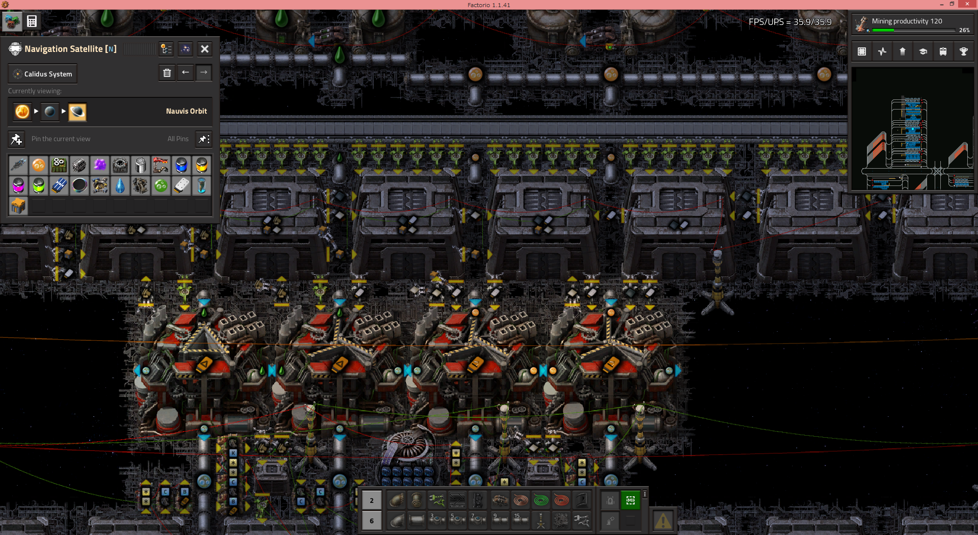
I've been playing Space Exploration ( more complex than vanilla ) lately and I really want a visualization of this setting.
There are w/b settings...

- 1.png (1.57 MiB) Viewed 5212 times
Re: show different appearance to blacklist/whitelist icons in alt mode
Posted: Tue Sep 28, 2021 5:08 pm
by foamy
Yeah, this is something I've wanted for ages. It gets particularly irksome in builds that do, by intent, both white- & black-listing of stuff, because troubleshooting it means clicking on individual inserters.
Dropping the do-not-allow symbol on top of the blacklist image seems to me to be a very simple resolution of the issue.
Re: show different appearance to blacklist/whitelist icons in alt mode
Posted: Sat Jan 13, 2024 12:08 am
by SteelWolf300
Now that the devs are reworking the inserters (
FFF-393), I thought it would be a good time to bring the suggestion again.
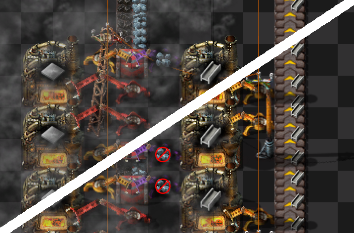
Example of current vs suggested, in a typical situation where I wouldn't want a whitelist on coal, in case I ever change fuel. Wouldn't the second be nice and clear visually?

- blacklist-inserter.png (450.8 KiB) Viewed 2234 times
Of course since the filter inserters will be gone in 2.0 you will have regular inserters with blacklist filter instead, but you get the idea.
Re: show different appearance to blacklist/whitelist icons in alt mode
Posted: Sat Jan 13, 2024 12:30 am
by spiral_power
That's a nice look.
I wonder why dev set the number of filters to 5. 4 would make it easier to display icons.
Re: show different appearance to blacklist/whitelist icons in alt mode
Posted: Wed Jan 17, 2024 6:11 pm
by SteelWolf300
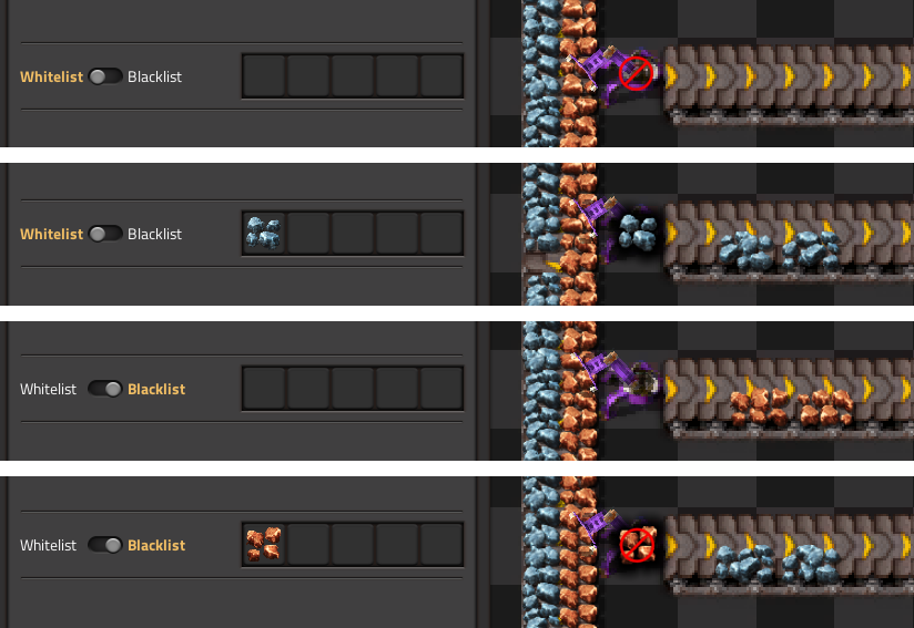
One shower thought later and it occurred to me that the block indicator (red circle) should probably be reversed between whitelist/blacklist when no item is specified.

- inserter-filter-block-indicator.png (232.47 KiB) Viewed 1997 times
Re: show different appearance to blacklist/whitelist icons in alt mode
Posted: Mon Apr 08, 2024 8:21 pm
by cjbturin
I found this thread looking for a mod while playing SE and I absolutely agree that it would be a game-changer in terms of visual clarity, especially in side-product heavy gameplay. SteelWolf300's visualisation looks super-convenient. I also found this old discussion about the possibility of blacklisting an item through a circuit condition:
viewtopic.php?t=67323 which could be considered related. Ability to set blacklist signal (through negative value maybe?) would be a banger.