Connectedness needs to be clearly indicated f. Power Poles
Posted: Sat Nov 22, 2014 10:51 am
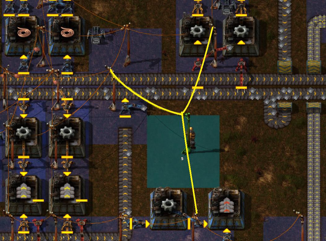
When placing Electric Poles, especially Medium and Big ones, I have to sit there and squint at the screen to determine whether there is or is not an ultra-thin copper-coloured line going from one already-placed Electric Pole to the one which I'm now trying to place.
That's bad UI design. The UI already makes use of various coloured overlays to show the "power coverage" of each placed Pole. There should be a similarly vivid and unmissable colour-indication to make it clear to the player whether the Electric Pole he's trying to place will or will not be connected to a powered grid if he puts it down on the tile he's currently pointing it at.
Yes, I know about the run-with-shift-held-down -thing or whatever it is it is, but that's only a solution for some of the cases. This suggestion here applies to a different set of cases, that of precise Power Pole placement, as opposed to maximizing resource-utilization when trying to connect distand "islands of industry" to the power grid.
The game already has a graphical UI utilizing colours. It should be utilized for this aspect of the game as well.