Page 1 of 1
The roboport sprite should be moved almost a full tile up
Posted: Fri May 25, 2018 10:31 pm
by Teraka
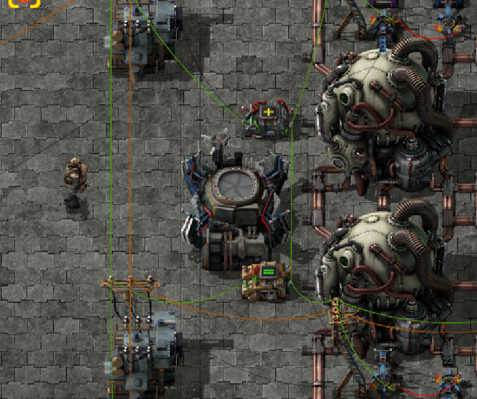
Seriously, it's way off-center and it's messing with my aesthetics.
Re: The roboport sprite should be moved almost a full tile up
Posted: Mon May 28, 2018 9:40 am
by Koltrast
thumb up
Re: The roboport sprite should be moved almost a full tile up
Posted: Tue May 29, 2018 8:05 am
by bobingabout
I wouldn't say a full tile up, I'd say make it a little less squashed so the base is closer to a 4x4. It's a tall structure, they need to not be afraid to overlap the graphics into the tiles above. Look at the substation right next to it, that's a 2x2 base, but the image takes up more of a 2x4 in actual graphics footprint.
Re: The roboport sprite should be moved almost a full tile up
Posted: Tue May 29, 2018 11:43 pm
by QGamer
bobingabout wrote:I wouldn't say a full tile up, I'd say make it a little less squashed so the base is closer to a 4x4. It's a tall structure, they need to not be afraid to overlap the graphics into the tiles above. Look at the substation right next to it, that's a 2x2 base, but the image takes up more of a 2x4 in actual graphics footprint.
Yes, that's what we need. The current roboport graphics as they are really confuse my brain.
Re: The roboport sprite should be moved almost a full tile up
Posted: Wed May 30, 2018 8:28 am
by bobingabout
It's a problem with the style they're using. The grid is square, 32x32, but the graphics are drawn from an angle looking down from the front top, which causes the height to be reduced by about 20 to 25%. Meaning, to visually look like a square base, it actually only takes up about a 4x3 in size, leaving the height of the structure to bring it back up to 4x4. And that's where your eyes get confused.