Page 1 of 1
make 'mode of operation' more clear in GUI
Posted: Sat Feb 03, 2018 6:19 pm
by impetus maximus
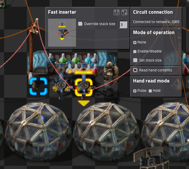
on my HUGE over-engineered science lab i noticed an inserter not working.

i set a LONG line of these inserters conditions by copy pasting.
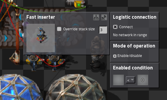
looking at it i couldn't figure out why it wasn't functioning.

so, i posted a bug report to have Rseding91 point out the logistic network enable condition.

i suggest we make it very clear, when you first open the GUI that there is
any 'mode of operation' set.
cheers
Re: make 'mode of operation' more clear in GUI
Posted: Sat Feb 03, 2018 11:01 pm
by Nexela
I agree The two buttons for circuit/logic should have a green background when connected to wires/ connected to network.
Re: make 'mode of operation' more clear in GUI
Posted: Sat Feb 03, 2018 11:16 pm
by mp0011
FIrst, the BOTH tabs should be visible, one next to another, if inserter (or anything else) is in "connected" state. I had similar problem with stations...
Re: make 'mode of operation' more clear in GUI
Posted: Sun Feb 04, 2018 2:05 am
by Zavian
+1
Re: make 'mode of operation' more clear in GUI
Posted: Sun Feb 04, 2018 9:57 am
by golfmiketango
I like Nexela's idea that the "tabs" that open up those submenus could be color coded to provide a hint when something noteworthy is going on inside them.
Can't say I 100% love the "tabs" thing but a screen full of radio boxes and clutter could get pretty annoying/intimidating and inconvenience gamers with smaller screens.
Also it's presumably more future-proof than the alternatives... I'm not sure if there is an API for mods to inject their own "tabs" in there, but, if there ever were one, I could also see that working out quite well, whereas a one-big-settings-dialog approach seems in some meaningful sense to be less "future?-mod-API-friendly" to coin an incredibly awkward phrase.
