Page 1 of 1
[factorio.com] Navigation bar not optimal
Posted: Wed Jun 07, 2017 8:21 am
by Nexarius
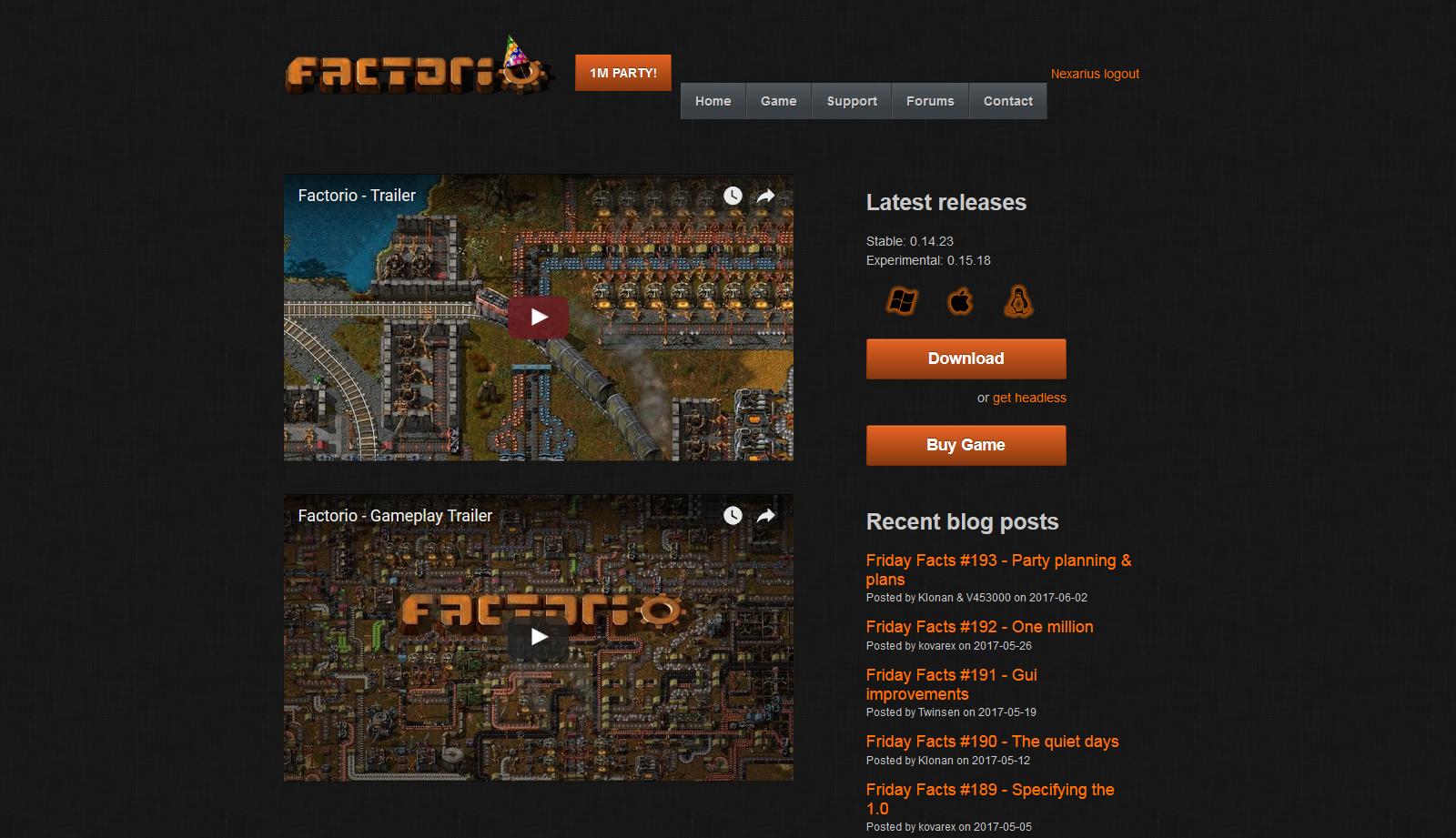
That doesn't look right.
Re: navigation
Posted: Wed Jun 07, 2017 10:16 am
by Jon8RFC
More should be done with the css and html to truly correct and clean things up, but since the button won't even be there for 2 weeks, the tiniest quick-fix for a decent amount of user name lengths would be adding <br> before the logout link and removing the inline style.
BEFORE:
Code: Select all
<div class="pull-right" style="margin-top: 10px;">
  <div class="pull-right">
    <a href="/profile"> </a>
    <a href="/logout"> logout </a>
  </div>
</div>
AFTER:
Code: Select all
<div class="pull-right">
  <div class="pull-right">
    <a href="/profile"> </a>
    <br><a href="/logout"> logout </a>
  </div>
</div>
For longer usernames, you may as well retain that change after removing the 1m party button. Some users with longer names may have had this issue even before the 1m button addition, but didn't care to report it.
A quick test with the default font css settings for the site shows that a 20-character name (to match the forum name length restrictions) with all W is the widest, in pixels, so that's what you'd need to account for with css and html adjustments for an actual fix, unless you go some fancier route with jscript, which I think would be overkill and a waste of time.
Re: [factorio.com] Navigation bar not optimal
Posted: Wed Jun 07, 2017 11:50 am
by Vals Loeder
At my end it shows correctly using Firefox as the browser.
Re: [factorio.com] Navigation bar not optimal
Posted: Wed Jun 07, 2017 12:31 pm
by HanziQ
Thanks for the fix, this will probably be addressed later on properly.