Page 1 of 1
[2.1] Give the new Oil refinery a little bit of color
Posted: Thu Jul 02, 2026 11:28 am
by worph
TL;DR
Give the new Oil refinery a little bit of color.
What
I love the model for the new Oil Refinery building.

- grafik.png (526.37 KiB) Viewed 354 times
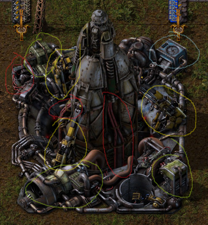
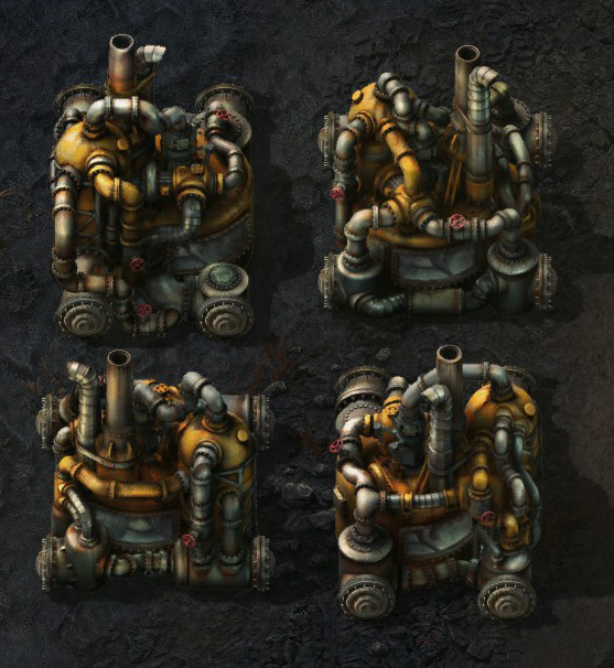
But it needs a touch more color. And I dont mean slap a large bit of blue on it. It just looks very orangey/coppery, which is fine as a baseline. But once you have the alt-view enabled, it really becomes very mushy. The new assemblers and rocket silo are a good example for how to mix in some color contrast, I think.

- grafik.png (920.57 KiB) Viewed 354 times
- grafik.png (1.04 MiB) Viewed 354 times
The rocket silo is obviously a more extreme example. It's a more complex machine, bigger, later in the game, more impactful gameplay-wise.
But it has a nice mix of colors and works well with alt-mode enabled.
(*edit: the chem plant could be a more direct example for a good amount of contrast I am talking about, could even be less. Just the red valve handle is a cool touch; if nothing else.)
- grafik.png (600.5 KiB) Viewed 302 times
Re: [2.1] New Oil Refinery building too monochrome
Posted: Fri Sep 04, 2026 9:32 pm
by worph
I have to bump this, because it keeps catching my eye.
Something is not really ideal about the new design.
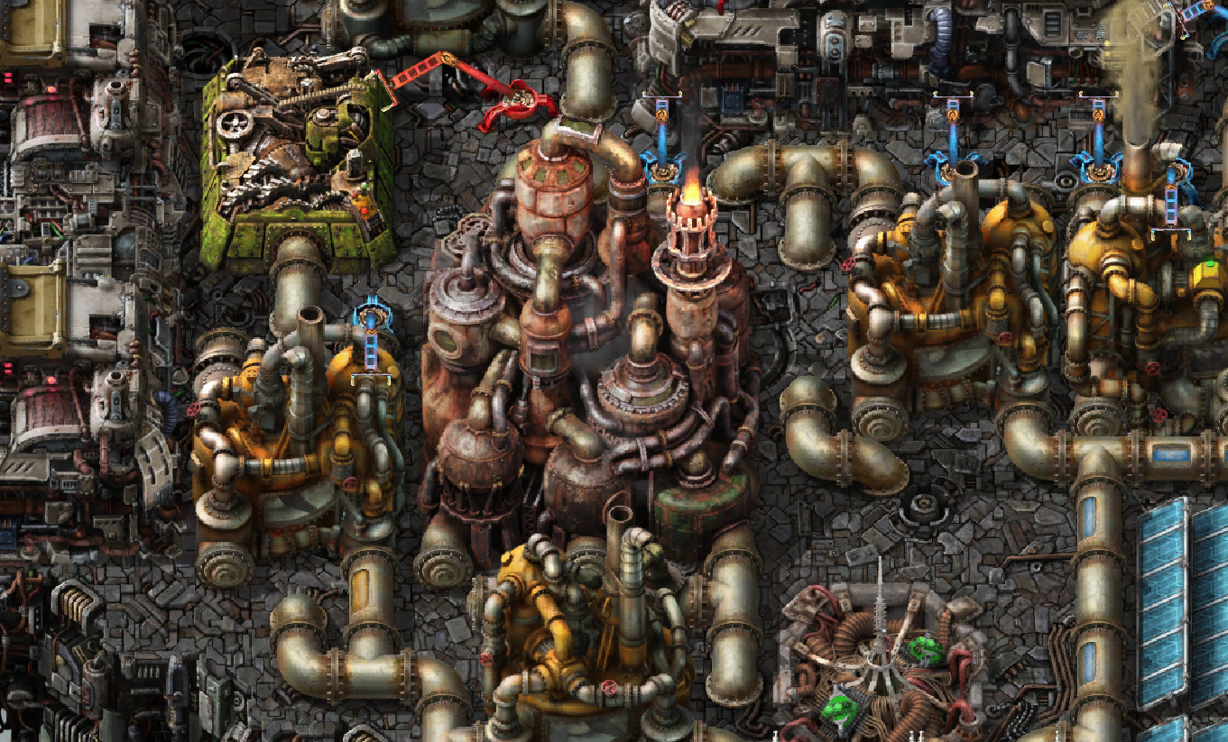
Compared to the chem plant
It unlocks at the exact same time as the chem plant right next to it and that does not make sense to my brain.
One looks like the 1870s, the other like 1990. I think, purely colorwise, they should be made more similar.
It just doesnt really fit into the aesthetics, and its purely the colors and textures. The shapes are fine and it doesnt need much.
- grafik.png (1.73 MiB) Viewed 159 times
Grainyness
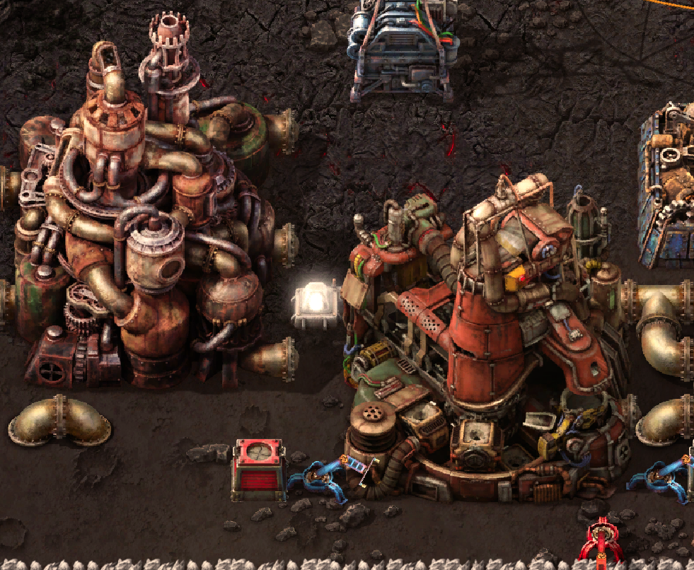
I also feel like the new refinery is a lot grainer than other buildings. I find this especially noticeable when it's next to a foundry. (im not playing on HD, maybe someone can report if its better there)
- grafik.png (1.17 MiB) Viewed 159 times
Yeah, would be interested to hear other peoples opinions.