Page 1 of 1
Improve number and letter icons for use with display panels
Posted: Mon Nov 04, 2024 1:55 am
by _ae
Most icons in the game, including the various line and arrow icons, have transparent backgrounds and dropshadows. These display well on the in-game display panels, and are readable from a distance. The current icons for numbers and letters were never great, and don't match the visual language of other icons except the color icons (which I also think could use a change). They also look bad and have poor visibility on display panels.
I recommend replacing them with larger, white letters/numbers with dropshadows. Additional ornamentation could be added if there are concerns about differentiating them from regular text when used inline, though I doubt this is needed. I've included a mockup for comparison, as well as one at 1/4 scale to show the difference in readability.
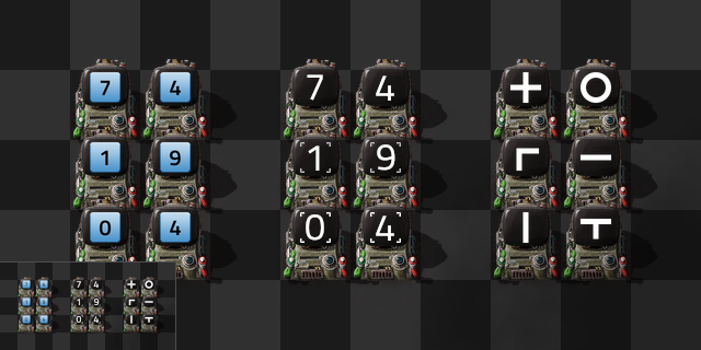
- factorio_icon_suggestion.png (110.81 KiB) Viewed 1081 times
Re: Improve number and letter icons for use with display panels
Posted: Mon Nov 04, 2024 4:21 am
by bullipatty
+1. but would actually like them as additional ones to distinct between signals like arguments etc and display values
Re: Improve number and letter icons for use with display panels
Posted: Mon Nov 04, 2024 5:13 am
by _ae
bullipatty wrote: Mon Nov 04, 2024 4:21 am
+1. but would actually like them as additional ones to distinct between signals like arguments etc and display values
I don't think we need two sets of letters and numbers for signals, so long as the set we have is suitable for displays. For visual consistency I might suggest redesigned all square-with-gradient icons — including the each/every/any symbols. Even the color icons could benefit from being a solid color, as gradients aren't really used anywhere else in Factorio's UI, and the black signal is currently a gray gradient.
Re: Improve number and letter icons for use with display panels
Posted: Mon Nov 04, 2024 1:12 pm
by bullipatty
_ae wrote: Mon Nov 04, 2024 5:13 am
I don't think we need two sets of letters and numbers for signals, so long as the set we have is suitable for displays. For visual consistency I might suggest redesigned all square-with-gradient icons — including the each/every/any symbols. Even the color icons could benefit from being a solid color, as gradients aren't really used anywhere else in Factorio's UI, and the black signal is currently a gray gradient.
you never NEED semantics, but it's always better to have them

but you might be right, having 2 sets is a bad idea. also, it's even already possible to distinct between different versions of "A" by assigning a quality to A...
Re: Improve number and letter icons for use with display panels
Posted: Mon Nov 04, 2024 4:31 pm
by Tinyboss
I think in this case it wouldn't be better for everyone. I have aphantasia--I have no visual memory or imagination. So if I have to remember which version of a digit I'm supposed to use, it's just an extra bit of cognitive load and another great opportunity to screw something up that will be hard to find and fix later on.