Page 2 of 4
Re: New API Docs website
Posted: Sat Sep 04, 2021 12:31 am
by curiosity
Sanqui wrote: Fri Sep 03, 2021 1:50 pm
The old web had to go
Just to clarify, you mean the backend and you took this opportunity to redesign the frontend, or was there something objectionable about the old design?
Re: New API Docs website
Posted: Sat Sep 04, 2021 7:56 am
by Solinya
I agree with Hornwitser. Unless I'm missing some secret way to hide the class list on the left, the actual documentation section gets scrunched into a much smaller horizontal space than the old docs layout, which means I can't fit nearly as much info on my laptop's screen. I'd prefer to have the navigation and documentation separated out in some manner, because I'm generally not navigating and reading at the same time, I'm doing one or the other. I'd feel differently if the navigation was for subsections on the current entry, especially for the long entries like LuaControl, but I don't need to e.g. see all events while trying to read the details of a LuaControl method.
Also the visual style on the new documentation is very busy with all the table lines and borders everywhere (not to mention the smaller width leads to more word wrapping, especially on the methods and parameter tables, which also leads to visible unaligned table column separators). The bold yellow on medium-gray I find harder to read than the orange on dark gray. I think this is actually more because of the lighter shade of gray used on the inner table rather than the yellow as either of the other grays on the table layout are easier to read as a background.
It is nice that the new docs come with a search box, but I tried searching for the info I'm often trying to reference and immediately discovered it doesn't search properties and methods, which was disappointing. Hopefully there are plans to expand the search capabilities in the future.
Re: New API Docs website
Posted: Sat Sep 04, 2021 12:23 pm
by Hornwitser
I also want to hammer home that this site design (that's also shared with the main site, blog, mod portal and others) has the worst scroll lag I've ever experienced on a site with a mobile friendly layout on my mid range phone. I stopped reading FFFs on my phone because I'd rather not read the FFF than have to deal with the horrible scroll lag of the layout. The scrolling frequently dips below 1fps and it can take 10 seconds(!) from when I've scrolled down until it actually renders. No other mobile site I've ever accessed has been this bad.
Looking into the CSS, it's no wonder it's this bad:
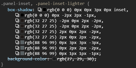
- box-shadow-stacks.png (28.44 KiB) Viewed 10354 times
9 stacked blured box shadows, and that's just the panel inset. Add another 14 for the outset and 12 for the panel hole and it's no wonder this site design is the worst performing one I've ever seen.
A single box shadow can measurably impact scrolling performance (2011) 35 layers of stacked blured box shadows is just madness. And the issue really is these box shadows because when I add * { box-shadow: none !important; } to the stylesheet all of the scroll lag vanishes like magic.
Please do what any sane person would do when implementing a tileset as visually intricate as the one you have and use border-images.
https://www.w3.org/TR/css-backgrounds-3/#border-images
Re: New API Docs website
Posted: Sat Sep 11, 2021 5:28 pm
by robot256
My biggest complaint is how the return type of each function is forced onto a separate line from the name and arguments list, instead of all on the same line as in the old docs. Even more than waste horizontal and vertical space, it interrupts visual scanning of the column of names. Looking for a specific function name, the blue entries don't contain the same type of information (a type vs a name) and interrupt the alphabetical ordering.
Re: New API Docs website
Posted: Mon Sep 13, 2021 8:46 pm
by mrvn
Why is the content forced into a window roughly half the width of my browser? For some functions half the function arguments are cut off and there is no left/right scroll bar. And for most others the description is split into multiple lines. Meanwhile half the screen is empty.
Also the spacing between function prototype and description seems to be chaotic. Sometimes there is a large gap, sometimes a small gap. Visually it is unclear where the description starts because each line is different. A straight table layout so that all descriptions start at the same spot would be more readable. I would suggest 4 columns: function name, arguments, return type, comment. arguments and comment should line warped as needed.
If I make my browser window less wide it suddenly switches mode without "Classes" sidebar. There the comment is moved to the next line instead of after each prototype. Now suddenly the function arguments line warp as needed. That actually looks much neater. But then I scroll down to the methods section and the three lines for each parameter take a lot of vertical space. Even the two lines in the wide window mode seems wasteful on space. Argument name and type could be on the same line. Again a straight table layout would be more readable. Having the comments start at different offsets is odd.
Note: Frequently pages have a sidebar that can be collapsed. So it's one click to have the "Classes" sidebar visible or not. Let the user choose please.
PS: can i sort the functions of a Class in the overview at the top?
Re: New API Docs website
Posted: Tue Sep 14, 2021 6:35 am
by Stringweasel
mrvn wrote: Mon Sep 13, 2021 8:46 pm
Why is the content forced into a window roughly half the width of my browser? For some functions half the function arguments are cut off and there is no left/right scroll bar. And for most others the description is split into multiple lines. Meanwhile half the screen is empty.
There's a button on the top right that expands the width to fill you screen. I found it after I had the same thought.

Re: New API Docs website
Posted: Tue Sep 14, 2021 1:36 pm
by Gummiente27
With these css rules the page looks much better to me, it removes the visual clutter inbetween the text:
Also this greatly reduces the amount of box-shadows, so it would further improve performance on older devices or browsers which are not good in handlng box-shadows.
Code: Select all
.panel-inset-lighter * {
    box-shadow: none !important;
}
.panel-hole {
    background: transparent !important;
}
If someone wants hr's horizontal dividers again, but simpler, try this css:
Code: Select all
hr {
    height: 1px;
    background: rgb(0,0,0) !important;
}
.dltabular hr {
    width: calc(100% + 64px) !important;
    background: linear-gradient(90deg, rgba(0,0,0,0) 2%, rgba(0,0,0,1) 5%, rgba(0,0,0,1) 95%, rgba(0,0,0,0) 98%) !important;
}
Before:
After:
After with hr's:
Re: New API Docs website
Posted: Tue Sep 14, 2021 4:38 pm
by mrvn
Stringweasel wrote: Tue Sep 14, 2021 6:35 am
mrvn wrote: Mon Sep 13, 2021 8:46 pm
Why is the content forced into a window roughly half the width of my browser? For some functions half the function arguments are cut off and there is no left/right scroll bar. And for most others the description is split into multiple lines. Meanwhile half the screen is empty.
There's a button on the top right that expands the width to fill you screen. I found it after I had the same thought.
Oh, it does that too? I tried that and it moved the return type into the same line as the function name. Didn't notice that is also uses all the space because when I tried I had the window already thin.
Do we need a tutorial for the API website?
Re: New API Docs website
Posted: Wed Sep 15, 2021 10:25 am
by curiosity
I don't think the API website should need any tutorial. It must be simple and intuitive to use.
Re: New API Docs website
Posted: Wed Sep 15, 2021 1:32 pm
by eradicator
curiosity wrote: Wed Sep 15, 2021 10:25 am
I don't think the API website should
need any tutorial. It must be simple and intuitive to use.
One might even go so far an argue that if the site feels like it needs a tutorial it's clearly overcomplicated. The old site's layout was quite straight forward.
Re: New API Docs website
Posted: Thu Sep 23, 2021 3:24 pm
by Xorimuth
Further to my earlier comments about monospace fonts, it would be useful if underscores had a gap between them to clearly show how many there are. Perhaps this is even more important for the wiki because of pages like
https://wiki.factorio.com/Tutorial:Localisation.
Re: New API Docs website
Posted: Wed Nov 10, 2021 12:45 pm
by Sanqui
Hi, in the meantime we've pushed out some more improvements to the
new docs website:
- Variadic arguments and methods taking tables were fixed
- The sidebar is now collapsible
- A consistent monospace font is enforced
- Tables can be sorted just like on the old website
- Styles were improved, made more lean, and compacted
- The scrollbar is styled to reduce visual contrast noise
- The Lua examples now come with syntax highlighting
Hopefully these changes make the new website more enticing and there is no dealbreaker. The old backend was difficult to maintain and extend, so we took the opportunity to apply new styles, but that shouldn't hamper usability, so I value the feedback. However, we intend to push it out soon so the overall lua docs system can be improved further.
Re: New API Docs website
Posted: Wed Nov 10, 2021 3:21 pm
by curiosity
The optional labels on the parameters and read/write labels on the object fields don't always keep to the right side, in particular when the docs are not in wide mode and the parameter/field definition wraps.
Sanqui wrote: Wed Nov 10, 2021 12:45 pm
- The sidebar is now collapsible
The uncollapsed sidebar follows the viewport, the collapsed one does not, which is inconsistent.
Sanqui wrote: Wed Nov 10, 2021 12:45 pm
- Styles were improved, made more lean, and compacted
Nothing has been done about box shadows, so the old issues with scrolling remain.
(although due to the rendering changes in Firefox this will now cause the page to flicker like crazy instead (which is
not an invitation to ignore this issue))
Re: New API Docs website
Posted: Wed Nov 10, 2021 6:25 pm
by raiguard
The improvements are noticeable, and thank you! However, I'm still very much against using the Factorio CSS styling for API documentation. I much prefer the old flat style to this one in every way possible. I understand you want to have a consistent style across all of the Factorio websites, but it just doesn't work here.
I will again refer to docs.rs for a clean, easy to digest style and layout. If I find the time, I'll make a mock-up of what I think would be a good design for the API docs, so I can speak with action instead of just words.
Re: New API Docs website
Posted: Wed Dec 01, 2021 2:18 pm
by Stringweasel
I'm not sure how plausible it is, but would it be possible to expanding the search function to include function names from
within classes. It would make it much faster to find the definition of the function you want to use.
For example, if I want to "create_entity" but I forgot how it works, then I can simply type it into the searchbar. Then it will list "LuaSurface" under classes, and possibly show the top class' result on the right.
Re: New API Docs website
Posted: Fri Dec 03, 2021 12:16 am
by ptx0
Raiguard wrote: Wed Sep 01, 2021 5:46 pm
Honestly, while the Factorio-esque design is OK for the main site, I don't think it works well here. I'm finding it generally harder to read things.
oh god it's so bad, it makes my eyes hurt.
Re: New API Docs website
Posted: Wed Dec 08, 2021 7:04 pm
by lovely_santa
I blame bilka for insisting on writing this post...

Any feedback is welcome... Well... while the latest release (with the new api doc) was being deployed, I was looking through the documentation while working on some mods. At some point the layout changed to the new layout, and was looking for a way to 'alter' the css code in order to obtain the old layout back. As in Factorio, I got sidetracked... I finished coding and went to bed.
I get to live with the new website, however, this morning I got some feedback from last nights coding session. While working I tried scrolling through the api on my 'old' phone (samsung galaxy s3). I had no problems in the past with the old website, however the new website shows major stutters while scrolling. Since you surf through the documentation pages quite quickly (which is basically what an api is made for), I notice quite a lot of stuttering while scrolling down. I am not saying this lightly, but it even got me out of my office to go to my locker and grab my other phone (samsung galaxy s7) in the hopes that this phone did not have such a bad stutter (mainly while scrolling). It was better, but after scrolling another 15 minutes through the api, I finally quited. It was the first time in over 4 years I quited coding because of resources... (api, internet connection, ...).
To make this story short, I only whish there was an option to have a toggle button to convert the website (visually) back to the old layout, in the hopes it would help. I 'normally' don't notice this on any laptop, except when I stress my laptop to its capacity (at that point any glitch is acceptable), however in these modern days, I expected more phone performance...
Stats:
On laptop: Using google chrome Version 96.0.4664.45 (Official Build) (64-bit)
On phone: Latest google chrome app from android store (displaying same version number
Off topic:
1)
https://lua-api.factorio.com/1.1.49/ showing me index.html (however it is named on factorio's host side), line 43 still has a console.log()
2) same page, line 3229 throws me a TypeError (cannot read property addEventListener of null object) => no element "hide-sidebar-button" found in document.
Kind regards,
lovely_santa
PS: reading back this post make it sound very depressing; which is not my intention, just trying to give some (deep) feedback as requested!

Re: New API Docs website
Posted: Sat Dec 11, 2021 5:01 pm
by Pi-C
I've just looked at LuaEntityDiedEventFilter. The old documentation would list optional attributes depending on the filter type, the new version just says "Other attributes may be specified depending on
filter", but not what additional attributes there are:
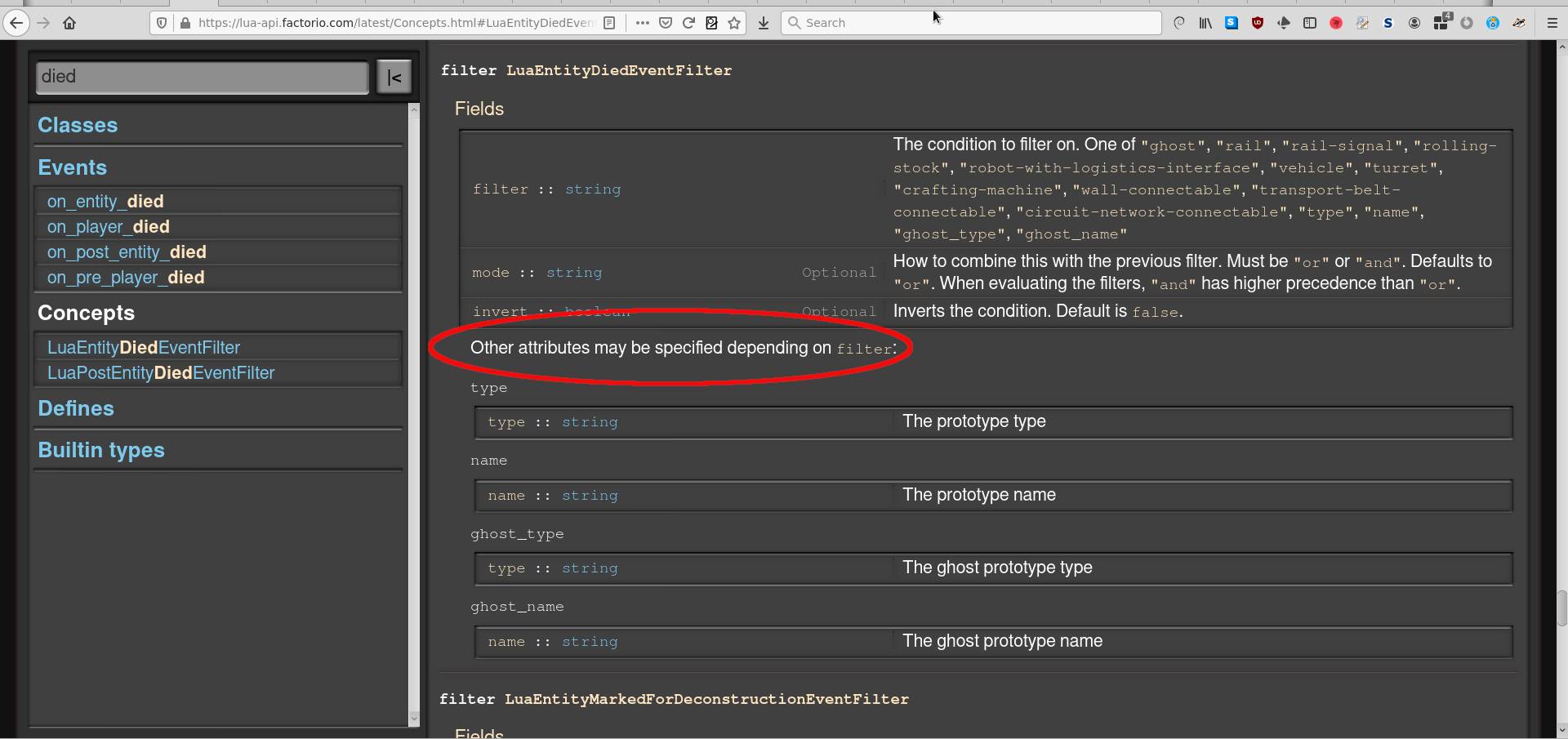
- LuaEntityDiedEventFilter.png (207.82 KiB) Viewed 9153 times
Re: New API Docs website
Posted: Sun Dec 12, 2021 4:57 am
by DaveMcW
On the class pages, we lost the information on what types are valid for each property.
For example, on the old API
LuaEntity.set_command has this info:
Can only be used if this is Unit
Re: New API Docs website
Posted: Sun Dec 12, 2021 11:00 am
by Optera
Why did you change everything that made the API site fast and easy to read?
Headers in bright yellow with blurry font (especially in bold) and normal white text on light grey makes my eyes hurt.
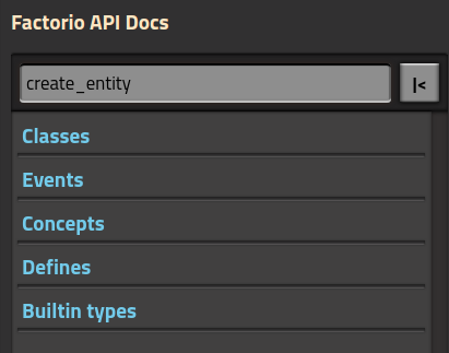
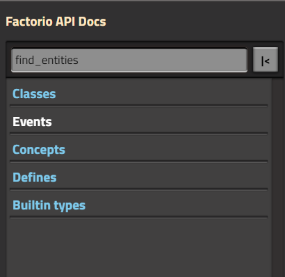
Search should filter functions containing the search text.
For example what is it trying to tell me here when searching for find_entities?
find_entities does not exist in Events, Concepts, Defines or Builtin types.
What it does NOT do is showing LuaSurface under Classes where find_entities is.
- Screenshot 2021-12-12 115649.png (16.93 KiB) Viewed 9102 times
Edit: Also if a class has lots of functions like LuaEntity you have to use the browser search function to find things anyway.