Kasp3r wrote:One solution would be to add tabs or scrolling like you suggested.
We have to look into what is the best solution how you would categorize tabs etc...
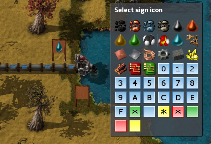
Also one question is do we want to show all icons or should it be restricted to default icons?
difficult question ...
as an example, i use the mod "Text Plates". that mod provides a lot of icons (77 different, each in two sizes and two colors, for a total of 308 icons). to reduce the number of items in the crafting menu, only four "base plates" are made visible, and users have to chose the final icon from a popup window when they place those base plates.
currently, your mod tries to show all those 308 icons, and that is really nice since all letters are included, a few special letters, and also arrows, etc. imagine a large sign "to the smelting section", followed by a series of arrows on small signs which show where to go :-)
if you would reduce the icons to those that are visible in the crafting menu, or even to only some small set of default icons, all this wouldn't be possible.
as an "opposite example", the boxing2 mod has icons for each box that can be made from any item in the game (thus a few hundred when having many mods), and most of those boxes look identical since they are dynamically created placeholder graphics, including for the 304 invisble plates that really don't exist (except maybe in blueprints for robots to place them).
if you want to quickly test your mod with many icons, just include these two mods and you should immediately get 600++ icons :-)
similar (although smaller) floods of icons come from mods like WideChests (which enables users to connect up to 42 steel chests vertically or horizontally to one single chest for big train stations, thus producing maybe 82 additional identical icons), and Satellite Radar which adds 17 tiers of radars (currently, the max is for 1632 satellites in space: 41x41 visible range and 169x169 scanning range :-)
if you exclude invisible icons from your selection window, it probably would remove the useful textplate(*) icons, maybe also the useless radar icons, but probably still keep all the box icons (including those placeholders generated for textplate boxes and all the other placeholders). :-) :-( :-) :-( :-( :-(
thus i probably wouldn't recommend this as selection criteria ...
(*) of course, the textplate icons can also be used without signs, since that is their purpose :-)
if you create tabs for the icons, you shouldn't invent some new order and grouping, but try to use the existing tabs in the crafting menu so that users don't have to learn some completely new ordering. ... btw: I'm currently shown 13 tabs in the craft menu, some (like the signs tab) with only 3, 4 or 10 items, and one even with 125+ items. installing bobs mods and angels mods etc, you probably will get flooded with another 10-15 tabs and many more items :-)
an alternative to the craft menu would be the selection window for signals that has the same icons as the crafting menu, plus more icons like the signals 0-9, A-Z, colors, and depending on installed mods even a set of text, mathematical, graphical signals, or even japanese kana signals/icons :-) ... btw: for signals, I'm currently shown 15 tabs, and they include the widechests, the radars, but not the textplates (boxing2 mod is currently disabled because of a bug in its migration)
I don't know whether it's easily possible to include signals for your signs, but at least japanese players might enjoy it :-) LOL
and when i have to live with lots of useless icons anyway, i surely would prefer to also have a few useful additional color signal icons etc, too :-)
maybe the window which shows the icon selection could get some checkmarks to enable and disable groups of icons (like invisible items, signals icons, etc). another idea (not thought through very well) would be to add more "small signs" (same graphics, but different selection methods), like a "small visible items" sign, a "small signals sign", and a "small default icons sign" that has a fixed small number of most useful icons for quick selection.
anyway, also a tabbed selection or any other method should probably get a scrollable list view since nobody knows which mods might add more tabs and/or more icons so that available space in windows of any size and with any number of tabs is not good enough.
thus implementing the scroll functionality should probably have top priority no matter whether you do tabs (later) or not.