Page 2 of 2
Re: Increase color contrast for agricultural tower overlay
Posted: Wed Dec 18, 2024 8:27 pm
by RnDMonkey
"Violently Inaccessible" is a good way to describe the visualization overlay of agricultural towers. I AM colorblind and it's an absolute nightmare for me. I would welcome the ability to customize these overlay colors in the vanilla game OR a text/symbol overlay in the center of the 3x3 squares OR the ability to mod the tint colors of all visualization masks like these:
rycieos wrote: Wed Nov 13, 2024 6:09 pm
Alternatively, make the tints (green, yellow, orange) customizable like other radius visualization pictures are. The API exposes this for the agricultural tower (
https://lua-api.factorio.com/stable/pro ... on_picture), but this sprite is used for the base, and all the colors are tinted on top of this, and those values are hard coded.
Because seriously, I love Factorio and what Wube has created here, but damn do some things suck if you're colorblind. I'm already using the Color Blind Ultimate mod, which helps a ton, but there is only so much they can do without Wube providing the right hooks for changing things.
Re: Increase color contrast for agricultural tower overlay
Posted: Thu Dec 19, 2024 8:53 am
by P.E.T.A.R.
Support for this. Accessibility should be there without having to rely on mods.
Re: Increase color contrast for agricultural tower overlay
Posted: Sun Dec 22, 2024 8:57 am
by JustusW
I found a workaround of sorts for at least my issues with this blueprint book:
Code: Select all
0eNrt3V1PW0cCgOH/4mtTzfdhkPpLqggZOLTeGJv6I92o4r+vjQvJEhRInnS3F1wGmGPsDI9Go3k1f04uFrvxdj1fbs8vVqv3k7M/P31lMzn75bN/Hr43v1wtj1/ezH9dzhaHry1nN+PkbPKvcbH4uNxtJ3fTyXx5Nf57chbvps/84OzX9fxyt9ju1rPFyXb1x7j+bEi6ezedjMvtfDsfjy90/4+P58vdzcX+J8/i9OE5F7vF+5P5cjOut/tvTCe3q81+1Gp5eKn9k3L4qU4nHydnJ6c/1f0LXM3X4+Xx+zEdfrEnD06PD57tf+zDeHK7Xn2YX43rk8vfxs32mReIn7/AM0/M06+85S8el04fHjc8/7jy+Ljr2Wb7qnc+PH3n5Znn1sfnrsffd/u3+pq3fHzyXwPOr+eL/ajN4ac2x5c6/t89zIPp5PEn/uurT6bOyWYcr/av+vtuttj/hvvvLFfrm/3kmU4uVze3s/Vsu9r/wpOf77+wO0zJGO7eHabM42+yXt2cX+yur+9fbLvejc99lO3bP8r29KM8fea5w/d8lO0f8lGm4ye5Xc82v50vV9vzh/dwdfwgv/VDPn38pW7Gq/nu5mRc7N/Q/g/h5Ha1GJ/5RNLnn8j9rzJf/IXAFz96/MG4/094/Btbb+fX88v5/i/s04ewmi8mh1/tyfh4iuO7jU8Bx0ccj59fyji+4PiK4xuOH3A8zr+E8y/j/Ms4/zLOn4zzJ+P8yTh/Ms6ffPqD/BvQvwH9G9C/Af0b0L8B/RvQvwH9G9C/Af0b0L8B/RvQv+8dj/Mv4/zLOP8yzr+M8y/j/Mvq38P4hn429LOhnw39bOhnQz8b+tnQz4Z+NvSzoZ8N/WzoZ0M/G/rZ0M+Gfjb0s6GfDf1s6GdFPyv6WdHPin5W9LOinxX9rOhnRT8r+lnRz4p+VvSzop8V/azoZ0U/K/pZ0c+Kflb0s6CfBf0s6GdBPwv6WdDPgn4W9LOgnwX9LOhnQT8L+lnQz4J+FvSzoJ8F/SzoZ0E/C/qZ0c+Mfmb0M6OfGf3M6GdGPzP6mdHPjH5m9DOjnxn9zOhnRj8z+pnRz4x+ZvQzo58Z/UzoZ0I/E/qZ0M+Efib0M6GfCf1M6GdCPxP6mdDPhH4m9DOhnwn9TOhnQj8T+pnQz4R+RvQzop8R/YzoZ0Q/I/oZ0c+Ifkb0M6KfEf2M6GdEPyP6GdHPiH5G9DOinxH9jOhnRD8D+hnQz4B+BvQzoJ8B/QzoZ0A/A/oZ0M+Afgb0M6CfAf0M6GdAPwP6GdDPgH4G9DOYn9347KZnNzy72dmNzm5ydoOzm5vd2OymZjc0u5nZjcxuYnYDs5uX3bjspmU3LLtZ2Y1KLIUwFMJOCDMhrIQwEsJGCBMhLIQwEMI+CPMgrINOjUpsizAtwrIIwyLsijArwqoIoyJsijApwqIIgyLsiTAnwpoIYyJsiTAlwpIIQyLsiDAjwooIIyJsiDAhwoIIAyLshzAfwnoI4yFshzAdwnIIwyHshjAbwmoIoyFshjAZwmIIgyHshTAXwloIYyFshTAVwlIIQyHshDATwkoIIyFshDARwkIIAyHsgzAPwjoI4yBsgzANwjIIwyDsgjALwioIoyBsgjAJwiIIgyDsgTAHwhoIYyBsgTAFwhIIQyDsgDADwgoIIyBsgDABwgIIAyDsfzD/wfoH4x9sfzD9wfIHwx/sfjD7weoHox9sfjD5weIHgx/sfTD3wdoHYx9sfTD1wdIHQx/sfDDzwcoHIx9sfDDxwcIHAx/sezDvwboH4x5sezDtwbIHwx7tevBYOp5Kx0PpeCYdj6TjiXQ8kI7n0fE4Op5Gx8PoeBYdj6LjSXQ8iI7n0PEYOp5Cx0PoeAadqLSAx/Idi3cs3bFwx7Idi3Ys2bFgx3Idi3Us1bFQxzIdi3Qs0bFAx/Ici3MszbEwx9aPtny01aMtHm3taEtHWznawtHWjbZstFWjLRptzWhLRlsx2oLR1ou2XLTVoi0Wba1oG5C2/2jbj7b7aJuPtvdoW4+282gbj7bvaNuOtutom46252hbjrbjaBuOtt9o24222/iq0e+mk/l2vDnce/h4IeN08mFcb+6fV1vqpfdaU205xU8XKobD6772DsePu5vZ+9XbDY5f3uD4rVfYnb50h+MPuRKy/k1XQrb/+5WQx5n4P7sQcvibLoQ8fbsQ8tOH0flCyD/2n/bhff6Sp3Xap/Xd1y6JfOGSx4cZ9n1XPL4w+oULHl8aHWl0otGZRhcaXWl0o9EDjaa5lmiuZZprmeZaprmWaa5lmmuZ5lqmuZZprmVz7etXn71WxYFUHEjFgVQcSMWBVBxIxYFUHEjFgVQcSMWBVBxIxYFUHEjFgVQcSMWBVBxIxYFUHEjFRio2UrGRio1UbKRiIxUbqdhIxUYqNlKxkYqNVGykYiMVG6nYSMVGKjZSsZGKjVRspGIlFSupWEnFSipWUrGSipVUrKRiJRUrqVhJxUoqVlKxkoqVVKykYiUVK6lYScVKKlZSsZCKhVQspGIhFQupWEjFQioWUrGQioVULKRiIRULqVhIxUIqFlKxkIqFVCykYiEVC6mYScVMKmZSMZOKmVTMpGImFTOpmEnFTCpmUjGTiplUzKRiJhUzqZhJxUwqZlIxk4qZVEykYiIVE6mYSMVEKiZSMZGKiVRMpGIiFROpmEjFRComUjGRiolUTKRiIhUTqZhIxUQqRlIxkoqRVIykYiQVI6kYScVIKkZSMZKKkVSMpGIkFSOpGEnFSCpGUjGSipFUjKRiJBUDqRhIxUAqBlIxkIqBVAykYiAVA6kYSMVAKgZSMZCKgVQMpGIgFQOpGEjFQCoGUjGIil1Q7GJiFxK7iNgFxC4eduGwi4ZdMHy7mPAHX0z4ShC7eNiFwy4adsGwi4VdKKSehXIWqlkoZqGWhVIWKlkoZKGO5e3iwR988eArKaSUhUoWClmoY6GMhSoWilioYaGEhQoWClioX6F8heoVilfeLhb8Z10s+EoMKWChfoXyFapXKF6hdoXSFSpXKFyhboWyFapWKFqhZoWSFSpWKFihXoVyFapVKFahVoVSFSpVKFShToUyFapUKFKhRoUSFSpUKFChPoXyFKpTKE6hNoXSFCpTKEyhLoWyFKpSKEqhJoWSFCpSKEihHoVyFKpRKEahFoVSFCpRKEShDoUyFKpQKEKhBoUSFCpQKECh/oTyE6pPKD6h9oTSEypPKDyh7oSyE6pOKDqh5oSSEypOKDih3oRyE6pNKDah1oRSEypNKDShzoQyE6pMKDKhxoQSEypMKDChvoTyEqpLKC6htoTSEipLKCyhroSyEqpKKCqxpoQOT9PZaTo6TSen6eA0nZumY9N0apoOTdOZaToyTSem6cA0nZem49J0WpoOS9NZaToqTSelAUCJRyQdkXBEshGJRiQZkWBEchGJRSQVkVBEMhGJRCQRkUBE8hCJQyQNkTBEshCJQmStJ0s9WenJQk/WebLMk1WeLPJkjSdLPFnhyQJP1neyvJPVnSzuZG0nSztZ2cnCTtZ1srEn+3qyrSe7erKpJ3t6sqUnO3qyoSf7ebKdJ7t5spkne3mylSc7ebKRJ/t4so0nu3ivGPu9V9rF50aeXKxW7/fDj1e/nT/cfveV5939B20z9RE=
It's just the variants of of soil around a tower and can be dragged over the map easily allowing you at least some contrast. It's a crutch. This still badly needs a proper fix.
Regards,
Justus
Re: Increase color contrast for agricultural tower overlay
Posted: Thu Jan 09, 2025 2:51 pm
by boran_blok
So, yeah, this makes also a pause to my SA run. The colorblind filters do not help at all. I cannot distinguish the yellow and green colors between all the visual noise on screen at all. (I have red/green colorblindness but it also affects certain tints of yellow and green)
I have made a mock as well how you could more clearly give feedback to the player similar as to how FTL does this:
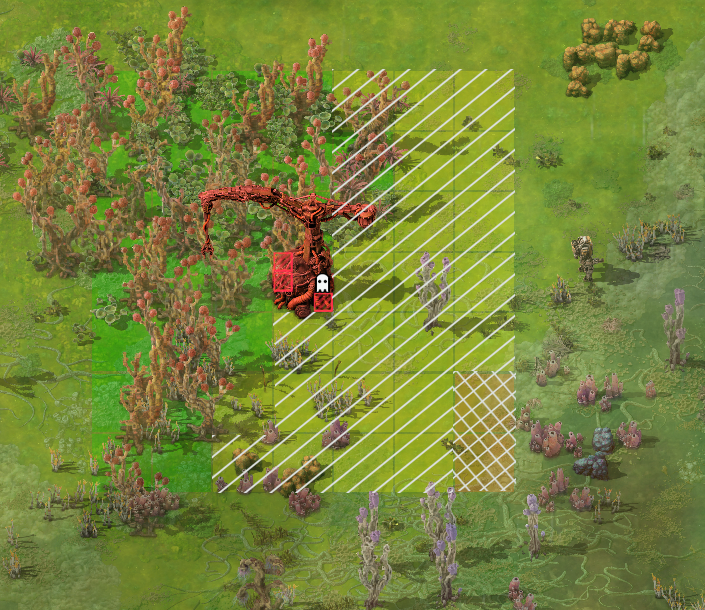
- GlebaColorMock.png (906.01 KiB) Viewed 1768 times
Here I used white, but a less harsh line color could be used as well (like orange on the yellow and yellow on the orange for example)
I am sorry if I colored some green tiles with the diagonal overlay, but as mentioned I cannot tell the difference and had to rely on pipette here.(The orange isnt much an issue for me)
In general colorblind compensation modes should not try and use different more contrasting colors, but entirely different means to convey the information to the player. (like patterns)
Re: Increase color contrast for agricultural tower overlay
Posted: Thu Jan 09, 2025 3:33 pm
by Tev
I just want to add big +1 to the pattern suggestion. I would also like it for when you hold soils in your hand - determining where you can use which is very painful and the pattern overlay would make it much less annoying.
Re: Increase color contrast for agricultural tower overlay
Posted: Thu Sep 25, 2025 1:34 pm
by Orlen86
I came back to my space age save after a few months away and found I needed to increase my yumako and jellynut production.
Started trying to build some more agricultural towers and was reminded just how terrible the interface is. It's disappointing that this is still in such a sorry state now.
Please add a non-colour indicator of some sort to the overlay so that we can see whether we're placing our towers in sensible places.
Re: Increase color contrast for agricultural tower overlay
Posted: Fri Oct 24, 2025 11:20 am
by valneq
For anyone trying to add this functionality via mod try
https://mods.factorio.com/mod/agricultu ... ent-helper