Please, do not listen to people complaining that the new UI looks bad. It look awesome IMO. I love the dark.
Idea with GUI is ok. looks very good, but is too dark than actual. too much contrast.
And, for you, new dark gui can push out players who have not very good sight. Game is not only for youngs, healthy guys.
Re: Friday Facts #289 - Character GUI
Posted: Sat Apr 06, 2019 7:58 pm
by Mike5000
unobtanium wrote: Sat Apr 06, 2019 3:00 pm
For the Logistic tab: Since the request slots will be infinite, why not
A) just display the crafting menu with the different tabs again and set the min/max numbers there. This way the player does not have to manually manage the slots. He is already familiar with the Crafting layout, thus he knows where which item is.
or B) take it even one step further and integrate it into the Crafting tab directly and removing the Logistic Personal slots entirely (just the trash slots would remain). Not sure on how the player would set the min/max numbers with a hotkey, when left and right (and CTRL combos) already are used to start crafting. Maybe middle mouse button?
This is a brilliant idea. In fact the logistic trash slots can go too. The crafting menu would control crafting, incoming logistics, and outgoing/trash logistics.
Re: Friday Facts #289 - Character GUI
Posted: Sat Apr 06, 2019 8:53 pm
by trad_emark
RGB is for computers
use HSV for humans
Re: Friday Facts #289 - Character GUI
Posted: Sat Apr 06, 2019 11:30 pm
by bobucles
A) just display the crafting menu with the different tabs again and set the min/max numbers there. This way the player does not have to manually manage the slots. He is already familiar with the Crafting layout, thus he knows where which item is.
It'll give players exactly what they've been clamoring for. A logistic slot for every item.
Re: Friday Facts #289 - Character GUI
Posted: Sun Apr 07, 2019 4:58 am
by Alice3173
TheoMarque wrote: Sat Apr 06, 2019 7:13 pmGame is not only for youngs, healthy guys.
Yeah, it's also for young(ish) unhealthy people, lol. But seriously, people who try to say "hey, don't listen to this group at all, totally disregard their needs because I like the way it is!!" when it's completely possible to satisfy that group without actually changing the default is a seriously self-centered jerk move and those people need to quit pulling that crap.
Re: Friday Facts #289 - Character GUI
Posted: Sun Apr 07, 2019 5:57 am
by DaleStan
unobtanium wrote: Sat Apr 06, 2019 3:00 pmA) just display the crafting menu with the different tabs again and set the min/max numbers there. This way the player does not have to manually manage the slots. He is already familiar with the Crafting layout, thus he knows where which item is.
How do you say that you want to have zero wood in your inventory? There's no crafting entry for wood, so no entry in the Crafting menu where you could configure that.
Or we can consider playing with Bob's Mods. They which provide three different ways to make wood, on two different tabs, none of them handcraftable. Which of those three should I use to ask the bots to take away the wood after I've gone on a tree-chopping spree with my personal roboport and construction robots?
TheoMarque wrote: Sat Apr 06, 2019 7:13 pmGame is not only for youngs, healthy guys.
Yeah, it's also for young(ish) unhealthy people, lol. But seriously, people who try to say "hey, don't listen to this group at all, totally disregard their needs because I like the way it is!!" when it's completely possible to satisfy that group without actually changing the default is a seriously self-centered jerk move and those people need to quit pulling that crap.
Wow, you guy are really determined to cavil at my statement and I didn't even write anything about people who have trouble with reading the new GUI.
I have written specifically about "people complaining that the new UI looks bad". That's not the same.
Let's talk about readability though.
I am shortsighted (seriously) and I have slight astigmatism. Right now, the sun from my window is pretty badly reflects from my not that clean monitor and I can still able to read the new GUI without my glasses. If anything, the high contrast seems to help. (I didn't make up any of that, btw.)
I'm not sure what you guys are talking about. The only situation I've experienced what bright light blurs my vision is when my glasses were really dirty.
Of course, I am fully for the GUI colors and textures being modable so if someone wants lighter colors (or any other look), they can.
Re: Friday Facts #289 - Character GUI
Posted: Sun Apr 07, 2019 8:57 am
by Alice3173
<NO_NAME> wrote: Sun Apr 07, 2019 8:21 amI have written specifically about "people complaining that the new UI looks bad". That's not the same.
Regardless of the rest of it you are telling the developers they shouldn't listen to people who disagree with you simply because they have a different view of things than you. That's a really crappy thing to do without very solid reason. And completely subjective things like "it looks perfectly fine to me!" is not solid reasoning at all.
Re: Friday Facts #289 - Character GUI
Posted: Sun Apr 07, 2019 9:24 am
by Octoshape
As many others have written before me, let me "add my vote" to that:
A button for disabling personal logistic requests would be very very handy. It would solve 2 problems I have seen skimming through this topic:
1. When dying and walking to your corpse you want to stop the bots from filling your inventory and wasting resources since you will have double the amount of everything. (Currently the only solution is to remove all requests, which makes me hesitant to take the time to set them up nicely)
2. While setting up the requests sometimes when you make a typo and set 1000 instead of 100 and the bots already go ham and deliver tons of stuff even when setting it back to 100 immediately, with this button you could turn it off, set up all your fancy requests, and then turn it on again once you're happy with it.
Re: Friday Facts #289 - Character GUI
Posted: Sun Apr 07, 2019 9:46 am
by Tev
I really like suggestions of togglable-requests and "ephemeral" (rather temporary?) requests, those would be so helpful. Sorting for requests would be nice to have too.
And it's not clear to me what would be the default flow for setting logistic slot - would it automatically set autotrash value too? That would be horrible for me, as I don't use autotrash for everything, and often carry a lot of extra items for some particular task. I guess this could could use some setting similar to "default requested size" - "automatically set autotrash value" or something.
<NO_NAME> wrote: Sun Apr 07, 2019 8:21 amI have written specifically about "people complaining that the new UI looks bad". That's not the same.
Regardless of the rest of it you are telling the developers they shouldn't listen to people who disagree with you simply because they have a different view of things than you. That's a really crappy thing to do without very solid reason. And completely subjective things like "it looks perfectly fine to me!" is not solid reasoning at all.
Well, I don't think there is something like "solid reasoning" when it comes to purely aesthetic aspect of something. There is only "I like it" and "I don't like it". The side which has more votes "wins".
I don't see a reason to start a shit storm over what was my exact phrasing when I said "I like it" so let's just end this discussion, OK?
unobtanium wrote: Sat Apr 06, 2019 3:00 pmA) just display the crafting menu with the different tabs again and set the min/max numbers there. This way the player does not have to manually manage the slots. He is already familiar with the Crafting layout, thus he knows where which item is.
How do you say that you want to have zero wood in your inventory? There's no crafting entry for wood, so no entry in the Crafting menu where you could configure that.
Or we can consider playing with Bob's Mods. They which provide three different ways to make wood, on two different tabs, none of them handcraftable. Which of those three should I use to ask the bots to take away the wood after I've gone on a tree-chopping spree with my personal roboport and construction robots?
Hm. But arent we already picking the item you want to trash/request from a similar UI to the Crafting menu? Why not just use that one directly isntead of it only appearing when I want to set a new trash/request slot? Of course, not exactly the Crafting menu. That indeed wouldnt work.
The problem with zero wood should be solved because you can now set both request and trash amount (min/max), or did I understood that wrong?
unobtanium wrote: Sat Apr 06, 2019 3:00 pmA) just display the crafting menu with the different tabs again and set the min/max numbers there. This way the player does not have to manually manage the slots. He is already familiar with the Crafting layout, thus he knows where which item is.
How do you say that you want to have zero wood in your inventory? There's no crafting entry for wood, so no entry in the Crafting menu where you could configure that.
Or we can consider playing with Bob's Mods. They which provide three different ways to make wood, on two different tabs, none of them handcraftable. Which of those three should I use to ask the bots to take away the wood after I've gone on a tree-chopping spree with my personal roboport and construction robots?
True, there are no raw resources in crafting. This is probably why the game has separate displays for crafting (actions) and logistic filters (items)... But still, there is technically nothing preventing them from being added there, with a red background just like any other items we can't manually craft.
And the second part could be easily solved by simply having any of the 3 wood-crafting tasks allow input into the same "wood requests" slot. Changing one of them will show up in all 3 locations.
But there is IMO another issue with this suggestion, besides the actions/items disconnect: that there would be no easy way to allow for grouping up requests into "task-related groups", as people have suggested above.
Re: Friday Facts #289 - Character GUI
Posted: Sun Apr 07, 2019 2:06 pm
by matimmk
About the colours in the logistics tab: I do have trouble noticing the red colour of (4). There is not enough contrast for me to differentiate it from the grey background colour. I have a kind of colour blindness, having trouble seeing red and sometimes differentiating it from green. On the picture of the logistics tab, there is enough contrast in "lightness" between the red and green yellow
(I really thought it was green, you see my problem?)
, so that is no problem. But there is not enough difference in "lightness" between the dark grey background (2) and the dark red background (4).
My other problems with reds in factorio
Another example: I have trouble with the colour scheme is the pollution visualization on the map. I have no chance seeing tiles with small pollution values (that is differentiating them from tiles with no pollution). Making matters even worse, I have trouble spotting any trees or forests on the map when the pollution visualization is enabled.
My solution to that specific problem was to modify core/graphics/pollution-visualization.png tinting it blue. Now I have no problem with the colour any more.
Using another colour, such as blue would help me out there, but there are more kinds of colour blindness, so that solution only works for some people, not all. It is a very subjective thing. Modding the pollution visualization is quite easy. If changing the slot background colour was as easy as that, I would still say it is a problem, but with a possible solution. (Which is still connected with some hassle for the user.)
However, when I need to modify a "sprite atlas" (is that the correct term) like core/graphics/gui-new.png it becomes a bigger hassle, as you need some experience to modify all important colours to your linking. Identifying which colours to change and finding a colour that fits. (Identifying is quite difficult on its own if you cannot easily differentiate them!)
In the technology GUI I have some problems with the (I think) greens, yellows and oranges. This is no problem in the list of technologies on the left (because there the order does the trick for me), but rather with tiles on the technology tree. Technologies unlocked by previous (finished) research get a colour that looks similar to the colour of already researched technologies. I cannot differentiate them on the first glance and have to look closely to be able to correctly choose the next research.
Using the tree to select which technology is needed to be researched next to get to a specific target technology, I often find myself clicking on a technology in the intent to research it, just to see that it is already researched. I am still perfectly fine playing the game this way, it just is annoying.
To change these colours, I think I have to modify that gui-new.png mentioned above. But that is not as easy as with the pollution visualization.
Enough rambling, back to topic!
Other that just changing colours, there is another solution.
Good practice to circumvent such problems is giving multiple options how the user can retrieve the information you want to get across. So what about (possibly in addition to the background colour?) adding small indicators/icons? For example: a down-pointing arrow indicating items being delivered, a question mark indicating missing items. Maybe even an up-pointing arrow indicating bots are on their way clearing your trash-slots (though there are still the trash slots which basically give you the exact same information). Colouring these indicators if probably a good idea, too.
But adding those icons might clutter the GUI in the logistics tab, which already has a high information density with all those numbers. I ask you to consider this suggestion, and if you like to add more such indicators to other parts of the user interface where appropriate.
And if doing so, please make the icons easily differentiable from any background by giving them a border with a high enough contrast. But as you are already doing that with the text characters, I have no doubt you will do the right thing there.
Other than that, I like where the character GUI is going. Good job, as with the other GUI redesigns!
Re: Friday Facts #289 - Character GUI
Posted: Sun Apr 07, 2019 5:06 pm
by Antyradek
Don't make things infinite from the beginning, such as requester fields. Make it an infinite research.
Otherwise the game becomes too easy. And the more research there is, the cooler.
So:
Research for requester functionality.
Research for auto-trash functionality.
Research for each row of requester/auto-trash.
Infinite research for rows for late-game ← useful even in current version.
For extreme:
Research for each row for request only.
Research for each row for auto-trash only.
Research for each extra FIELD of the above (but the cheap one).
Re: Friday Facts #289 - Character GUI
Posted: Sun Apr 07, 2019 7:23 pm
by pleegwat
Infinite research for request/trash slots doesn't make sense, as there is no point to having more trash slots than the number of items in the game, or more request slots than inventory slots.
Basically: Toggling groups of requests per-task, with request, idle, and trash states depending on the desired composition / transition between each set.
As a bonus, it would integrate the much-requested "Toggle Logistic Requests" functionality (might need a clear toggle for 'every' profile as well as each profile) which is helpful when you respawn and don't want to be inundated with items.
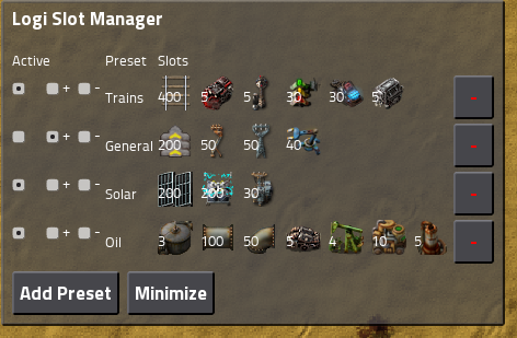
This is actually really cool. The possibility to make presets and select any combination of presets. Conflict is not a problem, it would just select the maximum of the request/trash amount of each individual item mentioned in more presets.
To make it clear, we are not planning this feature for now, but I'm definitely putting this idea into the trello category of (advanced UI features for later).
This is interesting, but I think far less important in terms of day to day use compared to one time requests (+ adding one time requests for the materials in a certain number of copies of a given blueprint).
Re: Friday Facts #289 - Character GUI
Posted: Mon Apr 08, 2019 12:15 am
by Jopika
Item is not requested and maximum amount is 0: When you don't want the item to be ever in your inventory, in this case, we just show no number, same as it is in the auto trash slots now.
I feel like this might be confusing for new players. If I was new to the game, intuitively understanding that "no numbers -> trashing this item" is difficult to know at a glance, especially when everything else has numbers.
Perhaps it might be useful to have a more standardized language/display? All logistics could have two numbers, where the first would be the amount you wish to have (min) and the second is the amount you want to have at most (max).
Logistic trashing would then display (0 0), to indicate "I want minimum 0 of this item from my network, and at most 0 in my inventory".
The main downside I would see to this would be the display could get more "noisy" or cluttered.
Re: Friday Facts #289 - Character GUI
Posted: Mon Apr 08, 2019 1:05 am
by MageKing17
matimmk wrote: Sun Apr 07, 2019 2:06 pm
I have a kind of colour blindness, having trouble seeing red and sometimes differentiating it from green.
Protanomaly? Me too (although I haven't had problems with pollution visualization since they made it brighter in... 0.17.12, I think it was).
Re: Friday Facts #289 - Character GUI
Posted: Mon Apr 08, 2019 1:02 pm
by chronix
I presume the armor box will also show current/max robots when you have a personal logistics bot, finding this is not as intuitive as I really want it to be.
Perhaps logistics area size
If you open the inventory, and start typing, can it start searching? The button is still handy for newbies, but it's something I'd like as an experienced player.