
TL;DR
Certain signals that look similar (I, J, L, perhaps more) are hard to make out when they show up on a wire. Look here at my example, on the red wire I happened to have exactly those signals, and I can't really tell which is which. (58k, 137 & 135)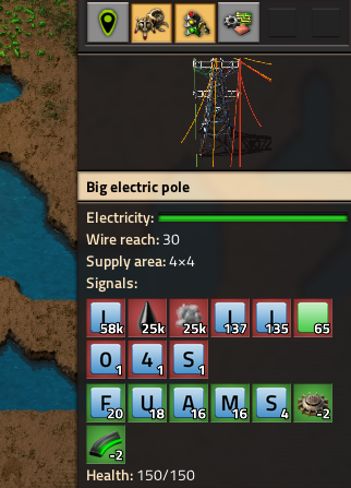
What ?
Well, I suspect this is a trickier case to deal with than one might first think. The signals have the same appearance everywhere and so does the placement of the numbers and it's great, but in this particular case it's a problem... Making special cases and exceptions for certain elements isn't really a developer's ideal scenario. Idk, perhaps just slightly move the value segment further diagonally down-right? Make the field (green, red) larger to accomodate and to keep the overall proportions. You know better than I! *edit, perhaps easier to try a different corner and see if there are fewer conflicts. Top right maybe? Although I agree the way it is now is probably the most eye-pleasing.Why ?
Working with circuit networks and signals is a blast, and making debugging or just seeing what's happening easier would be great. Some networks (of mine at least..) can be quite crowded with control signals and this UI phenomena could discourage the use of these similar looking signals. Also I think 0 and O are too similar looking, the danish Ø would be better for zero.Yes I realize it's not a huge deal.