Tighter GUI: smaller titles, smaller frames/bounding boxes
Posted: Sat Sep 05, 2020 10:12 am
Hi,
I'd like to suggest to make the main title fonts smaller (like "inventory") as well as the frames/ bounding boxes.
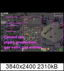
Why: These windows are always in the center, hiding everything behind. As a beginner I often find myself re-looking again, what was needed in that building - oh wait but this information is always hided behind the inventory -> close again.
On the picture you see it again. Also an idea to place the inventory always on the right side to keep the screen clean.
