
TL;DR
An extra graph with the netresults (production minus consumption) to see bottlenecks earlierWhat ?
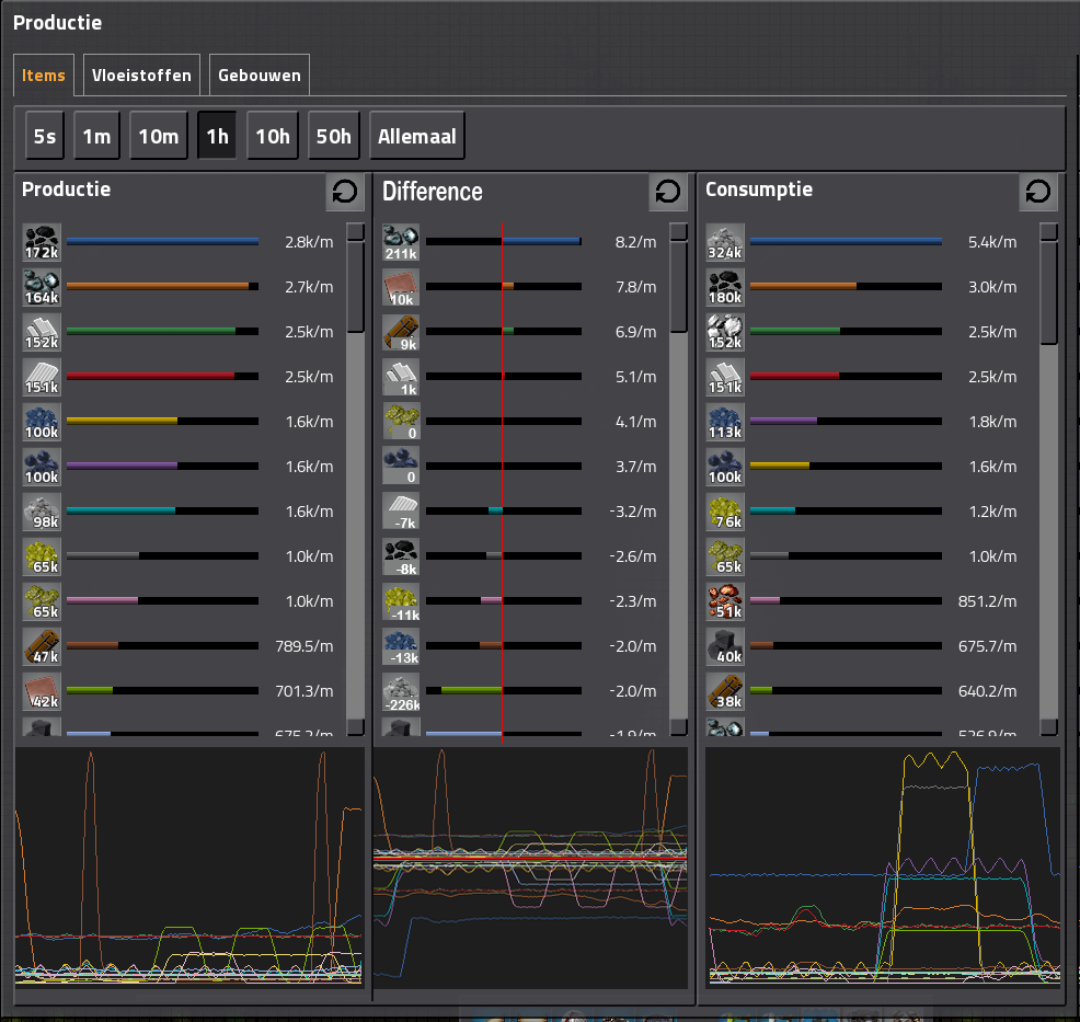
Right now there is a nice production and consumption graph. with a nice time-selection and selection of product.I wouldd like a third column with the difference between production and consumption.
A drawing says more than a thousand words, so here is my photoshop:
The numbers in the middle column are just made in this example.
Why ?
You may want to see which products you are draining or buffering. For example in the photoshop:Bobs crushed stone: I'm using 226000/hour more right now than I'm producing, so I'm draining by buffer somewhere.
Iron ore: I'm creating 211000/hour more than I'm consuming, so there is a buffer building up somewhere in the factory.
Ideally only the rockets should by positive and everything else should by 0


