Page 1 of 1
More readable electricity history graph
Posted: Sun Jan 28, 2018 1:28 pm
by SqFKYo
TL;DR
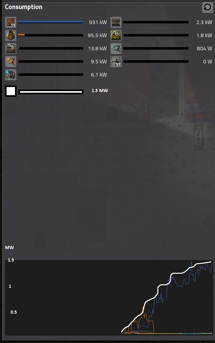
Having a sum energy usage and ticks on energy consumption would make it much clearer.
What ?
The electricity graph (when clicking power pole) should have sum graph as well as clearly labeled y axis, so it's easier to see the scale of things.
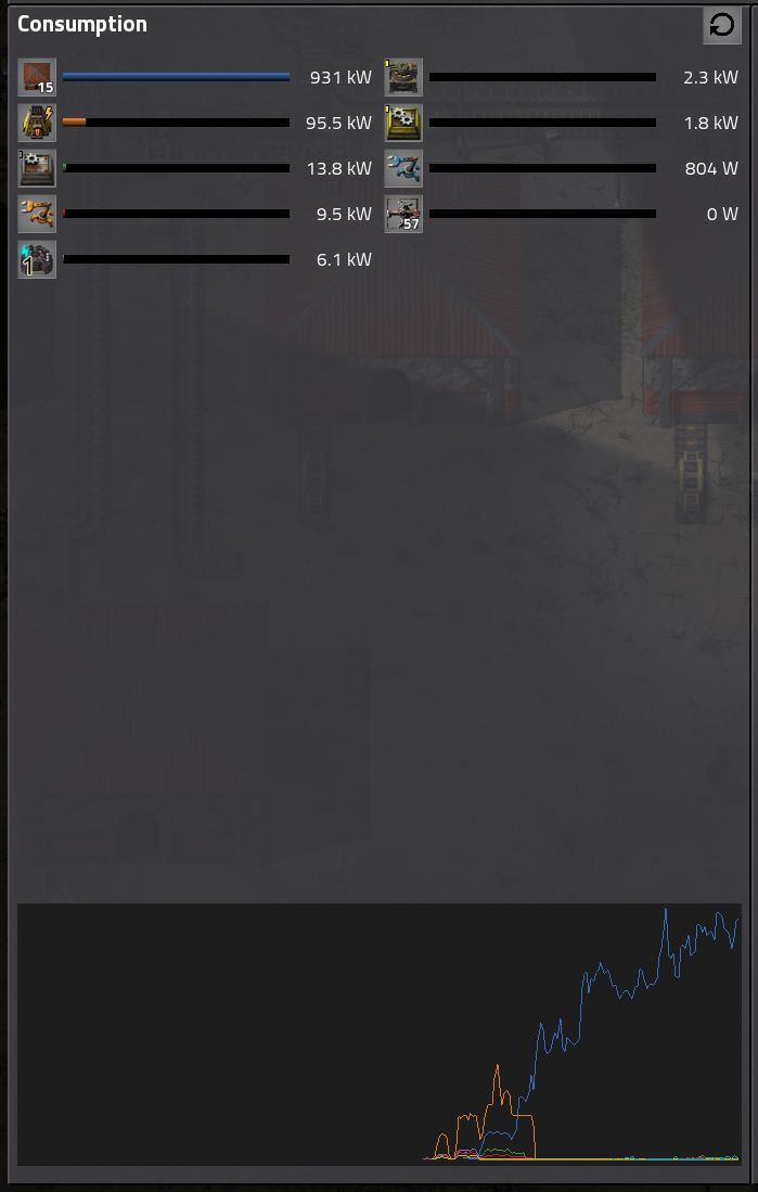
Before:

- original_electricity.jpg (42.57 KiB) Viewed 1249 times
After with sum (white line) added:

- electricity_after.jpg (90.21 KiB) Viewed 1249 times
Why ?
The history is currently fairly hard to read and plan with. These changes would make engineers happy and planning easier.
Re: More readable electricity history graph
Posted: Sun Jan 28, 2018 10:34 pm
by AileTheAlien
A few grid lines coming from the Y-axis to help you line up numbers would be nice too.