Blueprint UI improvements
Posted: Sat May 06, 2017 5:39 pm


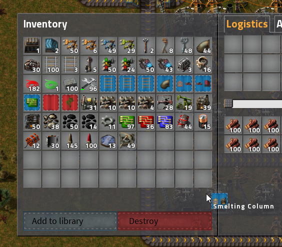
1. The current way of destroying (not clearing) blueprints is inefficient. It requires opening the blueprint, and a semi precise click. This could be improved by adding a target when you pick up the blueprint in your inventory.
A similar target could be added for the blueprint library as it seems to have the same issue.
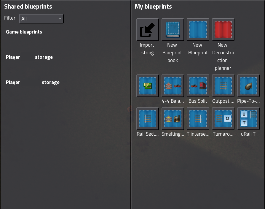
2. The blueprint library's default view is mediocre at best. It wastes a lot of space showing icons which could be used to show the full names of blueprints instead of 8 characters of them.
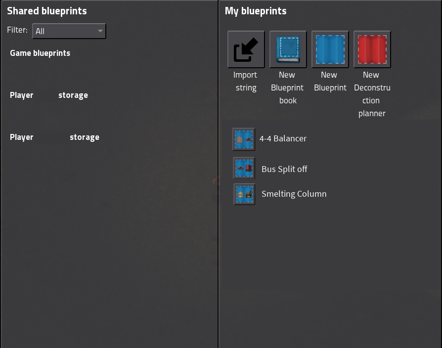
3. A proposal of a list view mode that can be toggled on to show full names and use space more efficiently for icons.