Suggestion: Change the UI for recipes with multiple outputs
Posted: Thu Apr 27, 2017 10:06 pm
Most recipes with a single output directly show what is being produced because that's the name of the recipe. Copper cable recipe? It makes copper cables, and only copper cables.
However, recipes that have multiple outputs don't have all those outputs in the recipe name, and this is probably for the best so the name doesn't get huge. However, it would be very welcome if the outputs were shown on mouseover when using the building that is making the recipe.
Example:

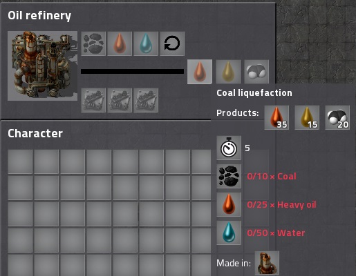
That is the Coal Liquefaction recipe being processed in an oil refinery. Notice how I have the heavy oil output highlighted, but it's showing the recipe instead? That needs to change.
I propose something along the lines of this picture I mocked up in Paint:

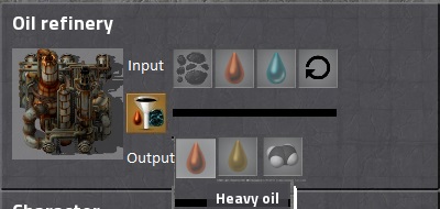
To the direct right of the assembler (or in this case, refinery) picture is the icon for the current running process. Mousing over the recipe icon will bring up the recipe. To the right of that are the inputs on top, and mousing over them will show what each input name is. Beneath the inputs is the progress bar (or bars, with productivity). Below the progress bar are the outputs, and mousing over each of them will show each output's name.
And the extra space on the right that I'm not using in the mockup? That can be used for modules.
The recipe reset button can be moved around wherever.
This input and output stuff isn't a huge deal in vanilla, but with mods the current setup makes it quite maddening to figure out what exactly each recipe does. This is especially true with AngelBob's where there are so many different chemicals and even if you know the scheme for each icon it's still quite the hassle to get production chains going. I'm sure there's some way to fit the inputs and outputs by name in the recipe itself, but until that lovely day the UI for assembler buildings would seem like an excellent first step towards knowing exactly what each recipe does even if its name doesn't fully give clues.
Gonna crosspost this to Reddit too to see how it fares there.
However, recipes that have multiple outputs don't have all those outputs in the recipe name, and this is probably for the best so the name doesn't get huge. However, it would be very welcome if the outputs were shown on mouseover when using the building that is making the recipe.
Example:

That is the Coal Liquefaction recipe being processed in an oil refinery. Notice how I have the heavy oil output highlighted, but it's showing the recipe instead? That needs to change.
I propose something along the lines of this picture I mocked up in Paint:

To the direct right of the assembler (or in this case, refinery) picture is the icon for the current running process. Mousing over the recipe icon will bring up the recipe. To the right of that are the inputs on top, and mousing over them will show what each input name is. Beneath the inputs is the progress bar (or bars, with productivity). Below the progress bar are the outputs, and mousing over each of them will show each output's name.
And the extra space on the right that I'm not using in the mockup? That can be used for modules.
The recipe reset button can be moved around wherever.
This input and output stuff isn't a huge deal in vanilla, but with mods the current setup makes it quite maddening to figure out what exactly each recipe does. This is especially true with AngelBob's where there are so many different chemicals and even if you know the scheme for each icon it's still quite the hassle to get production chains going. I'm sure there's some way to fit the inputs and outputs by name in the recipe itself, but until that lovely day the UI for assembler buildings would seem like an excellent first step towards knowing exactly what each recipe does even if its name doesn't fully give clues.
Gonna crosspost this to Reddit too to see how it fares there.