Page 1 of 1
Change the Research screen for more readability
Posted: Thu May 05, 2016 10:04 am
by Pegazz
Userstory would be as follow:
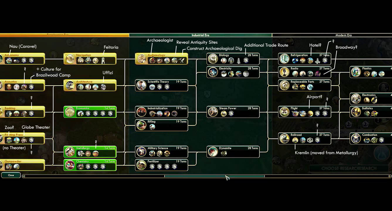
"As a player, I want to have a clearer display of the technologies' dependencies so that I can see in a second what technologies I need to research to unlock what I want" (I'm not great at writing user stories, sorry if it's not clear enough)
To better illustrate what I mean, here is a part of the Civilization V technology tree :

The added value is user-friendliness. For experienced player, this would maybe be inconsequent, but it would lower the barrier of entry for new players, without changing anything to the game mechanics (I say this as a new player)
I'm sorry if this has been proposed before, I tried to find something similar in the forum and didn't.
Re: Change the Research screen for more readability
Posted: Thu May 05, 2016 11:19 am
by bobingabout
They were actually planning to implement something like this, before settling on a cut down version for 0.13.
The big issue is basically... that it's not a tree, it's more like a web, and it becomes very hard to read if you try to display it in such a fashion.
Re: Change the Research screen for more readability
Posted: Thu May 05, 2016 4:45 pm
by Pegazz
bobingabout wrote:They were actually planning to implement something like this, before settling on a cut down version for 0.13.
The big issue is basically... that it's not a tree, it's more like a web, and it becomes very hard to read if you try to display it in such a fashion.
Yes, the screenshot from Civ is only there to better illustrate what I mean but the story is purposedly vague regarding the implementation

. I'm happy to read it's already been considered though
Re: Change the Research screen for more readability
Posted: Thu May 05, 2016 5:10 pm
by SyncViews
Civ has a pretty linear tech sequence in comparison though, as do a lot of games. You tried laying out the current Factorio tech tree as an example (on paper/paint/whatever, doesn't need to be pretty)?
And thats not even considering some of the currently missing links (at least in my mind, like being able to get logistic networks without smart chests, and techs needing blue or purple science before blue or purple science is unlocked, etc.)
Re: Change the Research screen for more readability
Posted: Thu May 05, 2016 8:07 pm
by DaveMcW
One of the major design goals of Civ is "good looking tech tree". If a tech doesn't fit into the tree, it is removed from the game. The Factorio devs are
less enthusiastic about doing that.
Re: Change the Research screen for more readability
Posted: Fri May 06, 2016 8:57 am
by steinio
I would also suggest, that to research a new tier, the current tier should be added to the lab.
This prevents a rush through science.
Re: Change the Research screen for more readability
Posted: Wed May 11, 2016 12:59 am
by ssilk
The new tech tree is part of v0.13.
https://www.factorio.com/blog/post/fff-128
Suggestions around it should be waited with until release, cause it's just waisted time to talk about unhatched eggs.


