Page 1 of 2
More advanced crafting menu
Posted: Sun Jun 07, 2015 12:03 pm
by MagicLegend
Hi there,
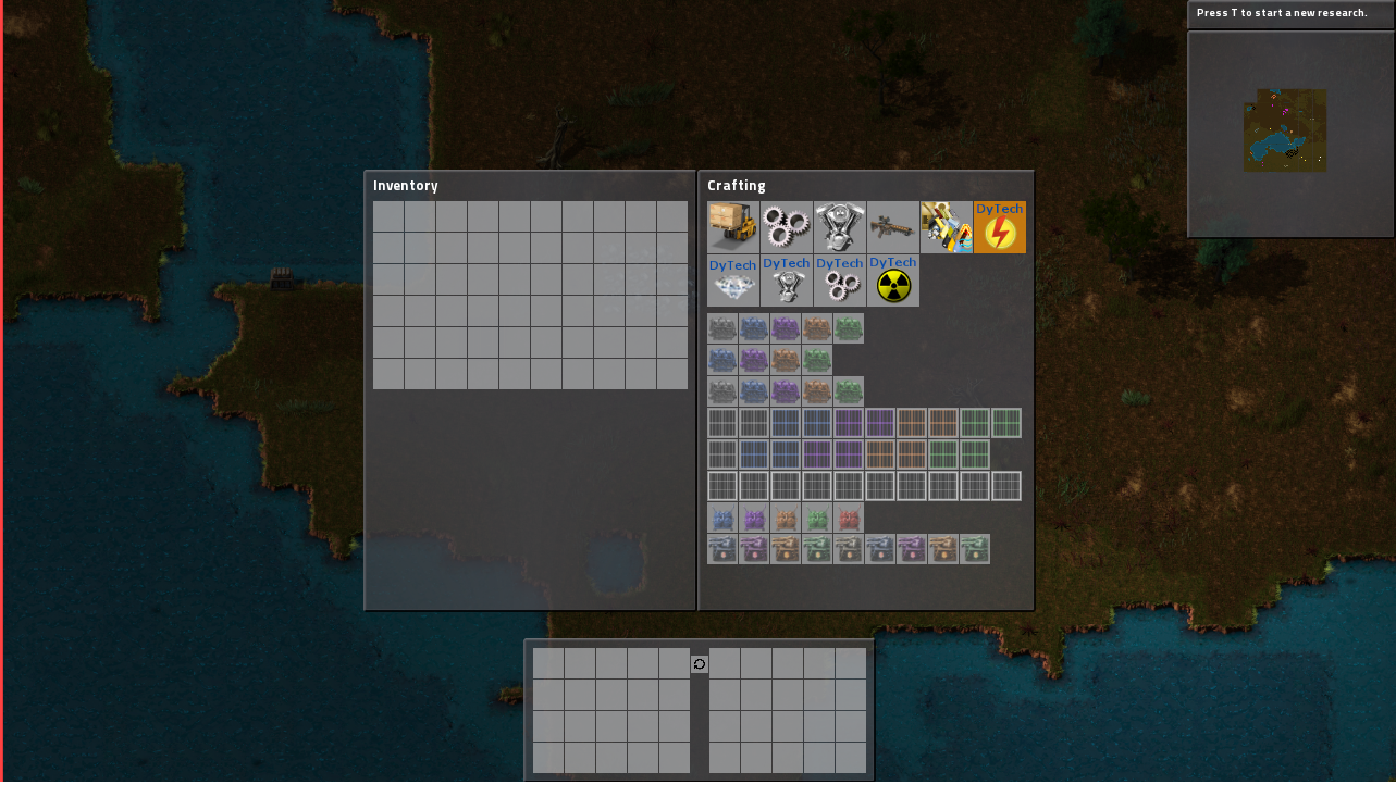
I'm working on DyTech-Power, and what bothers me is that I need to have a big cluster of recipes (which look very unorganized) with all the different tiers DyTech adds.
This is what it looks like right now (development build, so there are fewer recipes in the current release):

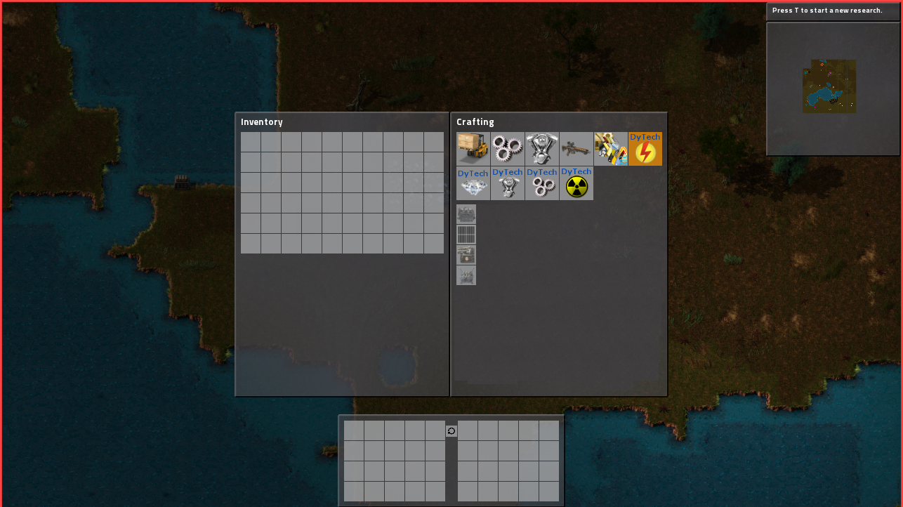
What I propose:

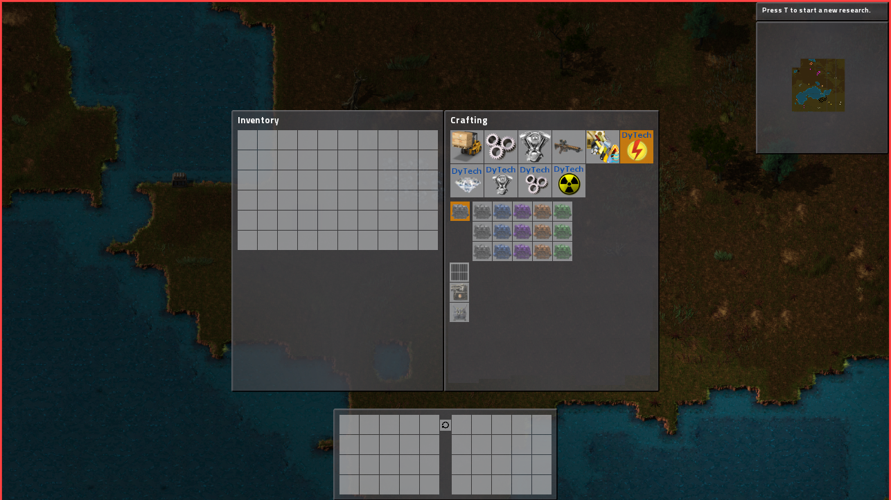
A more menu-like crafting menu. I know right? You can click on the icons to open the menu:

I think this would ease the cluster of recipes to find the right recipe that you want.
I'm asking this because I want to add new types of solars, accumulators, steam engines and boilers. It would make 3 types (small, normal, large) and 2 sorts (primary and secondary) per item. Combined with the marks it would make: 30 recipes for the solars; 36 for the accumulators, 30 for the steam engines and 30 for the boilers. That are a lot of recipes. It would be a lot more organised if I could organize them the way I propose.
I hope the devs are able to do something with this request. I'm sorry for my bad paint-skills. If you've ever wondered why I ask other people to make my art, this is why

~MagicLegend
Re: More advanced crafting menu
Posted: Sun Jun 07, 2015 10:57 pm
by ssilk
Isn't the fail just to have that many items, that this looks, like this is needed?
Wouldn't it be not more intelligent to use modules instead? Not of repairing a system, that was not concepted for that?
Example: Place a steam engine. Add a golden-rubin-with-purlples-stars-on-azur-blue-sky-MODULE => super steam engine.
Re: More advanced crafting menu
Posted: Mon Jun 08, 2015 7:47 am
by ratchetfreak
ssilk wrote:Isn't the fail just to have that many items, that this looks, like this is needed?
Wouldn't it be not more intelligent to use modules instead? Not of repairing a system, that was not concepted for that?
Example: Place a steam engine. Add a golden-rubin-with-purlples-stars-on-azur-blue-sky-MODULE => super steam engine.
Then you just move the problem to the modules tab.
Re: More advanced crafting menu
Posted: Mon Jun 08, 2015 9:40 am
by MagicLegend
ssilk wrote:Isn't the fail just to have that many items, that this looks, like this is needed?
Wouldn't it be not more intelligent to use modules instead? Not of repairing a system, that was not concepted for that?
Example: Place a steam engine. Add a golden-rubin-with-purlples-stars-on-azur-blue-sky-MODULE => super steam engine.
Hmm, not a bad concept. You would get even more recipes by that tho

I think it would look more organized if the items are menu's themselves.
~ML
Re: More advanced crafting menu
Posted: Mon Jun 08, 2015 12:49 pm
by ssilk
ratchetfreak wrote:ssilk wrote:Place a steam engine. Add a golden-rubin-with-purlples-stars-on-azur-blue-sky-MODULE => super steam engine.
Then you just move the problem to the modules tab.
No, because it can change behavior depending of what combinations are installed. One red module + blue module into furnace => Smelts 10 iron ore at once and produces 10 iron plate and one steel bar.
ok, bad example, but I think you understand how that works.

Re: More advanced crafting menu
Posted: Tue Jun 09, 2015 8:58 am
by MagicLegend
ssilk wrote:ratchetfreak wrote:ssilk wrote:Place a steam engine. Add a golden-rubin-with-purlples-stars-on-azur-blue-sky-MODULE => super steam engine.
Then you just move the problem to the modules tab.
No, because it can change behavior depending of what combinations are installed. One red module + blue module into furnace => Smelts 10 iron ore at once and produces 10 iron plate and one steel bar.
ok, bad example, but I think you understand how that works.

That's not a bad example, I really like that idea actually... The only thing is, that you'd get the same thing as the modules tab in Dytech; a cluster of recipes...

I think it is a bit unorganized, but maybe that's just me...
I'll talk with Dysoch about your modules idea, I think it could be a really neat gamechanger...
~ML
Re: More advanced crafting menu
Posted: Tue Jun 09, 2015 12:21 pm
by ssilk
MagicLegend wrote:The only thing is, that you'd get the same thing as the modules tab in Dytech; a cluster of recipes...

I've currently this in mind:
Code: Select all
     Origin Item
     vvvv placing vvvv
     Origin Entity
     vvvv add combination of items in (module) slots vvvv
     New Entity

     New Entiity
     vvvv mining vvvv
     Origin Item  ( + eventuially combination of items )
Well, the "Combination of items in the slots" can be of course some kind of recipe. And perhaps it takes also a while to "transform" it. But basically it can begin to work, if the transformation is finished.
If you mine the entity, well, then this is again the origin entitity (or better item then), there is no item-representation for the new entity needed then, which is exactly, what we want. The inserted modules may get lost when mined, or are a bit "weared" then.
This works of course only for entities, which you don't need much from, very specialized stuff. And you don't need much extra modules for that, you can concentrate on more on gameplay, instead of creating more and more different items.
Except if we have perhaps at some point some kind of automatic module filling; when the modules can be filled/emptied by the bots per logistic network. I hope this will be implemented.

Think for the possibilities with cars/tanks etc.
Re: More advanced crafting menu
Posted: Tue Jun 09, 2015 12:58 pm
by MagicLegend
Hmmm, I see what you mean... Really interesting. I'm gonna discuss with Dysoch what he thinks about this. I want to -as a test- implement this on the accumulators, too see what is possible, and what isn't.
I'll contact you if I need some more information.
Thank you for your input!
~ML
Ps. this doesnt mean I dont want my advanced crafting menu

Re: More advanced crafting menu
Posted: Tue Jun 09, 2015 7:00 pm
by bobingabout
I kind of like the idea, especially when a sub-catagory is spread over multiple lines like that. Not sure I'd go with that exact layout, but I still like the idea.
it could allow mods to have a catagory button within the intermediates tab, instead of like me having 3 extra huge catagory tab buttons at the top just for 3 pages of intermediates.
As it is now, If you add too many of those huge buttons, you pretty much end up with a construction menu where the big buttons take up 3 quaters of the height of the window, and the list of recipes is a small section at the bottom with several pages on the scrollbar.
Re: More advanced crafting menu
Posted: Wed Jun 10, 2015 7:32 pm
by MagicLegend
Yep, that's my point. The exact layout will be -ofcourse- made by the devs, this is just how I think it could look. I really hope they'll do something with my idea.
~ML
Re: More advanced crafting menu
Posted: Wed Jun 10, 2015 8:31 pm
by Goldern
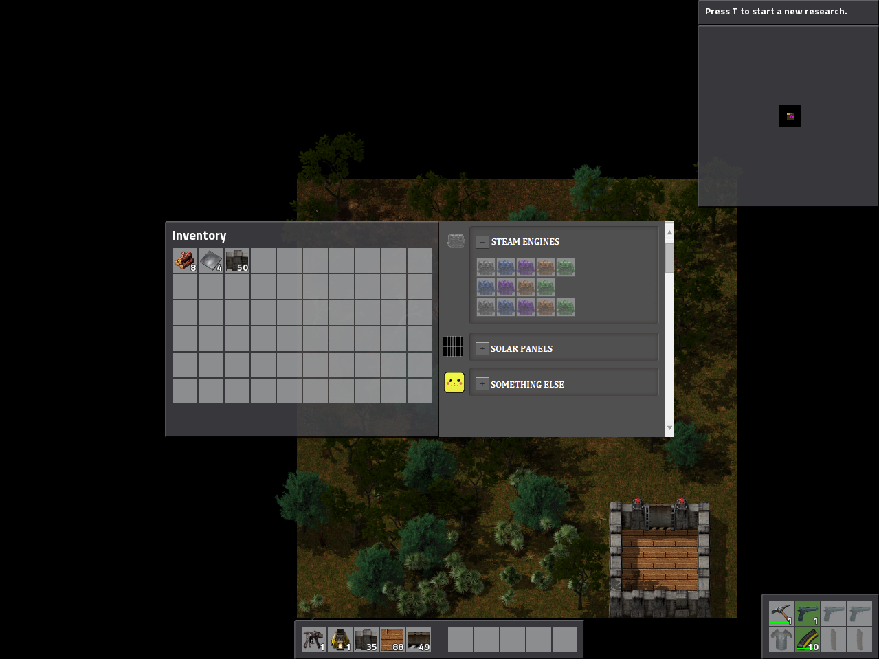
I would vote for a crafting menu like that:
[Forum cropped, so:]
Link:
http://i.imgur.com/QUgM6Tl.png
Re: More advanced crafting menu
Posted: Wed Jun 10, 2015 9:10 pm
by vedrit
I like the idea of items being in a sub-selection. Why isn't that how subgroups in the crafting menu works as it is?
Re: More advanced crafting menu
Posted: Thu Jun 11, 2015 12:06 pm
by MagicLegend
That is not how the ingame-layout looks, that's how the forum looks... I based my design on the ingame look of the subgroups as they right now are...
vedrit wrote:I like the idea of items being in a sub-selection. Why isn't that how subgroups in the crafting menu works as it is?
I don't know, the devs probarly never had enough items to fill an entire subgroup?
~ML
Re: More advanced crafting menu
Posted: Thu Jun 11, 2015 6:08 pm
by bobingabout
Thinking about it, it might require a sub-sub-group.... or instead of now how we have a item-group that adds the huge button up top and item-subgroup that determines what line it goes on, the item-subgroup would determine the small icon button sugested in your diagram, plus a item-sub-subgroup that detemines which line within the sub-group the icon would be on.
Re: More advanced crafting menu
Posted: Fri Jun 12, 2015 12:33 am
by Goldern
MagicLegend wrote:
That is not how the ingame-layout looks, that's how the forum looks... I based my design on the ingame look of the subgroups as they right now are...
vedrit wrote:I like the idea of items being in a sub-selection. Why isn't that how subgroups in the crafting menu works as it is?
I don't know, the devs probarly never had enough items to fill an entire subgroup?
~ML
I didn't knew the forum had a crafting menu :O
~Jokes aside, this is what i mean't, as you quite didn't understood:
Image1= "
http://i.imgur.com/4YRFnJ5.png"
Image2= "
http://i.imgur.com/DRgGbAq.png"
Re: More advanced crafting menu
Posted: Fri Jun 12, 2015 3:33 pm
by MagicLegend
bobingabout wrote:Thinking about it, it might require a sub-sub-group.... or instead of now how we have a item-group that adds the huge button up top and item-subgroup that determines what line it goes on, the item-subgroup would determine the small icon button sugested in your diagram, plus a item-sub-subgroup that detemines which line within the sub-group the icon would be on.
yep... Complicated stuff

It does! Never noted all those fancy buttons above the replybox?

I see what you mean. Although I'm not really sure if it is clear enough, and I think it takes too much space in the crafting menu...
~ML
Re: More advanced crafting menu
Posted: Sat Jun 13, 2015 1:06 am
by Goldern
It's meant to be divided in sections with related items, in a way so it can be pretty easy to spot what you really is searching for and using unlimited space in a limited space (scroll bar).
Even if it's not visually appealing, i think it has some benefits if you have tons of items that are almost the same, but well, there are many ways to make it easier tho, this is only the way i've imagined based on what you guys were saying/asking for.
Pallete System to clean up Crafting GUI
Posted: Mon Apr 05, 2021 5:24 pm
by KuroxUsagi
A Pallete System to help clean up a massive crafting GUI mess if you play modded, 1 single button for let's say "Pipe", when you right-click you get a dropdown or some kind of menu which will let you select which "Pipe" be it Stone, Iron, Copper, whatever. After selected once left-clicking the original button in the GUI as you would normally give you the type of "Pipe you selected beforehand if you wish to switch what type of "Pipe" again right-click the button to get the selection menu again. Various mods add different Tiers of Machines, this system could allow for 1 button which you then right-click to select which tier you wish and removing much of the clutter in the crafting GUI.
Re: Pallete System to clean up Crafting GUI
Posted: Mon Apr 05, 2021 11:34 pm
by ssilk
I may also point to
viewtopic.php?f=6&t=87419 Better Compression (Stacking/Boxing/Pallets) Support
Re: Pallete System to clean up Crafting GUI
Posted: Tue Apr 06, 2021 7:53 am
by ickputzdirwech
This very, very (very!) old topic discusses pretty much the same idea:
12777
