I don't think checkboxes is a good idea.
My first thought had been to do this via parameterized blueprints, and the upgrade planner idea had only come to me later, but either way, it's the same core.
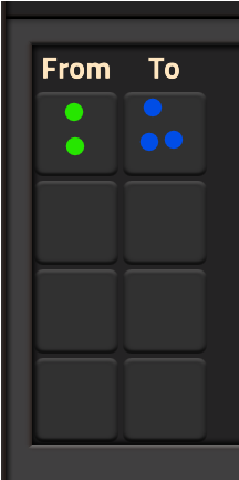
If I go with the upgrade planner UI, I'd want to do something like

- Screenshot 2024-11-05 173218.png (10.43 KiB) Viewed 373 times
and just drag that all over the parallel factory to upgrade it.
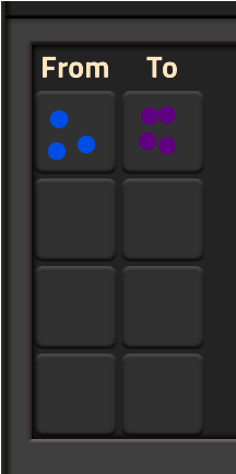
Then I could have a second one that could look like this

- Screenshot 2024-11-05 173218_2.png (11.01 KiB) Viewed 373 times
And this would upgrade any filter that is based on quality, so:
* Splitter filters (if it's only quality, or quality + item, but NOT any quality. NO quality = normal, so that would be affected)
* Assembling machine recipes (this is the one you originally suggested)
* Filter inserters (if any of the filters are checking for the FROM quality, they should be changed)
There are some edge cases, such as if you're checking for greater than/less than quality, but I think those should also be upgraded..
For the modules, that can already by done. They even added in the 'no module' icon so you can easily remove all modules, or add modules when there are none.
For the filters, you can currently change what item an inserter/splitter is filtering, and you can even change the quality, but only if there's an item. If you're filtering for pure quality, then you can't change it (blueprint claims 'Nothing to parametrise') (
which, side note, is a typo. Should say parameterize. But that's something else that I'll post on the bug forum now that I've noticed it.. I retract that cause some research shows it to be an accepted alternate spelling)
Taking a look at that related thread, it's almost what I'm suggesting, but not quite. That suggestion is to upgrade buildings, not recipes/filters.
The two are somewhat conflicting and would require some generic "structure" and generic "filter" and generic "recipe" icon. Ahh, ok, that's you meant with checkboxes! I get it now. I would do it as generic icons (kinda like the signals/unsorted tabs that show up in a few UIs) rather than checkboxes. More detailed control to do it as icons cause checkboxes would apply to the whole planner whereas icons would let you target only specific upgrades (i.e. can upgrade a filter from uncommon to rare at the same time as upgrading common buildings to uncommon).
OK, this was a bit rambling (I tend to think things through as I type up replies and leave my whole thought process there so you can see where I got my thoughts from), so I hope it all makes sense!