Page 1 of 1
Colorblindness/Accessibility Improvements
Posted: Sun Aug 06, 2023 10:39 pm
by Elusive92
TL;DR
Improve object/state readability by making their shapes more unique, in addition to their colors.
What ?
A great example of colorblind-friendly design is road signage. They don't rely on color, but use it as enhancement. Think of how a stop sign can even be recognized when fully covered by snow.
Similarly, some mods have tried doing something similar to same-shaped objects in Factorio. Here is an example from
"Colour Blind Friendly Science Packs" by Hornwitser:
Another example would be to use different bases for Stack- and Filter inserters (
https://github.com/alangrainger/factori ... ind-fixes/):
- OzpOzH0.jpg (25.64 KiB) Viewed 2431 times
Or, when those approaches are unavailable, choosing colors that are significantly less likely to collide with common color deficiency types (red/blue instead of red/green):
- MkAIGqp-cropped.jpeg (35.24 KiB) Viewed 2431 times
I would also like to reference
"Making Games Better for Gamers with Colourblindness & Low Vision | Designing for Disability" by Game Maker's Toolkit, which goes more in-depth about various approaches to dealing with vision deficiencies.
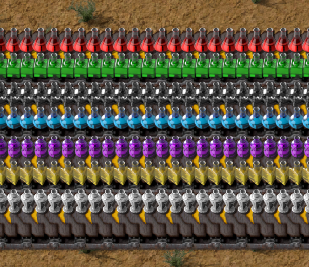
Here is, in no particular order, a non-exhaustive list of hard-to-distinguish cases, that arise with various types of color deficiency for different icons/indicators currently in the game:
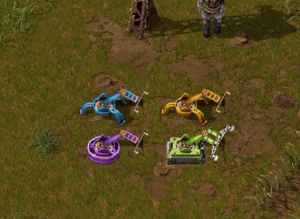
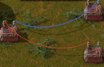
- Color-only circuit network signals
- Red vs. green circuit network wires
- Red vs. green indicator lights on rail signals and other buildings like miners
- Copper ore vs. Stone
- Inserter types
- Fluid/barrel types
- Circuit types
- Module types
- Belt types
- Science pack types
- Logistics network chest types
- Roboport zones
- Nuclear vs. Rocket fuel
- Ammo/Rocket/Shell/Grenade types
The main takeaway is that there is no color combination that will work for everyone. The most reliable way to address these issues are unique textures/patterns and shapes.
References to a selection of prior art:
https://www.reddit.com/r/factorio/comme ... ut_losing/
https://github.com/alangrainger/factori ... lind-fixes
https://mods.factorio.com/mod/colorblind_adv_circuit
https://mods.factorio.com/mod/cb-science
Why ?
Something like 7-8% of the population are affected by some kind of color deficiency, and it would be a shame if Factorio had an increased barrier to entry and mastery for those players. In addition, losing achievements just to be able to play the game normally is somewhat disappointing.
The game already features a color filter option. However, due to the complexity of human color perception, it rarely solves the problem, only partially mitigates it by making other details harder to distinguish instead. I am personally of the opinion that these kinds of accessibility improvements make sense to add directly to the core game.
Re: Colorblindness/Accessibility Improvements
Posted: Mon Aug 07, 2023 1:22 am
by AntiElitz
I have a red green color weakness and can only second this. eg I have a lot of trouble to see greeninsh turret range on reddisch desert tiles. The color filters to not really help sufficiently with this. In this case a dotted range circle though would do the trick with ease.
Re: Colorblindness/Accessibility Improvements
Posted: Mon Aug 07, 2023 2:35 am
by ctgPi
Note also e.g.
https://steamcommunity.com/id/hextree/r ... ed/427520/ is rated one of the most helpful negative reviews pre-Uncle Bob on Steam.
Re: Colorblindness/Accessibility Improvements
Posted: Mon Aug 07, 2023 6:10 pm
by _xer_
I have normal color vision, but when I play at night I have night mode on. It filters out a portion of the blue/green light to be easier on the eyes and not keep you awake as much. Most items in the game are still perfectly recognisable for me, but there are some that are difficult to differentiate:
- zzzzIMG.jpg (116.28 KiB) Viewed 2193 times
Left side is Lube/Tier 3 assembler/green science/efficiency modules,
right side is Water/Tier 1 assembler/blue science/speed modules.
Note that entities that are difficult to see normally, like ghosts or yellow inserters on copper patches, become almost invisible.
If the dev team is committed to providing an enjoyable game to visually impaired players, I would recommend doing a playthrough with the existing Saturation setting at 0 to see where potential improvements can be made.
Re: Colorblindness/Accessibility Improvements
Posted: Mon Aug 07, 2023 7:17 pm
by PunkSkeleton
I do agree with the OP. I am not colorblind but I can definitely see how difficult the game would be for me if I were.
Yes, there are mods for this but not everybody can or wants to play with mods. Especially new player experience is definitely not about mods.
Re: Colorblindness/Accessibility Improvements
Posted: Mon Aug 07, 2023 8:59 pm
by ardoRic
I got no skin in this topic, as I don't have any problem or filter that would warrant such a change.
But I wholeheartedly agree on making changes, where possible, to improve the experience of color blind / low vision people.
I don't think I have anything more to add at this point other than my support.
Re: Colorblindness/Accessibility Improvements
Posted: Sat Sep 02, 2023 10:36 am
by TheKillerChicken
I have a problem with seeing the rocks within a desert map. Having a Plasma Display does help that a little due to the phosphor-based colours, but I would like to see a colourblind mode, not just for my precious rocks, but for this game as a whole. I am concerned my vision may break more as I get older. I am all for this.
Re: Colorblindness/Accessibility Improvements
Posted: Wed Sep 13, 2023 6:49 pm
by Illiander42
There's the "color filter" option in graphics settings that claims to do something for this.
Don't know when it was added or how well-known it is. (Or how useful it is)
Also, a note on inserters: Stack inserters already have a non-colour visual difference - they have split arms.
Other than that, adding more voices to this one (I use colourblind science packs most of the time, and don't have issues that would make me need it)
Re: Colorblindness/Accessibility Improvements
Posted: Wed Sep 13, 2023 9:06 pm
by Elusive92
Illiander42 wrote: ↑Wed Sep 13, 2023 6:49 pm
There's the "color filter" option in graphics settings that claims to do something for this.
Don't know when it was added or how well-known it is. (Or how useful it is)
Unfortunately not very useful as I touched on in the last paragraph of the original post. It's become quite popular for games to go with this approach, and I really appreciate the effort, but it's fundamentally not a solution to the underlying problem.
Illiander42 wrote: ↑Wed Sep 13, 2023 6:49 pm
Also, a note on inserters: Stack inserters already have a non-colour visual difference - they have split arms.
That's true, it's already better than most other cases!
I appreciate your support for this proposal!
Re: Colorblindness/Accessibility Improvements
Posted: Thu Sep 14, 2023 11:14 am
by Illiander42
Elusive92 wrote: ↑Wed Sep 13, 2023 9:06 pm
Illiander42 wrote: ↑Wed Sep 13, 2023 6:49 pm
There's the "color filter" option in graphics settings that claims to do something for this.
Don't know when it was added or how well-known it is. (Or how useful it is)
Unfortunately not very useful as I touched on in the last paragraph of the original post. It's become quite popular for games to go with this approach, and I really appreciate the effort, but it's fundamentally not a solution to the underlying problem.
That's what I get for skimming posts, sorry

The filter is a band-aid fix that can be done with a shader pass at the end of the render chain, so it's a super-low-effort thing to do.
Definitely should be doing more.
Re: Colorblindness/Accessibility Improvements
Posted: Mon Jun 17, 2024 10:12 pm
by Illiander42
Bumpity bump for 2.0