Stacked Area Charts / Summaries graphs of power/pollution

Post your ideas and suggestions how to improve the game.

Moderator: ickputzdirwech

Locked
Starchild
Manual Inserter
Manual Inserter
Posts: 4
Joined: Mon Oct 28, 2019 6:38 am
Contact:

Stacked Area Charts / Summaries graphs of power/pollution

Post by Starchild »

TL;DR
Please add an option to present Power and Pollution graphs as stacked area charts.
What ?
Today all charts in the game are line charts.
Image

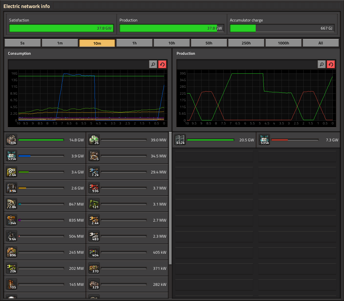
I propose implementing a new visualization type - stacked area charts. This option would be exposed through a toggle control in the chart UI in line with the other buttons directly above the chart (or else in the player settings menu) to switch between line chart and stacked area chart. This is requested specifically for Power and Pollution charts, but it could be offered on all charts for consistency.
Why ?
Often when I am looking at Power production and consumption and Pollution production and consumption, I want to see trends in the total sum across all entity types, and I want to see how each of those entity types compares to the total. This is easy to see with a stacked area chart, but next to impossible with the current line charts. This would be particularly valuable for reasoning about complex power setups with a mix of solar, non-solar, and backup accumulator/steam reservoirs. It would also be interesting to see how total pollution production compares to total pollution consumption over time.
Last edited by ssilk on Wed Sep 28, 2022 4:56 am, edited 1 time in total.
Reason: Change title to explain suggestion more obvious

SerhiiS
Burner Inserter
Burner Inserter
Posts: 19
Joined: Sun Sep 18, 2022 11:18 am
Contact:

Re: Stacked Area Charts

Post by SerhiiS »

Do you really need it in the game? Such statistics are not often needed. I think you can add an "Export" button to insert a table into the excel and play there as you like.

FuryoftheStars
Smart Inserter
Smart Inserter
Posts: 2530
Joined: Tue Apr 25, 2017 2:01 pm
Contact:

Re: Stacked Area Charts

Post by FuryoftheStars »

I’m not sure I understand what a “stacked area chart” is based on the description. Can you provide example images?
My Mods: Classic Factorio Basic Oil Processing | Sulfur Production from Oils | Wood to Oil Processing | Infinite Resources - Normal Yield | Tree Saplings (Redux) | Alien Biomes Tweaked | Restrictions on Artificial Tiles


User avatar
ssilk
Global Moderator
Global Moderator
Posts: 12888
Joined: Tue Apr 16, 2013 10:35 pm
Contact:

Re: Stacked Area Charts / Summaries graphs of power/pollution

Post by ssilk »

I’m sure this suggestion already exists, but couldn’t find it.

And this is not only useful for power and pollution, but any type of statistics.
Cool suggestion: Eatable MOUSE-pointers.
Have you used the Advanced Search today?
Need help, question? FAQ - Wiki - Forum help
I still like small signatures...

SoShootMe
Filter Inserter
Filter Inserter
Posts: 475
Joined: Mon Aug 03, 2020 4:16 pm
Contact:

Re: Stacked Area Charts / Summaries graphs of power/pollution

Post by SoShootMe »

ssilk wrote:
Wed Sep 28, 2022 5:03 am
I’m sure this suggestion already exists, but couldn’t find it.
There are suggestions around showing the total power and/or pollution (which seems to be the main benefit of this suggestion), but I couldn't find any specifically suggesting a stacked (or cumulative) chart.

One obvious issue with a stacked area chart is that it won't work well if the order of data series changes while you're looking at it; a similar problem to the reordering of the values under the chart.
And this is not only useful for power and pollution, but any type of statistics.
Summing the energy or pollution produced/consumed by different entities has a clear (and useful) meaning. It only makes sense for item, fluid and kill/loss numbers in limited cases - in general it's like adding 17 metres and 35 seconds - and seems much less useful, to me at least.

User avatar
ssilk
Global Moderator
Global Moderator
Posts: 12888
Joined: Tue Apr 16, 2013 10:35 pm
Contact:

Re: Stacked Area Charts / Summaries graphs of power/pollution

Post by ssilk »

SoShootMe wrote:
Fri Sep 30, 2022 2:30 am
One obvious issue with a stacked area chart is that it won't work well if the order of data series changes while you're looking at it; a similar problem to the reordering of the values under the chart.
Luckily there are more suggestions around.

viewtopic.php?f=6&t=96786 Add overall graph of the electric network
viewtopic.php?f=6&t=97352 Production Window and Science Packs
viewtopic.php?f=6&t=82939 Power Production Filtering
viewtopic.php?f=6&t=59485 (the Idea!) Sort Production Tab
viewtopic.php?f=6&t=68832 Electric Network Info to show Satisfaction Percentage Graph (and more)

And it’s a general problem to sort entities and other stuff by its value, instead of some fixed ID: viewtopic.php?f=66&t=16858 Overview of items stored in the Logistics Network
Summing the energy or pollution produced/consumed by different entities has a clear (and useful) meaning. It only makes sense for item, fluid and kill/loss numbers in limited cases - in general it's like adding 17 metres and 35 seconds - and seems much less useful, to me at least.
It has it’s sense in seeing change. I’m not so sure if the order must be seen.

See links above and
viewtopic.php?f=6&t=96786 Add overall graph of the electric network
viewtopic.php?f=6&t=58578 Difference (or net production) graph in production grapn

Related

viewtopic.php?f=80&t=19987 More Game Information (Statistics, Monitoring, Graphs)
viewtopic.php?f=6&t=77608 Change stats outputs from column to row based

And there is so much more around the graphs, I cannot link all. The problem with it is, that there are dozens of ideas that have all their sense.

In general I would like have a configurable statistic system like grafana (but with much less overhead).
Cool suggestion: Eatable MOUSE-pointers.
Have you used the Advanced Search today?
Need help, question? FAQ - Wiki - Forum help
I still like small signatures...

Locked

Return to “Ideas and Suggestions”