Page 1 of 1
forum cursor hard to see
Posted: Wed May 17, 2017 4:26 pm
by Nexarius
Re: forum cursor hard to see
Posted: Wed May 17, 2017 4:30 pm
by Koub
This is not exactly a bug in Factorio
 [Koub] Topic moved to This forum
Re: forum cursor hard to see
Posted: Thu May 25, 2017 10:29 am
by Nexarius
Could that be changed? It is really annoying.
Re: forum cursor hard to see
Posted: Mon Jun 05, 2017 10:29 am
by ssilk
This is so often issued now, that I would like to call it a bug.

Re: forum cursor hard to see
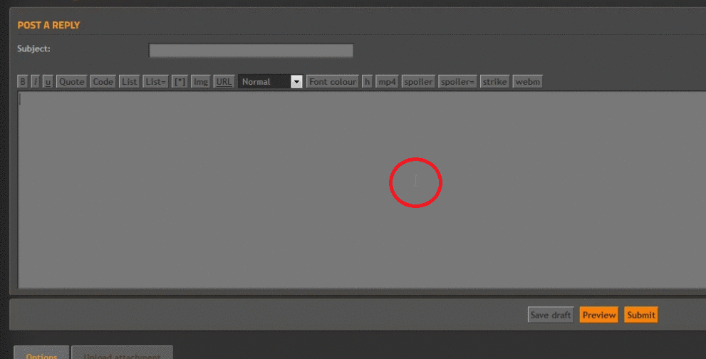
Posted: Sat Jun 10, 2017 4:57 pm
by Nexarius
Another bad design idea was to put black text on a grey background.
It looks like nobody will fix this so I just fixed it for myself with an addon.
Those are the changes that I'm using now and it looks like this.
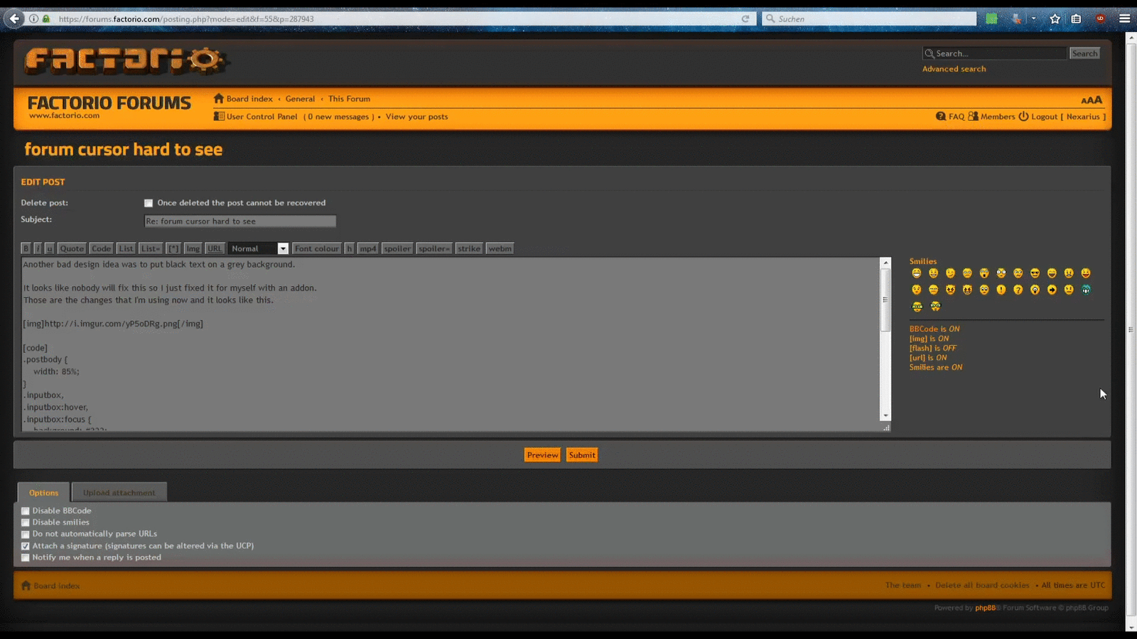
Code: Select all
.postbody {
    width: 85%;
}
.postprofile {
    width: 12%;
}
.notice,
.signature {
    color: white;
}
html .signature .postlink,
html .signature .postlink-local {
    color: #FF9F1C;
}
.inputbox,
.inputbox:hover,
.inputbox:focus {
    background: #333;
    color: white;
}
#postingbox #message-box textarea,
fieldset dl:hover dt label,
a.button1,
a.button2,
input.button2,
input.button3,
.post:target h3 a,
.postprofile dd,
#tabs a span,
.postprofile dt {
    color: white;
}
html dl.file dd {
    color: white !important;
}
Re: forum cursor hard to see
Posted: Thu Jul 13, 2017 2:40 am
by foodfactorio
hi i also noticed this and was going to mention as well, just for friendly feedback.
it could be something to do with how the background colours change when you move the mouse to the subject line, when replying, it goes from light grey to dark grey, and whitens the text...
...and when you click in the text field, it brightens the field, and sets the text darker again.
maybe an admin can tweak the css code from the backend to simply set the mouse cursor (text insert icon, which looks like a capital "i"... assuming it shows up when the mouse in somewhere inside the text field)
as it actually really is very hard to see, and i can only imagine will become worse, when using a larger screen resolution.
actually, maybe slightly better would be to make the mouse (text) cursor, (when it is in the text field), to become Factorio Yellow
just like the yellow submit button, since it could look cool as well as being functional, instead of the current very light grey colour which is hard to see.
Re: forum cursor hard to see
Posted: Thu Jul 13, 2017 5:43 am
by Optera
Would be nice if the forum skin was usable and not just looking good.
I switched back to phpbb default for this reason a while ago.
Re: forum cursor hard to see
Posted: Mon Apr 16, 2018 4:44 pm
by CzBuCHi
wow ... i didnt know i can change site skin ... thanks
...
PS: other skins are ugly as hell, but at least functional :/
Re: forum cursor hard to see
Posted: Sat Apr 28, 2018 12:13 am
by CageStooge
To quote from Friday Facts #238:
We are paying a lot of attention to the readability in general, according to the AAA standards of the WCAG. So the contrast with the panels and the font is increased quite a lot compared to previous mock-ups by simply using a contrast checker. Also the font size is increased by 2pt so it is more comfortable to read. Anyway, the user will have control of the font size in the options menu.
Could you take a look over here for a few, cause I am pretty sure this is
far from a AAA standard.
Re: forum cursor hard to see
Posted: Sat Apr 28, 2018 2:06 am
by dog80
+1 lol