Page 3 of 5
Re: New forum skin
Posted: Sun Jun 15, 2014 1:59 am
by ssilk
ShivaFang wrote:Just so you know, this yellow on grey skin does not show up to guests.
This will change, when the new layout is finished. Which it isn't yet.
Re: New forum skin
Posted: Thu Jun 19, 2014 1:26 pm
by Khyron
The new skin is a great step forward for the brand, well done. However...
muzzy wrote:Usability suffers quite a lot with the new skin. Contrasts are too low in a lot of places, hover effects are too strong (i.e. distracting) and so on. It feels unpleasant to use.
This. You simply can't use grey backgrounds for text areas because it halves your possible contrast.
I recommend using something like
http://contrastchecker.com/ (A W3C Web Content and Accessibility Guidelines tool) to find smallest change required so that you maintain your colour branding.
Edit: Another thing to watch out for is how the forum behaves on wide resolutions. (This was an issue for the old template as well.) Currently the forum will expand to use all available width. You can simulate having a wider monitor by using your browser's zoom feature (ctrl+mousewheel). It's generally a good idea to set a max-width when you're dealing with text content, that way the reader's eye doesn't have to sweep the whole width of the monitor. 960px is a bit of a standard and that's what they used on the phpBB site itself:
https://www.phpbb.com/customise/db/
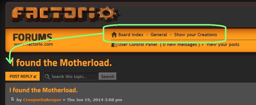
Edit 2: The breadcrumbs should be next to (or immediately above) the thread title.
Re: New forum skin
Posted: Sat Jun 21, 2014 5:23 am
by Darthlawsuit
I like dark color schemes but the light grey just does not fit in well at all.
For li.row #333 looks a lot better and makes it flow with the rest of the colors better.
Actually now I find myself avoiding the forums because of the color scheme =/ its that bad.
Re: New forum skin
Posted: Sat Jun 21, 2014 7:17 am
by therapist
Hate it. Looks cartoony, like I'm at the Tonka Trucks forums. Can't wait to login and make it go away.
Not that I really like the original all white with a sky blue header, but the unfinished, basic, default-feeling nature of that layout, for me, matches the feeling of coming to read about and share ideas about solving logistical problems and delving into alot of maths. Maybe that is what they want, a more "gamey" feeling layout but I'm not sure if thats what the new layout communicates to me either. Factorio has this solemn serious almost dark tone to it, and I want a layout that can capture that.
That got artsy-fartsy fast, appreciate the work done to make a new layout, but it still needs something more industrial feeling beyond just color scheme.
Re: New forum skin
Posted: Sat Jun 21, 2014 8:11 am
by ssilk
That has some truth. But having this layout now since a month or more I think, this can work also quite well in game.
What I like:
- the idea of having background illuminated LCD displays.
- the depth of the layout
- the font
- the overall color scheme (is not contrast)
What I don't like yet:
- too round edges. The game is quite "edgy", but here we we have several really round elements, especially the buttons, checkboxes, some round corners (I don't mean the smilies

) - think this is wanted, but that's my opinion after using it now for so long.
- the contrast of some parts. Most is already said:
--- for me the select boxes are not readable
--- the whole Mail area
--- some text markings
Re: New forum skin
Posted: Wed Jun 25, 2014 4:33 pm
by Der_Doodle
Well the Pro-Side of the Skin is that it fits to the webpage.
But the Con-Side is that that it is all harder to read.
While posting the Black on the light grey is more taxing for the eyes then a Black on White.
While browsing the Forums you can read the white on grey but it is slighty annoying that every 2nd post has a darker grey and a lighter grey backround.
And the "user infos" on the right side (user title, post count, joined date etc.) are hard to read on the lighter grey tone and a real biatch on the dark grey.
All in all after browsing abit with the new skin it became for me too annoying to use and i switched back to the old ugly (but alot easier to read) skin
Re: New forum skin
Posted: Fri Jun 27, 2014 5:39 am
by RawCode
too dark, i will keep old one.
Re: New forum skin
Posted: Fri Jun 27, 2014 11:54 am
by ssilk
Der_Doodle wrote:While posting the Black on the light grey is more taxing for the eyes then a Black on White.
Well, I thought that in the past, too.
But I changed about half a year ago the preferences of my IDE to use a very dark background. I can say now after half a year: It is much more useful to have a dark background, if you look at a screen very much time...
Of course I've white letters.
I think this is the problem here: I have grey background and black font. I would say: Personal taste.
Hmmmm...
What if we have two layouts: One dark and one light?
Re: New forum skin
Posted: Sun Jun 29, 2014 5:02 pm
by bulldog98
What I really miss is the quote button for post, maybe it's just me being blind, but it's so usefull.
Re: New forum skin
Posted: Sun Jun 29, 2014 5:34 pm
by ssilk
I was in contact with Kovarex about that.
The HTML-code for the buttons was transmitted, but the CSS hide it.
Currently working again. Sorry, can't say more, I'm moderator, not admin.
Re: New forum skin
Posted: Mon Jun 30, 2014 6:25 pm
by Fact_3011
Edit does not work me. (All browsers)
There is the option missing "If the skin would work, I would use it". The colors are not important for me, but I can not use a style which hide some of the most important buttons, let me not read everything and nearly make my mouse curser invisible while typing in this box.
Re: New forum skin
Posted: Mon Jun 30, 2014 9:50 pm
by ssilk
Please see the sticky topic
"I cannot edit my posts - Current issues with the website"
https://forums.factorio.com/forum/vie ... f=5&t=4635
It is just a small problem with a pic and the devs are in holidays. No need not to use it, when it is working again.
Re: New forum skin
Posted: Tue Jul 01, 2014 7:30 am
by transportman
I have a small issue with the skin, the mouse cursor almost seems to disappear over text fields I'm working in, as the mouse icon is almost the same shade of gray. I use the Windows default in Windows 8. Would it be possible to make the gray background of textfields a few shades lighter?
Re: New forum skin
Posted: Tue Jul 01, 2014 10:18 am
by SMOKEYBRUCE
I like the new skin however when I'm skiving at work its more intrusive on screen when my manager walks past

Re: New forum skin
Posted: Tue Jul 01, 2014 1:08 pm
by Raghnarok
I just want to say that this skin is realy nice, more factorio like and a bit zenburn

Thanks for this work.
Re: New forum skin
Posted: Tue Jul 01, 2014 1:19 pm
by Shaymes
maybe different board icons
readed thread = yellow conveyer belt
new post = red belt
developer thread = blue belt
hot topic animated belt (yellow/red/blue)
and such things, more icons from game
Re: New forum skin
Posted: Mon Aug 18, 2014 7:40 pm
by HeilTec
transportman wrote:I have a small issue with the skin, the mouse cursor almost seems to disappear over text fields I'm working in, as the mouse icon is almost the same shade of gray. I use the Windows default in Windows 8. Would it be possible to make the gray background of textfields a few shades lighter?
I totally agree. The mouse cursor literally disappears in the grey input fields. (It is very hard to see.)
I really like the skin and I use it despite this problem.
Re: New forum skin
Posted: Fri Jan 23, 2015 2:41 am
by GewaltSam
Maybe this sticky could be removed, the forum skin isn't what I would call "new" anymore, and this thread therefore obsolete

Re: New forum skin
Posted: Fri Jan 23, 2015 11:49 am
by cube
Good point, I changed it.
Re: New forum skin
Posted: Fri Jan 23, 2015 11:49 pm
by SHiRKiT
Prolly should be moved to "This Forum" area, since it feels it suits there perfectly.