Page 2 of 5
Re: New forum skin
Posted: Sat May 10, 2014 4:59 pm
by Teurlinx
It's OK, the only thing that bothers me is that the postbit (with avatar etc.) is on the right instead of the left.
Re: New forum skin
Posted: Sat May 10, 2014 6:45 pm
by ssilk
glex wrote:BTW, search bar is huge now : )
And the text-selection under Mac Firefox works now.

Teurlinx wrote:It's OK, the only thing that bothers me is that the postbit (with avatar etc.) is on the right instead of the left.
Why? Do you have a reason for that?
Re: New forum skin
Posted: Sat May 10, 2014 6:59 pm
by Umbru
A small gripe but the text color of embedded links is the same as standard text
Example
Re: New forum skin
Posted: Sat May 10, 2014 7:04 pm
by Teurlinx
ssilk wrote:glex wrote:BTW, search bar is huge now : )
And the text-selection under Mac Firefox works now.
Teurlinx wrote:It's OK, the only thing that bothers me is that the postbit (with avatar etc.) is on the right instead of the left.
Why? Do you have a reason for that?
I'm a huge forum user and I just got used to having it to the left. Mostly It just feels wrong on the right. It's also a little less convenient with how I have setup my - half screen size - browser windows.
Re: New forum skin
Posted: Sat May 10, 2014 7:24 pm
by ssilk
Hehe, I thought about an answer like "better readability" or so... Well, let's say it so: I think it makes sense, but I also know that it is some (!) extra work to change the layout now. And that only for some habits or a little bit better reading?
If Albert, the perfectionist, would like to do that, yes, of course.

Re: New forum skin
Posted: Sun May 11, 2014 12:22 pm
by Tenebrous
The left/right avatar thing doesn't bother me at all.
Re: New forum skin
Posted: Sun May 11, 2014 1:00 pm
by RMJ
Oh yeah!. i totally dig the Factorio skin

loving it. Makes the board feels as like a construction site!, which is the feel you game from playing the game.
I might in fact even enjoy a window theme like this
Re: New forum skin
Posted: Sun May 11, 2014 1:22 pm
by Drury
ssilk wrote:Teurlinx wrote:It's OK, the only thing that bothers me is that the postbit (with avatar etc.) is on the right instead of the left.
Why? Do you have a reason for that?
It makes it obvious who's posting when the text comes after the avatar.
Re: New forum skin
Posted: Mon May 12, 2014 7:02 pm
by CobraA1
Very professional looking, whoever made it knows what he/she is doing.
Only problem is, the grey color chosen and the red elements (such as when you have unread posts in a topic) really clashes. I don't know why a neutral color would clash with red, but that's the way my eyes seem to be seeing it.
Would also like to see a light background style for this skin
.
Re: New forum skin
Posted: Wed May 14, 2014 5:59 pm
by ssilk
The overall feeling with the layout is really good, I really like it. This are just some small handing/visibility issues...
- Links more visible.
https://forums.factorio.com/forum/vie ... 508#p26508
- The personal mail area is ... light...
- Editing area could be a bit more light (contrast).
- On IPad the mouse cursor is dark blue on grey, not well visible...
Edit:
- much lighter text area when not selected
- in overview mode (user-bookmarks for example) a much better visibility of the title (dark yellow on grey)... not visited links ...
Re: New forum skin
Posted: Thu May 15, 2014 11:33 am
by Albert
ssilk wrote:The overall feeling with the layout is really good, I really like it. This are just some small handing/visibility issues...
- Links more visible.
https://forums.factorio.com/forum/vie ... 508#p26508
- The personal mail area is ... light...
- Editing area could be a bit more light (contrast).
- On IPad the mouse cursor is dark blue on grey, not well visible...
Edit:
- much lighter text area when not selected
- in overview mode (user-bookmarks for example) a much better visibility of the title (dark yellow on grey)... not visited links ...
Danke ssilk, I take note of your report and the others too, and in the next coming days i'll try to fix it.
I was also planning to make better contrast by making darker the background, but this is a bit sensitive and I need a bit of time, something that now I haven't for this subject.
About the avatar area, left or right, honestly, it doesn't make any change to me. I mean under the post's title you always see the author in orange with a link, so is the second thing you read.
I feel like the most democratic CSS ever : )
Re: New forum skin
Posted: Thu May 15, 2014 5:37 pm
by beeurd
Looks good, colours are very industrial and suit the games theme well.
Just want a mobile skin... Or Tapatalk plugin
Re: New forum skin
Posted: Thu May 15, 2014 9:23 pm
by CobraA1
glex wrote:I feel like the most democratic CSS ever : )
Have you tried responsive design
?
You can do some crazy stuff with @media in a modern browser.
May even make the forums work well with mobile devices like smart phones.
Re: New forum skin
Posted: Fri May 16, 2014 10:51 am
by Albert
CobraA1 wrote:glex wrote:I feel like the most democratic CSS ever : )
Have you tried responsive design
?
You can do some crazy stuff with @media in a modern browser.
May even make the forums work well with mobile devices like smart phones.
I've tested the styles in several devices and resolutions, and in all of them, the styles are working quite well. Of course it would be great to have bigger buttons for resolutions smaller than 650px, but this sort of luxury is something non prioritary now.
anyway the @media is a good advice. i'll have it in mind in future tweaks.
Re: New forum skin
Posted: Wed May 21, 2014 11:17 am
by Ric
Just tried this now. Very nice & really suits the current game design colours.
Will definitely use it from now on
Only small comment is when you click out of a reply message box when still in reply mode, the background goes very dark & the text is almost unreadable.
Not a big deal but something to note either way.
Re: New forum skin
Posted: Wed May 21, 2014 8:35 pm
by GewaltSam
I'm pretty much a fan of "form follows function" when it comes to forum designs (it took around two weeks once until we were satisfied with our own forums), and I'd like to say that this design works great. Nice contrasts, no eye-hurting colors, and orange is my favorite color anyway
Also, darker backgrounds work great on forums, if you get the font color right (a bright white on a black background for example isn't very soothing in that regard), and you got that one covered. I like it pretty much after nearly two weeks of using it.
Re: New forum skin
Posted: Sun May 25, 2014 7:56 pm
by spacex
Can you adjust the contrast between the background color and the text color ? I have difficult to read the quote for example.
In term of contrast this skin is very poor. Sorry to tell that
Re: New forum skin
Posted: Fri Jun 06, 2014 7:47 pm
by Club Sandbox
Nice skin but some tweak must be done because you get easy lost with text area....
mouse is missing on the grey text area, you should keep the hover color state (#333333) because mouse cursor is too much light and sometime you miss the cursor when you wana chose between "save draft, preview & submit".
My only way to do that is to make a hard down pull, it's anoying and not friendly user at all.
The icon for "new reply message" is to much red, you should change a lil the hex because my eyes is bleeding

Or reduced the shadow on hover state maybe can help too.
Re: New forum skin
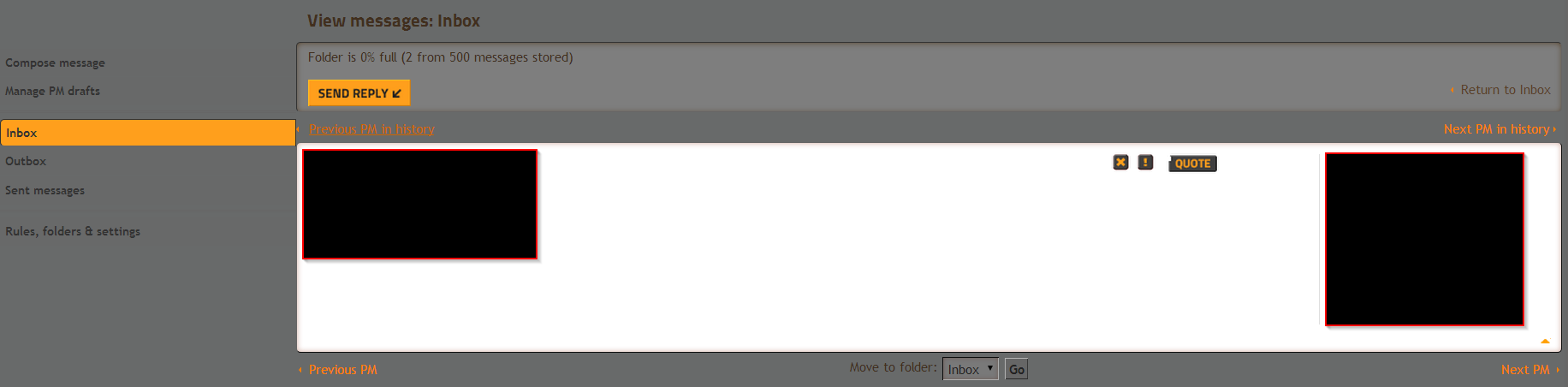
Posted: Sun Jun 08, 2014 2:11 pm
by theit8514
The Private Message Inbox window, the whole box is completely white with grey text and really hard to read.
Re: New forum skin
Posted: Sun Jun 15, 2014 1:54 am
by ShivaFang
Just so you know, this yellow on grey skin does not show up to guests. I just signed up to complain/ask for tips about a campaign map I'm frustrated with and was surprised that the entire UI appearance changed.
The other one looks much cleaner and friendlier - The yellow on grey is jarring.