Page 5 of 9
Re: Friday Facts #363 - 1.1 is getting close
Posted: Fri Nov 13, 2020 8:23 pm
by valneq
AntiElitz wrote: ↑Fri Nov 13, 2020 8:18 pm
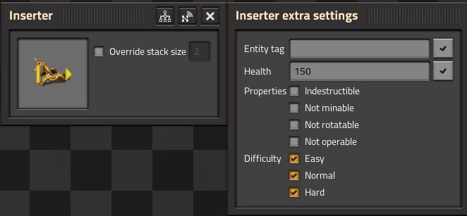
I don't quiet understand, the FFF literally has a screenshot of the inserter gui that usually has no inventory, but the inventory of the player is in the gui. Also i am really not sure what is the use case of having the player inventory open when configuring an inserter.
I guess the new GUI gives access to the item stack that the inserter is holding on to.
Re: Friday Facts #363 - 1.1 is getting close
Posted: Fri Nov 13, 2020 8:27 pm
by V453000
AntiElitz wrote: ↑Fri Nov 13, 2020 8:18 pm
V453000 wrote: ↑Fri Nov 13, 2020 7:34 pm
- if you uncheck the "Flat character GUI", you see either Logistics, or Crafting selectable by a tab. Not both. You only see both at the same time if the "Flat character gui" is turned on.
Ah cool! I got that wrong - thought the old option was removed, nice it's still an option!
V453000 wrote: ↑Fri Nov 13, 2020 7:34 pm
- We didn't add inventory to any entity, so splitters still don't have an inventory open. It's just that whenever any gui has an inventory, it's always on the left. This is inconsistent in 1.0, for example assembling machines have inventory at the bottom, a chest on the left.
I don't quiet understand, the FFF literally has a screenshot of the inserter gui that usually has no inventory, but the inventory of the player is in the gui. Also i am really not sure what is the use case of having the player inventory open when configuring an inserter.
Old:
New from FFF:
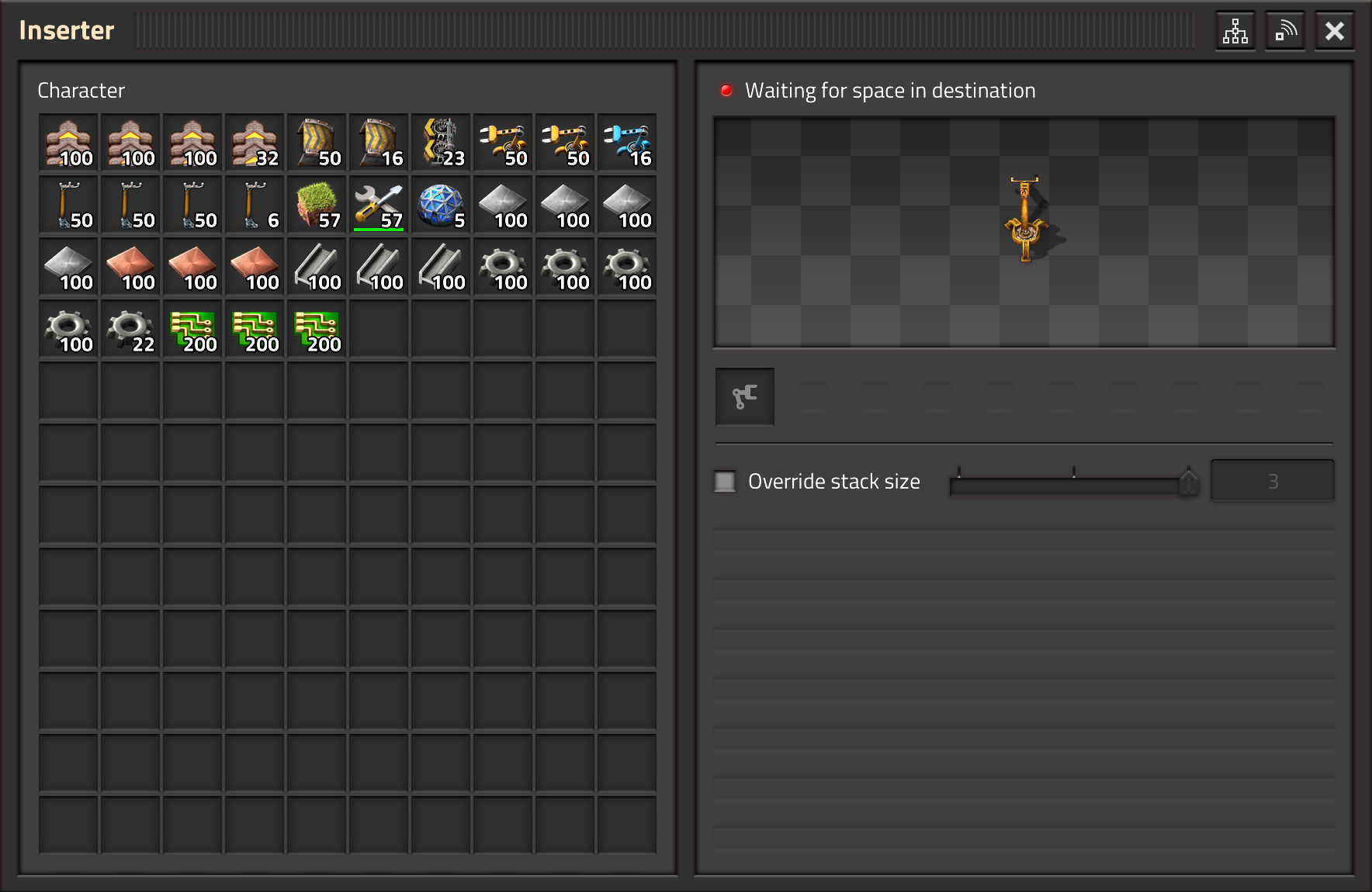
I forgot the inserter, it's because of the grabbed item slot that inserters now have since 1.1, fixed my post above. Sorry!

Re: Friday Facts #363 - 1.1 is getting close
Posted: Fri Nov 13, 2020 8:30 pm
by coppercoil
Kyralessa wrote: ↑Fri Nov 13, 2020 8:07 pm
You haven't lost them. On your Factorio account, you can download any major version all the way back to 0.6.4.
Yes, I know I can turn the time with a little mess. Why I can't do this with a zero clicks? Would it be possible to
rename Factorio017.exe to SeamlessConverter017.exe and insert it into the chain? (Please don't take it literally)
Re: Friday Facts #363 - 1.1 is getting close
Posted: Fri Nov 13, 2020 8:41 pm
by abadinvain
Nighttime lighting looks gorgeous, but, will it have hit on performance?
Re: Friday Facts #363 - 1.1 is getting close
Posted: Fri Nov 13, 2020 8:42 pm
by miturion
The lighting changes look really good!
Re: Friday Facts #363 - 1.1 is getting close
Posted: Fri Nov 13, 2020 8:50 pm
by jodokus31
coppercoil wrote: ↑Fri Nov 13, 2020 8:30 pm
Kyralessa wrote: ↑Fri Nov 13, 2020 8:07 pm
You haven't lost them. On your Factorio account, you can download any major version all the way back to 0.6.4.
Yes, I know I can turn the time with a little mess. Why I can't do this with a zero clicks? Would it be possible to
rename Factorio017.exe to SeamlessConverter017.exe and insert it into the chain? (Please don't take it literally)
Backward compatibility is dead weight. It's wise to remove it to increase maintainability by reducing lines of code and outdated logic
Re: Friday Facts #363 - 1.1 is getting close
Posted: Fri Nov 13, 2020 8:57 pm
by coppercoil
jodokus31 wrote: ↑Fri Nov 13, 2020 8:50 pm
Backward compatibility is dead weight. It's wise to remove it to increase maintainability by reducing lines of code and outdated logic
You can remove anything you want, just
keep that outdated code in a separate exe. Now I'm going to download OldFactoro.exe, can Factorio do it for me?
Re: Friday Facts #363 - 1.1 is getting close
Posted: Fri Nov 13, 2020 9:00 pm
by jodokus31
coppercoil wrote: ↑Fri Nov 13, 2020 8:57 pm
jodokus31 wrote: ↑Fri Nov 13, 2020 8:50 pm
Backward compatibility is dead weight. It's wise to remove it to increase maintainability by reducing lines of code and outdated logic
You can remove anything you want, just
keep that outdated code in a separate exe. Now I'm going to download OldFactoro.exe, can Factorio do it for me?
Interesting idea.
Re: Friday Facts #363 - 1.1 is getting close
Posted: Fri Nov 13, 2020 9:08 pm
by T-A-R
What is the point of showing the inventory next to inserters/combinators? It's duplicated functionality aswel, since you still need a selector for items which are not in your inventory.
Also in the new screen the "connect to logistic network" option could draw more attention.
About the flat GUI, I suggest to rename the first tab to "inventory" instead of "character", since it lacks armor/grid and equipped weapons/ammo.
Will the spidertron interface be flat/tabbed like the main gui?
Moving the weapon/armor screen to the bottom left is a really unpleasant surprising side effect of the added spidertron imo.
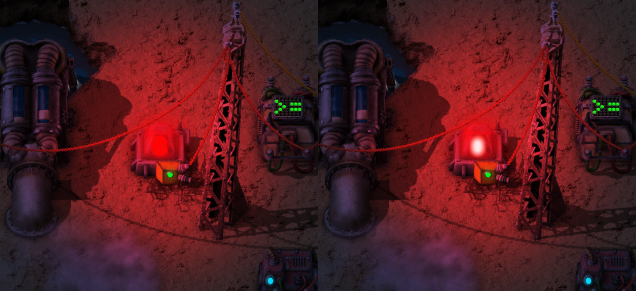
The lamp glow is much better as ambient lightning,
(for the nostalgic players to add green glow around the centrifuges:p). It makes me wonder how they perform (mix?) placed close together in multicolor setups.
+1 for
heat glow while we're on glow effects).
Re: Friday Facts #363 - 1.1 is getting close
Posted: Fri Nov 13, 2020 9:18 pm
by CorBlimey
hello. Very exciting content in 1.1
Are there any plans to add some more vanilla merch like mugs? T-shirts don't quite appeal to me but I would gladly admire my factory whilst sipping my coffee and tea from a Wube / green circuit mug. Also they would make great Christmas presents / stocking fillers
Re: Friday Facts #363 - 1.1 is getting close
Posted: Fri Nov 13, 2020 9:25 pm
by gGeorg
Character controls are on left, so where crafting is?
More serious, battery gauge is so tiny now is hard to see. When attacking, bitters, most common reason of my death is out of battery. Make it even smaller do not help. Can you keep battery in original size? Or better, make the battery gauge somewhat same as it looks like in the inventory. So it is better link in our brains.
Setting up inserter inside the inventory? Dont understand what is the purpose. Now it looks very confusing. Perhaps a short video could clarify ... .
Arrow to alert is smart. What about arrow contain the icon from the alert? So you better know which way is which alert.
Graphics, gorgeous. In the age of raytracing I am looking forward to yours the next big project.
Re: Friday Facts #363 - 1.1 is getting close
Posted: Fri Nov 13, 2020 9:50 pm
by 5thHorseman
Does the new drag locking for belts also work for undergrounds?
Re: Friday Facts #363 - 1.1 is getting close
Posted: Fri Nov 13, 2020 9:57 pm
by silvver
Are there any plans to add more QoL like sorting saves by name, time played, save date? (maybe also by version)
There is no problem when you have a few saves, but when you have much more, sorting them would be very usefull.
Re: Friday Facts #363 - 1.1 is getting close
Posted: Fri Nov 13, 2020 10:11 pm
by Yenz
silvver wrote: ↑Fri Nov 13, 2020 9:57 pm
Are there any plans to add more QoL like sorting saves by name, time played, save date? (maybe also by version)
There is no problem when you have a few saves, but when you have much more, sorting them would be very usefull.
1.1 will bring a search bar to find savegames by name at least.
Re: Friday Facts #363 - 1.1 is getting close
Posted: Fri Nov 13, 2020 10:38 pm
by 0xE1
Logistics taking 1/3 and middle of the Interface is awkward,
even more if you're playing without logistics, then it is super awkward.
Logistics probably would be much better on the left side, Inventory in middle and Crafting on the right side.
Re: Friday Facts #363 - 1.1 is getting close
Posted: Sat Nov 14, 2020 12:01 am
by NotRexButCaesar
sorahn wrote: ↑Fri Nov 13, 2020 11:35 am
And as tabs, the logistics menu is currently the 'far right' tab, so if flattened out, I would expect it to the far right panel.
How often do you handcraft things after unlocking bots? I practically don't handcraft at all. having the more often used thing closer will likely be much more convenient.
Jelmergu wrote: ↑Fri Nov 13, 2020 11:20 am
I am not so certain about the inventory revert, I quite like the way it is right now. It is less busy the way it is now, and most of the time you don't need both at the same time.
I like the proposed system better: I actually use the flat gui anyway.
Re: Friday Facts #363 - 1.1 is getting close
Posted: Sat Nov 14, 2020 12:48 am
by Drury
I like the tidy little window that opens up when you click an entity, like I'm not sure if I necessarily want a whole useless inventory when I'm just clicking an electric inserter. Not something to uninstall the game over, but seems like more of a weird downgrade in many cases for the sake of... I can't even tell, just consistency I guess? Meh.
EDIT: Well I just went and read the thread, makes a bit more sense now. Inserters have an inventory slot now, therefore they also get the inventory screen, splitters don't have it, so they don't get one. Didn't catch that, but still I kinda prefer the little window.
I never use the character tab for any reason other than to prank people in multiplayer by constantly changing my colors like a chameleon, no other complaints there. I also never use the logistics tab either so it's weird to have to have it on always, but whatever.
The arrows are a good idea, but I would prefer if they were arranged in a circle around the player character instead of stashed away at the edges. Why?
1. They're unnecessarily hard to spot when they're at the edges of the screen, especially if your monitor is huuuuuuge. You have to visually fish for them.
2. They go over the UI, which is fine if it's only when you hover over the alarm (i.e. not when the UI is being interacted with), but still strange to see.
Rich text selector, recipe notifications and belt build direction locking are godsends.
I just wanna say specifically a few words about the new night lighting. This is probably my favorite graphical change made to the game in the years I've been following it. I've always wondered how all those little lights and effects would look if they were being rendered at full brightness unaffected by the darkness, and voilá, a literal day and night difference! The fact that it's so technically simple is just a cherry on top. Love it so, so much. Oh god, those locomotive headlamps, even the top ones. Perfection. Do wagons have rear lights as well? Are there blue lamps on them too? Wouldn't mind if not, but if yes, that'd be so great.
EDIT: Also I'm thinking the discharging accumulators should still have some bright blue glow on them, they look a bit dim now.
As for the bonus icons - not gonna lie, at first I couldn't tell what most of them meant, but putting some thought into it I figured them out and now it seems obvious. Definitely an improvement over just red crosses everywhere.
Looking forward to all the new tech icons and broken mods too. No, really, it's gonna be as good an excuse as any to get the mod makers involved again after so many of them called it quits after 1.0.
So yeah, whenever you're ready.
Re: Friday Facts #363 - 1.1 is getting close
Posted: Sat Nov 14, 2020 1:07 am
by gGeorg
One nitpick, when improvin belt build. Make it so, with Alt key, it holds the belt orientation even when change line. e.g. instead of setting lef-right orientation (by R key) you rather press Alt and paint the whole belt by one mouse move. Include zig-zag. So it supports nice spaghetti builds

Re: Friday Facts #363 - 1.1 is getting close
Posted: Sat Nov 14, 2020 1:11 am
by gGeorg
0xE1 wrote: ↑Fri Nov 13, 2020 10:38 pm
Logistics taking 1/3 and middle of the Interface is awkward,
even more if you're playing without logistics, then it is super awkward.
Logistics probably would be much better on the left side, Inventory in middle and Crafting on the right side.
Yes. Inventory is the charater. So it is the middle. Perhaps allow panels shufle same as conditions for trains, so player can customize as it like.
Re: Friday Facts #363 - 1.1 is getting close
Posted: Sat Nov 14, 2020 2:41 am
by Illiou
Ok, the new light rendering looks sooo sick! Not to say lit...

In some instances though I think you took the "glow reduction" too far. For example centrifuge, lab, accumulator and heat pipes now barely, if at all, illuminate their surroundings. After all, what makes something look like a light is not only it being brighter than its surroundings, but also illuminating its surroundings. So if you would add back some glow, like you did for the furnaces, I think it would look even better.
I think this is also a great opportunity to make the colored lamps look more like an actual light source, namely by adding a close to white area in the center of the light. I have illustrated what I mean in the image below. No matter how colored, light sources nevertheless are usually close to white at their center. Look at depictions of lightsabers for an extreme example: they are basically completely white, only glowing with the color.
- lamp white center comparison.jpg (188.61 KiB) Viewed 6763 times
Btw, the steam locomotive is also burning stuff, maybe a slight orange glow from the cabin would look cool.
Regarding the alert icons: glad to see they get some attention! But my biggest hope is that, while you're at it, you're finally implementing that different icons are shown side-by-side, so that new alerts are actually even visible...
I also have to say that the arrows look kind of rough and... alpha-ish? If they aren't final, fine, but otherwise I think they need more polish and adjustment to the design aesthetics of the game. The also look pretty weird so close to the edge, I would place them more towards the center.
I do think the character tab has good reason to be in the game and am a bit sad to see it go. Maybe it should be opened by clicking the new character icon in the bottom left instead? Having all this stuff together in one window makes a lot of sense in itself.
PS: maybe not final anyway, but for clarity the text field icon selection window should probably be titled "Insert icon" instead of "Select icon".