Page 11 of 11
Re: Friday Facts #339 - Beacon HR + Redesign process
Posted: Thu Mar 26, 2020 12:55 pm
by Guilwin
I like the suggestions of server farm-style beacons.
I also had in mind that design ideas could come from boat radars like the ones in the picture below (either the spheric thing or the rotating bars - or both) in order to keep a neutral/familiar look but different from the existing radar building.

- Best-Marine-Radar-Reviews-680x350.jpg (8.36 KiB) Viewed 8919 times
[edit] And if the lightning/Tesla coil idea MUST be kept in the new design, I would suggest to put all the "electricity" inside a ball like those plasma lamps :
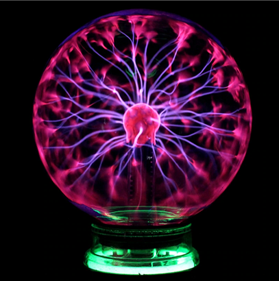
- plasma-ball-lamp.png (247.6 KiB) Viewed 8891 times
It would make the whole thing look less dangerous and possibly less eye-catching as well, since this is something many people seem to dislike in the new design.
Re: Friday Facts #339 - Beacon HR + Redesign process
Posted: Thu Mar 26, 2020 4:22 pm
by XBBX
First of all i don't like new beacon it looks out of place in picture with furnaces its like some alien tech added to factory
Second idea what about adding small black hole to towers top like its effecting time around
Black hole makes no sense but what ever sounds cool why because black holes effect is slowing time in effected area relative to outside not speeding up white hole? maybe no ok
Re: Friday Facts #339 - Beacon HR + Redesign process
Posted: Fri Mar 27, 2020 12:01 am
by leadraven
Guilwin wrote: ↑Thu Mar 26, 2020 12:55 pm
[edit] And if the lightning/Tesla coil idea MUST be kept in the new design, I would suggest to put all the "electricity" inside a ball like those plasma lamps :
plasma-ball-lamp.png
It would make the whole thing look less dangerous and possibly less eye-catching as well, since this is something many people seem to dislike in the new design.
It looks more like Lab already.
Re: Friday Facts #339 - Beacon HR + Redesign process
Posted: Fri Mar 27, 2020 5:07 am
by Sea_Kerman
+1 to the server rack or cooling tower/computer heatsink idea.
Re: Friday Facts #339 - Beacon HR + Redesign process
Posted: Fri Mar 27, 2020 12:05 pm
by Neotix
I also prefer some kind of server over that alien tower.
For inspiration devs could look at pc cases steampunk mods.
For example
http://www.eelambiense.com/projectlogs/ ... nal_10.jpg
It could be even modular, base with 2 slots and when we place module it would be shown in the slot. Each module could look little different.
Re: Friday Facts #339 - Beacon HR + Redesign process
Posted: Fri Mar 27, 2020 2:31 pm
by Guilwin
leadraven wrote: ↑Fri Mar 27, 2020 12:01 am
Guilwin wrote: ↑Thu Mar 26, 2020 12:55 pm
[edit] And if the lightning/Tesla coil idea MUST be kept in the new design, I would suggest to put all the "electricity" inside a ball like those plasma lamps :
[...]
It would make the whole thing look less dangerous and possibly less eye-catching as well, since this is something many people seem to dislike in the new design.
It looks more like Lab already.
Actually, it would be logical to have similarities between building designs, with all this technology being created by a single engineer, one could expect that parts of it will be reused from time to time.
The complete design for a beacon could be multiple "plasma balls" atop a "server rack", with the bottom part "creating" the beacon effect and the plasma balls "transmitting" the effect in the area (which is the idea behind the current beacon building design I guess). There could be one plasma ball for each module slot, possibly changing color depending on the module type used for each slot. Then it wouldn't really look like a Lab.
Re: Friday Facts #339 - Beacon HR + Redesign process
Posted: Tue Mar 31, 2020 11:46 am
by The_Dark_Nate
Ive lurked for years and always read FF news. But this is one thing i need to put my opinion in on.
I appreciate that alot of time went into this, however the final design is not great.
- Having the building as diffferent sprites defeats the object of factorios 'clean layout' principle.
- Having the spire just makes it look ridiculous. It is not neccessary
- And lastly, and this is the one thing i would urge you to reconsider - no other building in the game looks like i flayed a biter and used it's skin as the building, so why does this look flesh colored.
Re: Friday Facts #339 - Beacon HR + Redesign process
Posted: Sat Apr 04, 2020 4:14 am
by Vansaar95
Please update Power switch graphic too.
Re: Friday Facts #339 - Beacon HR + Redesign process
Posted: Sun Apr 05, 2020 10:15 am
by MrFaul
I don't like the "tower" idea of the beacon.
But I think this design is going somewhere
Lose the pin on top, sink it deeper into the hole to reduce the complexity.
Basically a hole in the ground with mysterious suspended machinery inside.
Add some sort of "cabling and piping" decals around it that indicate its range so its looks like it is reaching.
My biggest gripe with the beacon is that it doesn't show its purpose clearly like all the other things.
The decal method that sorta shows it range could be a awesome way to show that it does something.
"Animated decals" with occasional arcs between the cable and pipes would be ultra.
"The amount" of decals in a given area even soft indicates how many beacons are around so farms look nicer.
Re: Friday Facts #339 - Beacon HR + Redesign process
Posted: Wed Apr 08, 2020 9:32 am
by thewrulph
I also think this design might work but with a few changes. I like the look of it (awesome looking designs in general) but as others have pointed out as a replacement for the beacon I think some changes would be best.
- Make it a more neutral color, shouldn't stick out so much since it will be heavyily used.
- Remove the antenna. I understand the thought behind it, but I think it makes it too cluttered.
- Add in some vertical slotted "modules/boxes" in a ring around the tower (to illustrate the modules that we actually put in there).
That way it would be sort of like a "server" that we slot in the actual modules.
Re: Friday Facts #339 - Beacon HR + Redesign process
Posted: Mon Apr 20, 2020 2:03 pm
by slikts
Sorry for the "me too" comment, but I just want to reiterate that it's always been unfortunate that the reward for reaching late game is that optimized designs must become messier/busier and visually dominated by beacons. The updated graphic is interesting on its own, but just exacerbates the issue and misses the opportunity to allow for a cleaner look.
Re: Friday Facts #339 - Beacon HR + Redesign process
Posted: Thu May 07, 2020 5:49 pm
by ytsejam
I don't understand this design at all. It looks more like a rocket. Imagine a late-game factory with hundreds/thousands of those things everywhere.
Re: Friday Facts #339 - Beacon HR + Redesign process
Posted: Sat Jan 30, 2021 8:50 am
by lacika2000
Jugglered wrote: ↑Fri Mar 20, 2020 8:04 pm
Optera wrote: ↑Fri Mar 20, 2020 7:45 pm
lacika2000 wrote: ↑Fri Mar 20, 2020 6:17 pm
I would love to have a Tesla coil based defense structure, a la Red Alert 2, though. Food for thought?
Thanks, now i cant unsee that thing as tesla coil.

I agree on the RA2 tesla coil base defense structure. maybe use the design as an intermediate between gun turret and laser turret. doesn't do as much damage as laser, maybe different range, but an earlier access to a defense structure that doesn't need ammo.
I like this approach. Make it shorter range but more spread: it could also have an upgradable 'jump' effect, so that the arc jumps from one enemy unit to another with decreased impact (like chain overload in MassEffect3 multiplayer). Upgrading it would add a higher number of enemies where the effect would jump to, so at a later stage it could be really effective against hordes or enemy unit in short range, for example in front of the wall. Upgrading would, of course, also increase electricity consumption.
Re: Friday Facts #339 - Beacon HR + Redesign process
Posted: Mon Jun 21, 2021 8:00 pm
by redis
This new beacon design is the ugliest thing ever in factorio. I am not sure how anyone likes it compared to the classic beacon. The old beacon was creating a sense of dynamic with rotating tops and colors were matching. It was creating sense of volume for the entire factory. The new beacon does not blend aesthetically with its odd pinkish tint and flat look at all with any other entities of the factory. In large numbers these beacons create a sense of some strange messy piles of **** with sticking motionless needles. For example mining machines graphics redesign was spot on, but this is just a failure.
Re: Friday Facts #339 - Beacon HR + Redesign process
Posted: Fri Jun 25, 2021 7:03 pm
by BrainlessTeddy
redis wrote: ↑Mon Jun 21, 2021 8:00 pm
This new beacon design is the ugliest thing ever in factorio. I am not sure how anyone likes it compared to the classic beacon. The old beacon was creating a sense of dynamic with rotating tops and colors were matching. It was creating sense of volume for the entire factory. The new beacon does not blend aesthetically with its odd pinkish tint and flat look at all with any other entities of the factory. In large numbers these beacons create a sense of some strange messy piles of **** with sticking motionless needles. For example mining machines graphics redesign was spot on, but this is just a failure.
This post is pretty old and the beacon redesign was scrapped long ago.
Re: Friday Facts #339 - Beacon HR + Redesign process
Posted: Fri Jun 25, 2021 8:46 pm
by redis
BrainlessTeddy wrote: ↑Fri Jun 25, 2021 7:03 pm
redis wrote: ↑Mon Jun 21, 2021 8:00 pm
This new beacon design is the ugliest thing ever in factorio. I am not sure how anyone likes it compared to the classic beacon. The old beacon was creating a sense of dynamic with rotating tops and colors were matching. It was creating sense of volume for the entire factory. The new beacon does not blend aesthetically with its odd pinkish tint and flat look at all with any other entities of the factory. In large numbers these beacons create a sense of some strange messy piles of **** with sticking motionless needles. For example mining machines graphics redesign was spot on, but this is just a failure.
This post is pretty old and the beacon redesign was scrapped long ago.
That is right it is old, but sometimes you need to give something a test of time. Large bases with the redesigned beacon look particularly ugly. Bases which use mods built before this redesign look even worse (for example krastorio). Many new players did not even see the original beacon so they have no idea what to compare with and others just don't care and there is a mod to reskin. I am not sure I am a minority with this opinion.
The idea to "fix" this (since going back to old one is not an option) is to develop a new third design and hire some other designer for it with a fresh look.
Re: Friday Facts #339 - Beacon HR + Redesign process
Posted: Fri Jun 25, 2021 8:49 pm
by BrainlessTeddy
redis wrote: ↑Fri Jun 25, 2021 8:46 pm
That is right it is old, but sometimes you need to give something a test of time. Large bases with the redesigned beacon look particularly ugly. Bases which use mods built before this redesign look even worse (for example krastorio). Many new players did not even see the original beacon so they have no idea what to compare with and others just don't care and there is a mod to reskin. I am not sure I am a minority with this opinion.
Yes, I also hate this redesign but tbh I have long forgotten about it. I just thought you didn't realize how old it is.