Page 3 of 11
Re: Friday Facts #320 - Color correction
Posted: Fri Nov 08, 2019 6:27 pm
by DanGio
Looks good. Can't wait to test this.
Re: Friday Facts #320 - Color correction
Posted: Fri Nov 08, 2019 6:31 pm
by nevniv
A little too colorful, I think. I'm a little confused...its been admitted that the game has a dark theme, why make it colorful? It is not fitting. ToeJam & Earl can have colorful planets, rainbow trees, etc..
Re: Friday Facts #320 - Color correction
Posted: Fri Nov 08, 2019 6:33 pm
by valneq
Holy Cow. With these juxtapositions I realize how bad my monitor is. Whether I prefer the new or the old look of the entities depends on the angle from which I look at my monitor

Apart from that: *Thumbs up* for the new map colors. Waaay easier to read. Although you may now revisit the resource colors: I am not sure the vibrant pink of the oil now really fits on all possible terrain. [add:] Especially the single oil patch in between the trees at the bottom hurts my eyes. [/add]
And I for sure like the added variety in the tree colorings. Taking inspiration from alien biomes is not a crime

Re: Friday Facts #320 - Color correction
Posted: Fri Nov 08, 2019 6:34 pm
by Omarflyjoemacky
Love the new colors\brightness. I play on a 55" 4K screen - will be an awesome improvement. Also, the map view - very awesome.
Seems the community is somewhat split, but A-OK with me!
Re: Friday Facts #320 - Color correction
Posted: Fri Nov 08, 2019 6:41 pm
by Honktown
Why not like... have gamma correction and stuff in the settings?
Re: Friday Facts #320 - Color correction
Posted: Fri Nov 08, 2019 6:42 pm
by T-A-R
Too much sugar. (but a rather subjective topic)
I agree that the nighttime could be improved (i hate night vision, brrr) but these examples feel overboard. I dislike the blue hue. (the old night situation picture just looks much better, it has atmosphere, depth). The blue hue is like blue goggles not helping the original "problem".
I admit i see value of a 'warmer' desert and your trees are real pieces of art, but overall the light is too bright, too orange.
particular the provider chest and underground belts. I like my factory worn out, foggy, rusty and dirty due to endless exhaust of more and more dirt.
The new light feels like there are spotlights all over the place, to make this toyland tech shine bright and sweet, craving for a candy mod (refining sugar, adding artificial colors and flavours, wrapping them in colorful glitter plastic and distribute them to poison and pollute the local biters, feeding their addictive obesity, the world of a marketeer).
Picture show that improvement really can be made, but you are not there yet, it became less natural looking to me, and i prefer the old pictures.
Re: Friday Facts #320 - Color correction
Posted: Fri Nov 08, 2019 6:48 pm
by Krazykrl
The change to the brightness and contrast looks great on my properly configured IPS monitor(
http://www.lagom.nl/lcd-test/ ). Yes it looks less gloomy, but midday actually looks like midday due to increased contrast. Additionally it substantially helps usability to use the entire dynamic range of the color information you are trying to convey.
Re: Friday Facts #320 - Color correction
Posted: Fri Nov 08, 2019 7:10 pm
by porcupine
Just some attempted constructive criticism here. The new changes are welcome as far as I'm concerned, especially on the map views. Trees with actual different colors? Beautiful. Things do look a tad oversaturated/etc., but that said, the wooden boxes, and the stone tiles look distinctly worse under the new lighting:
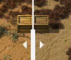
- snip1.JPG (12.6 KiB) Viewed 5381 times
The wooden chest no longer looks weathered, looks too clean.
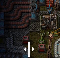
- snip2.JPG (20.87 KiB) Viewed 5381 times
It's harder to see, but the stone path looks like it's lost a lot of detail/definition being washed out with the new lighting. The worst part is, for the stone tile, the "brighter" version doesn't even really look brighter, just looks washed out.
Re: Friday Facts #320 - Color correction
Posted: Fri Nov 08, 2019 7:24 pm
by Rahbek
To add my $0.02...
Going by the pictures in order of their appearance in the blogpost:
1) I don't outright disagree with the idea that factorio might've been too dark but I don't feel that this is the right way.
While there is some instances in which the higher saturation looks "alright" there is quite a few (already mentioned by others) where it is way too much so that over all factorio loses its "rustic" feel to much of the machinery.
I think its a good idea but needs more tweaking to get it right.
2) Overall it feels nicer, trees definitely an upgrade. The grass seems a bit too orange-y to me but other than that it feels like a good change.
3) I am not sure how I feel about the orange sand yet. But as mentioned above the chests definitely need fixing!
4) Map feels more readable in terms of colours. Somewhere in this thread the suggestion was made to change the oil patch color ... sounds like a good suggestion to me. That pink feels out of place.
Re: Friday Facts #320 - Color correction
Posted: Fri Nov 08, 2019 7:30 pm
by EnerJi
Love the intent behind these changes. I'm seeing the images on a phone so I don't have any specific feedback because It'll probably look a little different on my computer, but I like what I see so far.
One thing that I wasn't totally sure about is whether the intent is to make it easier to see at night? I realize that for "game" reasons (in order to have a use for lights and night vision goggles and things like that) night can't be too bright.
But, right now I find it quite hard for my tired eyes to see at night. So much so that if I'm about to build something new I will almost always wait for night to be over which is obviously a big waste of time and doesn't exactly add to my enjoyment. So I hope night gets quite a bit brighter and easier to see. A gamma option that affects brightness at night in the settings would also be a welcome option in addition to or instead of making night brighter.
Re: Friday Facts #320 - Color correction
Posted: Fri Nov 08, 2019 7:37 pm
by ownlyme
i bet the dev who wrote this uses my blood mod with rainbow preset
fur_and_whiskers wrote: ↑Fri Nov 08, 2019 6:08 pm
Hey guys, looks like a lot of work went into this
Not at all.
Letting a batch image processor run over all the images is 2 clicks...
Guess that's also what i'm going to do to desaturate this candyland nightmare when they really ruin the game even more.
0.17 already was too vibrant, it seems like an april's fools joke to me that they want to make it even worse.
I liked the muddy look, that industrial theme of the game, the pollution, the life-hostile environment, the creepy biters from 0.16 (not those wannabe cute-eyes from 0.17)
Re: Friday Facts #320 - Color correction
Posted: Fri Nov 08, 2019 7:47 pm
by seludovici
Looks great team. The best change you made was making the forests on the map view have greater contrast; I never could see those.
Re: Friday Facts #320 - Color correction
Posted: Fri Nov 08, 2019 8:04 pm
by bbgun06
I like the new colors. I would also like to see more improvement to the map view, with different types of entities in different colors.
The capability is there:
https://mods.factorio.com/mod/Enhanced_Map_Colors
Re: Friday Facts #320 - Color correction
Posted: Fri Nov 08, 2019 8:04 pm
by OBXandos
I don't mind the color changes. I think they are close enough to still be acceptable to me.
What I am more interested in are the LUTs. Is that going to be something mod makers have access to change or create new ones? One of the great features of Cities Skylines was the ability to add LUTs to change what your city looked like. I would love to have that option here too. Synthwave Factorio here I come!(Hopefully)
Re: Friday Facts #320 - Color correction
Posted: Fri Nov 08, 2019 8:13 pm
by Serenity
I would love to at least have the belt colors on the minimap
Re: Friday Facts #320 - Color correction
Posted: Fri Nov 08, 2019 8:32 pm
by mikes61293
This seems like a decent idea taken a few steps too far. The revised saturation and brightness make the game look almost cartoonish.
Factorio has a lot of different colors to represent the different items/levels of development. They don't look too out of place due to the overall muted color palette. However, with the revised saturation levels turn the denser areas into a sea of color, the worst offenders being the inserters.
I think the game can be brightened up but should be dialed back a few notches from the current iteration.
Re: Friday Facts #320 - Color correction
Posted: Fri Nov 08, 2019 8:35 pm
by equitime77
Finally, theres lots of us been asking for this for years! Cant wait to try it out, will give the game a fresh new look and much less eye strain.
Re: Friday Facts #320 - Color correction
Posted: Fri Nov 08, 2019 8:37 pm
by Quarnozian
The results look pretty good on my IPS panel. I was worried when you said "brighter" at first, because I immediately thought of my TN panel, which makes bright colors look unnaturally fluorescent for some dumb reason... even after calibration.
Still looks terrible on my TN panel... but
everything looks bad on that screen.

I might try calibrating it again... but I'm pretty confident it's just the panel itself.
Re: Friday Facts #320 - Color correction
Posted: Fri Nov 08, 2019 8:40 pm
by Koub
I welcome the map changes. I mean really.
I also like the terrain/tree changes. However, I have mixed feelings with the factory part. Maybe it's just the novelty, and I'll get used to it quickly, but I also feel the colors are too vibrant for the game Factorio is. Luckily I also have a factory calibrated screen, so at least I have the colors the devs intend, but I think the new graphics, albeit beautiful, and crisp and bright, don't fit the Factorio theme. Especially if pollution doesn't dull everything.
Re: Friday Facts #320 - Color correction
Posted: Fri Nov 08, 2019 8:42 pm
by Serenity
The terrain changes are definitely great. I don't mind the factory changes in general. Some brightness there doesn't hurt. But some things like the green circuits don't look too good. The yellow/gold circuit paths on them are way too bright now