Page 7 of 9
Re: Friday Facts #246 - The GUI update (Part 3)
Posted: Mon Jun 11, 2018 4:25 am
by Alice3173
sporefreak wrote:One thing that really bugged me was that I was unable to easily set a setting back to its default. If I changed pollution decay for example and didn't pay attention to its value before changing it I would never remember the default is 2 without resetting everything.
I think I am getting my point across, but I propose a fix to this:
Double clicking a slider will reset only that slider to its default setting.
This is easy to avoid doing on accident (If you know how to do it) and will easily allow changing a single slider at a time until you get the exact setting you want.
Rather than double click, right click would be a better option. Much more difficult to accidentally trigger that. Especially for people like me who have a mouse which works perfectly fine other than sporadically triggering a double click when you just click once.
Re: Friday Facts #246 - The GUI update (Part 3)
Posted: Mon Jun 11, 2018 5:07 am
by eradicator
Alice3173 wrote:sporefreak wrote:One thing that really bugged me was that I was unable to easily set a setting back to its default. If I changed pollution decay for example and didn't pay attention to its value before changing it I would never remember the default is 2 without resetting everything.
I think I am getting my point across, but I propose a fix to this:
Double clicking a slider will reset only that slider to its default setting.
This is easy to avoid doing on accident (If you know how to do it) and will easily allow changing a single slider at a time until you get the exact setting you want.
Rather than double click, right click would be a better option. Much more difficult to accidentally trigger that. Especially for people like me who have a mouse which works perfectly fine other than sporadically triggering a double click when you just click once.
The
mod settings page needs a per-mod reset so much. Having to reset all settings for all mods just because one of them isn't working properly is maximum frustration ensured. Additionally having a per-setting reset option would be pretty awesome too though (still need the per-mod thing for mods with lots of settings though).
Re: Friday Facts #246 - The GUI update (Part 3)
Posted: Mon Jun 11, 2018 6:58 am
by Zaflis
UI looks nice overall. 1 thing is noticeable, the 2 small buttons for importing and exporting map exchange string. It really needs to be expressed with captions on buttons. The small arrow icons look too vague, even slightly mysterious on what they are there for. What does the small flat plane represent, the game or clipboard... Player can't be left with these questions

Re: Friday Facts #246 - The GUI update (Part 3)
Posted: Mon Jun 11, 2018 7:14 am
by eradicator
Zaflis wrote:UI looks nice overall. 1 thing is noticeable, the 2 small buttons for importing and exporting map exchange string. It really needs to be expressed with captions on buttons. The small arrow icons look too vague, even slightly mysterious on what they are there for. What does the small flat plane represent, the game or clipboard... Player can't be left with these questions :P
I remember reading a whitepaper once (can't find the link :x) about how designers often prefer using icons because they assume those are more universal and easier to understand, when in reality people understand buttons with text far better than icons. Cultural differences play a role there, but even if the icon designer and user are from the same cultural sphere the effect is still there.
Re: Friday Facts #246 - The GUI update (Part 3)
Posted: Mon Jun 11, 2018 7:59 am
by Engimage
I really enjoy where UI is going.
However I have to second several corcerns around:
- Inconsistency of Switches vs Checkboxes
- I do not like the idea of buttonish input fields. No matter the reasoning you give here @glex the best UI is the one you should not explain to people. It should be intuitive but this particular feature is not at all.
- Custom map presets are very welcome. I do understand this is another new feature but it is long expected and would fit really well here.
- Some dropdowns like difficulty could also become a slider. However sliders might be accompanied by a text representation near it. Yes this might take more space but I see it beneficial overall. You might consider making it a popup when hovering over a setting or moving the slider.
Re: Friday Facts #246 - The GUI update (Part 3)
Posted: Mon Jun 11, 2018 9:09 am
by Gecko
OH MY GOD!
I'm so excited! The
GUI looks amazing with the 'directional flowing buttons'!
I got to admit... I let the game rest for quite some time. I even stopped(!!) reading the FFF. And all this while wearing my Factorio T-shirt... Right now? I'm hyped. I'm sooooo hyped. The dark grey, the nice sliders, well-arranged GUI elements and now these flowing buttons? I think I go and warm up, boys! The game may be the same, yes, but as the saying goes "You eat with your eyes (first)!".
Also, henceforth I'm only previewing maps. How cares about playing any more? Those sweet sweet tech-looking ore indicators? Yes, please!
Srsly, you should implement those in-game, too!
One thing though...
Nova wrote:Please give me numbers for the sound [personal EDIT: not just sound but numeric values in general should be directly modifiable] settings! I don't want to frickle with the setting and have them "nearly the same" because I can't see if they are aligned. I want to see at what value they are and maybe even set the to precise ones. Especially when I change them for something and then change them back. I don't want to have to guess at what value they were, I want to exactly place them at the same value as before.
Re: Friday Facts #246 - The GUI update (Part 3)
Posted: Mon Jun 11, 2018 9:58 am
by mrvn
Just some comments:
1) Sliders for floating point numbers, like the evolution settings, should allow editing the number directly.
2) Add a mute button to the sound settings so sound can be turned off without loosing settings.
3) Even better add presets to the sound setting. e.g. Default, Mute, NoMusic.
Re: Friday Facts #246 - The GUI update (Part 3)
Posted: Mon Jun 11, 2018 12:42 pm
by Jigsawn
Just gotta say I am blown away with the amount of time and effort you guys are putting into making the GUI clean, intuitive and attractive. You are putting many other complex management/sim games to shame and the results speak for themselves. Look at early access titles like Prison Architect, which has a GUI full of inconsistencies and flaws, and you can see why it's so important to do a really good pass on the GUI before the final release.
I've done console game GUI design and that's hard in itself, I do not envy you guys with a PC game and such a large number of screens to work with, so major props are in order! Plus this sets you up in the future to take your GUI tech and the lessons learned into future titles to make it a far easier process next time round.
Other devs take note, this is how you approach GUI design right!
Re: Friday Facts #246 - The GUI update (Part 3)
Posted: Mon Jun 11, 2018 3:54 pm
by Sander_Bouwhuis
Henry Loenwind wrote:Sander_Bouwhuis wrote:
I'm not sure why Microsoft manages to get fonts right, and none of the competitors can get it to work right. Does anyone here know about Linux or Apple and can tell me what the problem is?
Funny thing is that technically Microsoft is the one rendering the fonts
wrong.
Without going into too much depth: Rendering fonts is tricky because they are vector shapes with round parts, diagonals and differing line width---and the screen is made up of (not very small) square dots. Imagine making a circle out of normal Lego blocks. Microsoft's solution is to move the letters around until they fit the pixel raster best. Apple on the other hand renders them where they actually are and uses grays for half-filled pixels. (Which actually is very useful if you're designing a print product, because it looks exactly as it would after being printed. That is, as far as I know, the root for the decision to work this way.)
And with modern hi-dpi/retina displays, Apple's strategy gives the better results. It will just look bad to you when all you see is screenshots on a low-dpi display. That also is what's happening with the mock-ups. Look at the full-sized images, there the text is sharp. Only the scaled-down version have blurry text.
That is interesting information. As far as I know Linux (and maybe Apple?) have been doing this for years. Well before people had 4k monitors. So, why couldn't Linux developers do the same as Microsoft to get the text sharp? Is it patents?
Re: Friday Facts #246 - The GUI update (Part 3)
Posted: Mon Jun 11, 2018 6:53 pm
by zOldBulldog
I kind of like the direction this is going.
One request for the map generator... please allow us to zoom the preview map, maybe to get an ore tooltip when we mouse over things, and put some marker to indicate the spawn point (so that we can find it even when we move the map). Not all of us have perfect vision.
Re: Friday Facts #246 - The GUI update (Part 3)
Posted: Mon Jun 11, 2018 8:02 pm
by Lubricus
Henry Loenwind wrote:Sander_Bouwhuis wrote:
I'm not sure why Microsoft manages to get fonts right, and none of the competitors can get it to work right. Does anyone here know about Linux or Apple and can tell me what the problem is?
Funny thing is that technically Microsoft is the one rendering the fonts
wrong.
Without going into too much depth: Rendering fonts is tricky because they are vector shapes with round parts, diagonals and differing line width---and the screen is made up of (not very small) square dots. Imagine making a circle out of normal Lego blocks. Microsoft's solution is to move the letters around until they fit the pixel raster best. Apple on the other hand renders them where they actually are and uses grays for half-filled pixels. (Which actually is very useful if you're designing a print product, because it looks exactly as it would after being printed. That is, as far as I know, the root for the decision to work this way.)
And with modern hi-dpi/retina displays, Apple's strategy gives the better results. It will just look bad to you when all you see is screenshots on a low-dpi display. That also is what's happening with the mock-ups. Look at the full-sized images, there the text is sharp. Only the scaled-down version have blurry text.
That is actually old Adobe technology (1984). They are doing some funky stuff as part of the font handling in postscript to make vector fonts look good at low resolutions.
Re: Friday Facts #246 - The GUI update (Part 3)
Posted: Tue Jun 12, 2018 12:25 am
by Jap2.0
I support custom presets. Also, yes, anything with a number should be able to be edited directly.
Re: Friday Facts #246 - The GUI update (Part 3)
Posted: Tue Jun 12, 2018 3:34 am
by Saevon
Looking at the map generation I see a few things:
1) I still don't see any help text for "frequence" "size" and "richness", I know most of my friends get confused over the options, and even I do too after a while between starting new maps.
A Hover text or a "?" icon for more information would be really useful here.
2) Similarly the Enemy values are hard to remember: group size? expansion distance (btw minimum expansion distance should be editable)
3) I agree with others, the Numbers beside the sliders should be directly editable, I often paste my desired numbers, its hard to know where to put the slider. Especially with polution, since there are different factors
Also reminds me of a feature I've wanted: Using a different seed for Land gem, and resources. I usually try to aim for maps with continents, and aim at specific landmasses, once that is done, then I check on the resources. It would be very good to be able to generate the same map (biomes, water, shape, cliffs?) then regenerate the resources (without having to change frequencies)
Another thing I've noticed, is there are a few mods messing with map generation (RSO, Island Maps, etc) it could be interesting to have an option for "map generation type" or a checklist for which ones to enable. Especially if the game includes some default varieties (Continents, Lakes, Rivers) or similar
Re: Friday Facts #246 - The GUI update (Part 3)
Posted: Tue Jun 12, 2018 6:00 am
by Koub
As a preambule, I'm not a GUI expert, nore a GUI designer, I'm just a user of a shitload of things, each with their own interface, and often dismayed at the GUI choices I face in my everyday life.
I think every single item in the GUI should support mouse over tooltip. I'm not saying there should be a tooltip on literally everything all the time, but there should be a builtin and straightforward way to ad a tooltip to about anything. This way, every option, every mapgen setting, ... can get an explanation on its exact effect, if needed, without actually eating up display space on the GUI. Have a look at VLC options if you want to see what I mean.
Every slider (whether discrete or continuous) should support mouse-over mouse wheel scroll adjustment. For discrete sliders (like in terrain settings), the tooltip should display the setting value.
Continuous sliders should have reasonable increments when modified with mouse-over + wheel (not too small, because having a one pixel increment size would be bothersome).
What is the conceptual difference between those buttons (why the shape difference) ?

- 2018-06-12 07_34_33-Friday Facts #246 - The GUI update (Part 3) _ Factorio.jpg (2.82 KiB) Viewed 5578 times

- 2018-06-12 07_35_11-Friday Facts #246 - The GUI update (Part 3) _ Factorio.jpg (3.24 KiB) Viewed 5578 times
(I'm not sure, but I think this might have been already pointed). Also, a button should keep a reasonable size to be percieved as a button. I actually didn't see the half screen play button on the map preview at first, I thought it was some sort of gui decoration.
On the next screen capture, two things bother me :
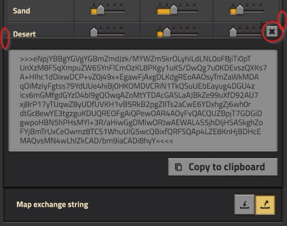
- 2018-06-12 07_46_52-Friday Facts #246 - The GUI update (Part 3) _ Factorio.jpg (59.38 KiB) Viewed 5578 times
First, the [X] at the top right. I mean I'm used to the "click X to close", but it's the only pane/window where we see it. Plus it's the only GUI element that sticks out of its pane. I find it disturbing.
Second, whenever part of a gui opens in front of the another, there should be :
- either naturally enough contrast (or size difference) to tell foreground and background on first glance
- or a darkening of the background to artificially highlight the foreground limits.
The limits of the exchange string pane are perfectly aligned with the background pane, and the color difference between both is tiny. As a result, it takes time for the brain to process the information. It is aesthetical, but less efficient in terms of pure GUI efficiency. I think the longer the brain has to work to figure things, the less a GUI is efficient.
Re: Friday Facts #246 - The GUI update (Part 3)
Posted: Tue Jun 12, 2018 7:17 am
by eradicator
Koub wrote:I think every single item in the GUI should support mouse over tooltip.
I only know the modding side of things ofc, but this is already possible. The tooltip is a fundamental property of every GUI element. So you could have tooltips on the window
frame if you wanted. I'd definetly appreciate if they made the effort to write a tooltip for every button of course =).
Koub wrote:
Second, whenever part of a gui opens in front of the another, there should be :
[...]
- or a darkening of the background to artificially highlight the foreground limits.
Most definetly. Though i think i prefer blend-to-white over blend-to-black, but that's only tiny details.
Re: Friday Facts #246 - The GUI update (Part 3)
Posted: Tue Jun 12, 2018 9:12 am
by ratchetfreak
maybe make the sync mods with save button a bit more obvious, it completely blends in with the rest of the window.
Re: Friday Facts #246 - The GUI update (Part 3)
Posted: Tue Jun 12, 2018 2:35 pm
by Amarula
Like many others, I am really happy with the direction of the GUI. I am wondering what if any changes are planned for the mini-map. I had actually started to draft up a page for the wiki (which is awesome thank you Bilka and Gangsir et al) describing the blueprint library (which totally confused me and I played for months without figuring out how to use the library until I found the reddit thread describing how to use it) and realized there was no page for the mini-map, so I started a draft for that. There isn't any point doing more work on those drafts if they are totally changing, but they are work in progress under my wiki page (
https://wiki.factorio.com/User:Amarula) if anyone wants to look and comment.
Re: Friday Facts #246 - The GUI update (Part 3)
Posted: Tue Jun 12, 2018 5:33 pm
by gacekssj4
First of all, you got 500% Copper ore on mockup
Secondly, I would stay with most logic (at last for me) button setup, which resembles progress. Left is back, right is move forward.
Let's say, I would associate it with progress... have you seen progress bar loading from right to left? It's always or in 99.(9)% cases left to right. Even on Linux, Mac and Windows.
It's also (except for some languages) natural order of writing text.
[Cancel button/s] [Utility buttons] [Progress buttons]. Why? If anyone is to complain, that this is "Windows endorsment" etc, look at the internet. Most of websites stay with this method. Left is Back, right is progress..
I would also go with colors like this
Cancel - grey (evantually red... but prefer gray), as it is not a thing that you would most commonly do... you move back only if you really want, or came to check something.
Utility - yellow... things that are worth "checking" like map preview, but do not trigger any kind of progress and are purely informational thinks that you might want to check.
Progress button... yess.. it's something that moves you on... Green is color is associated with growth and progres.
Also, you might want to look at other games... how many of them have: back/cancel in left bottom corner, right to cancelt button is "default" and accept/ok is on right side?
Re: Friday Facts #246 - The GUI update (Part 3)
Posted: Tue Jun 12, 2018 7:21 pm
by flapje
Tricorius wrote:KatherineOfSky wrote:I have a request -- currently the Map Exchange string is copy-able to the clipboard. Could you make it so that we can save it to a preset of our own? (So that it appears in the drop down menu). With very few exceptions, I always generate maps with the exact same settings, and it would be soooooo handy not to have to click the sliders/drop downs every time, or find the Map Exchange String and manually paste it in.
It would be great to be able to give a custom name to this new preset, (and of course have an option for deleting them).
I came here to say the exact same thing, only KoS said it better than I could have.

I would like this as well. I like to play with Death World “biters” settings and Rail World “environment” settings. It is kinda tricky currently to get that setup.
And I’ve always been a bit fuzzy about what the copy map string function does. I assume that it copies settings, of course, but I assumed there would be some sort of “seed” copied as well. My assumption was that you could duplicate the exact same map, but maybe resources and such are still randomized.
Regardless, a way to save custom setting sets would be amazing.
If you use a seed when you make a world the seed will be copied if you use the map string. But if you leave the string blank when you make the world (meaning random) it will also be blank in future worlds witch uses the map string.
It would still be a cool future do.
(Sorry for my English it is not my first language)
Re: Friday Facts #246 - The GUI update (Part 3)
Posted: Wed Jun 13, 2018 2:41 am
by Unknow0059
Love this UI, and that ore mockup is smexy.
Though, i gotta say; don't hope, implement a recommendation or something so the players actually press the random seed button.