Friday Facts #246 - The GUI update (Part 3)
-
zerohourrct
- Inserter

- Posts: 28
- Joined: Sun Apr 10, 2016 2:57 pm
- Contact:
Re: Friday Facts #246 - The GUI update (Part 3)
If the back button now scraps changes, it should be renamed to something like Cancel or Undo, and not back, so as not to conflict with veteran knowledge that 'back' = confirm.
- 5thHorseman
- Smart Inserter

- Posts: 1193
- Joined: Fri Jun 10, 2016 11:21 pm
- Contact:
Re: Friday Facts #246 - The GUI update (Part 3)
Far more likely just a mistake in the mock-up. Especially considering this screen doesn't have them:Jap2.0 wrote:New resource system confirmed?
pic
Re: Friday Facts #246 - The GUI update (Part 3)
soundsettings:
there is no "cancel" as describen in the text to see on the screenshot... as wenn its said "escabe is same as pressing back" but its not said if this means settings are saved or not
there is no "cancel" as describen in the text to see on the screenshot... as wenn its said "escabe is same as pressing back" but its not said if this means settings are saved or not
Re: Friday Facts #246 - The GUI update (Part 3)
one little thing i miss from the preview screen:
A highlighted area for the starting zone, nothing fancy, just a green coloured box showing it. then the preview screen would be perfect.
A highlighted area for the starting zone, nothing fancy, just a green coloured box showing it. then the preview screen would be perfect.
-
SirLANsalot
- Inserter

- Posts: 41
- Joined: Sat Mar 12, 2016 8:38 pm
- Contact:
Re: Friday Facts #246 - The GUI update (Part 3)
I love even the mockups of the UI....hell even if they are "WIP" they look amazing....I want!
- eradicator
- Smart Inserter

- Posts: 5206
- Joined: Tue Jul 12, 2016 9:03 am
- Contact:
Re: Friday Facts #246 - The GUI update (Part 3)
Difference between "very few" and "none" was exactly the thing i was going to say too. Looks good otherwise =).Jürgen Erhard wrote:THIS. I do like that you don't need two clicks to change a setting, but I dislike the lack of explanatory *visible* text.DanGio wrote:Cool !
Setting the frequency to minimum gives you very few ore, setting the size to minimum gives you no ore at all. How does one makes the difference between very few and none at all with the new sliders ?
______
Being able to directly select an old savegame for preset extraction would also be kinda nice. For the mean time i'm pretty sure mods can add presets. Not exactly comfortable to make a new mod for that, but...Twinsen wrote:We were looking into it. Unfortunately the interface was getting pretty complicated with a lot of gotchas. So in the interest of time we decided to keep it simple and keep new features to a minimum.KatherineOfSky wrote:I have a request -- currently the Map Exchange string is copy-able to the clipboard. Could you make it so that we can save it to a preset of our own? [...]
Re: Friday Facts #246 - The GUI update (Part 3)
Yeah, fancy name for a button. For me, they look like buttons. For others they seem to look like buttons. You will either have to tell users that this buttons are not buttons - or just make them not look like buttons. This will probably be one of the first fixes after the new GUI gets released. You might even get feature requests for making the numbers directly editable by including a text field...glex wrote:What it's elevated is what I call editable display (fancy, I know).
We here in the forum are the power users and understand what you say. But if you like to explain users that buttons are not buttons if they feature rounded corners...glex wrote:I hope this twisted explanation helps to understand a bit better.
Well, it does not matter much in this case, because they will just use the sliders next to the buttons and map creation is not that frequent a task anyway.
Re: Friday Facts #246 - The GUI update (Part 3)
The UI looks great!
However I do have a problem with the slider bars. Whenever I've used a slider bar, they've always seemed imprecise. I much prefer it to have a description (none, very small, small, etc) than a slider bar. If there is a tooltip (one that appears by your mouse) that does show a description, then that's fine. If there isn't maybe there could be an option to turn that on, or have an option to switch out the sliders with the drop down boxes like weave right now.
Other than that, it really looks good and will be a step up from the current one.
-
HalfPastZulu
- Inserter

- Posts: 36
- Joined: Sun Oct 08, 2017 10:37 pm
- Contact:
Re: Friday Facts #246 - The GUI update (Part 3)
At a quick non-interactive glance it may appear that way at first. However, after comparing a couple different screens you realize that text boxes are rounded and buttons are square.Bilka wrote:I'm calling it now: With the new GUI tileset, nobody will know if a value can be changed because the button and editable field look exactly the same. Notice the seed field for example, it looks exactly the same as the other buttons, making me wonder if it's a button, or a text field.
Re: Friday Facts #246 - The GUI update (Part 3)
Please give me numbers for the sound settings! I don't want to frickle with the setting and have them "nearly the same" because I can't see if they are aligned. I want to see at what value they are and maybe even set the to precise ones. Especially when I change them for something and then change them back. I don't want to have to guess at what value they were, I want to exactly place them at the same value as before.
Greetings, Nova.
Factorio is one of the greatest games I ever played, with one of the best developers I ever heard of.
Factorio is one of the greatest games I ever played, with one of the best developers I ever heard of.
Re: Friday Facts #246 - The GUI update (Part 3)
Will there be a way to save custom presets in the game itself? IE, without having to copy a string and saving it to an external file?
Re: Friday Facts #246 - The GUI update (Part 3)
Tabs are also rounded, though. Personally, I think text boxes should be square with a lighter (perhaps even white) background - or at the very least they should look 'pressed in' rather than 'popped out'.HalfPastZulu wrote:At a quick non-interactive glance it may appear that way at first. However, after comparing a couple different screens you realize that text boxes are rounded and buttons are square.Bilka wrote:I'm calling it now: With the new GUI tileset, nobody will know if a value can be changed because the button and editable field look exactly the same. Notice the seed field for example, it looks exactly the same as the other buttons, making me wonder if it's a button, or a text field.
-
Trax.Beaumont
- Manual Inserter

- Posts: 3
- Joined: Sat Jun 09, 2018 5:06 am
- Contact:
Re: Friday Facts #246 - The GUI update (Part 3)
The map preview is great in general. But one thing I've always missed when I was starting a new session: The player spawn point. I think this should show up in the preview as well.
Re: Friday Facts #246 - The GUI update (Part 3)
Why different types of "on/off / checkboxes" styles ?
Why
Koub - Please consider English is not my native language.
Re: Friday Facts #246 - The GUI update (Part 3)
Instead of placing the map preview to the right of the dialog, why not keep the dialog in place and instead put the map as a full screen backdrop? See mock below.
The dialog will then be hidden whenever the user moves the mouse outside of the dialog area and it will be shown again whenever the user moves the mouse over the title at the top of the screen.
1.
2.
The dialog will then be hidden whenever the user moves the mouse outside of the dialog area and it will be shown again whenever the user moves the mouse over the title at the top of the screen.
1.
2.
Re: Friday Facts #246 - The GUI update (Part 3)
As always, nice work on the UI update. It feels like something that can genuinely improve the game experience!
Onto more pressing issues... Since this GUI redesign phase is probably the last opportunity to add something fundamental to the way the UI is drawn, I urge you once more to improve the support for RTL languages.
You have already discussed how you're thinking about modifying the UI to suit colorblind players, bet let us not forget that they are but a small portion of all players, nowhere near the combined amount of potential players from the Arabic speaking countries, Iran, Israel, Pakistan, etc.
You have several courses of action here:
- Assign the manpower and fix it properly (I can elaborate on what needs fixing) in a matter of several days.
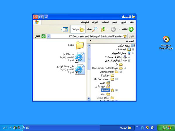
- "Dirty fix" by means of reversing the entire UI when the RTL flag is on (see example from MS below).
- Keep everything the way it is and ship a game that is embarrassingly unpolished for some players.
- Remove the ability to play the game in RTL languages and tell tens of thousands of potential players that you're not interested in them.

Leading Hebrew translator of Factorio.
Re: Friday Facts #246 - The GUI update (Part 3)
Sliders instead of dropdowns! This makes my old heart so happy! <3
- eradicator
- Smart Inserter

- Posts: 5206
- Joined: Tue Jul 12, 2016 9:03 am
- Contact:
Re: Friday Facts #246 - The GUI update (Part 3)
Just out of curiosity because some of my mods have GUIs. Is the $proper_fix even remotely automatable? Or would i have to redesign every GUI twice? Because as a "solo modder" i don't have the manpower to do everything twice, and i doubt most of the others have :x.Dev-iL wrote: You have several courses of action here:
- Assign the manpower and fix it properly (I can elaborate on what needs fixing) in a matter of several days.
Re: Friday Facts #246 - The GUI update (Part 3)
Seems like this is alrady being done, but I also want to stress that this is very important to make clear.zerohourrct wrote:If the back button now scraps changes, it should be renamed to something like Cancel or Undo, and not back, so as not to conflict with veteran knowledge that 'back' = confirm.
+1 to giving them another color if you dont want to change the button look at all. Just a way to make more clear that it's NOT a button.Tynach wrote:Tabs are also rounded, though. Personally, I think text boxes should be square with a lighter (perhaps even white) background - or at the very least they should look 'pressed in' rather than 'popped out'.
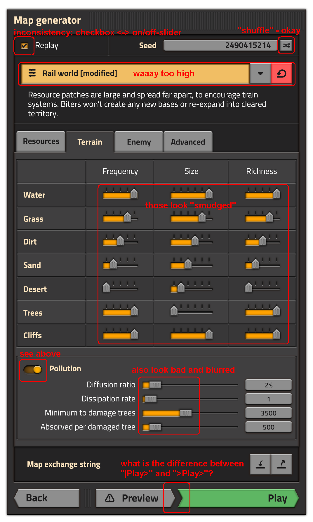
Oh god, the things you dont see at first glance... please please use only checkbox or only slider.Koub wrote:Why different types of "on/off / checkboxes" styles ?
I'm an admin over at https://wiki.factorio.com. Feel free to contact me if there's anything wrong (or right) with it.
Re: Friday Facts #246 - The GUI update (Part 3)
Thank you for the mockups.
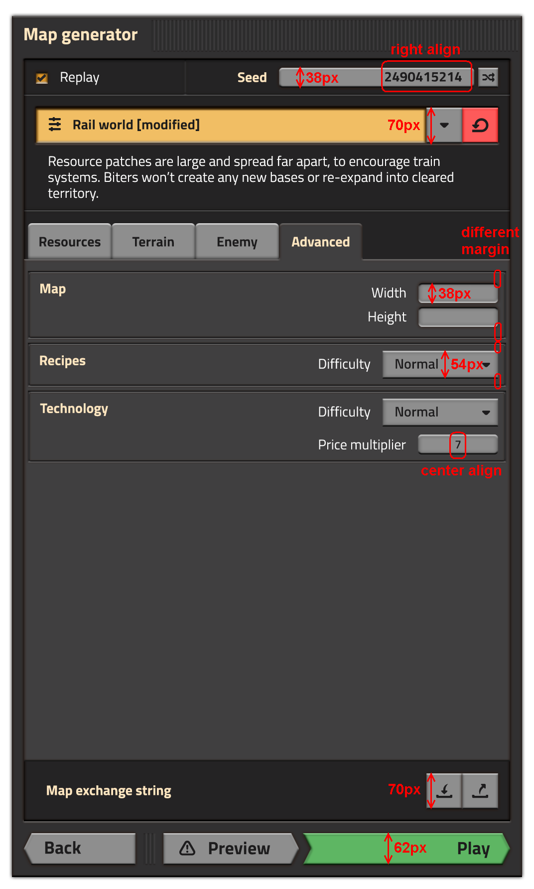
However I am not as happy as others seem to be with the outcome so far. For me it looks all over the place, riddled with inconsistencies and very "busy".
However I am not as happy as others seem to be with the outcome so far. For me it looks all over the place, riddled with inconsistencies and very "busy".
details


