Friday Facts #243 - New GUI tileset
-
StarWars_Geek
- Manual Inserter

- Posts: 3
- Joined: Fri Mar 03, 2017 1:41 pm
- Contact:
Re: Friday Facts #243 - New GUI tileset
It looks really good, the only change i would make would increase the brightness of the hover over the green and blue slot filters.

Re: Friday Facts #243 - New GUI tileset
looking great!
one thing that i always wanted to mention, not sure if thats GUI related
ingame chat (or any console command, warning etc.) could use some background thats not the world itself.
simple black/white, whatever, as long as that line is displayed.
the white text sometimes isn´t readable, unless the world in the backgound is dark, it realy depends on where you are in your world/map
I wouldn´t ask for a configurable chat window, which might always be active somehow. Even when not active after some time, guess you´d at least need a rider that you shouldn´t hide
I´d already be happy with more contrast as long as the line is active and shown
LOVED the imperial roast!
Re: Friday Facts #243 - New GUI tileset
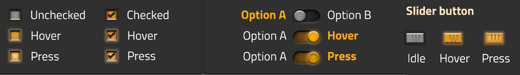
New UI looks very slick, for the most part.
A few accessibility concerns:
The "Disabled" status for Confirm stands out far more than its counterparts. It feels like it should use a dark grey background with pastel green text in a similar fashion to the other buttons. It may not be immediately obvious that the Confirm button is disabled due to not matching the other themes.
There's lots of issues for those who suffer Protanopia or Deuteranopia -- the most common kinds of colorblindness:
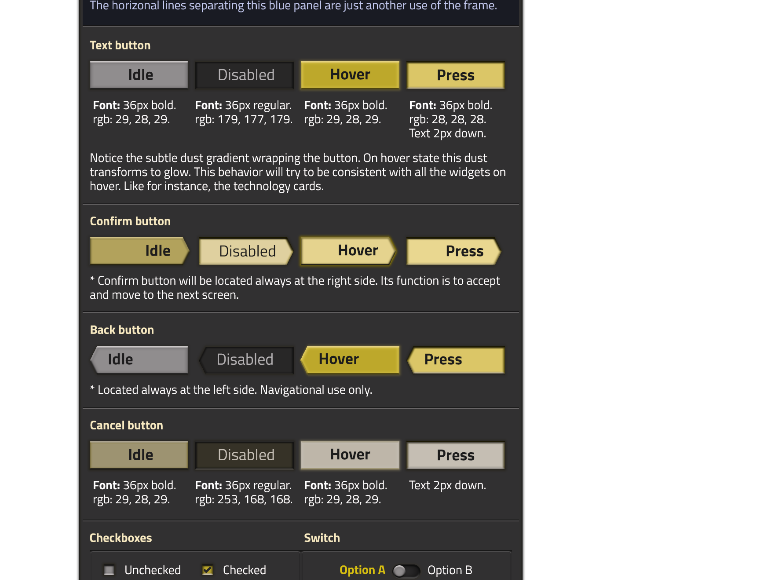
"Confirm" and "Cancel" are nearly the same color. This alone isn't too terrible due to other cues (button shape, text placement and the text itself), but...
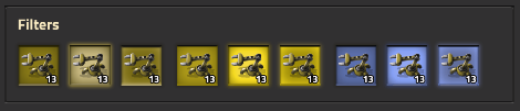
I'm not sure what the intent behind the filter color-coding is, but the red and green look nearly indistinguishable when run through the filter.
(Source: Coblis - COlor BLIndness Simulator)
A few accessibility concerns:
The "Disabled" status for Confirm stands out far more than its counterparts. It feels like it should use a dark grey background with pastel green text in a similar fashion to the other buttons. It may not be immediately obvious that the Confirm button is disabled due to not matching the other themes.
There's lots of issues for those who suffer Protanopia or Deuteranopia -- the most common kinds of colorblindness:
"Confirm" and "Cancel" are nearly the same color. This alone isn't too terrible due to other cues (button shape, text placement and the text itself), but...
I'm not sure what the intent behind the filter color-coding is, but the red and green look nearly indistinguishable when run through the filter.
(Source: Coblis - COlor BLIndness Simulator)
-
zebediah49
- Fast Inserter

- Posts: 119
- Joined: Fri Jun 17, 2016 8:17 pm
- Contact:
Re: Friday Facts #243 - New GUI tileset
IMO that's not too big of an issue, given that the major difference is that *you're pressing on it*. Having a subtle indication that your press was accepted is nice, and you don't want to change it so much to cause context confusion. You don't ever need to tell Hover and Press apart -- you just need a visual cue, while your attention is focused on the item, that your change has been accepted by the UI.meganothing wrote:Hover and Press color could be more distinct.
Also: I'm happy to see both the devs, and other users, carrying the color-blindness torch
E: For funsies, the devs should totally apply the new styles to the forum buttons, so we can try them out in practice.

Re: Friday Facts #243 - New GUI tileset
I came on to mention the disabled Confirm button is brighter than normal, while the Back and Cancel buttons are darker when disabled. It might be a good idea to darken the Confirm button when it's disabled to make the style more uniform.
The colorblindness problem is definitely a big one. Maybe adding a colourblind mode with different button colours would solve this.
The colorblindness problem is definitely a big one. Maybe adding a colourblind mode with different button colours would solve this.

Re: Friday Facts #243 - New GUI tileset
Really nice GUI!
But what are the different colors on the filters meaning?
Also found a typo can i keep it?
But what are the different colors on the filters meaning?
Also found a typo
- sahdow.PNG (16.33 KiB) Viewed 6481 times
Re: Friday Facts #243 - New GUI tileset
Sorry for making a second post. I'm still on newbie probation.
I whipped up a basic idea of what the colourblind buttons could look like.
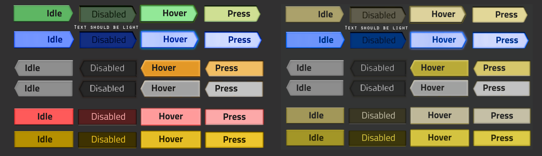
The left is the colours as one with normal vision should see them. The right is appears the way someone with Deuteranopia would see them.
Protanopia looks almost identical so I didn't bother to include it.
With both Protanopia and Deuteranopia, blue is still very visible and works as a good affirmative colour. I decided to completely grey out the negative buttons to maximize the colour availability.
Hue shifting the red buttons until they're yellow brightens them up and makes them somewhat clearer. They stand out more against the background.
I spent the last hour reading about colour blindness while making this. I learned a lot about the different types of colour blindness. Hope it helps.
I whipped up a basic idea of what the colourblind buttons could look like.
The left is the colours as one with normal vision should see them. The right is appears the way someone with Deuteranopia would see them.
Protanopia looks almost identical so I didn't bother to include it.
With both Protanopia and Deuteranopia, blue is still very visible and works as a good affirmative colour. I decided to completely grey out the negative buttons to maximize the colour availability.
Hue shifting the red buttons until they're yellow brightens them up and makes them somewhat clearer. They stand out more against the background.
I spent the last hour reading about colour blindness while making this. I learned a lot about the different types of colour blindness. Hope it helps.
Re: Friday Facts #243 - New GUI tileset
Appreciate the support for colour blindness. I’m assuming the GUI itself supports Windows’s font scaling or something similar...? That would assist with vision impaired especially on the giant monitors out there.
I like the idea of cleaning up the tutorial campaigns. The initial demo tutorials were incomplete for me. While YouTube searches answered most of my questions the existing mini tutorials in game are a good idea.
You could also expand your YouTube channel with tutorials or exploratory videos on various topics. But that’s taking player outside the game environment during play which might not be what you want.
-
Unknow0059

- Long Handed Inserter

- Posts: 96
- Joined: Tue Aug 08, 2017 7:37 pm
- Contact:
Re: Friday Facts #243 - New GUI tileset
What do you mean have respect for ketchup?Jon8RFC wrote:Neat to see the new office. More pictures as everyone gets moved in!
I'm just glad to see that SOMEONE brought ketchup. I taught my nephews about a year ago to "have respect for ketchup".
-
ThorsDragon
- Inserter

- Posts: 45
- Joined: Mon Jul 04, 2016 7:29 pm
- Contact:
Re: Friday Facts #243 - New GUI tileset
OH MY GOODNESS, THE GUI IS GORGEOUS!!
Re: Friday Facts #243 - New GUI tileset
You just need to clear out all the biters, right?Friday Facts #243 wrote:We are currently using approximately 40% of the available space, so there is a room for growth if needed.

Re: Please, no device dependent coordinates
In Canada we are forced to use both imperial and metric in our daily lives. In engineering and construction it leads to so many infuriating conversion requirements to accommodate both systems unless a preference is provided by the project manager or contractor. I wholeheartedly wish the imperial system was eradicated so my job would be a hell of a lot easier, but that requires the USA to stop being a special snowflake and touting their foolish implications that the rest of us are all using the wrong system of measurement which has been proven superior countless times.kovarex wrote:1) DPI uses the inch. The imperial measure system should have been eridicated long time ago. It is so bad, it is known for decades, and yet still people use it. Please stop!
Sorry for that little rant... Work was stressful recently for this very reason. Glad to know you hate it too.
I also +1 the idea of having the toolbar on the sides if possible.

Re: Friday Facts #243 - New GUI tileset
The GUI eveolves very nice!
Just the glow and emboss of the Checkbox/Switch/Radio buttons is a bit to much in ma taste.
On the colourblind topic:
Maybe a good way to implement it would be a selectable mode in the graphics options, and generally use a "hue shift" in the render-engine, so it also would correct issues of hard to distinguish things (could imagine somthing like longhand inserters on grass terrain). And this way it should be relatively easy to find solutions for all the kinds of colour-blindness instead of having tons of different icon-sets.
[ˈfʊɪ̯ mʊɪ̯ç]
Bavarian, translates to: Lots of Milk
Bavarian, translates to: Lots of Milk
Re: Friday Facts #243 - New GUI tileset
I really like the UI mockup! It looks great!
Then, there is also the Pressed Editable...

I can't quite articulate it, but there is something that is bugging me about it... It feels wrong in some subtle way that I cannot describe...
Keep up the awesome work!
I also think that the Hover and Press should be more distinct in a few cases, and I think it is an important issue. The fact that I know I am pressing it is a good feature *of the mouse button*, but if I cannot tell the difference on the UI between hover and press, I don't know if the application recognized that I pressed it and reacted to it. Although it is mainly the small elements that I find lacking.zebediah49 wrote:IMO that's not too big of an issue, given that the major difference is that *you're pressing on it*. Having a subtle indication that your press was accepted is nice, and you don't want to change it so much to cause context confusion. You don't ever need to tell Hover and Press apart -- you just need a visual cue, while your attention is focused on the item, that your change has been accepted by the UI.meganothing wrote:Hover and Press color could be more distinct.
Then, there is also the Pressed Editable...
I can't quite articulate it, but there is something that is bugging me about it... It feels wrong in some subtle way that I cannot describe...
Keep up the awesome work!
Re: Friday Facts #243 - New GUI tileset
I like the new UI Elements. Yet, I wonder if having the cancel button being red isn’t a bit too much.
There are at least two uses of a cancel button.
There are at least two uses of a cancel button.
- To not perform an action: Like in “exit program“: “Your data will be lost! Cancel or Exit?” Here Cancel should not be red. pushing it prevents the harm being done.
- Stop a Running task, which will make you loose the already achieved progress. Like “Cancel Research” if you then have to start over again. Here, Cancel should get the “Danger” color.

Re: Friday Facts #243 - New GUI tileset
New gui approved
Revamp Blue print UI Re: Friday Facts #243
Please revamp the blueprint UI!
Having the blueprint library makes blueprint less “real items”, and more like “recipes”. There are 3 places to store them: On character, in the game library, in the player library. And, even more confusing in a book inside each of these stores.
If I use a blue print to copy and paste, I end up with an item, that I need to dispose. Maybe having the concept of a clipboard would be nice.
Maybe the whole blue print handling should be made more abstract in that I have a labeled list of “templates” of which to create ghosts. Once created, the blueprint would exist only once, but may appear, through its properties, multiple times.
Having the label “Share” will make the print available in any game to other players. A book would contain all blueprints with a certain set of labels. Books and blueprints will appear in my game inventory, once I dragged them there.
The big question: will this combine with players expectations on saving game state? Maybe the whole player library needs to be stored with each game, but can also be stored on its own. But player library and character library should always be the same. As I have infinite space in the player blueprint library anyway, there is no need to keep in game/character “real item” copies of them.
Just my 2cents, finding the current blueprint organization very confusing.

Re: Friday Facts #243 - New GUI tileset
the first time you actually missed the Deadline for a FFF... atleast i think so.
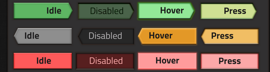
those GUI changes look amazing, though i would say that the cancel option could have a different look from the normal text button,
something like this? maybe? just another shape.
those GUI changes look amazing, though i would say that the cancel option could have a different look from the normal text button,
something like this? maybe? just another shape.
Re: Friday Facts #243 - New GUI tileset
H̛a̹̱̫̱̹͚v̛͙ȩ ̤y̬ͅo̠̲͉͍̳͢ͅu͙̲̤̰̟ ̵͓̱t͈̮̞̜͓̱͠ͅe̴̝s̨͕̱͕̗ͅt̡ẹ̷d̙̺̹ͅͅ t̰͚h̤͍e͖̖ ͍̝̳̝͍̼̱G̦͕̥̳U̸͉͍ͅI̻̖ w͔͚̬̖̹ͅi̱̲͖̭t̷͇̮h͍̣̼͔͈ ͉͙̭͇̯ͅt̮̬̬͕h͍̖i҉͍̹̗̰̣̥s̰ ̹̲̭̠̭͘ͅs͔̤͔e͕̱̮͔̘̼ǹ̙̺t̰̭̮̙̦̦ͅe͍̺̮n̮c͏̻̠͓̮̪͉̬è̫̦ ̭͓t̷̬̪̦̪̳̤͕o͈͇͡ͅo̞̩͖̦͘?̶̲̰̻

Re: Friday Facts #243 - New GUI tileset
Did anyone else notice biter mating behavior on the whiteboard?
Also, make sure the UI supports UTF-8 for some special characters like ö, ä and å
Also, make sure the UI supports UTF-8 for some special characters like ö, ä and å
she/they