Page 7 of 8
Re: Friday Facts #238 - The GUI update (Part II)
Posted: Wed Apr 18, 2018 5:17 pm
by Escadin
GUI rework
Please make this a part of your GUI redesign:
viewtopic.php?f=6&t=57534
There is a lot that can be done right or wrong about GUIs but the most fundamental flaw is when your GUI doesn't support the typical workflow of your user. I dare say, "editing" blue prints IS part of your user's typical workflow. Please support it by cutting uncessary steps and saving information where it's not necessary to re-enter them.
Edit~ Gawd why am I always so late to these that devs won't see my feedback anyway -.-
Re: Friday Facts #238 - The GUI update (Part II)
Posted: Wed Apr 18, 2018 5:41 pm
by Avezo
This is required in updated GUI.
From
viewtopic.php?f=6&t=47645
Re: Friday Facts #238 - The GUI update (Part II)
Posted: Wed Apr 18, 2018 7:20 pm
by Koub
Escadin wrote:Edit~ Gawd why am I always so late to these that devs won't see my feedback anyway -.-
I guess you don't know the right devs

. Factorio Devs
will read your feedback. Maybe not answer, but definitely read.
Re: Friday Facts #238 - The GUI update (Part II)
Posted: Wed Apr 18, 2018 8:29 pm
by Deadly-Bagel
Sander_Bouwhuis wrote:I'm a software engineer myself, and to be honest, I've never put support in my applications for it.
I'm sure to give this a good consideration for my next project though. (I guess it's hard to test, unless I can find a few colourblind people).
Most software is pretty easy to work around, if you're bothered to think about it. Our devs (with 2/8 of our staff colourblind no less) wrote a monitor that was simply "green is good and red is bad" which were so close in shade that I couldn't see them. We got it changed to "green circle is good and red triangle is bad" which is fine. They then instantly make the same mistake in several other applications, I gave up.
But yeah it's not difficult. Colour-coding makes things easy for the majority of people but colourblind users tend to be more attuned to shades and shapes so it's good to incorporate both. Use a light green/aqua and a dark red, for example, and where possible use distinctive shapes. Blue is very rarely a problem (except rare cases of blue-yellow, from memory?) and is a good third colour over orange or yellow.
Another good technique is a visual indicator, like the ROCK meter in Guitar Hero. I can't tell the difference between any of the three colours, other than shade, but the position of the needle quickly tells me how badly I'm doing.
In certain circumstances you can offer the option of a palette swap like Into The Breach or League of Legends, instead of red/green we can have red/blue, between then they cover practically every user.
Re: Friday Facts #238 - The GUI update (Part II)
Posted: Wed Apr 18, 2018 11:08 pm
by AlienZoo23
Escadin wrote:GUI rework
Please make this a part of your GUI redesign:
viewtopic.php?f=6&t=57534
There is a lot that can be done right or wrong about GUIs but the most fundamental flaw is when your GUI doesn't support the typical workflow of your user. I dare say, "editing" blue prints IS part of your user's typical workflow. Please support it by cutting uncessary steps and saving information where it's not necessary to re-enter them.
Very well said. Much as I love this game, it is full of annoyances like the blueprint editing referenced here. To this you could add:
- try replacing one bluprint from a book with an updated version;
- take 50 coal and distribute it even somewhat evenly among a group of stone furnaces;
- or fill a bunch ot turrets with a reasonable quantity of ammo by hand while still leaving some for yourself;
- remove 1 or two items from a chest that is being filled by some automatic process without the chest filling up and being stuck with useless items you didn't want;
- look at the progess bar for whatever science you are researching and say how many more science packs are needed to complete it (matters most early game; why is there no popup when I mouse over the bar?);
- the production and power screens show truncated values once the numbers get too high because otherwise they won't fit readably - but again why no popup with the exact number when I mouse over an item?;
0.16 finally allows us to re-order stations in a train's schedule. That one change would have saved me thousands of clicks if it had existed in 0.15. I lost track of how many times I groaned in anguish when I realised that I was going to have to redraw a blueprint because there was some small mistake or mis-feature in it.
I hope that's enough to make the point. Please put what the user wants to do or needs to know front and center. Only then start worrying about exactly where the button go etc. You'll never get everything just right or please everybody but please, please, please remember that it's a graphical USER interface - our API to the whole game.
Re: Friday Facts #238 - The GUI update (Part II)
Posted: Thu Apr 19, 2018 7:29 am
by Sander_Bouwhuis
Deadly-Bagel wrote:Sander_Bouwhuis wrote:I'm a software engineer myself, and to be honest, I've never put support in my applications for it.
I'm sure to give this a good consideration for my next project though. (I guess it's hard to test, unless I can find a few colourblind people).
Most software is pretty easy to work around, if you're bothered to think about it. Our devs (with 2/8 of our staff colourblind no less) wrote a monitor that was simply "green is good and red is bad" which were so close in shade that I couldn't see them. We got it changed to "green circle is good and red triangle is bad" which is fine. They then instantly make the same mistake in several other applications, I gave up.
But yeah it's not difficult. Colour-coding makes things easy for the majority of people but colourblind users tend to be more attuned to shades and shapes so it's good to incorporate both. Use a light green/aqua and a dark red, for example, and where possible use distinctive shapes. Blue is very rarely a problem (except rare cases of blue-yellow, from memory?) and is a good third colour over orange or yellow.
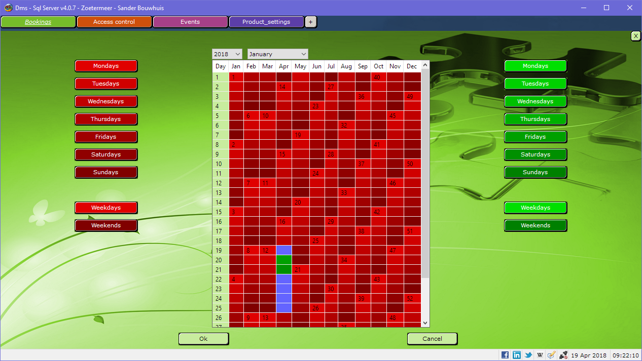
Because there are multiple types of colour blindness, I think I'll incorporate the option for the user to set the colours in the settings him-/herself.
I just made a screenshot of what I think might be the worst offender in one of my applications:
It's a calendar where the shades tell you the day of the week and the colours tell you whether a resource can be booked. I guess you have a hard time distinguishing the green and blue blocks?
Re: Friday Facts #238 - The GUI update (Part II)
Posted: Thu Apr 19, 2018 8:09 am
by bobingabout
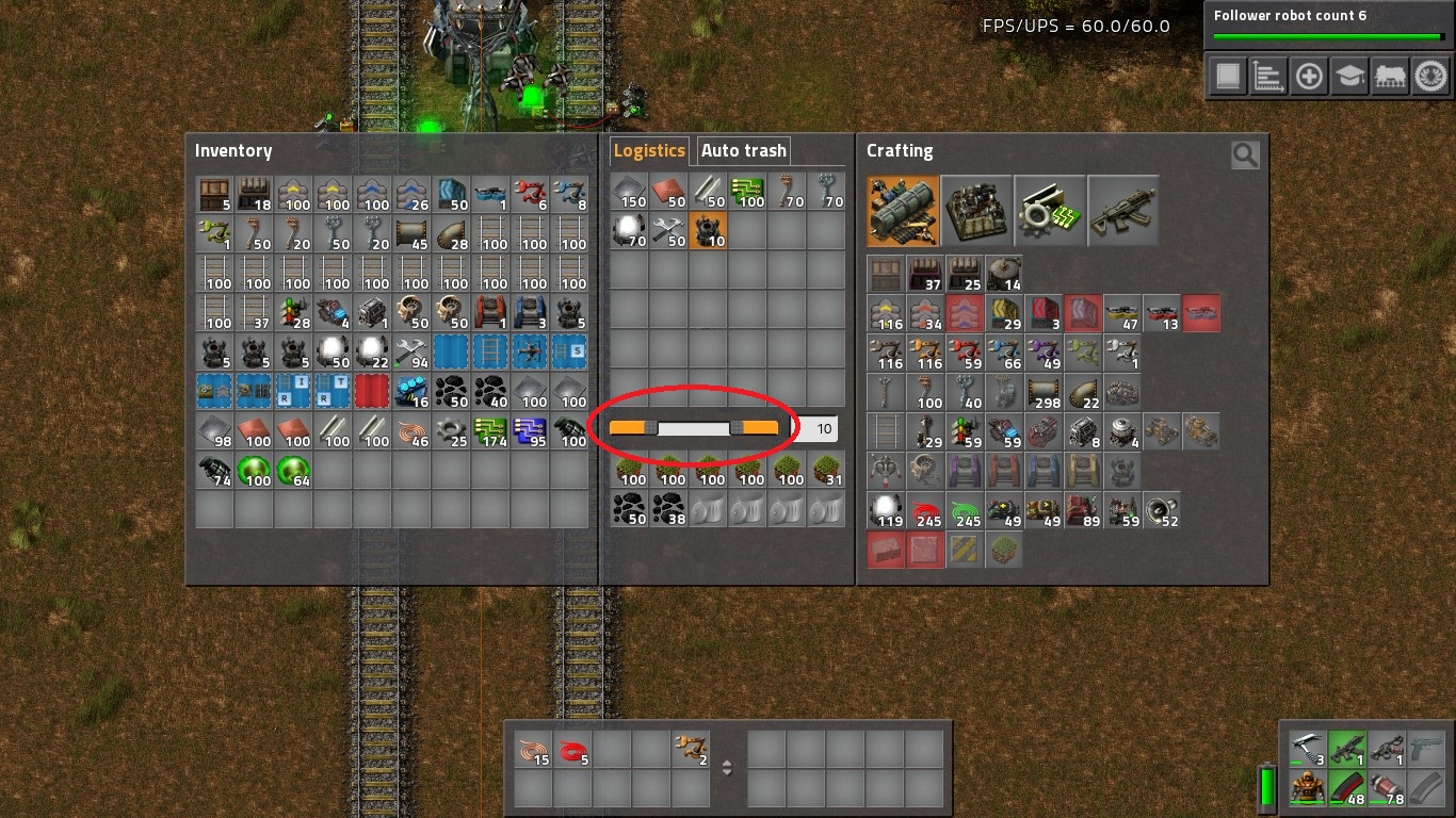
what the heck am I looking at? that makes no sense.
Re: Friday Facts #238 - The GUI update (Part II)
Posted: Thu Apr 19, 2018 9:12 am
by mrvn
bobingabout wrote:
what the heck am I looking at? that makes no sense.
I'm guessing just from the picture that it should request roboports if less than 10 are present and auto trash them if more than 100 (or whatever the second slider box is set at) are present.
Re: Friday Facts #238 - The GUI update (Part II)
Posted: Thu Apr 19, 2018 10:19 am
by Zavian
Personally I would rather they changed auto-trash settings, so that when you both request and autotrash something, it requests what is set on the request tab, and then starts trashing when you have more than request_amount + autotrash_threshold. That way the two will work together, and if I ever increase the request amount, the effective autotrash threshold will automatically change at the same time.
Re: Friday Facts #238 - The GUI update (Part II)
Posted: Thu Apr 19, 2018 10:49 am
by <NO_NAME>
Zavian wrote:Personally I would rather they changed auto-trash settings, so that when you both request and autotrash something, it requests what is set on the request tab, and then starts trashing when you have more than request_amount + autotrash_threshold. That way the two will work together, and if I ever increase the request amount, the effective autotrash threshold will automatically change at the same time.
Yep, that way you wouldn't have to set autotrash again after removing the request.
Re: Friday Facts #238 - The GUI update (Part II)
Posted: Thu Apr 19, 2018 12:24 pm
by Lilly
I agree with Kovarex on the Queue button.
- First the semantic meaning of the labels is inconsistent:
Code: Select all
Queue = Action
Queued = Status
Researched = Status
Unavailable = Status
- It is not clear whether clicking 'Queued' will in turn unqueue the research. Is suppose it is not, as it is not rendered as a button (though the difference is so minimal that I overlooked it the first time).
- Furthermore the Researched and Unavailable labels are themselves not buttons.
- It is inconsistent with the red Unqueue button, marked 'x', in the research queue:
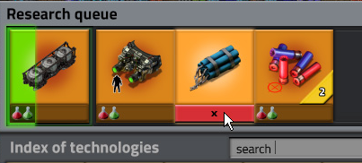
- unqueue.png (69.87 KiB) Viewed 6141 times
- You can't queue research directly from the list or tree. It requires two actions: selecting and then clicking queue in the featured technology window (which also does not have a fixed position and only becomes visible once the research has been selected.
I might prefer to have an add-to-queue button similar as the button marked 'x', however, then you can no longer hover the research bottles to see their pop-ups (assuming they have them) and ingredient requirements. Another option might be to do something similar as the KDE filemanager Dolphin does for selections. Upon hovering a file, it shows a click-able '+' to add the file to the selection, or a '-' to remove it.
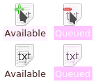
- add_remove.png (8.24 KiB) Viewed 6141 times
Also, add to queue, means adding it to the back of the queue. I can imagine there are situations where you want a certain research to be researched now, putting the current research on hold and pushing it to the front of the queue. In that case the featured technology frame would require multiple buttons: 'add to queue' and 'research now!'.
Re: Friday Facts #238 - The GUI update (Part II)
Posted: Thu Apr 19, 2018 2:12 pm
by meganothing
Sander_Bouwhuis wrote:
I just made a screenshot of what I think might be the worst offender in one of my applications:
It's a calendar where the shades tell you the day of the week and the colours tell you whether a resource can be booked. I guess you have a hard time distinguishing the green and blue blocks?
Not colorblind myself, but would suggest a thick black border around selected days (i.e. blue and green), either one big border around all consecutive or one border in every box, and a big black X in the box for unbookable days (blue?). Makes the type of colorblindness irrelevant.
Re: Friday Facts #238 - The GUI update (Part II)
Posted: Thu Apr 19, 2018 3:23 pm
by mrvn
Lilly wrote:Also, add to queue, means adding it to the back of the queue. I can imagine there are situations where you want a certain research to be researched now, putting the current research on hold and pushing it to the front of the queue. In that case the featured technology frame would require multiple buttons: 'add to queue' and 'research now!'.
Can you drag&drop in the queue to reorder them?
Re: Friday Facts #238 - The GUI update (Part II)
Posted: Thu Apr 19, 2018 4:56 pm
by ManaUser
hitzu wrote:My suggestion where to put action buttons.
Brilliant, this is way better!
Re: Friday Facts #238 - The GUI update (Part II)
Posted: Sat Apr 21, 2018 2:58 pm
by cogwheel
Use "Enqueue" instead of "Queue". The former is always a verb.
Re: Friday Facts #238 - The GUI update (Part II)
Posted: Sun Apr 22, 2018 1:54 am
by bobucles
Enqueue
I've never heard that word before in my life! All games just say "add to queue".
Re: Friday Facts #238 - The GUI update (Part II)
Posted: Sun Apr 22, 2018 6:04 am
by steinio
Just use "Add", "Remove",...
The context is the research tree and doesn't need to use complicated words for simple things.
Re: Friday Facts #238 - The GUI update (Part II)
Posted: Thu Apr 26, 2018 3:00 pm
by azairvine
Not enough of a distinction between the yellow and orange. Yellow needs to be more yellow! Kind of like "smilies" vs "forum bar"
Re: Friday Facts #238 - The GUI update (Part II)
Posted: Thu Apr 26, 2018 8:47 pm
by S7E
Sander_Bouwhuis wrote:
Because there are multiple types of colour blindness, I think I'll incorporate the option for the user to set the colours in the settings him-/herself.
I just made a screenshot of what I think might be the worst offender in one of my applications:
It's a calendar where the shades tell you the day of the week and the colours tell you whether a resource can be booked. I guess you have a hard time distinguishing the green and blue blocks?
Where are the green blocks? =(
Re: Friday Facts #238 - The GUI update (Part II)
Posted: Fri Apr 27, 2018 12:30 am
by Oktokolo
S7E wrote:Where are the green blocks? =(
April 20th and 21th. Pretty easy to spot for the people with mainstream color vision.
That said: The overall color theme of that GUI ist one of the most ugliest beasts i've ever seen (including game GUIs - and i did use a C64 for gaming back then).