I like it. Good work.
It would be nice if you may add the possibility to set conditions for a stop. Maybe like "if iron ore > 100 then station 'iron drop off'". This should be first available after some research in lab.
It should be possible to change station name and leave wait condition as it is.
It also would be nice if one can move scheduled stops up and down in list.
And I like also to have groups of trains with the same schedule so you can change master schedule and all the trains will follow.
Friday Facts #212 - The GUI update (Part 1)

Re: Friday Facts #212 - The GUI update (Part 1)
Thanks for pointing this issue about legibility, I agree with you. And thanks also for offering your help. Till now the work has been more focused on mechanics, general composition and style. We are still moving with many placeholder elements -final colors?, sizes?, icons?, textures?, etc.-snds wrote:Hey guys, a fellow UXer here.
I really love the functionality shown here. The UX here implies a much better way to interact with stations and wait conditions that have made it difficult for me as a player to get into in the current iteration of the UI. It's one of the reasons I haven't been able to really get a complex train base going.
Now for the issues. I know this is the first stab at things so please just take this as a friendly critique.
The font colors and weight really hurt the UI usability and legibility, it's actually one of the problems I see here with the site UI. There are similar contrast issues at work here. I know that Factorio is NOT a web app, but it would behoove your team to use a contrast legibility tool for the web. The same kind of physical issues occurs even in video games.
I would also go so far as to say that the heavy shadows on the active/hover states add to that legibility issue. They end up making the screen overall dirty and hard to interact with. I do get the point of the visual style. We're building a factory, factories are dirty, but you can make a clean and legible UI with visual treatments that don't make it hard to use.
The legibility issue also goes for the icons. The icons are too detailed for the size you're using and with that dark gray color. If you're going with that size, the icon needs to be far brighter and larger to make sure users understand what the icon is meant to imply. The tabs to the top right could probably use an increase in size as well. You have really big tabs on the left but these tiny ones at the top right. A size for the right ones that are a little bit larger might make more visual sense and would help with the user with parsing the systems you have employed here.
As much of the issues I've mentioned are legibility and color related I've included a link here for a legibility tool to try. https://webaim.org/resources/contrastchecker/
All of that said, I really do like where things are going. Factorio is a massive beast of a game when it comes to UI and I applaud the work done thus far. If you'd like another UX person's perspective and help you guys brainstorm things remotely, I'd love to help.
-Sean
The GUI is still looking for its final solutions and solid style. Every new panel has unique characteristics and limitations that affect the entire concept. So every step forward means rethinking what is done, and probably makes us re-adapt the used solutions for a more consistent ones.
As you said, Factorio is a massive beast concerning UI, not easy to domesticate. But luckily legibility is kinda easy to solve. Next iterations will be very focused on this issue.
Also need to mention that the mockups shown in the post are not at 100% size, so text and icons are quiet affected by it. Anyways, the problem is there also at 100%.
Re: Friday Facts #212 - The GUI update (Part 1)
Some more UX Comments;
- I think that the list of conditions should all be the same height. You could use a soft edge between horizontal elements, but don't add any vertical 3d box padding as this makes the height unpredictable.
- I personally don't like the buttons that poke outside the rectangle of the window. Are you more of a BEOS fan? The consequences for missing a button seem more dangerous. Map controls could be within the rectangle of the map.
- Talking about maps, how about some google maps - ish zoom control. Try to make sure *every* action has some kind of visible control. Though in-game zooming is a common function for a scroll wheel, some people might not know it can be done.
- Don't forget to include a visually obvious title bar that can be used to drag the window around.
- Building on a suggestion higher in the thread, perhaps the station list and conditions should be on the right. So you can collapse / expand the window to see the conditions.
- Some options for sorting / filtering the stations. Have a look at one of the OARC scenarios where everyone is building their own base. Consider putting the reachable stations at the top, with a toggle to hide the unreachable ones.
- Consider splitting the trains fuel & inventory (and mod equipment grids?) from the schedule UI. Open the inventory if you are next to the train, auto closing if you move apart like every other inventory in the game, eg car / tank. With a button and some other modified click action to open the schedule UI.
-
chris13524
- Fast Inserter

- Posts: 207
- Joined: Thu Jun 04, 2015 12:20 am
- Contact:
Re: Friday Facts #212 - The GUI update (Part 1)
+1 This is something I've been wanting for quite a long time. I've been playing OpenTTD recently, and they didn't quite get it rightFz0OiIDY wrote:Pretty nice. But I wish a feature for the train network to create groups for trains that share together the schedule and the color. Also if you can create color groups and save them instead to pick/copy it from a different train.
Also, I'm confused about the AND/OR precedence:
- A AND (B OR C)
(A AND B) OR C
I'm very excited!! Keep doing great work guys!
-
5thHorseman

- Smart Inserter

- Posts: 1193
- Joined: Fri Jun 10, 2016 11:21 pm
- Contact:
Re: Friday Facts #212 - The GUI update (Part 1)
Please don't take this into consideration. We all know we're playing a game in beta that can change in any way at any time. Make the game the best it can be, not the best you can fit into the current paradigm.Many players are already used to interacting with the game in a specific way, so any major changes are hard to make.
-
KindDragon
- Manual Inserter

- Posts: 4
- Joined: Fri Mar 11, 2016 11:44 pm
- Contact:
Re: Friday Facts #212 - The GUI update (Part 1)
Steam Controller support for GUI?
-
ThorsDragon
- Inserter

- Posts: 45
- Joined: Mon Jul 04, 2016 7:29 pm
- Contact:
Re: Friday Facts #212 - The GUI update (Part 1)
I LOVE TRAINS!!!!!!!!!!!!! Ok, now that I have that out. XD PLEEASSSSEEEE make the temporary stops- THAT'S SO COOL!!!!!! The GUI is gorgeous, thank you for you're work!! I wouldn't mind some changes, though it would be nice to leave the basic interactions intact. I'M SO EXCITED!!!! 
Re: Friday Facts #212 - The GUI update (Part 1)
Nice to see the UI changes, they're super cool looking and great idea already.
But what about the Logistic Network UI? You guys could take some ideas from the mod ALS which is a great tool, very simple, to manage your robot networks, see where you have robot hiccups and where you have spares.
I also saw that you guys are working to make modders life easier when it comes to UI management of the mod, which is great news, can't wait to see more iterations of that. Also Autofill is getting some love, nice to see mods becomming part of the game core.
I know its early alpha of 0.17 but throwing some ideas here and there could help you guys out, i Hope. Looking forward to the release date of 0.17. Good job dev team!
Re: Friday Facts #212 - The GUI update (Part 1)
See this.TRUEpicness wrote:Also I notice some different terrain in the background too
More desert types?
Could we start the red desert hype again?
There are 10 types of people: those who get this joke and those who don't.
-
Dr. Walrus

- Long Handed Inserter

- Posts: 96
- Joined: Fri Nov 20, 2015 6:30 am
- Contact:
Re: Friday Facts #212 - The GUI update (Part 1)
Copying schedules between trains is great and works well but that's not really what I was talking about. Although I agree adding routes that can be assigned to trains like other players have suggested would be great for players (me and almost everybody else) who have a lot of trains that run the exact same schedule and need to be changed all at once. Right now I get around the routes issue by having every type of train I use have a template train that sits at my base that I update manually and copy and paste to all other trains of that type.TehDwArF wrote:If I'm not mistaken, I believe you can Shift+Right Click and Shift+Left click to copy a train's color and schedule to another train (like how you can copy assembler recipes or inserter configurations). Unfortunately, because you can't modify a destination station you would still need to add all the conditions for stations you remove and replace. If all you want is a second train doing the exact same thing, copying it is quite easy.Dr. Walrus wrote:BUMPTehDwArF wrote:A few of quality of life improvements I would like for the GUI.
Not GUI related but as others have mentioned, having train groups would be really cool. Similar to some Rail style games, you could then even add a schedule where the leave condition is based off of even spacing (timing of departure/arrival) of trains, or an always occupied mode where it departs if a new train has arrived and is waiting to come into the station.
- Destinations should drag-able (or use up/down arrows) in order to rearrange the station list.
- The ability to switch a destination but keep the current wait conditions (useful for decommissioning a mining outpost and using the trains for other outposts).
- An option to have a train automatically switch to manual mode upon arrival at a designated station (personal and outpost building trains would massively benefit).
- A slim mode where only the stations are listed and the conditions are hidden, view-able by expanding the menu by clicking the station.
Plus I'd love to see the ability to copy and paste wait conditions from one station to another. My trains going to mining outposts have a fairly large amount of wait conditions and every time I add an outpost to my system I have to put in the same 8 conditions as every other outpost.
The problem I brought up was making it easier to add another destination to a train's schedule. Right now my train schedules look like this:
Code: Select all
Iron Unload wait until:     40s pass
                            or 5s pass
                            and inventory iron plate = 0
                            and inventory rocket fuel = 400

Iron Load 1 wait until:     5s pass
                            and inventory iron plate ≥ 5000
                            or 5s pass
                            and circuit iron plate < 120
                            or 5s pass
                            and circuit green > 0
                            or 10s pass
                            and circuit yellow > 0
                            or 40s pass

Iron Load 2 wait until:     5s pass
                            and inventory iron plate ≥ 11000
                            or 5s pass
                            and circuit iron plate < 120
                            or 5s pass
                            and circuit green > 0
                            or 10s pass
                            and circuit yellow > 0
                            or 40s pass

Iron Load 3 wait until:     5s pass
                            and inventory iron plate ≥ 16000
                            or 5s pass
                            and circuit iron plate < 120
                            or 5s pass
                            and circuit green > 0
                            or 10s pass
                            and circuit yellow > 0
                            or 40s pass
If you add in routes and the ability to copy and paste station conditions, I could just take the conditions for that train stopping at Iron Load 3 and duplicate it to the new conditions for stopping at Iron Load 4. I could make that change to the Iron Train Route and all of the trains are automatically updated. That's a lot faster.


Re: Friday Facts #212 - The GUI update (Part 1)
Great to see work being done on the GUI. Some comments below.
1. Buttons outside of the window frame ensure that it will be impossible to dock windows properly - or that user will find those buttons hidden by the edge of screen when moving windows to natural positions at the edge. Missing the buttons is much more likely to close the window and/or activate something else. In short, I really don't like this decision. Plus lots of buttons sticking in all directions give the window an extremely haphazard look.
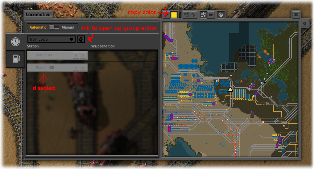
2. Icons on top of the train minimap have a lot of unused space - they could be easily expanded to have some text, which would make adapting to/learning the new GUI much easier for all involved. Minimap can be made slightly smaller to provide extra space - it will still be large enough for most purposes.
3. Minimap itself is great!
4. People already commented on transparent background - that will be extremely distracting (to the point of window being unusable when there's lots of movement underneath).

7. I really, really don't like current schedule view - it's bulky and wastes too much space. Have you tried using the entire area width? Something like this:
This makes full use of viewport width, allowing for longer station names, and can be made mostly text, saving a lot of space compared to current button blocks. Separation of adjacent records can be made by different background tints.
8. When hovering over a station in a map view, it would be really nice if all other identically-named stations were highlighted as well. And in the schedule list, if there are multiple stations with the same name, this should be indicated (like "Coal Unload (3 stations)" or whatever).
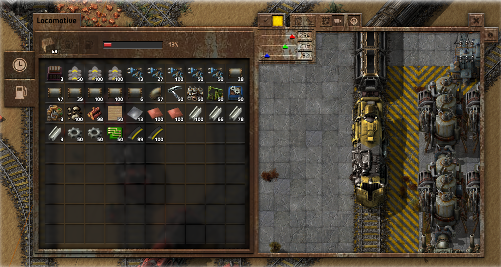
). This may be nice, but now it looks like an indicator of train's entire fuel load. I suspect you're going to get some new bug reports that "I have fully loaded my train with fuel, but the indicator shows it's only 24% loaded, plz fix". Perhaps change the indicator to absolute number of MJ's or something? Not sure.
12. Color picker would really benefit from a palette of predefined colors - I suspect it would be useful in multiplayer, ensuring that once players decide to paint all iron trains teal, it will be the same teal everywhere, and not each individual player's idea of it. Plus you could save time by selecting a color with a single click instead of careful slider dragging and typing specific RGB numbers.
13. Also, is there a need for two separate buttons for colorpicker? One should be enough - you click on a button with color, and you change color. And there's no need to change the pipette button to "accept" - clicking anywhere else in the window should just close the colorpicker, and whatever color was chosen in the process would remain.
1. Buttons outside of the window frame ensure that it will be impossible to dock windows properly - or that user will find those buttons hidden by the edge of screen when moving windows to natural positions at the edge. Missing the buttons is much more likely to close the window and/or activate something else. In short, I really don't like this decision. Plus lots of buttons sticking in all directions give the window an extremely haphazard look.
2. Icons on top of the train minimap have a lot of unused space - they could be easily expanded to have some text, which would make adapting to/learning the new GUI much easier for all involved. Minimap can be made slightly smaller to provide extra space - it will still be large enough for most purposes.
3. Minimap itself is great!
4. People already commented on transparent background - that will be extremely distracting (to the point of window being unusable when there's lots of movement underneath).
5. Is it possible to filter the list by typing a part of station name without having to click the "search" button first? That would improve usability greatly (and not only here, but in many other places as well). May clash with hotkeys though.Let's go through a short use case. You click add station and the list of stations appears. You can add a station by clicking on the station in the list or by clicking it in the small map. The map can be zoomed and moved around so you can easily find your station.
6. Hopefully for as long as the station is within the minimap view, and only showing the direction to the station if it's outside - otherwise scrolling through the list will result in the minimap view jumping all over the world like a rabid rabbit.Also, as you hover over stations in the list, the map will show their location.
7. I really, really don't like current schedule view - it's bulky and wastes too much space. Have you tried using the entire area width? Something like this:
Code: Select all
 1. Coal Unloading #12        {visit} {x}
    Leave:   IF inventory empty     {x}
             OR 30 seconds passed   {x}
             [add departure condition]
 2. Central Bay               {visit} {x}
    Leave:   IF 10 seconds passed   {x}
[add departure condition]8. When hovering over a station in a map view, it would be really nice if all other identically-named stations were highlighted as well. And in the schedule list, if there are multiple stations with the same name, this should be indicated (like "Coal Unload (3 stations)" or whatever).
9. Now this looks really cool. I assume there are two vertical panes (for categories and items within the category), with separate scrolling? Also, ability to filter by part of item name would be really useful here as well.Inventory selection image

10. Now this is simply fantastic!Finally a schedule can look something like this. The path of the train will be shown. We will try to paint the path the train is taking at the moment, it will change as the train takes different paths.
11. Regarding fuel tab, I see you added a text with percentile next to the "regress bar" (or a progress bar that shows regress, whateverThe fuel can be accessed from the separate tab and the color of the locomotive can be changed using the color picker.
12. Color picker would really benefit from a palette of predefined colors - I suspect it would be useful in multiplayer, ensuring that once players decide to paint all iron trains teal, it will be the same teal everywhere, and not each individual player's idea of it.
13. Also, is there a need for two separate buttons for colorpicker? One should be enough - you click on a button with color, and you change color. And there's no need to change the pipette button to "accept" - clicking anywhere else in the window should just close the colorpicker, and whatever color was chosen in the process would remain.
14. Please remove extra graphics from the button, it makes it actually harder to understand. A simple "T" would be enough IMHO.Turn station names on or off.
15. Looks OK. I assume the game will keep two different settings for train station name angles? One for global map, and another for trains minimap? Or is it the same setting? Some confusion is possible here I guess, no matter what you choose.Change the angle of the station names.
16. I'd suggest to make it a single switchable button, preferably overlaid on the map, Google Maps style.Switch to map view.
Switch to camera view.
17. I would really, really recommend to see this button separate (so it wouldn't be confused with just another map view mode) and in the top right corner of the left pane. And much larger, it's too useful to be that small.Center view on the train.
18. Will we be able to turn these buttons off? Pretty please, with a cherry on top?The small 'info' button you see on the right side will be a help button we will use throughout the game to help explain how different GUI work and when their elements mean. We will write more about this in some of the next parts of the FFF GUI update series.
19. Fantastic!We also want to add a neat tool for advanced players. Control-clicking on any point on the locomotive's map (or any station) will add a 'Temporary stop' to it's schedule. The train will try to go as close as it can to that point, wait a few seconds and finally automatically remove the 'Temporary stop' from it's schedule. This is very useful for quick transportation. It also allows you to quickly 'hijack' an existing train and use it to get somewhere, since the 'Temporary stop' will be deleted and the train's normal schedule will be resumed.
20. Awesome. Is it possible to also auto-refuel it en-route if the vehicle runs out of fuel while the player is riding it? That would be awesome squared.Another quality of life improvement will be a game option to automatically add some fuel from the player inventory when building vehicles (car, tank or locomotive), making rail transportation as simple as placing a locomotive on a rail, entering it and control-clicking where you want to go.

Re: Friday Facts #212 - The GUI update (Part 1)
Keep up the good work!
I think the transparent windows makes the GUI unnecessary busy.
As many noted there is something missing in the train logic to be able to make an effective many to many train station network. So I think there also is more work to do with the train logic that they UI have to handle, I don't know what...
I am drooling over the ideas for the toolbar mentioned in FFF-191 can't you sneak that into alpha 16? (asking impatiently jumping up and down the chair)
-
trad_emark

- Inserter
- Posts: 27
- Joined: Fri Sep 23, 2016 8:54 pm
- Contact:
Re: Friday Facts #212 - The GUI update (Part 1)
please make player's inventory always a separate window. eg. make it clear that it is a separate thing from the train/chest/assembler..
Re: Friday Facts #212 - The GUI update (Part 1)
Nice skin!Tomik wrote:Like [Marcus] 猛虎爆進拳 proposed on Steam, I support his motion to add an Alternate Skin option for the GUI..for those of us who love the Fallout-y look of the game:
Original:
Idea:
RUST SKIN FTW!

Please! Developers! Add Skin manager in game

Re: Friday Facts #212 - The GUI update (Part 1)
can you also make it possible to use the circuit system to decide where the train should go to?
Re: Friday Facts #212 - The GUI update (Part 1)
Ands have higher priority in math and C++ and all other programming languages I encountered.taikodragon wrote: I'm sorry, I must concede you're right. I feel like that makes ORs very hard to effectively use because they operate on an unequal level to ANDs. I can't think of a programming language where ANDs and ORs are not of the same precedent.
And as other people suggested, having train routes could be useful if it doesn't make it less understandable.
Re: Friday Facts #212 - The GUI update (Part 1)
Great! I really am looking forward in an updated UI, especially interactive wise!
With regard to the proposed train UI:
Thanks for the great work!
With regard to the proposed train UI:
- Do not allow to change the station name angle. This distracts from the purpose of the UI to configure and manipulate trains.
- It looks like the train color is part of the Fuel tab. That might be a misinterpretation of the mock up, but it does not make sense to me.
Thanks for the great work!
-
bNarFProfCrazy
- Fast Inserter
- Posts: 194
- Joined: Sat Apr 23, 2016 7:11 am
- Contact:
Re: Friday Facts #212 - The GUI update (Part 1)
Awesome proposal!
I have a question.
Consider a double headed train in a loopless layout. Think of a giant "Y".
If the train is at station A (Unloading station) it can move to both station B (loading station) and C (loading station), but if it moves to B it can no longer drive to C because it has to turn on the road to drive there. Does your algorithm check that? (Aka use the last station's position for the next station's search)
Re: Friday Facts #212 - The GUI update (Part 1)
This pic causes 1 concern...

Are you considering to drop moddability of the categories? The way it's layed out makes it look like 4 categories is standard that can't change.
I might still prefer the way they were before, on top.
Are you considering to drop moddability of the categories? The way it's layed out makes it look like 4 categories is standard that can't change.
I might still prefer the way they were before, on top.
Re: Friday Facts #212 - The GUI update (Part 1)
I really like how the mockups looks like.
But I miss something since the very beginning of the trains schedules: a pre-condition to go to a specific station.
Not very necesary, except for refueling. With the introduction to that awesome feature of "temporary stops", we can go a little further so this is my suggestion:
Separate Fuel and Cargo tabs.
Fuel tab, where you can do the following:
- See the fuel capacity and remaining percentage
- Setup refuel exclusive station and percentage limit to trigger it. When the fuel capacity lowers the limit, the train adds a temporary stop on "Refuel station", and then continues the schedule.
Cargo tab:
- A section with the sum of all the cargo.
- Cargo breakdown of each wagon.
Thanks
Keep going, you are doing an awesome job!