Page 4 of 6
Re: Friday Facts #195 - Poles re-design
Posted: Sun Jun 18, 2017 4:45 am
by KingIonTrueLove
I change my mind on the new small poles. I actually like them, its just that yellow color of the wood is bad. the base actually looks pretty good. My opinions on the rest of the poles remain the same though.
Re: Friday Facts #195 - Poles re-design
Posted: Sun Jun 18, 2017 5:32 am
by RobertTerwilliger
Oh well, my time has come) As being IRL construction designer, I have some thoughts about those poles, that actually quite good in general, but have some flaws, like you've said, they're still WIP.
The big ones: 2.b looks very good, but hotisontal triangle trussings should have 2nd diagonals not diagonal, but rather perpendicular - it IRL gives more strenght for triangular trussing, and makes a tip not so crumped.
Also all diagonals are connected from the outside, but they should be installed from inside of the pole - it will make it's look much more "clean".
Also maybe small triangle top is needed - IRL it would prevent wires touching the pole, in game it may prevend too-wierd-looking wires if plonking smaller poles too close to big one. Just make sure it won't overlay on horisontal view with rear connection.
Medium pole 2.a looks much better to me - yes, it's not so unique, but it looks like you expect it to look. 2.b is just too odd, honestly)
Small one has very weird shadow, so it makes me suspect it has some really odd top. Why not making it simply sitting on top of the wooden rod, T-shaped, just like big 2.a-b and medium 2.a?
I doubt hotisontal view of T-shaped poles could cause real problems - it may look not so clear in that rotations, but as we have them in multiple rotations, it'd be easy to understand what are they like. It's just like IRL blueprints - one view is usually not enough, but with 2-3 or more of them any object becomes "readable".
Re: Friday Facts #195 - Poles re-design
Posted: Sun Jun 18, 2017 7:05 am
by torham
KingIonTrueLove wrote:I don't usually like to complain about somebody's artwork, but I have to put in my two cents as well: I *hate* the new pole designs.

Hate is such a strong word.
People hated the conversion from 64 stack sizes to decimal stacks. There was an uproar about it for good few weeks. People were writing mods that converted factorio to the old stack system.
Players hate change, and demand it in equal measure. We haven't even seen the new poles in game. What we have seen so far is just max zoomed renders on transparent background.
Re: Friday Facts #195 - Poles re-design
Posted: Sun Jun 18, 2017 7:34 am
by Dysan27
SteelWolf300 wrote:FFF195 wrote:
But to be honest I find a bit annoying the absurdity of having a diagonal pole that requires another support on the base just to be stable. What kind of engineer does a pole like that?
I personally don't think that a diagonal pole is a problem, especially within a game with a "Steampunk" graphic design. Speaking about absurd designs, there are on most machines apparently useless pipes, gears, wires, but I think theses "useless" details provide the game with a wonderful atmosphere.
I just really love the medium pole v1. And as you said :
FFF195 wrote:
The good part of the v.1 is that it is very unique, and you can recognize this pole as from Factorio anytime you see it.
Maybe I am the only one who will regret the "old" design for the medium pole, and if most of the feedbacks are in favor of v2.a/b/x, I will resign to it.
And I will still keep playing Factorio, because I find it amazing, and you guys are doing a great job!
Nope not the only one, I came here specificly to say the same thing. The new medium posted looked too, normal.
Wow, should really read the whole thread first.
Some other thoughts on the small pole, my first thought was "there not the same model" as without looking at the shadow it looks like the horizontal view is attached at the end, while the 45 deg is attached in the middle. After looking at the shadow I realize that the connectors are on a seperate are out from the top, hence the gap in the shadow. But it just looks weird. The cross bar should be attached on the center or the side, and not out on another arm. As is it looks like it jumps when the pole rotates.
Re: Friday Facts #195 - Poles re-design
Posted: Sun Jun 18, 2017 10:20 am
by Syrchalis
torham wrote:
Players hate change, and demand it in equal measure.
True. And if they go live like that (which they don't as they said they are still working on them) I doubt we would really hate them that much. Though if we stay among the new content we can more or less accurately say which we like more. If we compare them with the old stuff we are used to the effect of change will always take place, not when we only look at the new stuff though.
Re: Friday Facts #195 - Poles re-design
Posted: Sun Jun 18, 2017 10:37 am
by ctrlaltdel02
The concept of diagonal medium pole must stay, who said all in factorio must be as real as possible? That power pole is iconic because of its unique design. Make it HR, but keep the design idea.
Re: Friday Facts #195 - Poles re-design
Posted: Sun Jun 18, 2017 10:41 am
by morhp
I think the new power poles look very good. Some small suggestion:
Big pole 2b could have some more decoration, like larger insulators, transformators, wires going to the ground, a maintenance ladder etc. The diagonal rotation looks quite weird with how the diagonal struts look.
I really like medium pole 2a. I'ts probably the most commonly used pole in many factories and it looks unobtrusive and simple. medium 2b looks slightly weird with the slanted triangle top, but I could live with that, the old medium pole looked weird, too. I think however that the there's to much weight in the tower segment, it only needs to support a few wires, not nuclear blasts. 2a looks much more transparent. What could be nice would be a triangular cross section.
The small one looks fine except the weird diagonal shadow and the wood color.
Re: Friday Facts #195 - Poles re-design
Posted: Sun Jun 18, 2017 5:45 pm
by psychomuffin
I like the old designs. As is, the wood pole is simple and straight-forward, the medium has a unique and neat look to it (also, the uniqueness helps the eye identify it easier), and the large looks like a long distance line with it's wide base. The new ones look too similar to each other, and aren't all that special. I think this is a case where your first idea you went with is the best.
As for signals, keep in simple. I don't think you need most of those. So much can determined from context.
Re: Friday Facts #195 - Poles re-design
Posted: Sun Jun 18, 2017 6:34 pm
by Syrchalis
Oh yes, that's a very important argument I forgot:
The weird diagonal medium pole we have now is great because it's very easy to distinguish from the small and large power pole. And any other structure for that sake.
The new icons for warnings I like though.
Re: Friday Facts #195 - Poles re-design
Posted: Sun Jun 18, 2017 8:50 pm
by Albert
Thanks a lot for your opinions.
Concerning the medium pole, there are a lot of discrepancy. Some of you dislike a lot the medium pole v.1 and some others just love it.
I personally want to change it because basically is not optimal for the gameplay, but as I said, don't wanna lose the iconic part of it.
Maybe after your comments i don't care that much if it's absurd or not a diagonal pole.
So I hope the final result will keep the spirit of the old factorio pole.
Anyway I know by experience that changing something in the game after so long playing with it, is always difficult. It happened hundreds of times. Normally players don't like changes, but if the re-design is good, after getting used to the new version, you will see clearly how much the new version improves the situation.
Well I'll keep working on it.
No pressure : )
Re: Friday Facts #195 - Poles re-design
Posted: Sun Jun 18, 2017 9:21 pm
by Koub
So far, I have leved every HD texture that has been added.
However, there's something that just doesn't feel right with the models I've seen. And I am unable to explain what. It's like when you see something that falls in the uncanny valley. You know something is wrong, but most of the time you can't pinpoint it, it just feels wrong.
Maybe it's that once rotated, the poles seem to have different shapes that I had imagined when I see them unrotated, as if both didn't match. As if the perspective was wrong maybe, or something alike.
From all the models that were presented, the medium pole 2.0a was the least meh, even though I prefer the 1.0.
And this is not the usual "the older was better" rant : I prefer most of the HD graphics that were added so far. It's just that different is not always better.
Sorry to give a negative feedback for something that must have taken hours of work
Re: Friday Facts #195 - Poles re-design
Posted: Mon Jun 19, 2017 12:21 am
by hitzu
glex wrote:Normally players don't like changes
As far as I remember every other new graphics for old entities was welcomed very well by the players like new rails, train stations, trains and pumps. They are really improved sexy new versions. I don't remember much of complains. New power poles are different story.
Re: Friday Facts #195 - Poles re-design
Posted: Mon Jun 19, 2017 12:35 am
by Ludicrous
I was just driving and saw this today and it screamed big power pole to me so i thought i'd add it here incase you guys were interested.
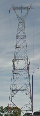
- Big Power Pole.PNG (95.01 KiB) Viewed 8900 times
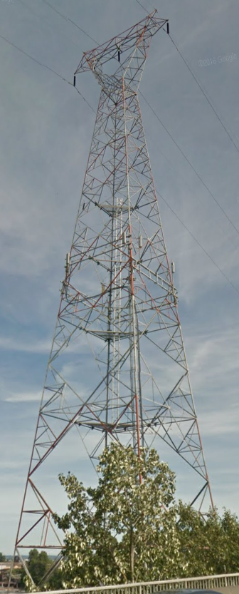
- Big Power Pole 2.PNG (518.84 KiB) Viewed 8900 times
Re: Friday Facts #195 - Poles re-design
Posted: Mon Jun 19, 2017 1:44 am
by Escadin
hitzu wrote:glex wrote:Normally players don't like changes
As far as I remember every other new graphics for old entities was welcomed very well by the players like new rails, train stations, trains and pumps. They are really improved sexy new versions. I don't remember much of complains. New power poles are different story.
Exactly.
This is not about not liking change. I have welcomed and highly anticipated EVERY change they made so far. However, these new models (as displayed by the pictures anyway) lack an iconic look to easily distinguish them and the necessary details (cables, transistors, different metal types, etc) that give them their 'make-shift' like looks which every other model in factorio has.
On closer look, the small pole is actually kind of okay in that regard (could use some cable running up the entire post) but the main wood section is too bright in my opinion. Perhaps it will look better in perspective with a real factory as background but I can easily see them dominating the sight given how many you have to put up early on.
However, the others are carbon copies of real world poles that you can see every day and that kind of breaks the immersion for me. Nothing in factorio looks like it's real world counterpart (i.e. like it was perfectly designed and then mass produced). They look like crudely fiddled about gimmicks that mimic their real world counterpart's functionality above all else while their appearance is whatever it happens to be with the materials our character ended up using.
That makes those new poles look as much out of place as modded entities with models ripped from other games.
Re: Friday Facts #195 - Poles re-design
Posted: Mon Jun 19, 2017 7:54 am
by bobingabout
glex wrote:Thanks a lot for your opinions.
Concerning the medium pole, there are a lot of discrepancy. Some of you dislike a lot the medium pole v.1 and some others just love it.
I personally want to change it because basically is not optimal for the gameplay, but as I said, don't wanna lose the iconic part of it.
Maybe after your comments i don't care that much if it's absurd or not a diagonal pole.
So I hope the final result will keep the spirit of the old factorio pole.
Anyway I know by experience that changing something in the game after so long playing with it, is always difficult. It happened hundreds of times. Normally players don't like changes, but if the re-design is good, after getting used to the new version, you will see clearly how much the new version improves the situation.
Well I'll keep working on it.
No pressure : )
I don't mind it.
I don't love it, nor do I hate it. It's just "The medium pole", and I don't give it a second thought anymore.
My suggestion would be for a very thin grid metal post up the middle, with a T shaped head.
Re: Friday Facts #195 - Poles re-design
Posted: Mon Jun 19, 2017 11:14 am
by Damaskox
I enjoy the old electric pole graphics.
The Big pole v2.a is ugly. I dislike it. It almost looks like a...tall sound tower...or a light tower.
v2.b looks better, but I still enjoy the old look more.
The Medium pole v2.a also looks ugly.
v2.b looks better, but again, I enjoy the old style more.
The Small pole v2.a looks cool. I give that my approval =D
Though...the second picture, is it just the rotation making it look strange, like the upper metal thing has been taken off and replaced at the middle of the wooden beam, or is it totally different graphics?
I also love the new warning pictures.
Keep doing good work!
Re: Friday Facts #195 - Poles re-design
Posted: Mon Jun 19, 2017 9:48 pm
by psychomuffin
glex wrote: Some of you dislike a lot ... others just love it... Anyway I know by experience that changing something in the game after so long playing with it, is always difficult.
All of you there at Wube are awesome listening to the community, weighing the options, and making something that really is a great change. There are so many other companies that make changes without user input, and often make things worse, and just use the "players don't like change" as a scapegoat. I am not at all worried what you'll do, since you take the time to get feedback =-) and implement changes that really are improvements.
Re: Friday Facts #195 - Poles re-design
Posted: Tue Jun 20, 2017 7:41 am
by bobingabout
Ludicrous wrote:I was just driving and saw this today and it screamed big power pole to me so i thought i'd add it here incase you guys were interested.
Big Power Pole.PNG
Big Power Pole 2.PNG
Yes.
Re: Friday Facts #195 - Poles re-design
Posted: Tue Jun 20, 2017 4:34 pm
by sthag

Hey,
I'm very curious about the work on the poles. So yummy to see the new versions and read about the thoughts.
I really like the medium v1 one.
The way the strut is at an angle is great. Also the material color combination fits very well in my opinion.
As the big and small ones are more like real ones to me, the medium one has the greatest factorio style.

MrGrim had some thoughts (not allowed to link to because I'm too young, sorry), few posts earlier about the scale of things. I also share this opinion. The v1 poles have great dimension and proportion imho. The head of the poles is big and important and the strut is somewhat smaller. But at the same time the strut is unique for the stage of the game (research progress) it's in. I'm missing this style in the new v2 big and medium versions, somehow. Also the v1 ones have more detail for me than the new ones.
Thanks for sharing so much detail about your development.
Cheers
Re: Friday Facts #195 - Poles re-design
Posted: Tue Jun 20, 2017 5:45 pm
by CharitableClas
OK. My opinion on the whole electrical system when I first started playing was if you tech up to substations why use the other poles anymore other than the big ones to transport power over long distances.
Now that I have several hours and days and a year or two under my experience tool belt I realize that you still use the other poles to make more compact designs. My point is this if you want to upgrade the graphics to make them look better why not have the Big Electric Poles carry high amount of electricity to the substations which you can make split the power like a smart grid so if you have something that needs more power in one area and not so much in another the substation says OK we need to move power in this direction more than that direction. An example of this would be you have a huge circuit production to the east of your substation and a small oil production to the west of it the oil doesn't need as much of the power so it sends the amount it needs for oil production and sends the rest it gets over to the circuit area. In ratio terms it would be like 25% to the west and 75% to the east. Then you have your medium poles that "transform" the power down to the needed wattage for the buildings then the small poles transfer that power from the medium to the building itself. So it is like in real life but you have something "Iconic" for Factorio as the substations in real life just "transform" power down from extremely high voltage down to just high voltage then sends it on down the lines to where ever its gotta go to. If that seems like too much to do that's fine I just thought I would throw my idea out there just in case someone who makes mods likes the idea and can do that.