Page 1 of 6
Friday Facts #195 - Poles re-design
Posted: Fri Jun 16, 2017 8:05 pm
by Klonan
Re: Friday Facts #195 - Poles re-design
Posted: Fri Jun 16, 2017 8:11 pm
by y.petremann
Great icons ...
Re: Friday Facts #195 - Poles re-design
Posted: Fri Jun 16, 2017 8:13 pm
by brunzenstein
Waiting for the nice poles to come...
Re: Friday Facts #195 - Poles re-design
Posted: Fri Jun 16, 2017 8:14 pm
by Ghoulish
[..] but step by step Factorio looks better.
It sure does!
Re: Friday Facts #195 - Poles re-design
Posted: Fri Jun 16, 2017 8:14 pm
by HammerPiano
Wow the warning signals look awesome great job!
And the power poles look amazing. I knew it was a good idea to upgrade my GPU

Re: Friday Facts #195 - Poles re-design
Posted: Fri Jun 16, 2017 8:22 pm
by MasterBuilder
I'm really liking that big pole v2.a. Shame it can't work as-is.
No love for substations? They're all that's missing.
Re: Friday Facts #195 - Poles re-design
Posted: Fri Jun 16, 2017 8:25 pm
by SpeedDaemon
I love the new warning icons, with one exception... I think the "something got blown up/destroyed" one should stay a mushroom cloud (just make it a silhouette to match the others).
Re: Friday Facts #195 - Poles re-design
Posted: Fri Jun 16, 2017 8:27 pm
by Albert
MasterBuilder wrote:I'm really liking that big pole v2.a. Shame it can't work as-is.
No love for substations? They're all that's missing.
yes : ) love for substations, of course.
it is there but no textures yet. next post (of mine)
Re: Friday Facts #195 - Poles re-design
Posted: Fri Jun 16, 2017 8:48 pm
by Cordylus
That's sad that big pole v2a is so hard to implement - it's the greatest one.
The big pole v1 is awful - it looks like some toy. The v2b also looks strange.
For the top of the medium pole I suggest you this:
Re: Friday Facts #195 - Poles re-design
Posted: Fri Jun 16, 2017 8:48 pm
by blaine
Large poles really miss those big ass insulators from the low resolution version in my opinion. New ones look sleek, but it is kinda bad for factorio?
Re: Friday Facts #195 - Poles re-design
Posted: Fri Jun 16, 2017 8:49 pm
by Hamster
I think medium 2a looks better than 2b.
Re: Friday Facts #195 - Poles re-design
Posted: Fri Jun 16, 2017 8:54 pm
by SteelWolf300
FFF195 wrote:
But to be honest I find a bit annoying the absurdity of having a diagonal pole that requires another support on the base just to be stable. What kind of engineer does a pole like that?
I personally don't think that a diagonal pole is a problem, especially within a game with a "Steampunk" graphic design. Speaking about absurd designs, there are on most machines apparently useless pipes, gears, wires, but I think theses "useless" details provide the game with a wonderful atmosphere.
I just really love the medium pole v1. And as you said :
FFF195 wrote:
The good part of the v.1 is that it is very unique, and you can recognize this pole as from Factorio anytime you see it.
Maybe I am the only one who will regret the "old" design for the medium pole, and if most of the feedbacks are in favor of v2.a/b/x, I will resign to it.
And I will still keep playing Factorio, because I find it amazing, and you guys are doing a great job!
Re: Friday Facts #195 - Poles re-design
Posted: Fri Jun 16, 2017 8:56 pm
by Earendel
Pole design feedback:
Big pole 2b looks good.
Medium pole 2a looks good,
Medium pole 2b has a better hue, but overall is a much more awkward looking design. 2a looks much better overall.
Small pole looks fine. I'd be curious about a version where the supporting pole is centred under the 3 connections.
Re: Friday Facts #195 - Poles re-design
Posted: Fri Jun 16, 2017 9:04 pm
by Mango
Very nice to see work in progress.
Here is what I think:
Big pole:
v2.a doesn't seem to be 2x2 but 1x2 or even 1x1 if moved a little bit. The the top part looks really nice and "new".
v2.b looks more massive or hard-set and I always though big pole shoud be like that. Also it fits well into 2x2 tile grid.
Medium pole:
v1. is as you said really iconic to factorio and i don't know how I feel about removing it.
v2.a is nice and simple looking. It's nice that it is clearly made out of steel as it is probably first thing you make from it and you make it alot.
v2.b... the pole is nice and fits nice with big 2b pole. But the top... I must say i hate it... I think it doesn't fit to factorio at all and looks ugly when rotated.
Small pole:
Not much to see there but i don't undestand the shadow of the rotated one. I probably never realised how it looks when standing in front of it.
Icons:
Those icons look really nice but I have few suggestions.
3. is destroyed building? There should be something like explosion to be clear with it.
Im not sure what theese icons represents:
6 7 12 13
Re: Friday Facts #195 - Poles re-design
Posted: Fri Jun 16, 2017 9:10 pm
by Pandemoneus
Mango wrote:Very nice to see work in progress.
Here is what I think:
Big pole:
v2.a doesn't seem to be 2x2 but 1x2 or even 1x1 if moved a little bit. The the top part looks really nice and "new".
v2.b looks more massive or hard-set and I always though big pole shoud be like that. Also it fits well into 2x2 tile grid.
Medium pole:
v1. is as you said really iconic to factorio and i don't know how I feel about removing it.
v2.a is nice and simple looking. It's nice that it is clearly made out of steel as it is probably first thing you make from it and you make it alot.
v2.b... the pole is nice and fits nice with big 2b pole. But the top... I must say i hate it... I think it doesn't fit to factorio at all and looks ugly when rotated.
Small pole:
Not much to see there but i don't undestand the shadow of the rotated one. I probably never realised how it looks when standing in front of it.
Icons:
Those icons look really nice but I have few suggestions.
3. is destroyed building? There should be something like explosion to be clear with it.
Im not sure what theese icons represents:
6 7 12 13
Yeah, the shadow of the small pole 2a looks really weird.
Re: Friday Facts #195 - Poles re-design
Posted: Fri Jun 16, 2017 9:27 pm
by Engimage
While poles do look better cause of HD textures but it is my first time I can say I don't like the design even of a single one. Especially color of a wooden pole...
Re: Friday Facts #195 - Poles re-design
Posted: Fri Jun 16, 2017 9:54 pm
by jamuspsi
So this might not be the perfect place to ask this, and so I'll ask it again if you don't see it.
I'm working on a sleeve of tattoos representing my favorite video games- limited to games I've played for a hundred hours or more. Factorio is absolutely one of the games I want to represent, and I figure I might limit myself to a bronze gear as per the logo. But I'm a little nervous- with all the art changes you guys are making, is the logo going to change? Should I wait a while?
Re: Friday Facts #195 - Poles re-design
Posted: Fri Jun 16, 2017 10:02 pm
by userasd
I think I am the only one who liked the medium pole v.2b with its bent top...
Re: Friday Facts #195 - Poles re-design
Posted: Fri Jun 16, 2017 10:16 pm
by Rivsung
On the large poles: I like the legs of the pole but I'm not a fan of the top. I could get used to it though.
On the Med poles: I like v2a more than v2b. The base of either is ok with me but I really dislike the top of v2b. It looks odd raised so high in the air.
On the small poles: the color reminds me of a pencil. It looks more yellow than brown.
The icons look great though I'm not sure what a few of them are (11, 12).
Given the situation, crash landed on an alien planet, I think it's perfectly reasonable to expect some items not to be perfectly designed.

Re: Friday Facts #195 - Poles re-design
Posted: Fri Jun 16, 2017 10:20 pm
by ribsngibs
I think the diagonal support struts on the big poles (both v2.a and v2.b) are really confusing in the 45 degree diagonal rotations because of the isometric projection. They just happen to line up with the camera angle so that the diagonal supports look horizontal, and the opposing foreground and background diagonals cross in a perfect X, so your brain interprets the majority of it as if it were a picture taken from head on (no camera pitch), and then the top looks like it's stuck on broken and tilted on an angle.
i.e. when I look at it, my brain interprets the red lines as being
horizontal support beams, not diagonal, and then the purple lines as being diagonal X shapes inside each square.
So it looks like a head on side view, and then the top looks like it's on wonky like an Escher drawing.
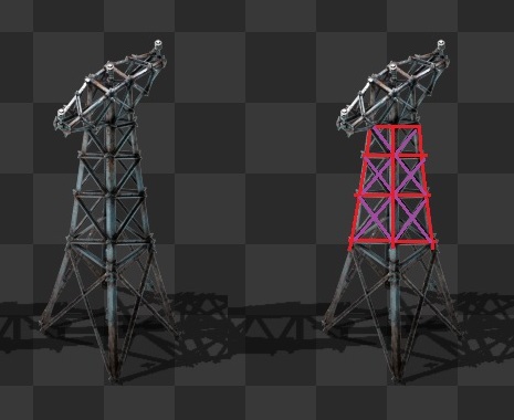
- pole03.jpg (38.96 KiB) Viewed 16921 times