Page 3 of 20
Re: Friday Facts #191 - Gui improvements
Posted: Fri May 19, 2017 5:54 pm
by Junion
Honestly for the toolbar I like how it currently works. But that is in part because I get the toolbar upgrade, specifically, to upgrade my inventory.
If you give us back the lost inventory space as inventory I'll be ok with it. Otherwise I'd like to be able to pull up just my inventory on the side and be able to grab items from it and use it on screen without needing to re-close the thing. Though I will admit I do like the idea of being able to place ghosts without needing the item or blueprints. Since sometimes I'm trying to ghost design something and losing the last item to bots stops it from happening.
For the inventory, sort/autosort is sort of around already..I forget where it is but you're able to just click a button that turns on/off autosort...turn it on for a moment to do a sort command, however it being easier to find is ok by me.
For the rest. If it is feasible, make it so we can have a checkmark or similar somewhere that says 'use old style interface'. And I'll be ok with you changing what new players are greeted with. When I shift click an item I know exactly where it will go (though with the toolbar now just shortcuts..nothing will go there, which is fine means more things hit the trash slots). Mostly I just like hitting a button and all the information is there, immediately, without me needing to swap between 3 tabs to find what I want. Because sometimes I do want to open up my inventory, swap my ammo out, trash some extra crap I don't need anymore, and craft some item right quick that I no longer have on me.
I ESPECIALLY want the weapon display to be something we can toggle, I like having all currently equipped weapons shown..and ammo count, so that I know how much ammo I have left in my weapon at all times. Please do not force me to be without this useful information, unless you all plan to work more on having stuff fight biters for us, without us needing to be there in person.
Oh yeah, I do like the idea of being able to filter inventories, that is useful.
Re: Friday Facts #191 - Gui improvements
Posted: Fri May 19, 2017 5:55 pm
by MasterBuilder
I never understood why all my weapons and ammo need to be shown on my screen all the time, when 95% of my time is spent building factories.
Because sometimes we need to shoot in a hurry and we need a quick way of making sure we're not going to nuke ourselves.
I'm all for moving it into a tab, but, we still need a quick way of seeing which weapon we have equipped.
Re: Friday Facts #191 - Gui improvements
Posted: Fri May 19, 2017 5:55 pm
by AcolyteOfRocket
I'm not too fussed one way or the other about the UI changes, the game is already good, but these don't address the few flaws thew game has (ie: naff combat).
Filtereable inventory space looks like a plus.
You might want to add one extra disadvantage to your presentation though :-
"Ghost placement - Noobies might be rather confused by the ability to place items they don't actually have in their inventory, and don't even have the tech for"
Just a thought

Re: Friday Facts #191 - Gui improvements
Posted: Fri May 19, 2017 5:55 pm
by Aoz
Everything up until the player inventory is gold and is great. The player inventory idea however suffers from the problem of hiding information (which sounds like the point - but I don't think it's desirable).
You may say that it's bad that you rarely need to see your characters loadout but when you DO go biter thrashing you do need that heads up display of how many uranium bullets you have left, or how much battery you have left on your personal defense lasers. One of the worst (best?) parts about E is it comes up front and center and is huge and this change wouldn't help that, pulling it up during combat to check levels is a no-go. Yes you mainly build factories in this game but that's not the ONLY thing you do and to remove important information for other pieces of gameplay is bad. Instead give players an easy way to hide UI elements they don't need through something easier than the options menu (maybe those F1-F3 buttons
.
Another problem is that E - which today always does what you want, will now only sometimes do what you want lategame and that is truly maddening. Sifting through tabs is not awesome. Adding more tabs to a website/app/game UI does not make it better it makes it harder to find what you're looking for. Even if you know what you're looking for many users will slap E (or the wrong F-key), and fumble around in the tabs until they find what they're looking for because it's muscle memory that they build and it's easier to build muscle memory around easy actions. Because it's that kind of muscle memory action the labels won't help, the hotkeys won't help, it's just how users are.
In some kind of awkward summary: The problem you're trying to solve is the awkwardness around where do shift-clicked items go. But in order to solve this problem that I can't imagine many people truly care about, you're taking away one of the best parts of the UI: Simplicity. Press E, see everything you could ever need right now, no tabs, no information hiding, just clearly separated sections that manage every piece of what you want to do with your inventory (organize/view, logistics organization, crafting).
It's not all negative, the character screen is very cool and maybe could find a place somewhere in the game

Thanks for reading. Thanks for everything! Great game.
Re: Friday Facts #191 - Gui improvements
Posted: Fri May 19, 2017 5:59 pm
by Twinsen
MasterBuilder wrote:I'm all for moving it into a tab, but, we still need a quick way of seeing which weapon we have equipped.
I didn't make it very clear in FFF, you you can still see your active weapon and ammo, something like this, possibly attached to the quickbar:
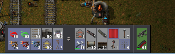
- Capture.PNG (198.11 KiB) Viewed 7522 times
Re: Friday Facts #191 - Gui improvements
Posted: Fri May 19, 2017 5:59 pm
by MainTango
Most of the changes sound very promising and would make lots of things much more intuitive when it comes to UI. One thing however, I have a slight problem with. in the FFF you wrote:
I never understood why all my weapons and ammo need to be shown on my screen all the time, when 95% of my time is spent building factories.
That is certainly true over the course of an entire game and with default biter settings. However, there are times where I focus on annihilating biter nests for 100% of the time, sometimes for 2 or more consecutive hours. That's why at least when driving a tank I'd like to be able to see the ammo count for each weapon at a glance. After all, the ammo count doesn't take up that much of screen real estate anyway.
Re: Friday Facts #191 - Gui improvements
Posted: Fri May 19, 2017 6:04 pm
by High2
Here's my idea on it:
Make it a Research Unlock
A lot of people use these old mechanics (myself included) of the old toolbars,
yet these new changes to me feel like they are necessary.
There is already a research to add a toolbar. Is it a possiblity to add some research that would allow you to select the toolbar mode?
The idea here is to leave it as is before research, and after the research let people decide if they want to use the toolbar as a shortcuts system or a storage one. (obviously this means no extra inventory space)
Another thing is adding swappable toolbars. (like sets of toolbars one can make, one for trains, one for factories, one for defense ect.)
(this might need a restriction if the "inventory" side of the toolbar is kept, because adding more toolbar sets would mean expanding the inventory
The tabs are a welcome touch, as long as we can keep multiple weapons/ammo and still swap em the old way (thats more intuitive) (speaking of, what about research increasing the gun/ammo size , so we can finally have machine gun, shotgun, flamethrower AND rocketlauncher all at once (why not add the pistol too)
Just throwing ideas, I'm rambling though, back to my factory
Re: Friday Facts #191 - Gui improvements
Posted: Fri May 19, 2017 6:06 pm
by Ratzap
One thing I'd like to see that seems to be missing is on the character page. It shows the battery levels but it would be handy to have an indicator of whether your current equipment draws more power than you generate. A simple traffic light would work or a pair of numbers representing usage and generation. I realise that not everything will be active at once but it'd beat trying to work it out from various tool tips.
Re: Friday Facts #191 - Gui improvements
Posted: Fri May 19, 2017 6:11 pm
by robodino3
I have approaching 700 hours and I welcome all the improvements. I especially like being able to ghost things that aren't in your inventory. I can't tell you how many times I would craft an item in order to ghost it, forgetting that I was wearing a roboport and as soon as I ghost the first item, a robot takes it from me to go place it and I can no longer ghost more of that item.
BradleyUffner wrote:
Does this mean we could get multiple toolbars that we could cycle through? I could have my default toolbar, and additionally have a "Train" set, or a "Fluid" set for when I am focusing on those things.
Good news for everyone wanting multiple toolbars that could be cycled. We already have that. Pressing "X" will cycle the toolbars. If you are wanting more than two, there is probably a mod for that. I vaguely remember having more than two at some point, but I don't know if it was part of the base game and later removed, or if I was playing on a game that had mods installed. I could definitely see room for something similar to the blueprint books where you would have several toolbars(not all shown each customized for constructing different types of projects such as "Train" or "Fluid".
Re: Friday Facts #191 - Gui improvements
Posted: Fri May 19, 2017 6:11 pm
by Martc
I am supporting this changes, especially building ghosts from toolbar. It's very frustrating when bots take you last item, and you can't continue planing you factory.
Re: Friday Facts #191 - Gui improvements
Posted: Fri May 19, 2017 6:12 pm
by Omarflyjoemacky
If there is one thing I've learned from loaders.... don't ask the players to decide on idea implementations. Just put the ideas in. The player will get used to it. Especially if the ideas make sense.
Re: Friday Facts #191 - Gui improvements
Posted: Fri May 19, 2017 6:13 pm
by JadeSpider
Thanks for the clarification on showing the weapon and ammo. That is better than nothing, but still not as easy to take in at a glance while fighting as the current UI. If I want to know how much smg, shotgun, and flamethrower ammo I have left, I can see all of that easily. If I want to know which weapon I have selected, I can tell by the position of the selected weapon, which means I can see it in my peripheral vision and do not have to look directly at it. These are features we would lose if all we could see was the currently selected weapon. Also, I assume the battery level of the suit will be there also?
As for the UI tabs people are complaining about, I tend to agree with them that a tabbed design makes things harder to do. Having all of the information in one place is really nice. Separating it into tabs may make it easier to learn (although I am not convinced), but it certainly does not benefit the experienced player. As far as what shift+click does, there are other ways to solve those issues. There could be more modifier keys (like Ctrl+Click or Ctrl+Shift+Click or whatever) that do different things. New players aren't going to know or care about Shift+Click on inventory items anyways, so it really only affects experienced players. Also, the problem of it not always doing what you want is a really minor issue that I doubt many people are too concerned about.
Re: Friday Facts #191 - Gui improvements
Posted: Fri May 19, 2017 6:15 pm
by fregate84
Twinsen wrote:BradleyUffner wrote:Does this mean we could get multiple toolbars that we could cycle through? I could have my default toolbar, and additionally have a "Train" set, or a "Fluid" set for when I am focusing on those things.
I like this idea.
agree, good idea.
And changes you want to do look nices and better for the gameplay.
Re: Friday Facts #191 - Gui improvements
Posted: Fri May 19, 2017 6:19 pm
by deemer
Disadvantages I see:
The granularity of 2 inventories is lost. Putting your entire inventory in a chest while keeping your toolbar inventory is no longer possible
This is something I do a lot in the mid- to late-game. Essentially, I automate one way or another (usually w/ requester chests) to have a supply of building materials ready for each project I do often (mining outpost, wall-building, solar array, nuclear plant, etc.) I set the request amounts based on blueprints. When I want to build one of those, I dump my inventory, but keep my ammo, blueprints, and construction bots, and grab the contents of the proper chests (I have lights set to turn on when they are ready).
I suppose I could set up a chest to grab my blueprints, bots and ammo from, but it would be nicer if I could one-click dump my inventory while keeping those things. (It would be better than at present, actually, as now I have to manually clear out the slots I don't want from the toolbar.) Maybe if there were an option to not dump things from filtered slots?
Also +1 to multiple toolbar configurations. I'll actually use it properly if I don't have to manually set it up each time I do something different.
Re: Friday Facts #191 - Gui improvements
Posted: Fri May 19, 2017 6:23 pm
by Dispaminite
I'm not a fan of the toolbar change because I never liked the idea of locking my toolbar with specific items. I like having the items I'm crafting (or picking up from a chest) going into the toolbar bar, since I'm planning on using them.
If possible, I would prefer an option to set it one way or another.
Re: Friday Facts #191 - Gui improvements
Posted: Fri May 19, 2017 6:23 pm
by Jon8RFC
I've only been playing since May 7, 2016, and I was not a fan of the filter/smart inserter color change. However, I think this UI change with tabs will be great and I have some quick additions to your awesome ideas.
I will definitely miss is this:
The granularity of 2 inventories is lost. Putting your entire inventory in a chest while keeping your toolbar inventory is no longer possible
People don't like change
But with the
seemingly complex, yet very useful, keyboard/mouse inputs (shift/alt/ctrl+mouse1/mouse2/mouse3+etc), I'm sure you can make a simple tweak to make this more functional not only for inventory, but everywhere. Why not add a second mouse3 middle-click option (red, for reserving as blue does and allowing insertion, but removal must be manually clicked to be removed with mouse1, and bots cannot take from it) and add both to player, chest, vehicle, cargo inventories?
If the item is occupying a slot, mouse3 click once to go blue, again to go red, again to reset; as it is, just add the red option. If the slot is empty (this lack of use frustrates me with train cargo), the first mouse3 click opens the select-item window just how the logistics request does, and the blue slot is set; mouse3 click again and it's changed to red; allow shift+mouse2&shift+mouse1 copy&paste like you can with items' settings on the ground (inserters, chests, refineries, etc). It's a bit more complexity, but this game already has complex controls that are very handy to have once you've learned them. Make it global, how you all have begun to make other features global...player, chest, vehicle, cargo, anything with inventory.
The new red option would retain the missing feature, while also permitting a new feature of not allowing bots to take items or for players to take items by ctrl+mouse1 on a chest. It can also serve as retaining failsafe/backup items that you always want to have, without having to create a chest that isn't logistics-enabled. One potential hurdle I see is--how do you track them? Another tab or drop-down menu in the logistics UI that shows a separate network of "reserved" items. Logistics networks, player network, and reserve network. Seems like great potential for 0.16!
Re: Friday Facts #191 - Gui improvements
Posted: Fri May 19, 2017 6:24 pm
by Mango
I like all the ideas exept one - The character equipment hidden under inventory.
Twinsen wrote:MasterBuilder wrote:I'm all for moving it into a tab, but, we still need a quick way of seeing which weapon we have equipped.
I didn't make it very clear in FFF, you you can still see your active weapon and ammo, something like this, possibly attached to the quickbar:
Capture.PNG
This is nice butn I'm raiding biter nests I usually use more weapons, so it would be nice to see how much ammo do I have for all my weapons and what weapon is currently selected.
And as you can see total number of items in the inventory It would be nice to also see total number of ammo.
Re: Friday Facts #191 - Gui improvements
Posted: Fri May 19, 2017 6:24 pm
by sparr
Inwoods wrote:As for F1 etc on laptops, people can rebind if desired.
Currently the F key shortcuts are among the ones that can't be rebound in the game options.
Re: Friday Facts #191 - Gui improvements
Posted: Fri May 19, 2017 6:25 pm
by JadeSpider
For the weapon information area, perhaps a toggle between seeing all of weapons and ammo and seeing only the currently equipped would be enough to make everyone happy. Each person can choose if they want full or compact mode. I definitely prefer to see them all, as well as see the current battery level. The harvesting tool and armor spots are not useful though and could be in the inventory window somewhere instead.
Re: Friday Facts #191 - Gui improvements
Posted: Fri May 19, 2017 6:27 pm
by Killerhuehnchen
I didn't know i wanted these changes before. I like them.
But please change the hotbar hotkeys from [shift]+1..5 to 6..0 and while you're at it: twenty quick slots are not enough even with blueprint books. So please add more levels to the toolbelt upgrade research.