Page 3 of 3
Re: Friday Facts #110 - Tech art finished
Posted: Sun Nov 01, 2015 2:40 pm
by JackGruff
MushroomDynamo wrote:it'll be hard to appreciate these gorgeous pictures ingame if I need a small telescope to make them out
I agree.
Also, I spy two "rocket defense" icons.
Re: Friday Facts #110 - Tech art finished
Posted: Sun Nov 01, 2015 2:55 pm
by oLaudix
JackGruff wrote:
Also, I spy two "rocket defense" icons.
First one in the one before last row and?
Re: Friday Facts #110 - Tech art finished
Posted: Sun Nov 01, 2015 3:22 pm
by JackGruff
oLaudix wrote:
First one in the one before last row and?
6th on the same row. I guess it'll be a 0.13 thing.
Re: Friday Facts #110 - Tech art finished
Posted: Sun Nov 01, 2015 5:04 pm
by yago2003
i think i found a technology icon for a new technology that i dont recognize, 12 down and 5 to the right, the one with the rocket, does this mean you will be able to go to space?
Posted: Mon Nov 02, 2015 1:08 am
by AlexTheNotsogreat
Something tells me that there will be new research nodes with this, such as two spacecraft-based nodes, some box... things, and lots of other unusual ones!

Re: Friday Facts #110 - Tech art finished
Posted: Tue Nov 03, 2015 6:17 am
by Gandalf
I'm still wondering how the technology icons will look in game. They look bloody awesome in the large view in the FFF post, but in game they will become much smaller sprites (I assume). So I'm not sure if all the amazing detail will still be visible or if maybe the tiny resolution will instead make some of the icons hard to identify.
Re: Friday Facts #110 - Tech art finished
Posted: Tue Nov 03, 2015 7:24 am
by ssilk
Hm, they can make them bigger in game.

Re: Friday Facts #110 - Tech art finished
Posted: Wed Nov 04, 2015 11:18 pm
by Wyrm
Mr. Fusion is cute, but may lead to legal trouble. I suggest a more unique-looking fusion reactor.
Re: Friday Facts #110 - Tech art finished
Posted: Fri Nov 06, 2015 10:26 am
by anstow
jorgenRe wrote:Im sorry for being picky about the molucles yet again
Also i still get the correct coffenie molecule ready for use

!
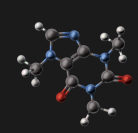
Notice the extra bound.
!
I believe this caffeine molecule isn't quite right either: there is a missing hydrogen atom on the bottom most carbon atom.
Re: Friday Facts #110 - Tech art finished
Posted: Fri Nov 13, 2015 12:16 pm
by Nasabot
I just updated to 1.17 (though I saw the tech icons before) and my opinion on this is, that the improved tech icons are a waste of resources. Sorry, I know, that you dont want to hear this as the new icons were made in good intentions to improve the game, but in my opinion they are unnessassary and are maybe even worse than the old ones.
Icons should be a symbolical eye catcher. A good icon does not shine by many details and eleborated graphics, but by SIMPLICITY and its ability to represent an object or a topic fast. (like a light bulb for science)
Well, actually I dont mean, that the new icons are bad by any means, but the old ones were PERFECTLY FINE and did their job well (or even better), so I dont understand, why they were changed.
However, even though the game is pretty good in its current state, there are a lot things which could use some balancing and rework in order to enrich the gameplay in a meaningful way. Please dont waste your brain on creating fancy graphical stuff, but on creating smart game mechanics
I guess the playerbase who plays factorio is not interested in graphical quality too much, else they would play games like anno 2205.
Player(at least I) who play factorio want a complex building simulator which has a lot of finesse, balanced possibilities, challange and long term replayability.
I am sure you knew this, I just wanted to remember you
Re: Friday Facts #110 - Tech art finished
Posted: Fri Nov 13, 2015 12:58 pm
by RepairMan
Nasabot wrote:I just updated to 1.17 (though I saw the tech icons before) and my opinion on this is, that the improved tech icons are a waste of resources. Sorry, I know, that you dont want to hear this as the new icons were made in good intentions to improve the game, but in my opinion they are unnessassary and are maybe even worse than the old ones.
Icons should be a symbolical eye catcher. A good icon does not shine by many details and eleborated graphics, but by SIMPLICITY and its ability to represent an object or a topic fast. (like a light bulb for science)
Well, actually I dont mean, that the new icons are bad by any means, but the old ones were PERFECTLY FINE and did their job well (or even better), so I dont understand, why they were changed.
However, even though the game is pretty good in its current state, there are a lot things which could use some balancing and rework in order to enrich the gameplay in a meaningful way. Please dont waste your brain on creating fancy graphical stuff, but on creating smart game mechanics
I guess the playerbase who plays factorio is not interested in graphical quality too much, else they would play games like anno 2205.
Player(at least I) who play factorio want a complex building simulator which has a lot of finesse, balanced possibilities, challange and long term replayability.
I am sure you knew this, I just wanted to remember you
Some Friday Facts before they were talking about placeholder graphics and where the alien research icon comes from, you might wanna read it because thats part of the reason the have redone the tech icons.
Re: Friday Facts #110 - Tech art finished
Posted: Fri Nov 13, 2015 4:14 pm
by Smarty
Nasabot wrote:I just updated to 1.17 (though I saw the tech icons before) and my opinion on this is, that the improved tech icons are a waste of resources. Sorry, I know, that you dont want to hear this as the new icons were made in good intentions to improve the game, but in my opinion they are unnessassary and are maybe even worse than the old ones.
Icons should be a symbolical eye catcher. A good icon does not shine by many details and eleborated graphics, but by SIMPLICITY and its ability to represent an object or a topic fast. (like a light bulb for science)
Well, actually I dont mean, that the new icons are bad by any means, but the old ones were PERFECTLY FINE and did their job well (or even better), so I dont understand, why they were changed.
However, even though the game is pretty good in its current state, there are a lot things which could use some balancing and rework in order to enrich the gameplay in a meaningful way. Please dont waste your brain on creating fancy graphical stuff, but on creating smart game mechanics
I guess the playerbase who plays factorio is not interested in graphical quality too much, else they would play games like anno 2205.
Player(at least I) who play factorio want a complex building simulator which has a lot of finesse, balanced possibilities, challange and long term replayability.
I am sure you knew this, I just wanted to remember you
You know the old tech icons and they looked like the item you wanted to research but after a while you'll get used to the new graphics
(i have the same problem
)
Re: Friday Facts #110 - Tech art finished
Posted: Sat Nov 14, 2015 4:40 pm
by Overread
My only problem with the new tech icons is that for research options which have levels (like bullet damage or transport belts etc..) the icon has no difference in appearance barring a tiny number that is very easily missed. A bigger visual change would be greatly appreciated even if its just changing the primary colour of one or two segments of the icon to reflect different "levels"