Page 1 of 8
Friday Facts #405 - Whole belt reader, New logistics GUI
Posted: Fri Apr 05, 2024 11:00 am
by FactorioBot
Re: Friday Facts #405 - Whole belt reader, New logistics GUI
Posted: Fri Apr 05, 2024 11:08 am
by SnowZyDe
If I want to play multiplayer, then I would like to see a minimap by choosing a server, if I didn't like it, I wouldn't waste time going to this server and downloading mods that are active on this server.
Re: Friday Facts #405 - Whole belt reader, New logistics GUI
Posted: Fri Apr 05, 2024 11:15 am
by FleshyNessa
Filterable pumps was something I wanted a while back (sorting out undelivered fluids at a LTN fluid depot); really looking forward to this. Are there any plans to add circuit control to loaders too? I know they're not visible within vanilla, but it would be amazing to have that functionality exposed to the modding community. (whitelist/blacklist, enable/disable, just like an inserter.. ..bulk loaders?)
Re: Friday Facts #405 - Whole belt reader, New logistics GUI
Posted: Fri Apr 05, 2024 11:19 am
by svalorzen
Perhaps you could still add the option that if one clicks on a specific item (or member), the minimap will add icons of where that item is stored/located? So you can re-add the functionality of showing where things are, but it is less obtrusive as you do not need all the different minimaps, and you can toggle things individually.
Re: Friday Facts #405 - Whole belt reader, New logistics GUI
Posted: Fri Apr 05, 2024 11:19 am
by Ghoulish
More neat changes! Though please bring back the rocket launch GUI! Updating it to show rockets launched per minute etc would be great!
Re: Friday Facts #405 - Whole belt reader, New logistics GUI
Posted: Fri Apr 05, 2024 11:20 am
by Xoriun
With the first and second iteration, you could see where each of the items in a network currently are. This information can be really valuable in some circumstances (like when changing some part of the base but forgetting to remove one single request).
I think it would be a really nice if there was a way of seeing this information in the final design. Like if hovering an item in the table, all members containing this item are highlighted on the map (similar to how the chests and roboports are highlighted on the minimaps in the first 2 iterations, but all in the single map).
Same goes for the requests tab in iteration 2. Maybe this could be implemented in a similar way, like a third table below the items table.
EDIT: turns out, I need to type faster.
Re: Friday Facts #405 - Whole belt reader, New logistics GUI
Posted: Fri Apr 05, 2024 11:27 am
by SupplyDepoo
THANK YOU! I love these changes.
The little graphical details on the belts is such a nice little touch, and the fact that you iterated through multiple different versions of the logistics gui shows that Factorio is a true labour of love.
I would suggest adding a highlight to every network in the list that contains items matching a text search.
Re: Friday Facts #405 - Whole belt reader, New logistics GUI
Posted: Fri Apr 05, 2024 11:28 am
by TheoMarque
Em, pumps...
I posted a bug-topic:
viewtopic.php?f=29&t=101540
about some fluids resting in "virtual" pipe in pump. Pumping station (form one to other train) need some amount of fluid buffer. Is is some inconsistency according to transfer barreled fluids (all barrels can be transferred form one to other wagon). This need some "fix" to push last fluid drop into wagon-tank, especially when we start switching fluid filters on pumps.
Re: Friday Facts #405 - Whole belt reader, New logistics GUI
Posted: Fri Apr 05, 2024 11:29 am
by againey
Xoriun wrote: ↑Fri Apr 05, 2024 11:20 am
EDIT: turns out, I need to type faster.
It doesn't hurt to reinforce that this is a feature that multiple people want. I too would love to have an easy way to determine where specific items are stored.
Sometimes, after using the logistics window to confirm that the item does exist, I want to just go pick it up myself, rather than fiddling with temporary logistics requests and waiting on bots. Since I already have the logistics window open and I've located the item type in the list (usually with Ctrl+F), it could be just one tiny additional step of hovering over or clicking the item and glancing at the minimap to get the info I want. That would be a very welcomed feature!
Re: Friday Facts #405 - Whole belt reader, New logistics GUI
Posted: Fri Apr 05, 2024 11:30 am
by kevincox
It sort of looks like you were avoiding naming networks. This seems like an obvious affordance.
I guess the question is how to name it. But maybe you can just name roboports and it will list the names in the network. (The idea is that you would typically only name one roboport per network.)
Whole belt reader indicators
Posted: Fri Apr 05, 2024 11:42 am
by Karamel
Maybe the whole belt reader indicators should be asymmetrical, to indicate which direction the connector is from a belt segment? Belts are easy to trace with your eyes, but you do need to know which way to go.
Re: Friday Facts #405 - Whole belt reader, New logistics GUI
Posted: Fri Apr 05, 2024 11:42 am
by Terrahertz
Amazing changes, Good Job!

Two questions though:
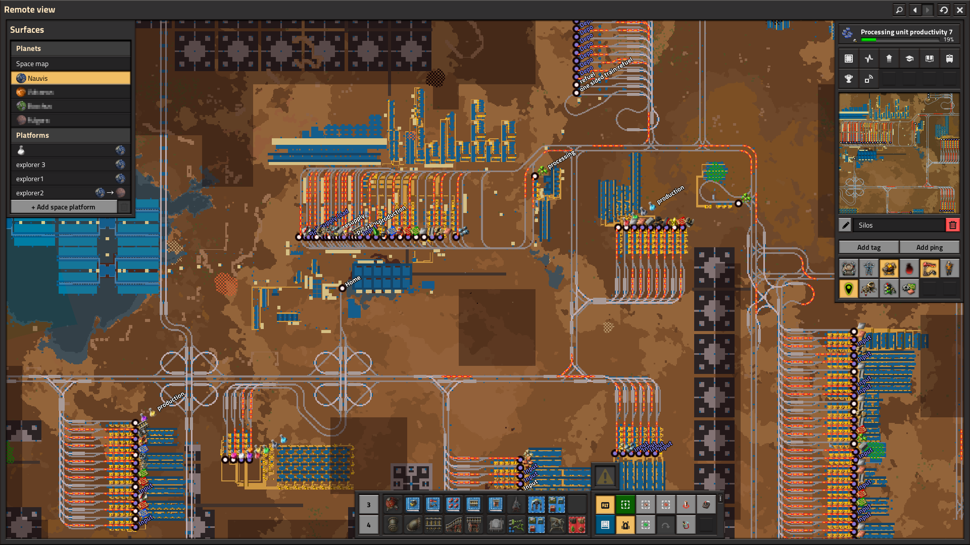
- Is this GUI now always there in the remote view or is it only showing when the Logistics-Networks are displayed on the map?
- As shown in FFF-380 this piece of real estate is already used by the Surfaces overview. How do they interact? Is one just pushing the other further into the middle?

Re: Friday Facts #405 - Whole belt reader, New logistics GUI
Posted: Fri Apr 05, 2024 11:43 am
by francoisb
No more Rocket Control Units? Rockets take blue chips now? I’m not crazy, am I? I saw that right?
Re: Friday Facts #405 - Whole belt reader, New logistics GUI
Posted: Fri Apr 05, 2024 11:45 am
by Hares
How about allowing reading the fluid system contents in the same way you read the whole transport line?
This info already exists on the UI, you just need to allow exporting it to the circuit network
Re: Friday Facts #405 - Whole belt reader, New logistics GUI
Posted: Fri Apr 05, 2024 11:45 am
by Tooster
One problem there is with the current GUI is that the item counts cause all the elements in the list to shift by 1, which I assume is sorted alphabetically, so when you have an alphabetically first item constantly added and removed from the network (e.g. you run out of buffer and consume as as much as you produce), then the whole concept of item list is unusable, because you neither can reliably click or even read it if everything jumps around each tick. You should investigate sorting by "update frequency" or some other way to display this information.
One thing I'm missing is logistic network requests view, similar to the one in the Project Cybersyn mod's experimental Manager UI (enabled in mod's experimental settings). It would show current logistic requests in the network and their status (pending i.e. not yet fulfilled and in-transit count)
Re: Friday Facts #405 - Whole belt reader, New logistics GUI
Posted: Fri Apr 05, 2024 11:46 am
by gGeorg
Whole belt reader = cute
- i like small fence around include gates on side feed belt, just cute
- sushi is fun to make but it is somewhat unreliable&visually_ugly, until your new feature came, it really asks players to use sushi. Play factorio like new a game to develop new designs.
Faster subsequent rocket launches = nope
- if you make the expansion such way that more rockets is needed, then rather add new tech, more tonnage ( item capacity) technology to research.
- start of a rocket should stay a precious moment, always. Do not add inflation, rather make it even more precious or even more spectacular. You cant get a holiday every single day, or can you? Imagine Chrismas every day, ... that sucks. That is what you need to keep in mind when thinking about rocket launch.
Pump filters = interesting
- i dont know how to use it yet, but as a fan of sushi belts, I would try to put more fluid types into the same system.
New Logistic networks GUI = best part of FF
- explaining your developing process, is the best part of FF. List of a new features is nice, I rather read your ideas and issues you overcome in the process.
- regarding improvements :
1. The window of items in the network is standardized size. So there is a lot of gray space, dead space. therfore >>> save precious space Make window autoresize.
2. Also, set autoresize for network list wiindow, so it can spread on whole vertical size of monitor if needed. Less scrollbars more game.
3. Keep the networks docked on left upper corner. Move items&members window on the right edge of the screen. Dock it under the view_selections window. I have used to see list of items reading on the pole, on the exact same place of the screen. Also, splitting those two windows allow them autoresize more aggressively so it save even more dead space and remove unnecessary scrollling.
Thank you for your relentless support
Re: Friday Facts #405 - Whole belt reader, New logistics GUI
Posted: Fri Apr 05, 2024 11:47 am
by Trexer
That new logistic network view looks awesome! I can't wait.
Gotta echo the other points that being able to find the location of items etc in a network could be very useful.
Also, the "members" view would never get long in base factorio, but I'd be concerned that with mods it might start taking up a bunch more real estate (with different varieties of chests/warehouses/roboports etc)
Maybe cap it at 2/3 lines with a scroll bar, or make it collapsible?
Re: Friday Facts #405 - Whole belt reader, New logistics GUI
Posted: Fri Apr 05, 2024 11:52 am
by Fiorra
I'm wondering if this "Remote view" is supposed to replace the map, or if it's a separate interface?
In SE I always disliked the split between "map view" and "satellite view", and I'm hoping that 2.0 will find a way to unify those.
Re: Friday Facts #405 - Whole belt reader, New logistics GUI
Posted: Fri Apr 05, 2024 11:56 am
by Nutterz
Oh my god...
Is it just me or is my 700+ hour smooth brain never known the logistics menu "l" existed??
I've been desperately trying to read the contents of a system by hovering over a Roboport... god that would have been helpful years ago.
Thanks for revleaing this amazing feature to me!!! and the rest of the content too I guess lol
Re: Friday Facts #405 - Whole belt reader, New logistics GUI
Posted: Fri Apr 05, 2024 11:57 am
by Engimage
For me personally the biggest issue with the list of items is their order and finding the particular item in them.
So I would try to group and sort the items in the list similar to the crafting menu/combinator picker so the order is more consistent across the game.
