Page 3 of 9
Re: Friday Facts #243 - New GUI tileset
Posted: Sat May 19, 2018 9:16 am
by Nexarius
Sigma1 wrote:Did anyone else notice biter mating behavior on the whiteboard?
N̷̛̛̜̘͉̼̱͓̗͚͓͒͊͌̀͊͗͘o͔͈̹̭̹̍̄̅̾̋́ͅ
.
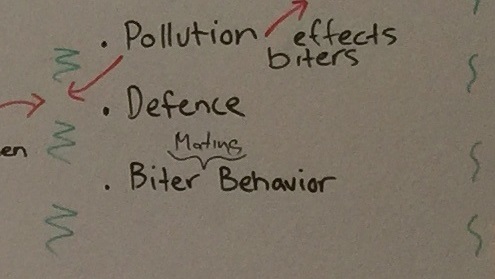
- fff-243-office-picture-albert.jpg (37.82 KiB) Viewed 6858 times
Sigma1 wrote:Also, make sure the UI supports UTF-8 for some special characters like ö, ä and å
Don't forget ü and ß.
Re: Friday Facts #243 - New GUI tileset
Posted: Sat May 19, 2018 9:25 am
by thereaverofdarkness
Nexarius wrote:Don't forget ü and ß.
I don't think Ssilk will let them forget ß.
Re: Friday Facts #243 - New GUI tileset
Posted: Sat May 19, 2018 9:41 am
by vyktor
Checkboxes, radiobuttons and switches look really great.
Speaking of the table... When is the "campaign ideas brainstorm" starting? How many tower defense levels are we getting? (Hold off biters until rocket gets built)
Re: Friday Facts #243 - New GUI tileset
Posted: Sat May 19, 2018 9:55 am
by ske
Nexarius wrote:
fff-243-office-picture-albert.jpg
I think I spotted a bug, better catch it early before it
affects the quality:
https://en.oxforddictionaries.com/usage ... -or-effect
Re: Friday Facts #243 - New GUI tileset
Posted: Sat May 19, 2018 10:24 am
by svalorzen
Really love the new GUI, but I've always wondered whether a more rusty background would be more in theme with the rest of the game. Smooth matte grey doesn't really fit the rest of the game. Would still using grey, but with a rusty iron texture maybe work better? Have you given a though to something like this (maybe you're leaving the specific textures to use for later)?
Re: Friday Facts #243 - New GUI tileset
Posted: Sat May 19, 2018 11:14 am
by Alice3173
Gergely wrote:By the way, what is the difference between a checkbox and a switch? When should I use a check box instead of a switch?
A switch is explicitly an either/or option. Checkboxes can be grouped together. Switches probably could as well but checkboxes tends to work better when using them in that way.
Re: Friday Facts #243 - New GUI tileset
Posted: Sat May 19, 2018 11:49 am
by muzzy
JESUS CHRIST CANT YOU FIX THOSE BEVEL/SHADOW/GLOW/ETC GRADIENT RAMPS INTO SOMETHING MORE REASONABLE FFS?!
YOU'RE MAKING THE UI EVEN WORSE THAN IT WAS!!!
Seriously. Like super seriously. SUPER SUPER SERIOUSLY. You're making everything look blurred and out of focus. The panel borders are a DISGRACE. The inner shadows are ATROCIOUS, and even more so when you're "softening" things with a weak dark outer glow (which has a slight red tint for some goddamn reason to top it, too). Let me tell you, that softening looks like shit. Those round buttons are somehow EVEN WORSE. The scrollbar bump pattern looks like a mushy mess. The slider button pattern just MIGHT look okay if it was only insets, but it isn't. There's some stupid bumps in the middle of them, with their shadows are hugging the bottom of the widget's face, making it looks like complete nonsense. The checkboxes are probably the worst of them all.
I understand you're more concerned about the color scheme, typography, layouting and such things ... but I haven't been able to play this game ever since you started your UI revamp because the fucking gradients in the toolbar/inventory grid are messing with my head, and now you're showing off things like THIS. *cry*
I'd very much prefer a completely flat UI instead of this monstrosity.
Re: Friday Facts #243 - New GUI tileset
Posted: Sat May 19, 2018 12:02 pm
by Drury
Sigma1 wrote:Did anyone else notice biter mating behavior on the whiteboard?
Factorio is Frog Fractions now.
Re: Friday Facts #243 - New GUI tileset
Posted: Sat May 19, 2018 12:03 pm
by Avezo
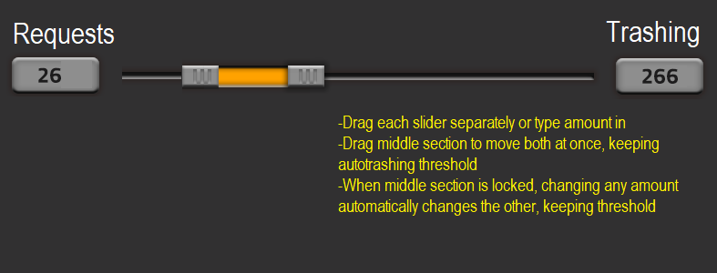
Those sliders makes me afraid you aren't going to do double-variable-slider in the end? Ones I suggested using for autorequests and autotrashing like below:
Re: Friday Facts #243 - New GUI tileset
Posted: Sat May 19, 2018 12:11 pm
by Yes-Man
Very good to hear that you're investigating to make my (and the 8%'s) life easier.
Also: THEY ARE BILLIONS!^^
Re: Friday Facts #243 - New GUI tileset
Posted: Sat May 19, 2018 12:19 pm
by Zavian
Avezo wrote:Those sliders makes me afraid you aren't going to do double-variable-slider in the end? Ones I suggested using for autorequests and autotrashing like below:
@Avezo there is a better way to implement equivalent functionality, that has also been suggested several times. Just change the auto-trash semantics so that it trashes at the autotrash amount above your logistic request amount. That way if you increase the request amount the autotrash is also automatically increased. That removes the need for the double text boxes that the double slider would require. (Well not really removes, but one is on the logistics request tab, and the other is on the trash tab).
Re: Friday Facts #243 - New GUI tileset
Posted: Sat May 19, 2018 1:26 pm
by f1sh
Gergely wrote:By the way, what is the difference between a checkbox and a switch? When should I use a check box instead of a switch?
Switch is the kind of checkbox and technically equals to it.
Nevertheless, in a user experience design, there is a a little difference between switch and checkbox. Checkbox is a light-weight; usually we do not expect any action when it changes state; or it completely do nothing until user pressed saving button below.
Switch is heavy. After switching it on, a busy process of connecting, synchronizing starts immediately.
Re: Friday Facts #243 - New GUI tileset
Posted: Sat May 19, 2018 1:27 pm
by Drury
Gergely wrote:By the way, what is the difference between a checkbox and a switch? When should I use a check box instead of a switch?
Re: Friday Facts #243 - New GUI tileset
Posted: Sat May 19, 2018 1:45 pm
by Avezo
Zavian wrote:Avezo wrote:Those sliders makes me afraid you aren't going to do double-variable-slider in the end? Ones I suggested using for autorequests and autotrashing like below:
@Avezo there is a better way to implement equivalent functionality, that has also been suggested several times. Just change the auto-trash semantics so that it trashes at the autotrash amount above your logistic request amount. That way if you increase the request amount the autotrash is also automatically increased. That removes the need for the double text boxes that the double slider would require. (Well not really removes, but one is on the logistics request tab, and the other is on the trash tab).
I think it still would be better implemented with double-slider, it actually 'stores' have 3 values: Request, Trash, and amount between them. Middle amount is basically the same threshold for autotrash you are talking about.
The way it would be implemented would be clicking or typing amount in each slider AND ability to drag both sliders at once when clickign in the middle of them, giving same functionality you mention of keeping threshold for autotrash. Maybe even add ability to lock that, then changing either amount for requests or trashing would automatically change the other one while keeping threshold.
It would remove neccesity of two separate logistic tabs for requests and trashing too.
- Paint edit
- factorio proposal.png (16.31 KiB) Viewed 6780 times
^something like that, edited in paint
Re: Friday Facts #243 - New GUI tileset
Posted: Sat May 19, 2018 2:13 pm
by Albert
tk0421 wrote:will it be layout customizable too? ive always wanted to move the toolbelt to the left or right side of the screen.
This is a feature that I also want to have in the game. If we have time we will have it. (No. Maybe?)
Re: Friday Facts #243 - New GUI tileset
Posted: Sat May 19, 2018 2:14 pm
by Dev-iL
Several comments:
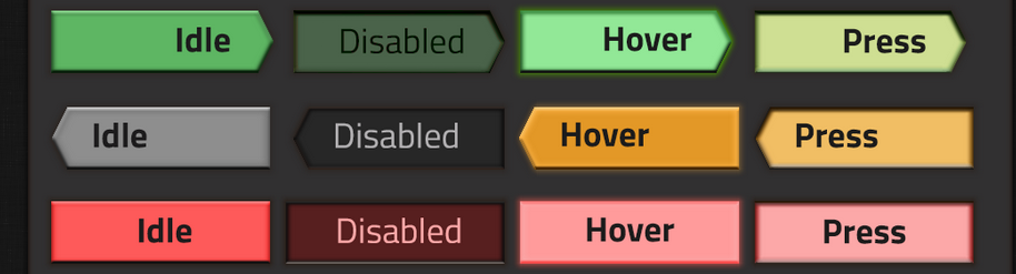
- Regarding the GUI: what about disabled radio/checkbox/slider?
- Regarding the "Colorblind mode": it's going to be optional, right? I'd hate for GUI element color to be hideous just because one size has to fit all.
- Regarding NPE (
Null pointer exception new-player experience): since you're adding glow to buttons, how about adding a green glow to buttons you expect the learning player to build? For example, if the objective is "build a radar and connect it to a power source", upon opening the crafting menu, the small power pole will be highlighted with a green border so as to make it easy to identify.
- Regarding the new office: Where is it? Far from the old one? (I might come to Prague later this year and would love to know if it's near to where I'm going to be.)
Happy
Shavuot 
Re: Friday Facts #243 - New GUI tileset
Posted: Sat May 19, 2018 2:25 pm
by Albert
DrNick wrote:I came on to mention the disabled Confirm button is brighter than normal, while the Back and Cancel buttons are darker when disabled. It might be a good idea to darken the Confirm button when it's disabled to make the style more uniform.
The colorblindness problem is definitely a big one. Maybe adding a colourblind mode with different button colours would solve this.
That's exactly what I have in mind. Going to options and check the colourblind mode. But I can't say much about it, cause still very early for us to speak about it.
The point is that some colourblind mode options can affect the general aspect of the normal GUI. By having a different mode we have much more freedom to tweak colours and shapes exclusively for any kind of condition.
Concerning the Disabled green button, you're right.
Re: Friday Facts #243 - New GUI tileset
Posted: Sat May 19, 2018 2:38 pm
by Albert
muzzy wrote:JESUS CHRIST CANT YOU FIX THOSE BEVEL/SHADOW/GLOW/ETC GRADIENT RAMPS INTO SOMETHING MORE REASONABLE FFS?!
YOU'RE MAKING THE UI EVEN WORSE THAN IT WAS!!!
Seriously. Like super seriously. SUPER SUPER SERIOUSLY. You're making everything look blurred and out of focus. The panel borders are a DISGRACE. The inner shadows are ATROCIOUS, and even more so when you're "softening" things with a weak dark outer glow (which has a slight red tint for some goddamn reason to top it, too). Let me tell you, that softening looks like shit. Those round buttons are somehow EVEN WORSE. The scrollbar bump pattern looks like a mushy mess. The slider button pattern just MIGHT look okay if it was only insets, but it isn't. There's some stupid bumps in the middle of them, with their shadows are hugging the bottom of the widget's face, making it looks like complete nonsense. The checkboxes are probably the worst of them all.
I understand you're more concerned about the color scheme, typography, layouting and such things ... but I haven't been able to play this game ever since you started your UI revamp because the fucking gradients in the toolbar/inventory grid are messing with my head, and now you're showing off things like THIS. *cry*
I'd very much prefer a completely flat UI instead of this monstrosity.
THANKS FOR YOUR OPINION!!!!!
https://www.youtube.com/watch?reload=9&v=UR-yHDWhBpU
Re: Friday Facts #243 - New GUI tileset
Posted: Sat May 19, 2018 2:50 pm
by FasterJump
Nice work on the UI. By the way, are you going to make the UI works for different UI scales? (
related thread)
Re: Friday Facts #243 - New GUI tileset
Posted: Sat May 19, 2018 2:55 pm
by Inari
NPE to me means NullPointerException

f1sh wrote:Gergely wrote:By the way, what is the difference between a checkbox and a switch? When should I use a check box instead of a switch?
Switch is the kind of checkbox and technically equals to it.
Nevertheless, in a user experience design, there is a a little difference between switch and checkbox. Checkbox is a light-weight; usually we do not expect any action when it changes state; or it completely do nothing until user pressed saving button below.
Switch is heavy. After switching it on, a busy process of connecting, synchronizing starts immediately.
Interesting, in Android the only suggested difference seems to be that checkboxes are for sets of things, and switches for single elements I think?