Page 2 of 8
Re: Friday Facts #348 - The final GUI update
Posted: Fri May 22, 2020 5:39 pm
by lxkfjhls
Yes. Look at the blue science recipe.
SuperSandro2000 wrote: ↑Fri May 22, 2020 4:41 pm
Rails are 45° turns and not 90°

45° is true to in-game mechanics. You need to use two curved rails to build 90° turn.
Re: Friday Facts #348 - The final GUI update
Posted: Fri May 22, 2020 6:13 pm
by factoriouzr
I'm really disappointed that you are pushing the blueprint library improvements till later. This was the most important change in my opinion. This was the thing that needed the most improvement, and after waiting for years for this, you are still pushing it out.
Really disappointed.
Re: Friday Facts #348 - The final GUI update
Posted: Fri May 22, 2020 6:19 pm
by Blacky007
you have no clue how bright the new icons look with my new colorblind glasses - WOOOOOOOOOOOOOW
https://cdn.factorio.com/assets/img/blo ... llsize.png
Re: Friday Facts #348 - The final GUI update
Posted: Fri May 22, 2020 6:31 pm
by CheeseMcBurger
The new icons look dope!
But I really dislike them as world-sprites (on belts and on the ground). They are too intense, stick out too much, are too polished and look more like plastic trinkets than real stuff. The plates look more like cubes, not flat at all. The sulfur is too green.
The new landfill sound is really great. Love it already.
And I'm divided about the new GUI sounds. Can't put my finger on it, but I think they should be much more inconspicuous / less noticable.
Re: Friday Facts #348 - The final GUI update
Posted: Fri May 22, 2020 6:41 pm
by invisus
Is that a new icon for the old beacon design?
Re: Friday Facts #348 - The final GUI update
Posted: Fri May 22, 2020 7:07 pm
by irbork
Engine icon is not very representative. Maybe change it to something similar to electric engine with an exhaust or consider renaming engine to moving parts or treads. I can only imagine how bad the new icon has to look on compressed lane.
Re: Friday Facts #348 - The final GUI update
Posted: Fri May 22, 2020 7:09 pm
by Jap2.0
Apparently - I don't really see it. This was the one that stuck out to me most, it looks more like a belt of some sort than anything else, especially not an engine (there isn't any part to propel it).
Other questions:
Do the sounds overlap? How does it sound when I fill 20x20?
Per Rseding: "It plays once for the batch of tiles you build.... There are 3 sounds depending on the amount of tiles you build. Just like normal entities: the bigger you build the bigger sound is used."
(at least as of before, presumably something similar now)
Other thoughts:
- New GUI sounds are either great or terrible. I can see them being pretty intrusive.
- Overall nice job with the sprites (because apparently I forgot to mention that).
- The splash with the landfill is amazing.
- I was wondering if you were going to mention the G2A thing, iirc it made the front page of HN yesterday.
Re: Friday Facts #348 - The final GUI update
Posted: Fri May 22, 2020 8:39 pm
by 5thHorseman
The first time I saw the new fish icon I wasn't wearing my glasses and I thought it was a stylized 50s rocketship.
Re: Friday Facts #348 - The final GUI update
Posted: Fri May 22, 2020 9:04 pm
by KatherineOfSky
UI/Tabs:
I would like to request one change to the UI, one that I have seen quite a few people ask for: the tabs at the top are in reverse color, and I would hope that the currently active tab would be in Light color, and the hidden ones would be in Dark color. Note that I am requesting just the tabs change color, not the frame of the window or background.
In every Windows application I can think of, the open tab is highlighted, and the hidden ones are dark, so Factorio is directly opposite of that which feels confusing. In Factorio, I always wonder if I am on the correct tab.
Sound Effects:
The sound effects are just too much. Why is there a delete placed bp sound effect? I really liked it being silent. There is zero reason to have most of these sound effects, and I feel the game is going to be a horrible cacophony of noise. (Many people on the steam forums have complained already at the sound changes). In general, I've always felt that Factorio is a very chill game. I love to just sit and listen to the soundtrack while playing. Having sound effects for every single thing you do is not a welcome change, and definitely detracts from the character of the game.
Having said that: I turn of ALL sound effects for my OS, disable notifications for my phone, desktop apps, etc. The modern world is far too noisy.
When you have a definite visual confirmation, e.g. clicking the crafting button, or changing tabs on the interface, there really isn't need for a sound effect.
If you don't outright remove the sound effects, I hope you will provide a detailed toggle menu. I would not want to turn off ALL the sound effects, just the extraneous ones.
Icons:
They look AMAZING!
Re: Friday Facts #348 - The final GUI update
Posted: Fri May 22, 2020 9:04 pm
by Zaflis
I think you should mention also if it's good or bad for you. Some people like bright, some don't. You still can change color balances in settings though.
Re: Friday Facts #348 - The final GUI update
Posted: Fri May 22, 2020 9:58 pm
by valneq
Some more feedback:
- Why does landfill still have grass on top? The tiles you place don't have grass any more. Instead, it has an artificial grid pattern.
- The reflections on science packs are sharper and "more glossy" than the reflections on any other icon, the comparison with the fulid droplets is most striking. The reflections on the fluid droplets are less sharp in comparison. Almost as if they have a different surface structure than the glass of the erlenmeyer flasks.
- The portable fusion reactor equipment graphics look like a size of 2×4, not like 4×4. All other equipment graphics do fill the equipment squares they occupy.
- Why are sulphur crystals all the same, and not use the randomness feature like the ores?
- Have you tested the colors of the red/green signal wire against some color blind people? Will the signal wire entities between power poles get the same colors? Are these colors still easily distinguished from the regular copper cables? The screen shot does not show any signal wires in use.
Re: Friday Facts #348 - The final GUI update
Posted: Fri May 22, 2020 10:02 pm
by Serenity
Not a fan of the engine if that's what it is. The current engine and electric engine look pretty good
Most of the other stuff looks pretty great

valneq wrote: ↑Fri May 22, 2020 9:58 pm
Why are sulphur crystals all the same, and not use the randomness feature like the ores?
It's not an ore but a manufactured material. Sulfur like that is really a relatively fine powder, but I guess that's hard to represent in discrete pieces
Re: Friday Facts #348 - The final GUI update
Posted: Fri May 22, 2020 10:38 pm
by SuperSandro2000
Jap2.0 wrote: ↑Fri May 22, 2020 7:09 pm
Apparently - I don't really see it. This was the one that stuck out to me most, it looks more like a belt of some sort than anything else, especially not an engine (there isn't any part to propel it).
- I was wondering if you were going to mention the G2A thing, iirc it made the front page of HN yesterday.
I do not see the engine either.
https://news.ycombinator.com/item?id=23257075
Re: Friday Facts #348 - The final GUI update
Posted: Fri May 22, 2020 10:40 pm
by beiju
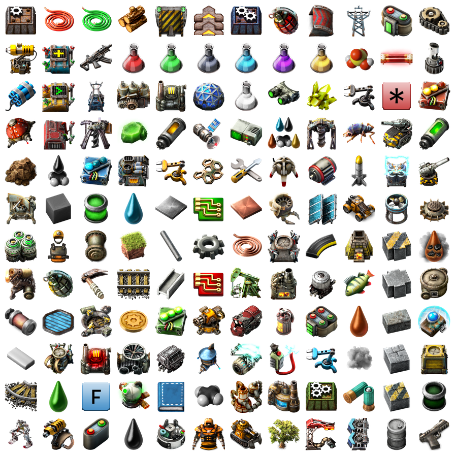
The new icons look amazing, particularly the way you adapted roboports, laser turrets, etc. into their portable versions.
However, I think the engine icon is one of the "problematic cases" you were asking about. It doesn't look at all like an engine, which could still be ok, except that it
does look like a belt. I often play with people who describe things based on their icon ("arms" instead of "inserters", "cogs" instead of "gears", "rocks" instead of "stone", etc.) and I'm sure they would start calling these "belts", causing mass confusion between engines and transport belts. Also, the similarity between normal and electric engines was nice, and with these icons it's gone.
The other one that stands out is mining drills (I assume that's what it is, it's the icon below sulfur in
this image). It looks very different to the mining drill building, unlike all the other entity icons.
But the work it takes to redesign all of these icons with so few issues is very impressive!
Re: Friday Facts #348 - The final GUI update
Posted: Fri May 22, 2020 10:41 pm
by Drury
HUGE thanks for rotation sounds, that ought to be very useful.
I'm liking the menu sounds, too. Very satisfying.
The new icons seem pretty readable at a glance, although yeah, you're right in that I'll need to adjust. I am liking how you removed details and highlighted the iconic shape of each entity to make it more obvious at at a glance as to what it is.
I strictly dislike is the new engine unit icon. Two gears linked by a chain doesn't scream "engine" to me, at least nowhere near as much as the old engine cylinder icon. It made sense how 8 cylinders would come together to form a V8 for the car. Doesn't make sense that 16 gears and 8 belts do.
The new horizontal heat pipe icon looks a bit too abstract, doesn't look as nice as the vertical regular pipe. Not sure about lime green sulfur either, looks more like uranium to me.
Re: Friday Facts #348 - The final GUI update
Posted: Fri May 22, 2020 10:56 pm
by DanGio
High scale fish ! :O
1 thought about sound : the 2nd video show that pipette tool now produces a sound like other ghost actions. I don't feel like it should, because no order is being issued to bots when using pipette. If a sound is to be added to pipette, I guess there should also be a sound for emptying hand ? I feel like that's too much.
Overall I think the recent additions to the game are really great, I'm looking forward to next release.
Re: Friday Facts #348 - The final GUI update
Posted: Fri May 22, 2020 11:41 pm
by DaemosDaen
On review, to me alot of the menu sounds sound like they are from Daggerfall. May be it's just me, but... *shrug* (Might also be dating myself with that reference)
I like most of the icons, until I get to the in-grid equipment battery. Something seems really off about it almost like it's two different things in each of the grid tiles.
Over all this makes me want to get a 1440p monitor to play the game on. Which I will be once things get back to a little more normal.
Re: Friday Facts #348 - The final GUI update
Posted: Fri May 22, 2020 11:45 pm
by Mur
Looking great!
Re: Friday Facts #348 - The final GUI update
Posted: Sat May 23, 2020 12:36 am
by CheeseMcBurger
KatherineOfSky wrote: ↑Fri May 22, 2020 9:04 pm
UI/Tabs:
[...]
In every Windows application I can think of, the open tab is highlighted, and the hidden ones are dark, so Factorio is directly opposite of that which feels confusing. In Factorio, I always wonder if I am on the correct tab.
+1
KatherineOfSky wrote: ↑Fri May 22, 2020 9:04 pm
Sound Effects:
The sound effects are just too much. [...] Having sound effects for
every single thing you do is not a welcome change, and definitely detracts from the character of the game.
I had a similar complaint earlier, but now I can explain it better. The sounds are too intrusive. They should be so subtle as to not notice them. But now that every little thing has its own sound effect, it is really noticable that the weight of the sound effect is all over the place. GUI sounds should not be noticed at all. They should make you aware that you clicked something, but if you "hear" them, that's already a problem. And the new GUI sounds are extremely intrusive. Landfill got toned down a tad, which is nice (love it). Rotating buildings got a sound, which already has little weight, but I feel it's still to much.
Noise pollution is getting strong with the game...
Re: Friday Facts #348 - The final GUI update
Posted: Sat May 23, 2020 12:41 am
by valneq
KatherineOfSky wrote: ↑Fri May 22, 2020 9:04 pm
UI/Tabs:
I would like to request one change to the UI, one that I have seen quite a few people ask for: the tabs at the top are in reverse color, and I would hope that the currently active tab would be in Light color, and the hidden ones would be in Dark color. Note that I am requesting just the tabs change color, not the frame of the window or background.
In every Windows application I can think of, the open tab is highlighted, and the hidden ones are dark, so Factorio is directly opposite of that which feels confusing. In Factorio, I always wonder if I am on the correct tab.
The default style for Windows applications is to have bright UI elements and black text. In this logic, brighter elements have a higher contrast to the text – which is why they are used for highlighting.
In Factorio, the style is reversed: the text is bright and the UI elements are dark. Hence, also the highlighting is reversed.
I find this most logical choice of handling a dark UI theme.
