Page 1 of 4
New API Docs website
Posted: Wed Sep 01, 2021 4:29 pm
by Sanqui
Hi,
we have decided it's time to retire the
Lua API website you're all probably well familiar with. It has been difficult to maintain and Therenas' excellent work on the JSON docs proved an opportunity to build a new website that's more in line with the current Factorio style.
Now, of course, functionality is more important than style in a website that works as a reference. The new website comes with a handy sidebar search and some other improvements, but most importantly it will be possible to improve based on requests from the community. All while continuing to work offline!
Please
check out the new API docs website here and give us feedback - if something looks broken, missing, or if you have ideas on improvements. 1.1.39 is the last release that will ship with the old style, so make sure to take a look now! Thanks!
Re: New API Docs website
Posted: Wed Sep 01, 2021 4:59 pm
by Xoriun
The boxes in which the example and classes are embedded are cut off horizontally if a line is too long (eg. when viewed on mobile) and are impossible to scroll.
Re: New API Docs website
Posted: Wed Sep 01, 2021 5:25 pm
by curiosity
The very first impression upon opening the docs: this design is too overloaded and overcomplicated for the task. Although the expand button helps to hide the background and increase usable space, so it lessens the effect somewhat.
At a first glance, the search is nearly useless. I can search through any plain list with the browser's search already, the only benefit being that it is self-contained. The usefulness of the narrowing down feature is controversial.
What would be actually useful is searching in every name in the docs, maybe in desciptions as well, or even in any text. So if I search for "print", I would see the libraries page, LuaGameScript::print, LuaForce::print, LuaPlayer::print and whatever else may contain the word. This is where the narrowing down may shine, showing you the list of pages containing your word, or maybe even entries on each page (e.g. showing LuaForce::print vs just LuaForce).
This is all for now, I haven't had an opportunity to actually use the docs.
Re: New API Docs website
Posted: Wed Sep 01, 2021 5:46 pm
by raiguard
Honestly, while the Factorio-esque design is OK for the main site, I don't think it works well here. I'm finding it generally harder to read things. I agree that the search on the left takes up a bunch of room, perhaps having it be collapsible would solve that.
I am also experiencing scroll lag on the new site that doesn't exist on the old. I'm not sure what could be causing that, but it makes the site feel very bloated and clunky (even though it really isn't). I'm on my work laptop, but an i5-1145G7 should be plenty good enough to scroll without lagging.
A great autogenerated docs site that might serve as inspiration for good layout and search functionality would be
docs.rs. It's straightforward, easy to read, has dark and light themes, and phenomenal search functionality.
Re: New API Docs website
Posted: Wed Sep 01, 2021 6:36 pm
by Deadlock989
This feels like a large step backwards. Bringing the bloated, laggy style of the mod portal to the API docs wasn't anywhere on my radar.
Please let us keep the option to keep using a completely minimal style when we're searching for documentation.
Re: New API Docs website
Posted: Wed Sep 01, 2021 6:56 pm
by Xorimuth
I think it looks quite nice, and obviously being able to update it easier is a big improvement.
My initial suggestions:
- Lose the background (or make the 'expand' button fully expand to hide the background)
- Turn down or remove the font-weight on the class attributes (the css `.strong` rule)
- Remove the monospace font altogether? It makes it so much harder to read. If not, the above font-weight change would help, perhaps generally making the monospace text bigger would also be better. Edit: this may actually be more to do with the font choice (which seems to be unspecified(?), so might be platform dependant - I'm on macOS). The old site's monospace font was very light and sans-serif. The new one is extremely serif.
- The vertical dividers seem unnecessarily 'deep' (or dark/thick?)
- Don't have parameters in tables (or improve table styling). It seems way too busy
- The vertical margins in the attribute descriptions seem a bit off. In particular, the p+p margin-top rule adds a massive gap between 'Return value' and the text below it. 'Return value' is much closer to the parameters table above it than the text below it.
- I don't like the underline when hovering links
Re: New API Docs website
Posted: Wed Sep 01, 2021 7:01 pm
by SoShootMe
As noted by others, I also see scroll lag. Using Chrome on Windows 10, this seems to be due to the combination of a large, scaled background image and "background-attachment: fixed".
Using Chrome on a modest Android 9 phone, the main, Mods and new API sites all seem to have some performance issues with scrolling but only the new API site has "background-attachment: fixed", so changing it may not fix all performance issues, but seems like a good start.
Re: New API Docs website
Posted: Wed Sep 01, 2021 7:13 pm
by eradicator
First look impression: My system is not very fast, but the old doc worked flawlessly. The new one is laggy and doesn't even render as fast as I scroll. There's too much visual clutter, the doc doesn't need to look like a game. Due to clutter and the larger font it feels like I have 50% less information on the screen compared to the old doc. Also there's something weird going on with some fonts being anti-aliased and some not. And ohgosh, I hope the url / page names don't change or I'll be spending days fixing all the links of my library mods documentation. I mean, the search function might become useful, but is there really any need to completely change the visuals? I always have difficulties getting used to new color schemes/layouts and the likes. (@Bilka probably remembers my rantings about the prototype documentation visual clutter when he was improving that.)
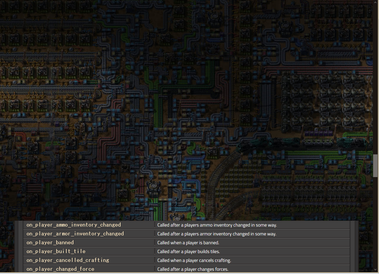
- cutoff.png (1.68 MiB) Viewed 9280 times
Re: New API Docs website
Posted: Wed Sep 01, 2021 7:30 pm
by Muppet9010
For some reason loading the factorio website and the new API docs web pages on my phone is really slow. Even when loaded scrolling is really slow.
It's not the newest phone I will admit, but it's fine on other websites like the old Api docs, BBC news, Twitter, etc.
Re: New API Docs website
Posted: Wed Sep 01, 2021 8:05 pm
by DaveMcW
defines.html uses 2 conflicting anchor styles.
defines.html#defines.alert_type is used internally and works.
defines.html#alert_type is used on other pages and fails.
Re: New API Docs website
Posted: Wed Sep 01, 2021 10:00 pm
by PFQNiet
I have to agree, when looking for documentation I want it clear and boring so I can find the information I want and get back to work. Any time lost to things like visual clutter or scrolling performance is time lost in development, and multiply that by every modder's every search through the documentation and that adds up to a lot of lost time.
I totally understand making the main site and even the mod portal "pretty" and visually appealing, but API documentation should be functional, not beautiful.
Re: New API Docs website
Posted: Thu Sep 02, 2021 3:07 am
by curiosity
Xorimuth wrote: Wed Sep 01, 2021 6:56 pm
- Remove the monospace font altogether? It makes it so much harder to read. If not, the above font-weight change would help, perhaps generally making the monospace text bigger would also be better. Edit: this may actually be more to do with the font choice (which seems to be unspecified(?), so might be platform dependant - I'm on macOS). The old site's monospace font was very light and sans-serif. The new one is extremely serif.
For me it's the exact same font, although removing boldness does help a lot with readability.
I don't think removing the monospace font is a good solution. You have to differentiate between code and plain text. Specifying the font is way better (and attaching a good monospace font, if necessary).
("extremely serif" makes me think of Times New Roman and I can't imagine that as monospace)
edit: Just noticed the huge font on Eradicator's screenshot, mine is definitely smaller, smaller than the plain text font. Worth specifying the font just for size consistency.
edit 2: Even the design itself is different! Spacings, colors. Mine looks near-uniform grey.
Re: New API Docs website
Posted: Thu Sep 02, 2021 5:41 am
by GrumpyJoe
Not that I'd ever need it, but I had a look because of the news and the scrolling lag is as horrible as on the main page.
Things like these shouldn't be prettyfied
Knowing the team for a few years now and considering what's been said above, I'd say it's best to rethink the whole thing
Re: New API Docs website
Posted: Thu Sep 02, 2021 10:46 am
by Xorimuth
curiosity wrote: Thu Sep 02, 2021 3:07 am
Xorimuth wrote: Wed Sep 01, 2021 6:56 pm
- Remove the monospace font altogether? It makes it so much harder to read. If not, the above font-weight change would help, perhaps generally making the monospace text bigger would also be better. Edit: this may actually be more to do with the font choice (which seems to be unspecified(?), so might be platform dependant - I'm on macOS). The old site's monospace font was very light and sans-serif. The new one is extremely serif.
For me it's the exact same font, although removing boldness does help a lot with readability.
Yeah, your font looks much nicer. From looking at the CSS, I can't tell why the font has changed, they both appear to be using `monospace`. I don't think I'm going crazy...?
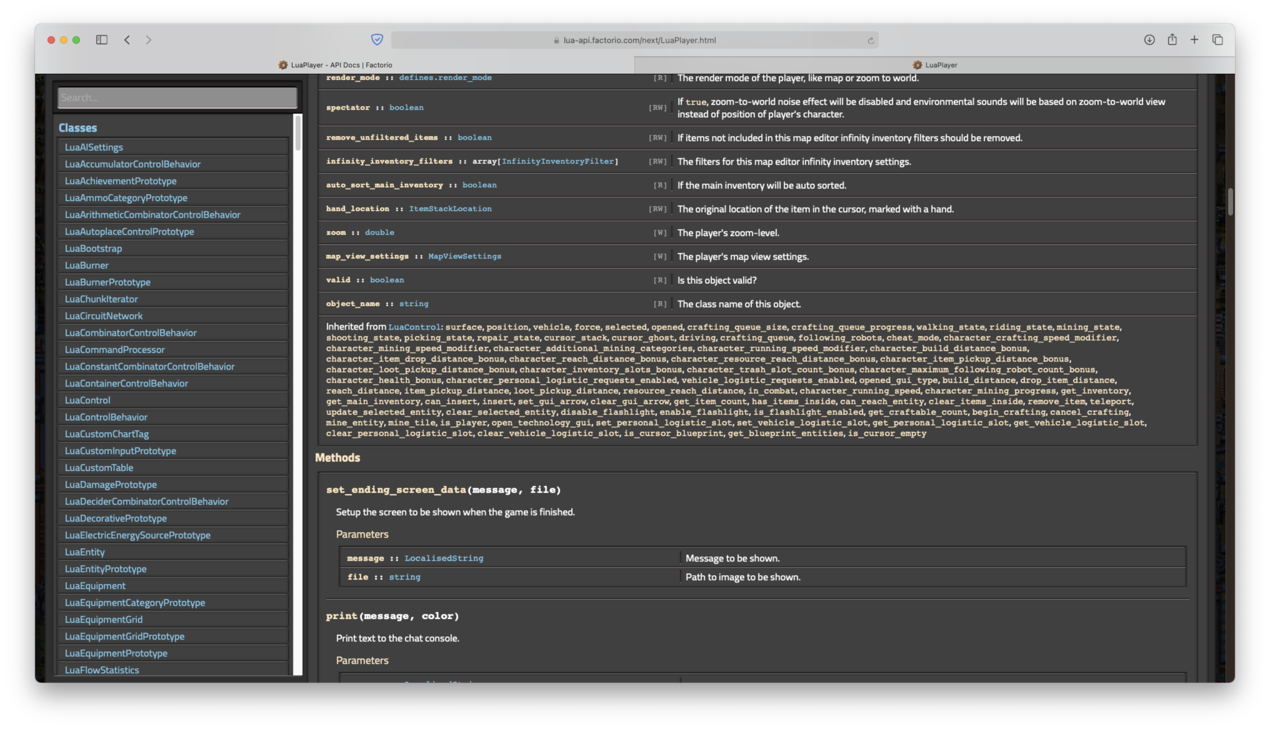
- Screenshot 2021-09-02 at 11.34.27.png (2.22 MiB) Viewed 8948 times
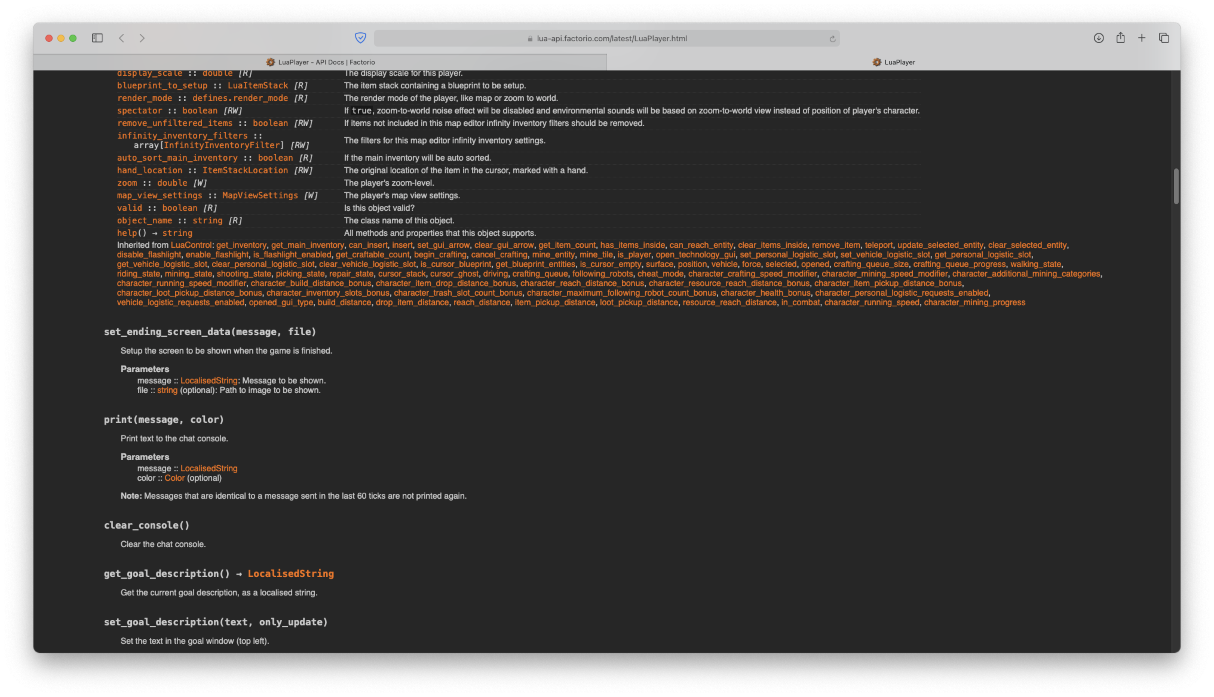
- Screenshot 2021-09-02 at 11.36.55.png (1.58 MiB) Viewed 8948 times
I don't think removing the monospace font is a good solution. You have to differentiate between code and plain text. Specifying the font is way better (and attaching a good monospace font, if necessary).
You are probably right, but the old site didn't use monospace in a lot of where perhaps it 'should'.
("extremely serif" makes me think of Times New Roman and I can't imagine that as monospace)
Just look at the serifs on the new 'y'!
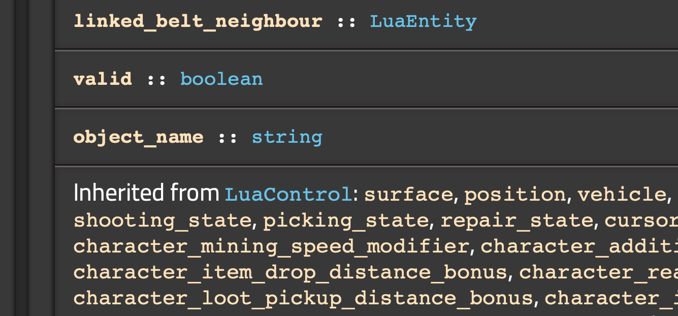
- Screenshot 2021-09-02 at 11.38.32.png (113.61 KiB) Viewed 8948 times
- Screenshot 2021-09-02 at 11.38.39.png (101 KiB) Viewed 8948 times
Re: New API Docs website
Posted: Thu Sep 02, 2021 1:18 pm
by eradicator
Xorimuth wrote: Thu Sep 02, 2021 10:46 am
Your screenshot comparison also shows well that the new design needs much more horizontal space to display the same information. The old design imho flows better. And as I don't have an extra screen just for docs that's pretty important for me too. Quite honestly the "old" layout is one of my favourite docs at all. It's clear, the orange-white/gray contrast is really comfortable to read for me. There's no waste of space. And my brain doesn't have to do extra work to seperate information from decoration. I don't even need the sidebar because I already know the page names by heart and can type them into the url bar directly, which is mostly 3 or 4 letters with autocomplete.
Re: New API Docs website
Posted: Fri Sep 03, 2021 1:50 pm
by Sanqui
The old web had to go, but I agree with the functionality over style notion. Being flashy was not the point, so I'm happy to make changes to improve readability and usability.
I have already made some changes, for example reduced contrast on dividers and increased information density on the tables.
I've also removed the background, so please let me know if you still have performance problems!
Coming up, we will decide on a monospace font for consistency. There are more changes to come based on your feedback, so keep it coming, thank you.
P.S. The URL layout hasn't changed, and if it ever does, there will be redirects in place forever. I hate link rot as much as the next person.
Re: New API Docs website
Posted: Fri Sep 03, 2021 4:10 pm
by eradicator
Sanqui wrote: Fri Sep 03, 2021 1:50 pm
P.S. The URL layout hasn't changed, and if it ever does, there will be redirects in place forever. I hate link rot as much as the next person.
This is nice to know. However "events.html" is "Events.html" in the new version, breaking all links to it.
[Edit: Also redirects don't work offline ;).]
[Edit 2: Just to clarify: My mod
Eradicator's Library is bundled with a local copy of the api doc against which it links. So that everyone can just unpack the mod and have a working offline documentation with working offline links to the api doc (and lua doc for that matter).]
Re: New API Docs website
Posted: Fri Sep 03, 2021 4:49 pm
by Xorimuth
Your .docs-dl rule needs to have padding-top and padding-bottom set to 0, not 6px. Currently the first item in every list has extra space above it, and the last item has extra space below it.
Re: New API Docs website
Posted: Fri Sep 03, 2021 5:25 pm
by curiosity
I observe choppines and reduced responsiveness while scrolling the classes page. Doesn't happen in the old version.
Re: New API Docs website
Posted: Fri Sep 03, 2021 11:06 pm
by Hornwitser
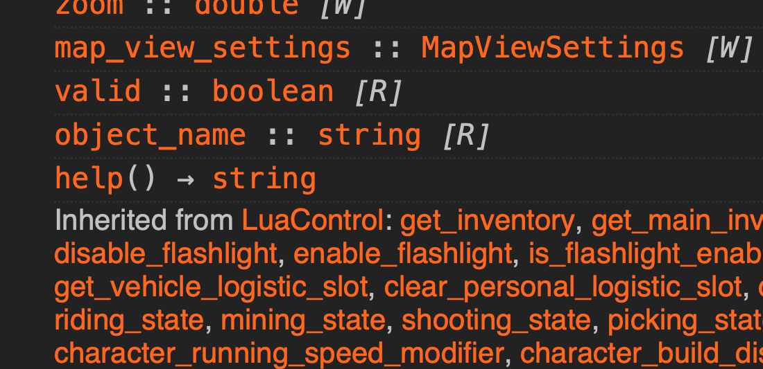
My first impressions to this was wow, why is it so visually noisy? Maybe it's something to get used to. My second impression was why is it so hard to read? The old one was something I'd describe as highly refined functionality over form to the point of beauty. Easy to read, easy to skim, just great. But the new one seems to make me screech aaaaa in my head trying to use it. Who knows maybe it's just change aversion.
Anyway I decided to make a comparison screenshot using the same screen width.
This the new layout in my browser
- new.png (225.99 KiB) Viewed 8569 times
And this is the old layout in my browser
- old.png (105.89 KiB) Viewed 8569 times
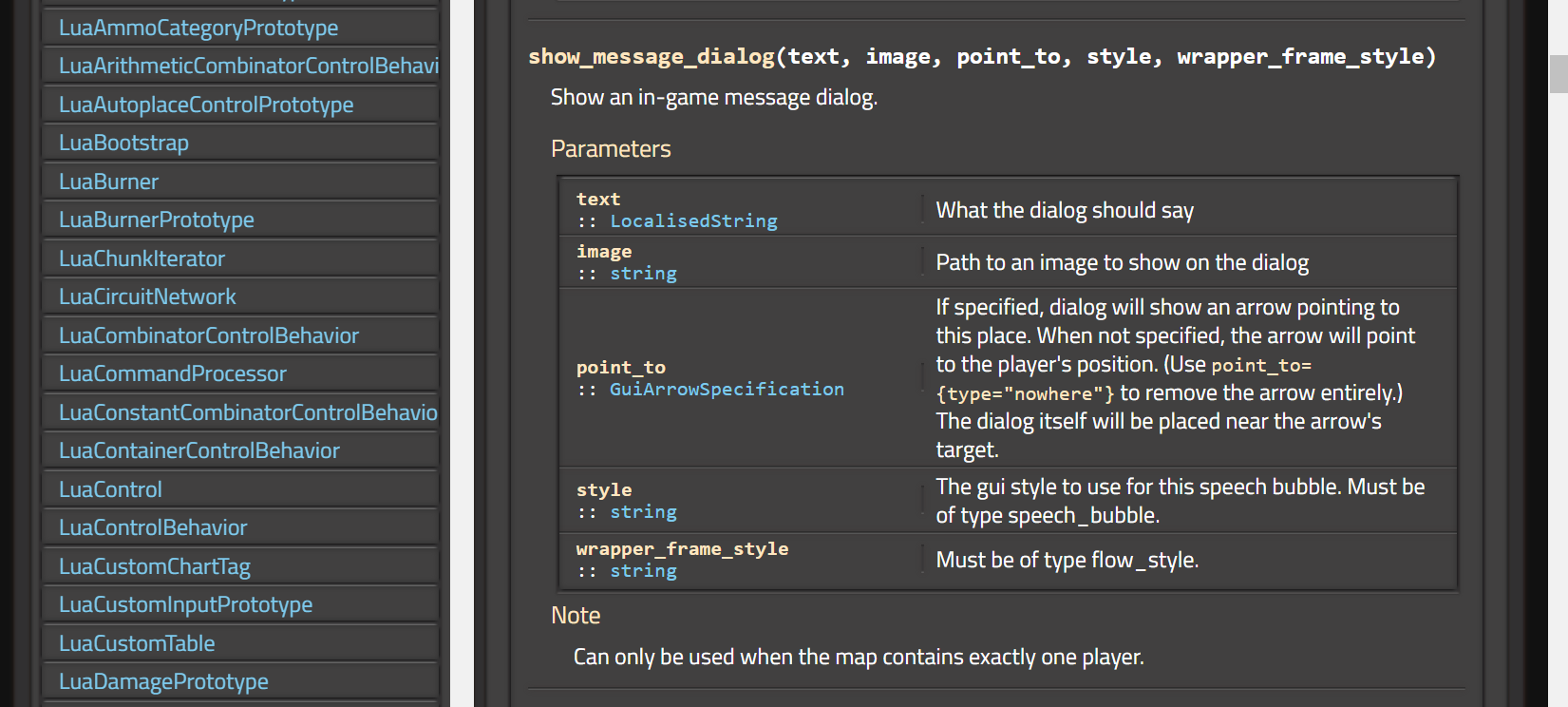
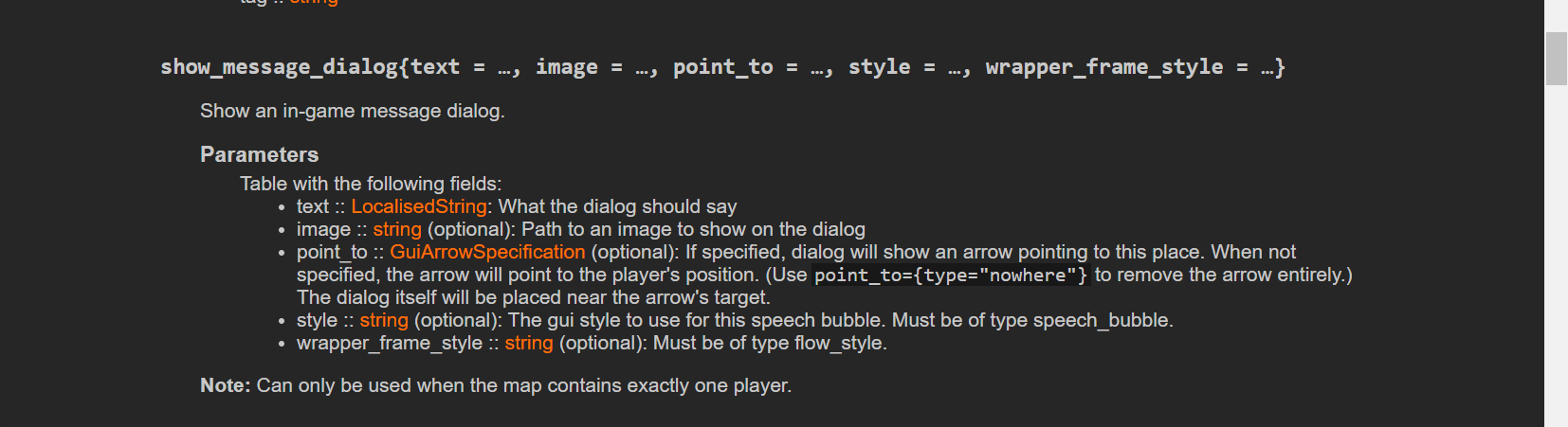
Seems to take a lot more vertical space now, and 1/3 of it is dedicated to.. classes? Weird, I'd thought the list of methods and properties for the current page would be what you'd put in the left menu, anyway having a search box is great though, that's a welcoming change, too bad I can't search for methods or properties in it. If you add that and a keyboard shortcut to focus the search bar that'd be great.
But the biggest problem here is that the new docs is wrong. In the old docs show_message_dialog is a function taking a single table as a parameter where text is required and the rest is optional parameters. In the new docs show_message_dialog is a function taking 5 parameters that are all required. This is unusable! I cannot use an API doc where it doesn't tell me what call style it uses for each method and which parameters are optional!