Page 2 of 2
Re: Version 1.1.2
Posted: Tue Dec 01, 2020 11:08 pm
by Ghoulish
eradicator wrote: ↑Mon Nov 30, 2020 12:39 am
Also at least using the huge filler space for something useful would've been nice. Like getting rid of the tiny extra windows for circuits.
So much better, useful and gets rid of the dead space.
Re: Version 1.1.2
Posted: Tue Dec 01, 2020 11:17 pm
by kovarex
Ghoulish wrote: ↑Tue Dec 01, 2020 11:08 pm
eradicator wrote: ↑Mon Nov 30, 2020 12:39 am
Also at least using the huge filler space for something useful would've been nice. Like getting rid of the tiny extra windows for circuits.
So much better, useful and gets rid of the dead space.
It is not better for various reasons. First of all, you don't want to pollute the gui of every single entity by this, because if you wanted to be consistent it would have to be done this way everywhere. Which means, also in containers for example etc. It would give the wrong impression to the new users that it is something important to interact with, and drive the attention too much to it.
Re: Version 1.1.2
Posted: Wed Dec 02, 2020 1:29 am
by Ghoulish
kovarex wrote: ↑Tue Dec 01, 2020 11:17 pm
It is not better for various reasons. First of all, you don't want to pollute the gui of every single entity by this, because if you wanted to be consistent it would have to be done this way everywhere. Which means, also in containers for example etc. It would give the wrong impression to the new users that it is something important to interact with, and drive the attention too much to it.
There's so much in Factorio that I fully understand not wanting to overload players. With that in mind consider the concept above, but with the logistic and circuit connection windows greyed out until the requisite research is done, which could lead to a pop up window tutorial briefly explaining what they do maybe? - as no one would deny their importance.
I would argue that there is more consistency if the above concept were used. Consider clicking a logistic box:
- 003.png (390.14 KiB) Viewed 2404 times
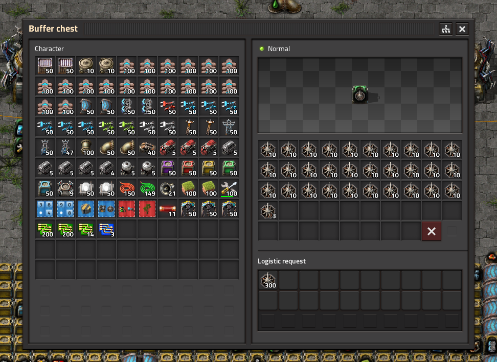
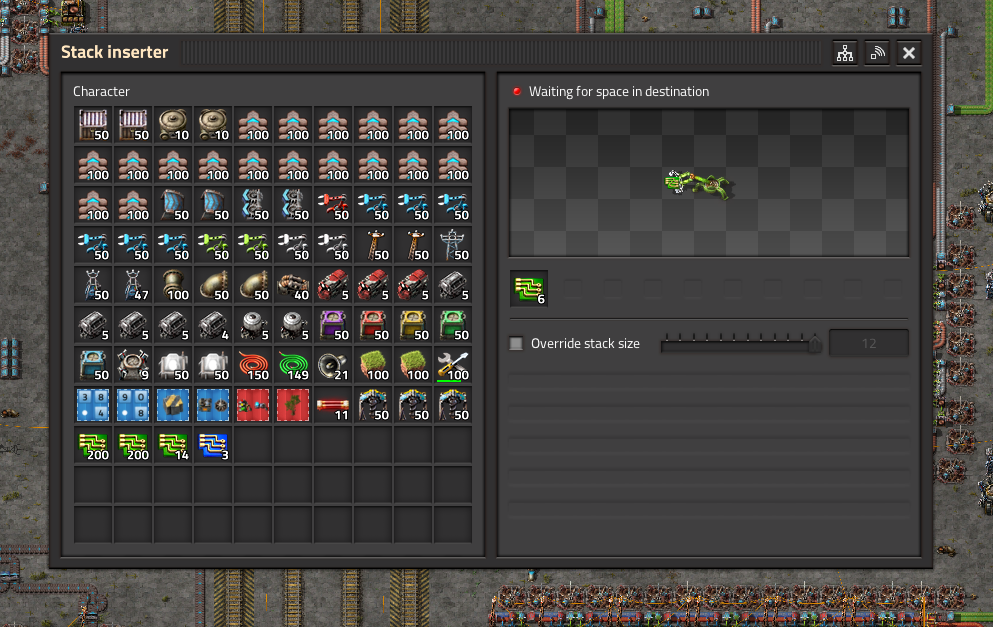
You have all the information you need, and the dead space you have with the inserter window, here is filled with relevant information to the buffer chest, and the UI bits to use it. The dead space under the inserter window should be the same - use this space to show relevant information for the inserter - including the logistic and circuit UI. It would save clicks too, minimising the number of button clicks required to access this or that has to be net win for all, simpler, faster, greyed out so new players don't worry about it until researched, and more consistency because there would be no need for an arguably unnecessary window slapped on the side.
- 002.png (466.35 KiB) Viewed 2404 times
Re: Version 1.1.2
Posted: Wed Dec 02, 2020 4:46 pm
by kovarex
Ghoulish wrote: ↑Wed Dec 02, 2020 1:29 am
kovarex wrote: ↑Tue Dec 01, 2020 11:17 pm
It is not better for various reasons. First of all, you don't want to pollute the gui of every single entity by this, because if you wanted to be consistent it would have to be done this way everywhere. Which means, also in containers for example etc. It would give the wrong impression to the new users that it is something important to interact with, and drive the attention too much to it.
There's so much in Factorio that I fully understand not wanting to overload players. With that in mind consider the concept above, but with the logistic and circuit connection windows greyed out until the requisite research is done, which could lead to a pop up window tutorial briefly explaining what they do maybe? - as no one would deny their importance.
I would argue that there is more consistency if the above concept were used. Consider clicking a logistic box:
003.png
You have all the information you need, and the dead space you have with the inserter window, here is filled with relevant information to the buffer chest, and the UI bits to use it. The dead space under the inserter window should be the same - use this space to show relevant information for the inserter - including the logistic and circuit UI. It would save clicks too, minimising the number of button clicks required to access this or that has to be net win for all, simpler, faster, greyed out so new players don't worry about it until researched, and more consistency because there would be no need for an arguably unnecessary window slapped on the side.
002.png
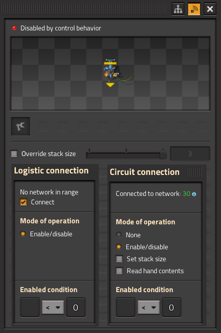
Your example perfectly illustrates the problem. There is no space for the logistic/circuit condition windows in the logistic GUI without adding scrollbars, and having it extra window in one gui, but already inside in other is the inconsistency I was mentioning.
Re: Version 1.1.2
Posted: Thu Dec 03, 2020 12:32 am
by eradicator
kovarex wrote: ↑Tue Dec 01, 2020 11:17 pm
It is not better for various reasons. First of all, you don't want to pollute the gui of every single entity by this, because if you wanted to be consistent it would have to be done this way everywhere. Which means, also in containers for example etc. It would give the wrong impression to the new users that it is something important to interact with, and drive the attention too much to it.
For the record: I wasn't arguing at all that it should be permanently shown (sorry for the rough mockup). Having it like one of the "foldable" bars in settings -> controls would serve the purpose. And a bit more attention to the fact that circuits exists doesn't really hurt imho. Though you're right about the consistency ofc. The current mini-window system just feels like it's literally "tacked on" - like an afterthought. And it's not even possible to view logistic+circuit conditions simultaenously.