Page 2 of 4
Re: Version 0.18.27
Posted: Tue May 26, 2020 7:40 pm
by Blacky007
I think the elektric miner needs a rework - it looks to much after the burner miner
the rocket fuel and the nuklear fuel are to similar!! as a red green color deficiency user its nearly impossible to keep them apart - PLEASE CHANGE IT - go back to glowing style for the nuclear fuel!
Re: Version 0.18.27
Posted: Tue May 26, 2020 8:15 pm
by Hiladdar
I have several issues with the miner. First when you remove the entity, sometimes there is a small sound, sometimes not. I understand that too much sound will turn into noise, but some consistency would be nice.
My second comment is the difference in appearance between how the icon for the miner appears as and what the actual entity is on the ground. Additionally, when the inventory is opened up, and a minor drill is picked up, it displays what looks like a supped up burner miner, once the cursor moves off the personal inventory and is over the terrain, the appearance changes, to that of a minor drill. I do expect some difference between the actual entity graphic and an icon, but the current difference between the entity and the icon, but this is too much of a difference.
The other icons in game look nice. It will take some time to adjust to the newer, nicer looking icons.
Hiladdar
Re: Version 0.18.27
Posted: Tue May 26, 2020 9:11 pm
by Murdersquish
I'm already used to the new icons. They're great.
I like the sound changes, and the subdued aspect of many of them. Unfortunately, opening and closing an assembler is now Incongruously harsh. I know it's been a staple sound for all these years, but it's out of place and due for a change.
Re: Version 0.18.27
Posted: Tue May 26, 2020 9:12 pm
by Murdersquish
Blacky007 wrote: ↑Tue May 26, 2020 7:40 pm
I think the elektric miner needs a rework - it looks to much after the burner miner
I concur. Hil*, two posts up, does a good job of explaining the problem.
Re: Version 0.18.27
Posted: Tue May 26, 2020 9:31 pm
by MbraY
Sound of placing belts is now quieter than before, don't know if that's intentional or not, anyway great update, love the new icons (maybe electric mining drill need some rework)
Re: Version 0.18.27
Posted: Tue May 26, 2020 10:00 pm
by Locane
The new sounds are pretty good, but who missed this equipment grid bs lol
I play at 125% interface size because I can't see shit otherwise.
So much wasted space
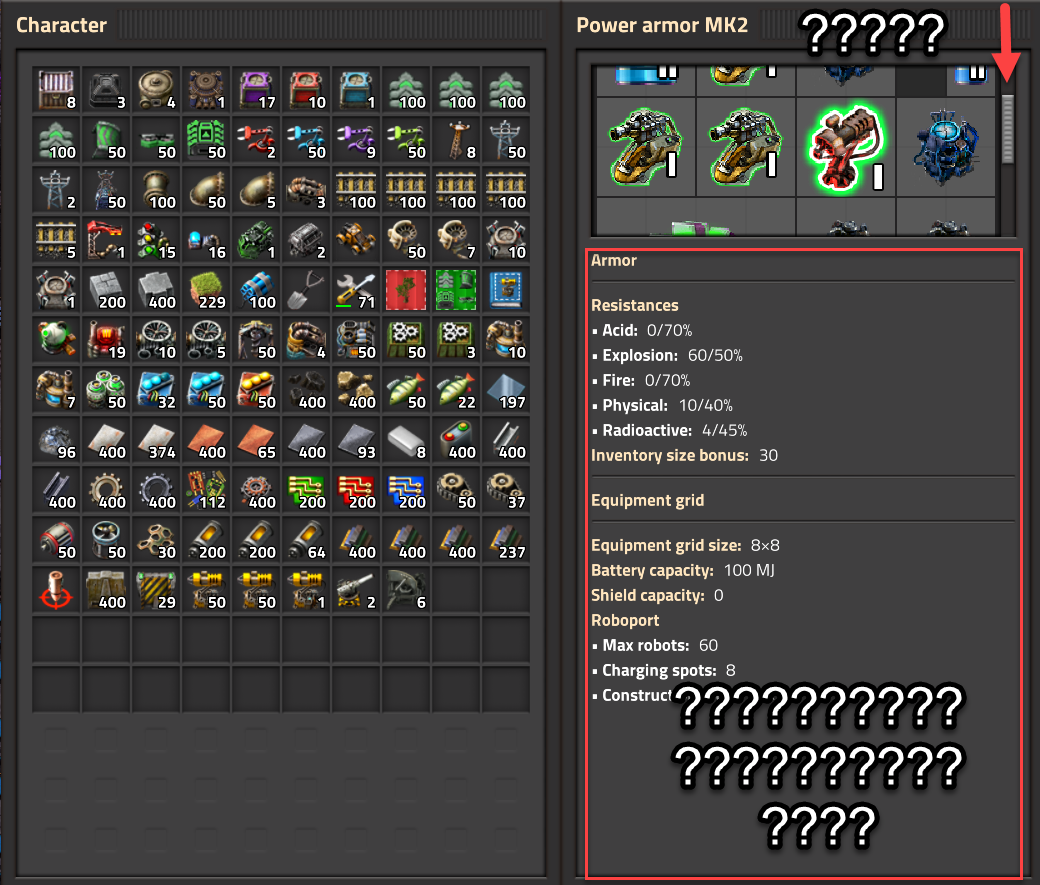
PS:
Can YOU tell the difference between my concrete and refined concrete in the screenshot above? Because I have to look directly at it to do so.
Re: Version 0.18.27
Posted: Tue May 26, 2020 10:18 pm
by valneq
Locane wrote: ↑Tue May 26, 2020 10:00 pm
The new sounds are pretty good, but who missed this equipment grid bs lol
I play at 125% interface size because I can't see shit otherwise.
I cannot confirm this. Maybe some mods you use are not adapted to 0.18.27 yet and mess up the UI?
With vanilla Factorio 0.18.27 on 125% interface scale it looks fine:
- equipment grid.jpg (146.47 KiB) Viewed 6647 times
Re: Version 0.18.27
Posted: Tue May 26, 2020 10:27 pm
by NikWillOrStuff
I noticed an issue with some of the new sounds immediately. All the problematic sounds I've found are found in the player inventory: Switching between tabs, or sub-tabs, or the "close" button for the inventory.
The "click" of these sounds are fine, but the "unclick" happens completely out of sync with your actual finger. It keeps throwing me off a little. Especially since each sound effect has different timing, for some reason. It also doesn't make sense that those actions are all performed by clicking your mouse (identical action), but give different mouse-click-like sounds.
I don't think fixing the timing would make it feel perfectly fine, I think a different type of effect would be better overall. Some new sound related to the menus switching, rather than my mouse clicking (which already has it's own sound that I hear every time, the game doesn't need to duplicate that sound)
Overall opinion of this update is fantastic though. I love these quality-of-life tweaks and additions, especially the icons <3
Re: Version 0.18.27
Posted: Tue May 26, 2020 10:28 pm
by SuperSandro2000
The new ghost building sound is annoyingly high.
Re: Version 0.18.27
Posted: Tue May 26, 2020 10:48 pm
by dvalitov
Electric drill and chemical plant icons are ugly. They not even look like buildings they represent.
Reactor looks like it from some childish game.
Finally high resolution steel axe! But belt immunity think still looks ugly in researches. Also battery tech icon does not match.
But electric mining drill looks worse them all. Really. Electric mining drill don't have actual drill like burner drill. It have two mills and it sifts soil.
Re: Version 0.18.27
Posted: Tue May 26, 2020 11:06 pm
by Usul
Deconstruction sound of rail and splitter is so harsh and loud! I hurts my ears, so I copied the soundfile deconstruct-metal-medium.ogg over it, which also fits better to rails being metal.
Re: Version 0.18.27
Posted: Tue May 26, 2020 11:10 pm
by Usul
MbraY wrote: ↑Tue May 26, 2020 9:31 pm
Sound of placing belts is now quieter than before, don't know if that's intentional or not
Yes, it's definately was made quieter, which I like, however the deconstruction sound of the belts is now about twice the volume of the construction sound. Please make it quieter, thanks!
Re: Version 0.18.27
Posted: Tue May 26, 2020 11:15 pm
by Impatient
This release broke some mods for me.
Factorio said these had to be disabled before startup:
- Helmod
- Enhanced map colors
- PickerAtheneum
- ToDo List
This one made F crash when loading a game:
- Change map settings
Re: Version 0.18.27
Posted: Tue May 26, 2020 11:19 pm
by fighting.dreamer
Blueprint and BlueBook icon content are very hard to read on 14" notebook screen (before update they were perfectly crisp and easy).
Overall many icons become blurry and hard for eyes.
100% (lo-dpi)

200% (hi-dpi)

From the good side, I like new circuit network icons, easy for eyes.
Re: Version 0.18.27
Posted: Tue May 26, 2020 11:23 pm
by Usul
Hiladdar wrote: ↑Tue May 26, 2020 8:15 pm
My second comment is the difference in appearance between how the icon for the miner appears as and what the actual entity is on the ground. Additionally, when the inventory is opened up, and a minor drill is picked up, it displays what looks like a supped up burner miner, once the cursor moves off the personal inventory and is over the terrain, the appearance changes, to that of a minor drill. I do expect some difference between the actual entity graphic and an icon, but the current difference between the entity and the icon, but this is too much of a difference.
I agree. When I looked at the new icons showcased in the
last FFF, I thought "Cool new burner miner icon!". And today: "Wait... what?! It's the electric miner. What were they thinking!"

Re: Version 0.18.27
Posted: Tue May 26, 2020 11:26 pm
by Impatient
IMO the icon for the assembler mk3 is not good distinguishable from the other 2 assembler icons. Before I could distinguish it by the color alone. Now I have to look at the gears on top of it to know of what type a stack is.
Re: Version 0.18.27
Posted: Tue May 26, 2020 11:27 pm
by Usul
*aaaaw* the new belt immunity equipment are cute little glowing shoes! Love it.

Re: Version 0.18.27
Posted: Wed May 27, 2020 2:47 am
by jamiechi1
MbraY wrote: ↑Tue May 26, 2020 9:31 pm
Sound of placing belts is now quieter than before, don't know if that's intentional or not, anyway great update, love the new icons (maybe electric mining drill need some rework)
I agree. I can't hear the belt placement at all without turning the volume up, which makes everything else too loud. Also I prefer the older look of the electric mining drill.
In addition the batteries look horrible to me. Looks more like an overly rounded symbol for a single cell of a car battery. Don't like it.
The older nuclear reactor symbol looks better.
The electric motor (engine) looks better but I don't like the new regular engine symbol. (Maybe a picture of an older style inline diesel engine would work.)
And, finally I prefer the older symbol for the flying robot frame.
Most of the other symbols look ok to me.
Re: Version 0.18.27
Posted: Wed May 27, 2020 3:49 am
by husky777
First thing I want to say: thank you for your work! You are probably the best team of game developers in all of steam. I also apologize for the pain of reading my English.
A few moments on icons:
- the lightning bolts on the battery pack look weird. I mean the moment when it is lying on the ground as an object or riding on the conveyor.
- The solid fuel engine icon is more like a gear or conveyor than an engine...
- The electric drill icon does not look like the drill itself when installed on resources.
- the icons for the nuclear reactor and the rocket silo look incomprehensible. Previously, they were more expressive.
- Icons of the modules of speed, efficiency and productivity - with too twisted brightness
- sulphur icon is discoloured
- the drone icon in an empty drone station looks too minimalistic compared to other similar icons
- the icon of names of railway stations when opening the map does not give understanding
The other hundreds of icons, in my opinion, are great work.
Re: Version 0.18.27
Posted: Wed May 27, 2020 5:01 am
by Locane
valneq wrote: ↑Tue May 26, 2020 10:18 pm
Locane wrote: ↑Tue May 26, 2020 10:00 pm
The new sounds are pretty good, but who missed this equipment grid bs lol
I play at 125% interface size because I can't see shit otherwise.
I cannot confirm this. Maybe some mods you use are not adapted to 0.18.27 yet and mess up the UI?
With vanilla Factorio 0.18.27 on 125% interface scale it looks fine:
equipment grid.jpg
That's good to know - I'm using Krastorio 2; maybe they messed with the interface. Thanks for your post!