Version 0.18.27

Information about releases and roadmap.
Zulan
Long Handed Inserter
Posts: 52
Joined: Mon Jan 25, 2016 5:55 pm
Contact:

Re: Version 0.18.27

Post by Zulan »

The majority of graphical and sound changes are great and very much appreciated. Some of it mainly about "getting used to it". But a few things peek out to me very strongly:

The ghost placement sound is not only annoying, it literally makes me physically uncomfortable - like screeching on a blackboard. While this might be related to individual perceptions, all others I play with feel the same way.

Contrary, the entity placement sound has become very quiet related to other sounds. I have become very reliant on hearing this particular sound for confirming face-paced actions and counting rows of entities while dragging. Consequently, this forces me to increase volume.

Some of the sounds just feel very redundant, in particular the UI sounds. I counted 6 different *clicking* sounds spending a few seconds in the options menu. That feels like a fresh installation of Windows 95 - I distinctly remember disabling sounds was one of the first things after a Win95 installation was to disable them. I thought UI design evolved beyond that by now ;).

When it comes to the icons, the electric miner icon stands out. While I don't like the look, that matters much less that the fact that it's very had to distinguish from the burner miner. Imagine explaining to a friend who's just picked up the game which miner to pick. This is not an issue with belt, inserters, or assemblers.

A general thing I noticed with the Icons: For me (1440p resolution) the UI scale defaults to a very sensible 125%. However, the Icons don't seem to be quite as crisp at this scale than at 100% or 200%. I feel that may be quite a common default scale, so it would be great if that could get some love too.

These things stand out as needing to be addressed to me. Some other changes, I don't like, but I would give a try getting used to before really criticizing it. And again, overall this is a good step towards a polished game.

Bienxanh
Manual Inserter
Manual Inserter
Posts: 1
Joined: Fri May 29, 2020 3:14 am
Contact:

Re: Version 0.18.27

Post by Bienxanh »

Love the new icons! Each one a piece of yummy candy.

Except now it is harder to see and distinguish the speed and efficiency module's level 1/2/3, because the contrast of blue-LED-on-blue-module or green-LED-on-green-module is much lower than before. Productivity module is still OK because it's yellow-LED-on-red-module.

Please just make the LEDs of speed and efficiency module in a color contrasting to the module's body.

This would certainly help for color vision impared players too, which I am not btw.

The very old "chip/circuit/card" looking module icon had the best visibility of their level, imho.

Jürgen Erhard
Filter Inserter
Filter Inserter
Posts: 298
Joined: Sun Jun 12, 2016 11:29 pm
Contact:

Re: Version 0.18.27

Post by Jürgen Erhard »

5thHorseman wrote:
Sat May 30, 2020 10:16 am
posila wrote:
Sat May 30, 2020 5:59 am
Big Mike wrote:
Fri May 29, 2020 9:32 pm
I like everything and I think you guys did a great job. My only issue is with the icon for the electric miners. They do not look like the in game model
This will be fixed soon enough.
Aww this somewhat implies that the iconic look of the miners will be gone. I understand because they make no sense (I mean, flywheels? fans? what are those?) but still... Iconic.
They remind me of tunnel boring machines, specifically the head like in https://en.wikipedia.org/wiki/Tunnellin ... achine.jpg

User avatar
5thHorseman
Smart Inserter
Smart Inserter
Posts: 1193
Joined: Fri Jun 10, 2016 11:21 pm
Contact:

Re: Version 0.18.27

Post by 5thHorseman »

Jürgen Erhard wrote:
Mon Jun 01, 2020 9:34 pm
5thHorseman wrote:
Sat May 30, 2020 10:16 am
Aww this somewhat implies that the iconic look of the miners will be gone. I understand because they make no sense (I mean, flywheels? fans? what are those?) but still... Iconic.
They remind me of tunnel boring machines, specifically the head like in https://en.wikipedia.org/wiki/Tunnellin ... achine.jpg
*terrifying mental image of those things mounted horizontally to slide them back and forth across the surface.*

YAAAAAAASSSSSSS!

Tradios
Manual Inserter
Manual Inserter
Posts: 1
Joined: Sun Jun 14, 2020 6:58 pm
Contact:

Re: Version 0.18.27

Post by Tradios »

Zulan wrote:
Sun May 31, 2020 2:24 pm
The ghost placement sound is not only annoying, it literally makes me physically uncomfortable - like screeching on a blackboard. While this might be related to individual perceptions, all others I play with feel the same way.
+1. Can't stand the new ghost build sound. If it doesn't get changed I hope someone makes a mod for it.

dreamworkeraholic
Burner Inserter
Burner Inserter
Posts: 6
Joined: Wed Dec 20, 2017 5:26 pm
Contact:

Re: Version 0.18.27

Post by dreamworkeraholic »

DanGio wrote:
Wed May 27, 2020 7:50 am
Locane wrote:
Wed May 27, 2020 5:01 am
valneq wrote:
Tue May 26, 2020 10:18 pm
Locane wrote:
Tue May 26, 2020 10:00 pm
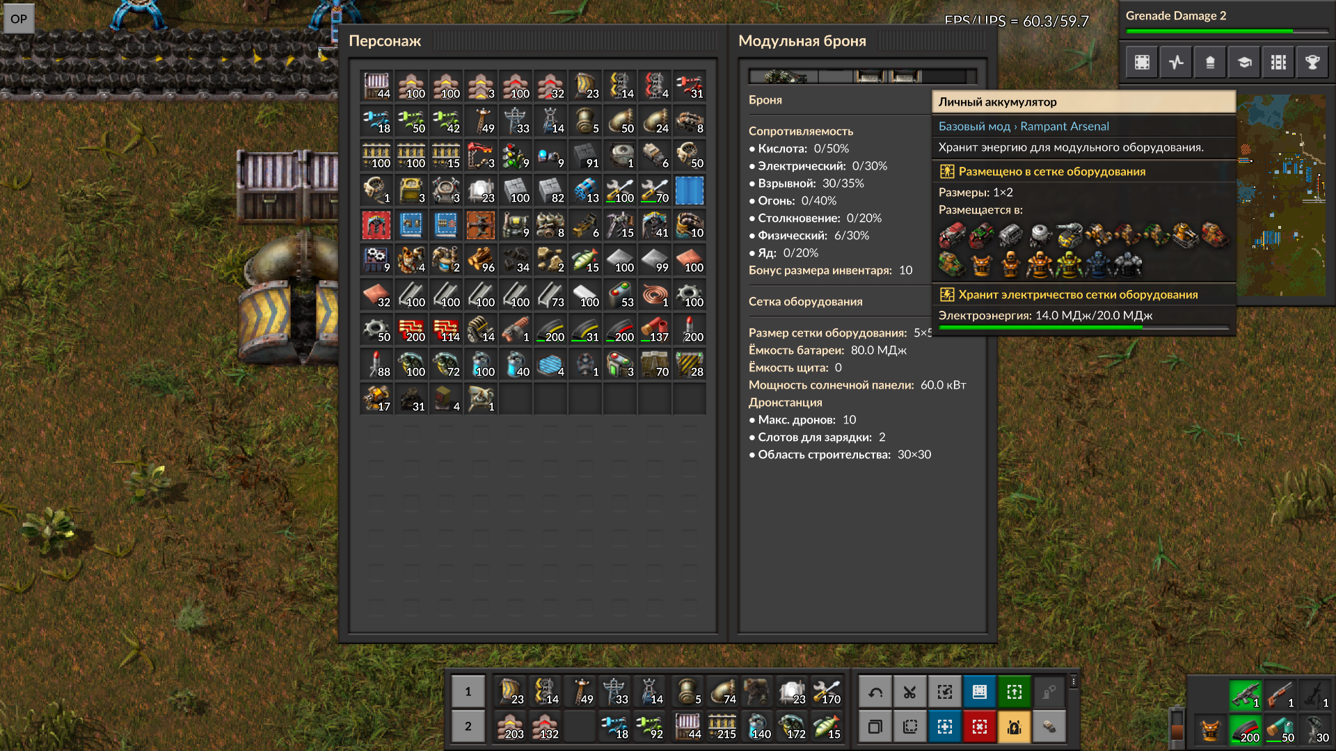
The new sounds are pretty good, but who missed this equipment grid bs lol
I play at 125% interface size because I can't see shit otherwise.
I cannot confirm this. Maybe some mods you use are not adapted to 0.18.27 yet and mess up the UI?
With vanilla Factorio 0.18.27 on 125% interface scale it looks fine:
equipment grid.jpg
That's good to know - I'm using Krastorio 2; maybe they messed with the interface. Thanks for your post!
This happens in 0.18.27 vanilla. The reason it's not happening for everyone at 125% is probably that people have different resolutions. This is power armor MK1 at 150% interface size, I'm running at 1920*1080 resolution :
armor.jpg

Maybe file a bug report ?
Same thing
Image

Post Reply

Return to “Releases”