Version 0.13.2

Information about releases and roadmap.
lancar
Fast Inserter
Fast Inserter
Posts: 158
Joined: Tue Dec 02, 2014 5:49 pm
Contact:

Re: Version 0.13.2

Post by lancar »

kovarex wrote:
lancar wrote:The research screen needs some alterations.

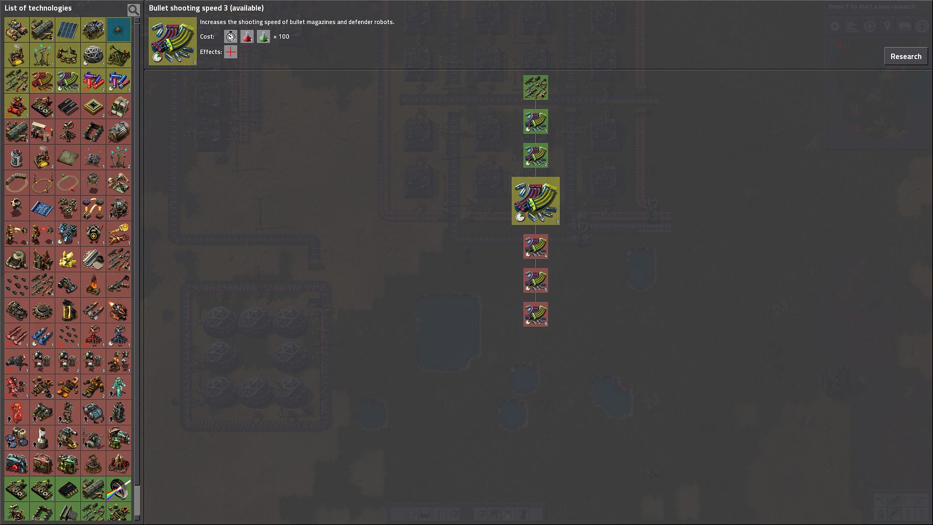
On a 1440p display, the relevant information is all shot up into the top left corner, and the tree takes up just a tiny part in the center of the screen. The rest is unused grey.
Also, the research button itself sometimes wanders off the screen to the right (not in this screenshot tho, was in 0.13.1. maybe you fixed it?)

http://i40.photobucket.com/albums/e216/ ... 5913_1.jpg

I suggest the research window not be fullscreen, and instead adjustable size, or size dependent on resolution.
It is like this on purpose, lot of other research trees are much bigger so we need as much space for the tree as possible.
I understand what you're getting at, but imho it's not very intuitive UI design. The most relevant information should be front and center, and the tree isn't it. Because techs have many interdependencies and are researched on a color-by-color basis instead of tree-progression basis, the most relevant information is the techs you can current select to research and what they bring to the table if you pick them.
All other decisions come after knowing this crucial first bit of information, "what do I have, and what can I do with it". Only after this comes the "how can I reach X", if it's even asked at all.
Currently, this information is as far away as possible from where your eyes are looking when gameplay is interrupted by the research screen popping up, and the problem is made even worse on larger displays as evident by the screenshot.

In games like civilization you research on a large tree-progressing model, A leads to B leads to C and D, branching off and re-merging as they go. The most relevant decision is right there in the center of the screen, and the game even suggests what to pick next.

But factorio doesn't work like that. The tree here is a lot wider, more complex, with long branching root ends that lead nowhere (most upgrade paths, like bullet damage, for example).
Therefore, if you want the tree to be the front-and-center spot you click to progress it has to display ALL the possible choices at the same time, with info near the place of clicking, and it also cannot be cluttered or else it will overload the viewer with too much information frontloaded at once.
(In fact, the upgrade branches can be easily truncated to one single tech marked as [upgradable] that just switches to its latest incarnation when researched and no information is lost while tonnes of space saved)

No matter the model chosen for the research screen in the future, the thing that a player ALWAYS wants to know the answer to first is what (s)he can select right now, and that's currently still the old green-marked icons located far to the top left. The tree is, unfortunately, not relevant to answer this question (yet?).

Additionally, as a side note, the research button needs to be close to the tech you click to research. Moving all the way across the whole screen to push the button is just consuming more time than needed.

User avatar
jockeril
Filter Inserter
Filter Inserter
Posts: 357
Joined: Sun Feb 08, 2015 11:04 am
Contact:

Re: Version 0.13.2

Post by jockeril »

lancar wrote:
kovarex wrote:
lancar wrote:The research screen needs some alterations.


I suggest the research window not be fullscreen, and instead adjustable size, or size dependent on resolution.
It is like this on purpose, lot of other research trees are much bigger so we need as much space for the tree as possible.
I understand what you're getting at, but imho it's not very intuitive UI design. The most relevant information should be front and center, and the tree isn't it.

In games like civilization
[...]

But factorio doesn't work like that
[...]

(If) until the time that that is implemented, the thing that a player wants to see is what (s)he can select right now, and that's the old green-marked icons currently located far to the top left. The tree is, unfortunately, not relevant enough.
and as a side note, the research button needs to be close to the tech you click to research. Moving all the way across the whole screen to push the button is bad.
from what I read you don't like the way they made the tree because (I presume) you're used to looking at the old research screen and working off of that - Well let me tell you about my first time with 0.13:

I found out there is an achievement that you get for building your first locomotive in under 1.5 hours time - I really want that achievement so I wanted to know what techs I needed to research to get to it...

In the old versions of 0.12. I had to jump backwards by clicking on "Railway" and clicking on every required tech and on it's every required tech and back to "railway" for the next required tech - see how that can be confusing ?

But with 0.13's vertical tech tree view - I can just click on "railway" and now I have a tree view of every tech needed to get to it and I can research them fast to get the achievement.

In my opinion they definitely improved the research screen, adding the tech tree the way it now is[/] was a great choice and it should stay that way
[request] RTL support please

My mods

Formally Hebrew translator for FARL & EvoGUI mods

join me on
- Twitter[@jockeril],
- Twitch.tv/jockeril,
- Youtube/jocker-il (or JoCKeR-iL)
- and steam !
Image

lancar
Fast Inserter
Fast Inserter
Posts: 158
Joined: Tue Dec 02, 2014 5:49 pm
Contact:

Re: Version 0.13.2

Post by lancar »

jockeril wrote:
lancar wrote:
kovarex wrote:
lancar wrote:The research screen needs some alterations.


I suggest the research window not be fullscreen, and instead adjustable size, or size dependent on resolution.
It is like this on purpose, lot of other research trees are much bigger so we need as much space for the tree as possible.
I understand what you're getting at, but imho it's not very intuitive UI design. The most relevant information should be front and center, and the tree isn't it.

In games like civilization
[...]

But factorio doesn't work like that
[...]

(If) until the time that that is implemented, the thing that a player wants to see is what (s)he can select right now, and that's the old green-marked icons currently located far to the top left. The tree is, unfortunately, not relevant enough.
and as a side note, the research button needs to be close to the tech you click to research. Moving all the way across the whole screen to push the button is bad.
from what I read you don't like the way they made the tree because (I presume) you're used to looking at the old research screen and working off of that - Well let me tell you about my first time with 0.13:
I found out there is an achievement that you get for building your first locomotive in under 1.5 hours time - I really want that achievement so I wanted to know what techs I needed to research to get to it...
In the old versions of 0.12. I had to jump backwards by clicking on "Railway" and clicking on every required tech and on it's every required tech and back to "railway" for the next required tech - see how that can be confusing ?
But with 0.13's vertical tech tree view - I can just click on "railway" and now I have a tree view of every tech needed to get to it and I can research them fast to get the achievement.
In my opinion they definitely improved the research screen, adding the tech tree the way it now is[/] was a great choice and it should stay that way

Missing my point, as you describe an active query to the system, rather than what I talked about which is about initial information presentation. If the tree can display the "what can i do right now" immediately when the screen pops I would be ok with it, but it doesn't. That info is presented in the top left, in the old way.
I, too, like the ability to order the tree to divulge detailed information about the progression, but remember that this is a sub-function of the screen. It's primary job is, and always will be, to select a tech to research next.
That's why this function should be front and center. What it actually looks like is irrelevant, as long as it's easy to understand and get an overview at a glance.

Kryzeth
Long Handed Inserter
Posts: 90
Joined: Sat Jul 25, 2015 9:07 am
Contact:

Re: Version 0.13.2

Post by Kryzeth »

FactorioBot wrote:Moved the copper wire back to the intermidiate category in the recipes.
Single greatest change in the history of everything, even greater than minable rock, landfill, and all of the train updates combined. Incorporates the one and only mod that I ever made and I love it :D

Post Reply

Return to “Releases”