Page 1 of 1
[0.17.47]Freeplay message style regression
Posted: Sun Jun 09, 2019 6:16 am
by Choumiko
After starting a new game in 0.17.47 i get the old style message:
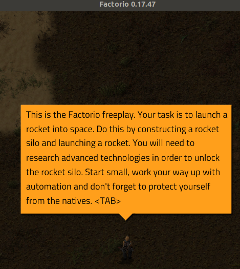
- Screenshot from 2019-06-09 08-04-53.png (270.87 KiB) Viewed 1736 times
versus 0.17.45:
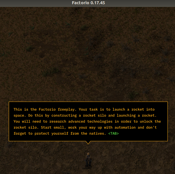
- Screenshot from 2019-06-09 08-08-09.png (440.12 KiB) Viewed 1736 times
Don't know if this is intentional, but i like the .45 version of it
Re: [0.17.47]Freeplay message style regression
Posted: Sun Jun 09, 2019 6:52 am
by eradicator
Ah yes. I forgot to report this yesterday. :)
Re: [0.17.47]Freeplay message style regression
Posted: Sun Jun 09, 2019 10:58 am
by mexmer
honestly, for me new style messages were unreadable, while oldstyle are much better.
Re: [0.17.47]Freeplay message style regression
Posted: Mon Jun 10, 2019 11:04 am
by wheybags
This is intentional, the fact that they changed in earlier version of 0.17 was due to technical restrictions meaning we had only one style available.
The black outlined style is exclusively for compilatron, so it is no longer used in freeplay.
Re: [0.17.47]Freeplay message style regression
Posted: Mon Jun 10, 2019 6:43 pm
by eradicator
Hm. I can't shake the feeling that the old one looks "less polished" though. Maybe it's just because i know that it is "old". I kinda liked how the new one was "wider" and had a seperate color for the <tab> key component to highlight that it's not part of the text. Also the dark color scheme had a less sharp contrast with with the surrounding ground tiles.
mexmer wrote: ↑Sun Jun 09, 2019 10:58 am
honestly, for me new style messages were unreadable, while oldstyle are much better.
Font size? Contrast?
Re: [0.17.47]Freeplay message style regression
Posted: Tue Jun 11, 2019 12:10 am
by MakeItGraphic
eradicator wrote: ↑Mon Jun 10, 2019 6:43 pm
Hm. I can't shake the feeling that the old one looks "less polished" though. Maybe it's just because i know that it is "old". I kinda liked how the new one was "wider" and had a seperate color for the <tab> key component to highlight that it's not part of the text. Also the dark color scheme had a less sharp contrast with with the surrounding ground tiles.
mexmer wrote: ↑Sun Jun 09, 2019 10:58 am
honestly, for me new style messages were unreadable, while oldstyle are much better.
Font size? Contrast?
Its the contrast for me, it's an eyesore the new style.
Re: [0.17.47]Freeplay message style regression
Posted: Tue Jun 11, 2019 6:15 am
by mexmer
eradicator wrote: ↑Mon Jun 10, 2019 6:43 pm
Hm. I can't shake the feeling that the old one looks "less polished" though. Maybe it's just because i know that it is "old". I kinda liked how the new one was "wider" and had a seperate color for the <tab> key component to highlight that it's not part of the text. Also the dark color scheme had a less sharp contrast with with the surrounding ground tiles.
mexmer wrote: ↑Sun Jun 09, 2019 10:58 am
honestly, for me new style messages were unreadable, while oldstyle are much better.
Font size? Contrast?
especialy contrast combined with thin font is bad. maybe if letters were double thickness it would be better, but i still like 0.16 style more. it's much easier to read.
only downside of old style is, that you can't emphasize keys, like it is in white on black style.
Re: [0.17.47]Freeplay message style regression
Posted: Tue Jun 11, 2019 10:33 am
by eradicator
mexmer wrote: ↑Tue Jun 11, 2019 6:15 am
eradicator wrote: ↑Mon Jun 10, 2019 6:43 pm
Hm. I can't shake the feeling that the old one looks "less polished" though. Maybe it's just because i know that it is "old". I kinda liked how the new one was "wider" and had a seperate color for the <tab> key component to highlight that it's not part of the text. Also the dark color scheme had a less sharp contrast with with the surrounding ground tiles.
mexmer wrote: ↑Sun Jun 09, 2019 10:58 am
honestly, for me new style messages were unreadable, while oldstyle are much better.
Font size? Contrast?
especialy contrast combined with thin font is bad. maybe if letters were double thickness it would be better, but i still like 0.16 style more. it's much easier to read.
only downside of old style is, that you can't emphasize keys, like it is in white on black style.
Yea, the letters are really small in the new style. I think what bothers me most about the old one is the dark -> bright -> dark contrast. If the background (i.e. the world) was bright too (like in a pdf) i might've liked it better.