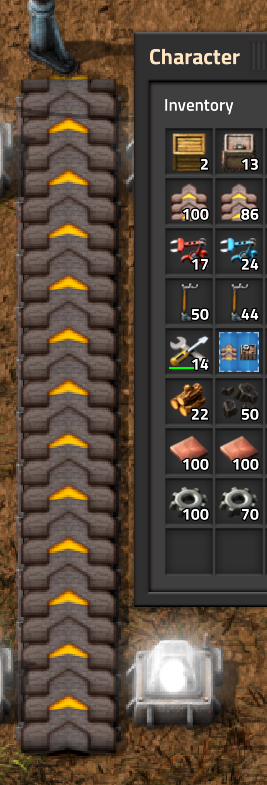
Not sure if this is really a bug, or just my eyes deceiving me, but it looks off to me.
[0.18.27] Transport belt icon is off-color
- kenzierocks
- Burner Inserter

- Posts: 14
- Joined: Sun May 15, 2016 10:42 pm
- Contact:
[0.18.27] Transport belt icon is off-color
Transport belts look brighter and redder than when actually placed on the ground:

Not sure if this is really a bug, or just my eyes deceiving me, but it looks off to me.
Not sure if this is really a bug, or just my eyes deceiving me, but it looks off to me.
- Attachments
-
- factorio-current.log
- Current log
- (12.58 KiB) Downloaded 99 times
Re: [0.18.27] Transport belt icon is off-color
Nothing here looks like a bug to me
- kenzierocks
- Burner Inserter

- Posts: 14
- Joined: Sun May 15, 2016 10:42 pm
- Contact:
Re: [0.18.27] Transport belt icon is off-color
Upon further investigation, I would actually like to formally request that this be fixed, even if not a bug per se. This looks extremely weird compared to the old icons (both upscaled without interpolation, though you could look at the raw files if you wanted):

Why does it have an almost copper-like color to it?
Why does it have an almost copper-like color to it?
Re: [0.18.27] Transport belt icon is off-color
Rust from exposure to moisture?
The item is probably optimized to be displayed with dark background as in the inventory, hence it is brighter.
The entity, on the other hand, has to look good in contrast against a variety of different natural ground tiles.
Honestly, I never would have noticed there is a difference in these colors. It is really subtle when not side by side.
Re: [0.18.27] Transport belt icon is off-color
Honestly I think it's more pronounced when looking in the inventory. On the ground, it's a dark object with a light background, and in the inventory it's a light object with a dark background. I can't see the red tint in-game at all, but the difference in brightness I think is rather apparent. Well, relatively apparent. I also probably wouldn't have noticed if it hadn't been pointed out, but now I can definitely see it just at a glance.valneq wrote: ↑Fri Jun 05, 2020 8:54 pmRust from exposure to moisture?
The item is probably optimized to be displayed with dark background as in the inventory, hence it is brighter.
The entity, on the other hand, has to look good in contrast against a variety of different natural ground tiles.
Honestly, I never would have noticed there is a difference in these colors. It is really subtle when not side by side.
- kenzierocks
- Burner Inserter

- Posts: 14
- Joined: Sun May 15, 2016 10:42 pm
- Contact:
Re: [0.18.27] Transport belt icon is off-color
Sorry for not being clear - I don't see any redness in the non-icon texture, this is purely about the fact that the icon doesn't resemble the texture in the world. The icon texture is much redder than the texture in the world, which is nearly black.
Re: [0.18.27] Transport belt icon is off-color
There's plenty of structures that look remarkably different from their icon representations. Just part of design. It's meant to look recognizable, not exactly the same.
Maybe there is discoloration? Seems unlikely though, and based on response, even more unlikely.
Maybe there is discoloration? Seems unlikely though, and based on response, even more unlikely.
Re: [0.18.27] Transport belt icon is off-color
The report is closed, make a development suggestion instead.


