Change to the layout of the mobile mod portal.
Posted: Wed Apr 10, 2019 12:02 pm
Can we change the layout of the mod portal so the 'username | My licenses | My mods | Logout | Notifications' flows onto its own line when the browser window is narrow enough.
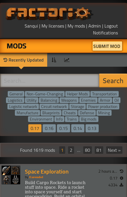
At the moment on mobile, the logo takes up the majority of the space, and due to how things are currently laid out, 'Notifications' ends up under 'Submit Mod' on my mobile.
Admittedly, this is a screenshot from my desktop, but this is how things look on my mobile with the current layout:
At the moment on mobile, the logo takes up the majority of the space, and due to how things are currently laid out, 'Notifications' ends up under 'Submit Mod' on my mobile.
Admittedly, this is a screenshot from my desktop, but this is how things look on my mobile with the current layout:
- Capture.JPG (55.73 KiB) Viewed 1449 times